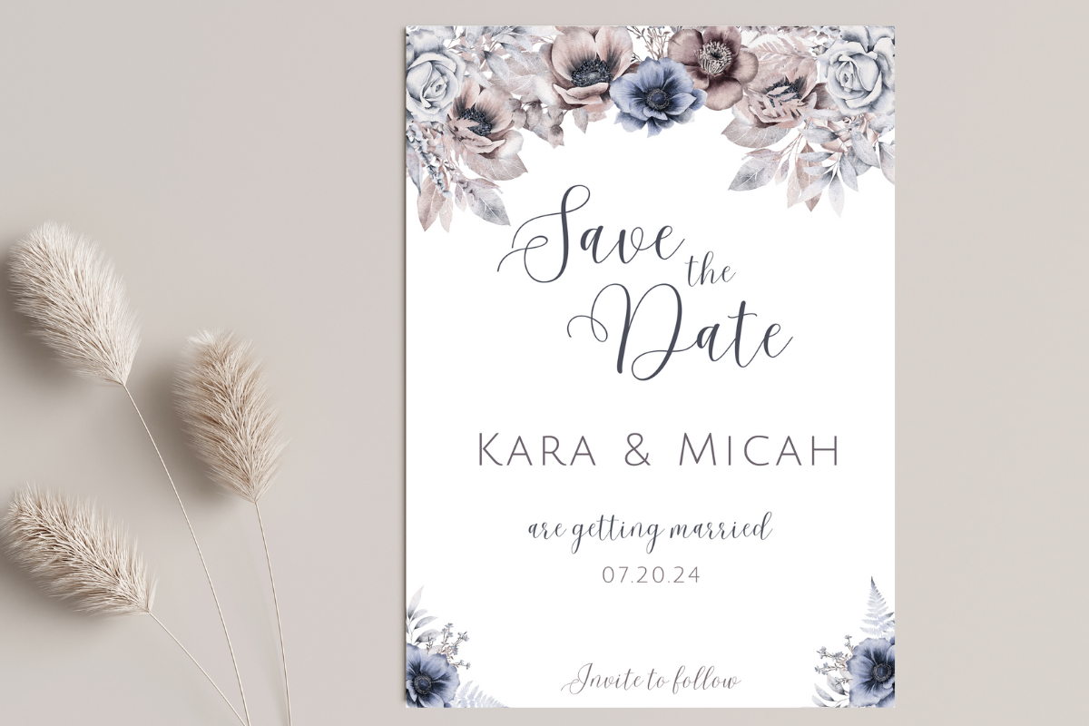
We sent our save the dates eight months out and I still got a text from my aunt asking if the wedding was a costume thing. It was not. The card just said our names, a date, and the word “celebration” in a curly font I picked at 1am, and somehow that read as a Halloween party to a woman who has known me since birth. I redid them.
Here is the thing I did not believe until I lived it. The words on a save the date do almost nothing except answer one question, which is when, and yet I spent two weeks agonizing over them. Too stiff and people think it is a work event. Too loose and your grandmother is confused. I went through about a dozen versions on the back of a takeout menu before I trusted myself.
So below are the templates I actually leaned on, sorted by the tone I was going for, plus the exact lines I ended up using or wished I had. I print a test page on plain paper first and read it out loud in the kitchen, because a sentence that looks fine on screen sounds insane spoken. A couple of these are affiliate links, so if you grab one it tosses a little something my way. Doesn’t cost you a cent.
Quick note, a couple of these are affiliate links. If one ends up at your reception, it helps keep this little blog running and you pay the same.
When I wanted it to feel like the fancy kind
My cousin got married at a winery and her save the dates had this cut-out detail that made everyone keep them on the fridge for a year. I wanted that. This bundle is what gets you close without paying a stationer four dollars a card.
The wording I used here stayed formal because the design carries the weight already. “Together with their families, Nora and Sam invite you to save the date” and then the date underneath in a smaller line. I did not add the venue. With a delicate design like this you do not want a wall of text fighting the cut-out part, so I kept it to four lines and let it breathe.
One gripe. The laser-cut effect prints best on heavier stock and my home printer choked on anything above 80lb, so I ended up at the copy shop on Wexford again. Worth knowing before you buy the cheap cardstock thinking you’ll DIY the whole thing.
The plain one I gave my no-nonsense friends
A coworker of mine got engaged the same spring and she did not want anything she called “precious.” Her words. This is the template I sent her. Clean layout, room for the words to actually be the point.
For wording on something this stripped back I went middle of the road. Not stuffy, not jokey. “Save the date for the wedding of Nora and Sam” with the date and city below, and that was it. No venue, no website, because a clean card like this looks wrong crammed full. She added one line, “formal invitation to follow,” which I think is the single most useful sentence you can put on any save the date.
The catch is the font it ships with sits a little tight, so the date ran close to the edge on my first print and got clipped. I bumped the bottom margin a few millimeters and it was fine. Five minute fix, one wasted page.
For the destination wedding nobody believed was real
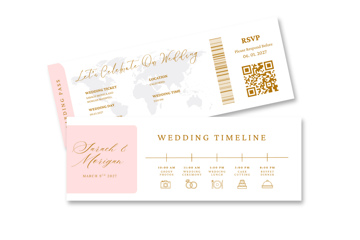
My maid of honor is getting married in Charleston and half her guest list lives nowhere near it, so a boarding pass save the date actually does a job here. It tells people, loudly, book a flight. I helped her fill this one in over wine.
The wording on a boarding pass card is half the fun and half the trap. You can lean into the airline bit, “now boarding: the wedding of,” departure date, destination as the city. We added “book early, the small airport fills up” as a tiny footnote line, which is the kind of practical detail a destination guest actually needs. Skip the cute gate numbers though. She wanted a fake “Gate LOVE” and we both agreed it tipped into too much.
My one complaint is the template has a lot of little text boxes and it is easy to leave one with placeholder Latin in it. Check every field twice. We almost mailed forty cards that said “lorem ipsum” under the date.
The moody one for the couple who hate pastels
Some friends of mine had a November wedding in a converted warehouse and a soft floral card would have been a lie. They wanted dark. This template is black background, light text, and it photographs beautifully if you’re sending a digital version by text or email.
For wording on a dark card I kept it short and a touch dramatic because the look invites it. Just the two names big, the date in numerals, and “more soon” underneath. That was the whole card. When the design is doing this much you really do not need the venue or a website line cluttering it, and they sent the details later in a follow-up email anyway.
The thing to watch is light text on dark prints heavier than you expect at home, and my friend’s first run came out muddy and gray. She had to nudge the text brightness up and print at the shop. If you only ever send this digitally you skip that whole headache.
The soft one I keep recommending to spring brides
This is the one I send people who say they want “pretty but not babyish.” The blue and beige floral hits a nice middle and it does not scream baby shower the way pure pastel sometimes does. My neighbor used it for an April garden wedding and it suited the whole thing.
The wording I’d put on this leans casual and warm. “We’re getting married! Save the date” up top, names, the date, and the town. She added their wedding website on the very bottom in tiny text, which works on a floral card because there’s natural white space at the base where it doesn’t fight the design. That’s the only place I think a website line really sits comfortably.
My nitpick is the flowers run close to the corners, so if you trim by hand like I do you’ll shave a petal or two. Print it with crop marks if the template offers them, or just accept slightly imperfect corners. Mine were imperfect. Nobody said a word.
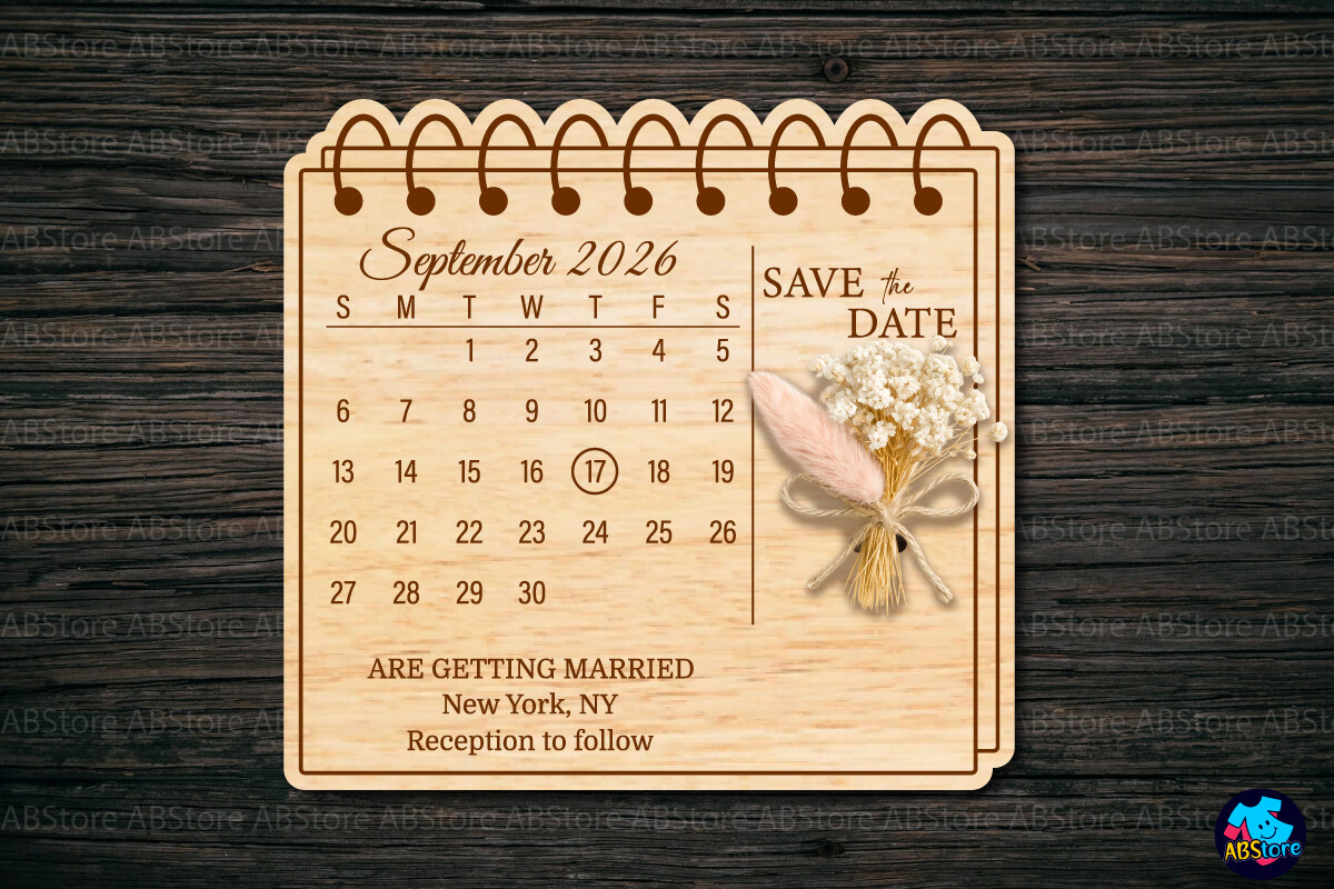
The little calendar trick that actually got people to circle the day
I almost did not include this one and then I remembered my sister-in-law’s card had a tiny calendar with the date circled and I literally hung it on my fridge and looked at it for months. That is the whole point of a save the date and this design just does it well.
Wording on a calendar card writes itself a bit. The month grid shows the when, so the text can be sparse. “Save the date” big, names, year, and that’s plenty because the circled square handles the rest. I would not add the venue or much else, the calendar is the hero and extra lines just sit awkwardly around the grid.
The only annoying part is making sure the circled date matches the actual day of the week, because the template ships with a generic month and you have to swap it. My sister-in-law’s first version had the date circled on a Tuesday and the wedding was a Saturday. We caught it. Barely.
The cut-file one for the friend who owns a Cricut and won’t stop
Every friend group has the one with a cutting machine and a garage full of vinyl. Mine made her own save the dates with an SVG like this and they came out shockingly good, like store-bought, and cost her almost nothing in materials.
For wording on a cut design you keep it minimal out of necessity, because every line you add is another thing the machine has to cut clean. She did just “save the date,” the two names, and the numeric date, layered in two colors. No website, no venue. The little couple illustration carried the personality so the text could stay quiet.
The honest catch here is this one is for people comfortable with cut files. If you do not own the machine and have never weeded vinyl, this is not your starting point, and that is fine. My friend spent a full Saturday on her first sheet before she got the layers to line up. The next forty took an hour.
Questions Brides Ask Me
What do you write on a save the date?
Honestly? Less than you think. The job of the card is to answer when, so the non-negotiables are your two names and the date. That’s it. Everything past that is optional.
I agonized over this and then realized my own confusion was the answer. When my aunt thought ours was a Halloween party, the fix wasn’t more words, it was clearer ones. Names, date, the city, and the line “formal invitation to follow” so people know the real details are coming. I leave the venue and the website off most cards and save them for the invite.
Do I include the venue?
I didn’t, and I’d tell a friend to skip it too in most cases. A save the date is a heads-up, not the itinerary, and a full venue name plus address usually crowds the design and makes the card look like a flyer.
The exception is a destination wedding. When my maid of honor sent hers for Charleston, people needed to know the city right away to book flights, so the location was the whole point. Even then we only put the town, not the venue street address. That part waited for the invitation.
How do I mention the website?
Tiny, at the very bottom, and only if there’s room. I learned this the hard way after I tried to fit our URL in the middle of a card and it looked like a coupon. Moved it to the bottom in small text and suddenly it was fine.
A floral or open layout usually has natural white space at the base where a URL sits without fighting anything. My neighbor put “details at” and then the address on one little line and it disappeared into the design, which is exactly what you want. If your card is busy or moody, skip it on the card and send the link in your follow-up email instead.
Before You Hit Print
The part I wish someone had told me before I redid ours four times is that the design picks the tone, and then the words just have to not get in the way. A laser-cut card wants four formal lines. A boarding pass wants you to play along. Match the words to the look and you stop second-guessing every sentence on the back of a takeout menu.
Whatever you pick, print one test page on plain paper and read it out loud in your kitchen before you commit to the good stock. If it sounds normal said aloud, it’ll read normal in a mailbox. And if your aunt still texts you confused, well, at least the date will be right.