Our wedding was a four-hour drive plus a ferry, and I did not figure out the ferry schedule until after the invitations were printed. Two of my cousins almost missed the rehearsal because the last boat leaves at 6:40, which is the kind of detail nobody knows unless you tell them. I tell people now. Loudly.
Destination save the dates are a different animal from the regular kind. People are not just penciling you into a calendar. They are pricing flights, asking off work, deciding if they can swing a hotel for three nights or just one. If your card shows up too late, they have already booked something else for that weekend, and there is no polite way to undo a Costco beach trip your aunt has been excited about since March.
So I send these earlier than feels normal, and I put more on them than feels normal. Below are the templates and a magnet I would hand a friend planning the same thing. I printed test pages of most of these on plain paper first and squinted at them from across the room. A few of the links are affiliate links, so if you grab one it tosses a little something my way at no cost to you.
Heads up, some links here are affiliate links. Grab a template through one and I get a small cut, no extra charge to you.
The floral one I sent first, six months out
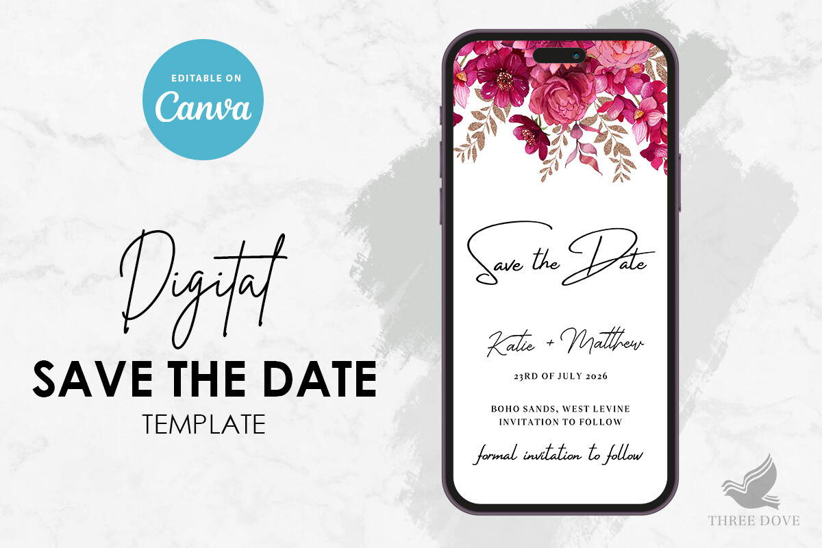
I started with this because florals read as soft without screaming theme, and for a destination thing you want people to feel invited, not summoned to a brand. I typed our names, the town, and the weekend, then printed one on copy paper and stuck it on the fridge for a day to see if I still liked it. I did.
The flowers sit around the edges, so there is real room in the middle for text. That matters more than it sounds when you are cramming in a date and a website and a little line about flights. My one gripe, the default date font is dainty, almost too dainty, and on a phone screenshot it got hard to read. I bumped it up two points and it was fine.
Greenery, because half my guests hate pastels
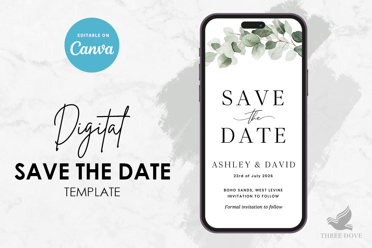
My maid of honor took one look at the floral version and said her husband would think it was a baby shower. Fair. So I made a second set in this greenery layout for the guests who lean plainer, and honestly it photographed better when people posted it to their group chats. Eucalyptus just does that.
It printed clean at the copy shop on Webster, no streaking on the green, which my home printer absolutely cannot pull off. Watch the corners though. The leaf art runs close to the trim line, and if your cutter is even slightly off you clip a stem. I left a hair more margin and nobody noticed.
When you want color that survives a mailbox
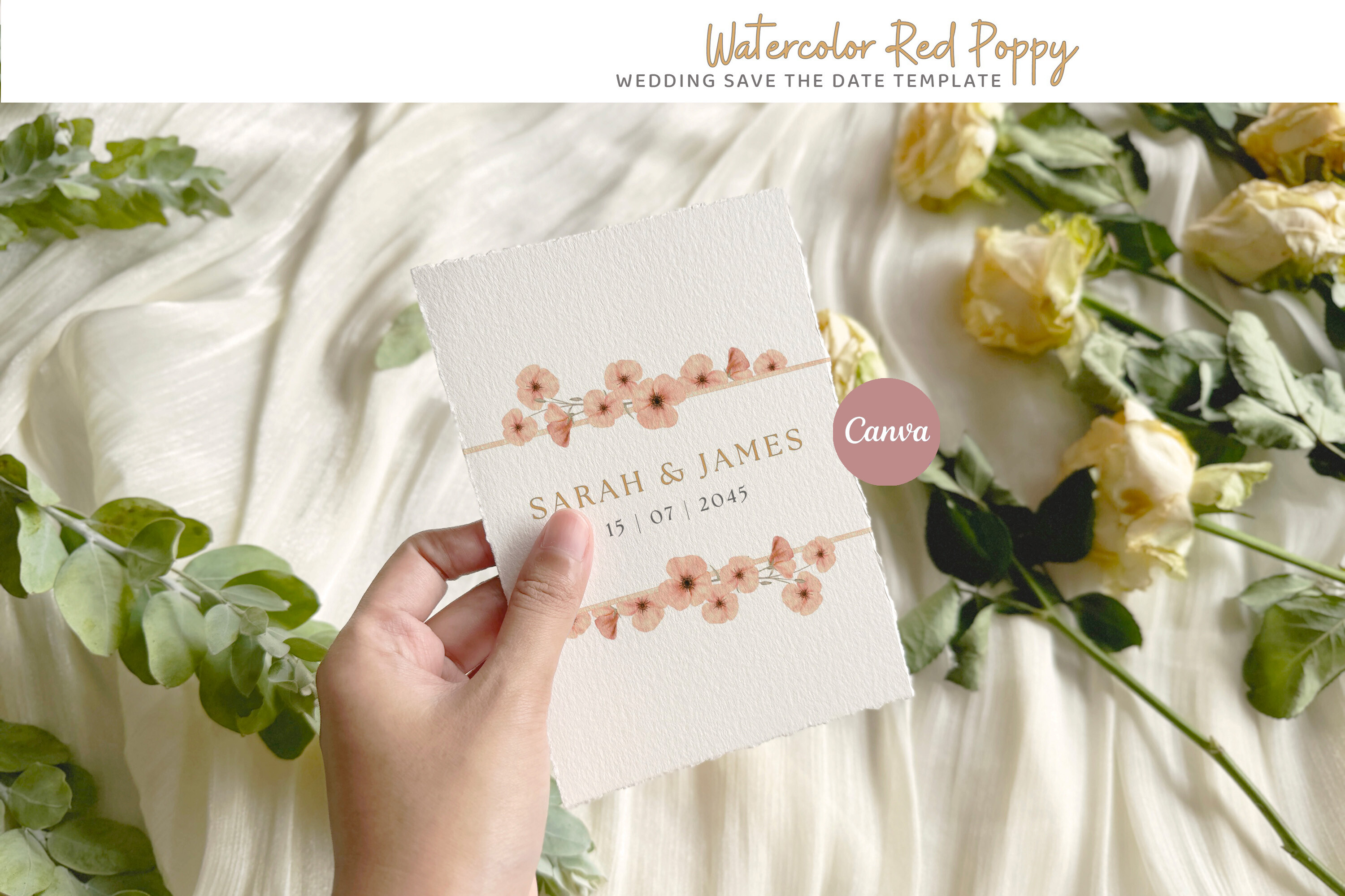
A coworker of mine did a wedding in Mexico and used something poppy-red like this, and the cards looked alive in a stack of beige envelopes on her counter. That stuck with me. For a sunny destination, color sells the mood before anyone reads a word.
You type your details in and the poppy stays put, it does not slide around when you change the date, which I have had happen with cheaper files. The catch is ink. Big saturated red eats cartridges, so I would not print a hundred of these at home. I took the file to the shop and paid for the good paper. Cheaper in the end than three home cartridges and a streaky reject pile.
The magnet that actually stays on the fridge
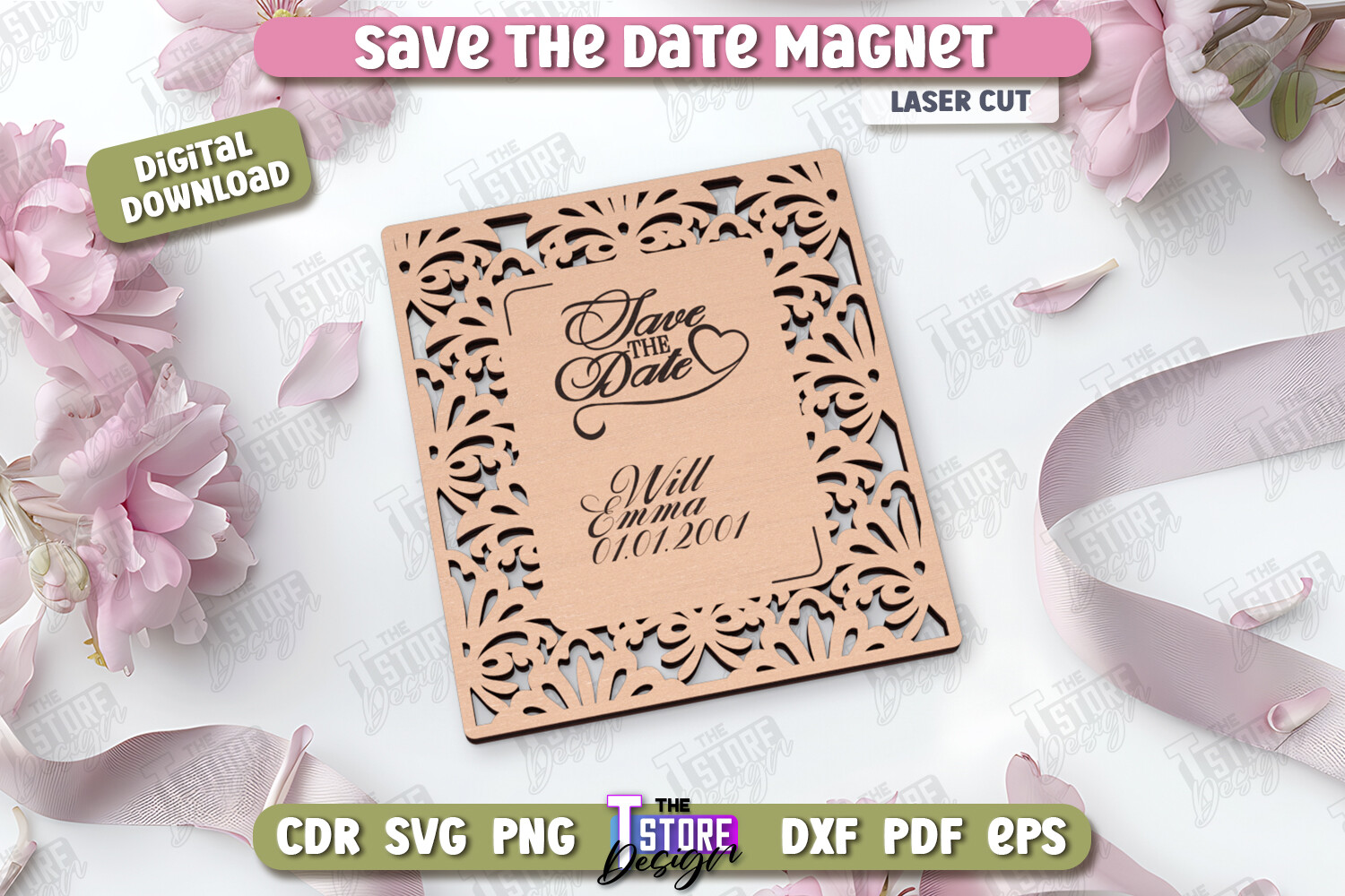
Here is my one strong opinion about destination weddings. Send a magnet. People lose paper. They do not lose the thing stuck to the fridge between the takeout menu and the kid’s drawing, and for ten months that magnet is quietly reminding them to book the flight.
This laser-cut style has a nice shaped edge instead of a plain rectangle, so it does not look like a pizza coupon. I ordered mine from a print place that does magnets, since this is not something you run off at home, and the turnaround was about a week. Only nitpick, keep the text simple. Detailed travel info does not fit on a magnet, so this is your reminder, and the card or website holds the rest.
Spring destination, cherry blossom, do it yourself
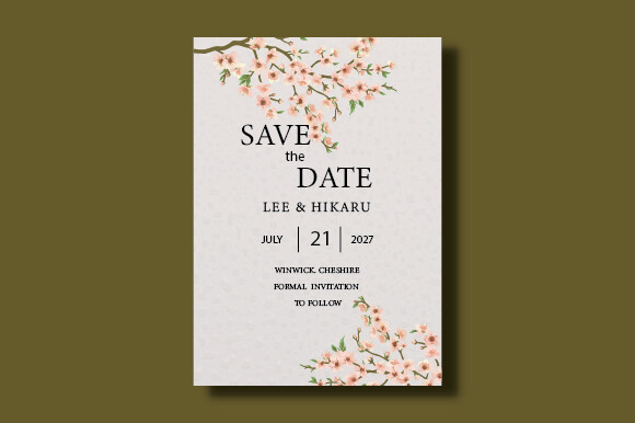
Got a spring trip? This one just makes sense. My friend got married outside Lisbon in April and the blossoms on her stationery matched the actual trees, which felt like a happy accident she fully took credit for. This is the DIY route, you edit it yourself, so it is the budget pick if you are printing a smaller batch.
I ran a test page and lived with it taped near the door for two days before committing. The pink is delicate, which is the whole point, but it also means a cheap printer can wash it out to almost nothing. Hold a test sheet up to a window. If the blossoms vanish, your printer is the problem, not the file. Mine was the problem.
Blush, gold, and a little more dressed up
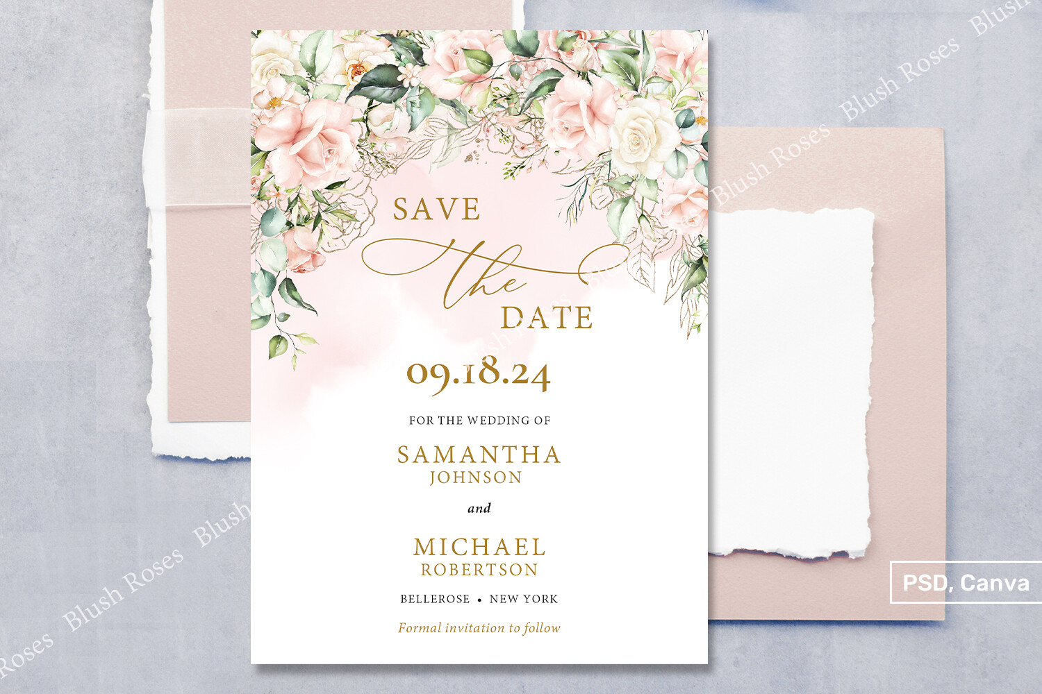
Some destination weddings are barefoot on sand and some are a vineyard with a dress code, and this blush-and-gold one is for the second kind. The gold accents make it read a step fancier without you doing anything. I would send this for an evening wedding somewhere people are flying in to dress up.
The eucalyptus and blush sit well together, soft but not mushy. One honest warning, the gold is printed gold, not foil, so do not expect it to shine in person. It looks great flat and on screen. If you want real metallic you are paying a print shop for foil, and that is a different budget conversation. For most people the printed version is plenty.
Terracotta tones for a desert or warm-weather trip
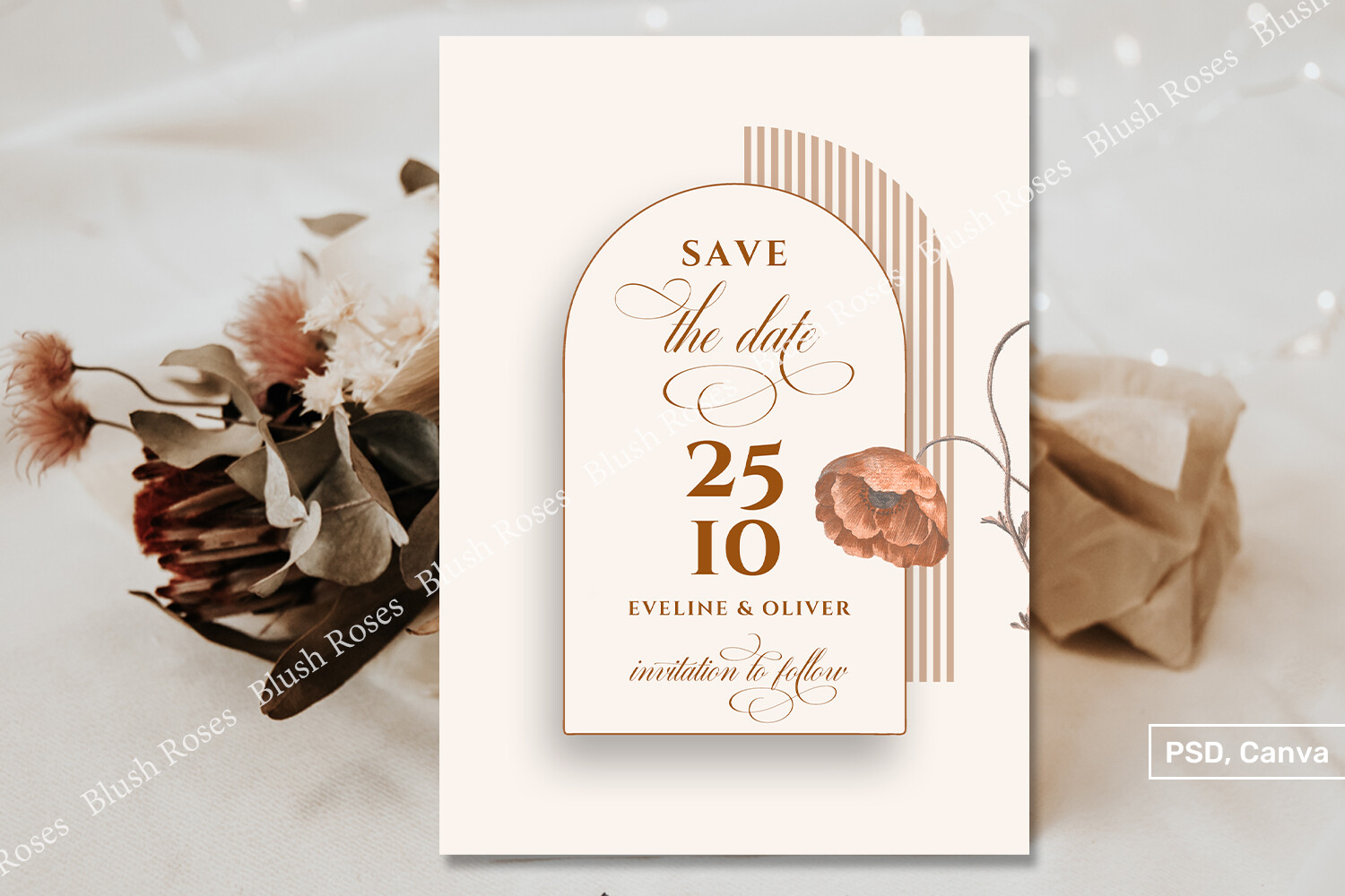
I am a little obsessed with terracotta for warm destinations. The arch shape and the brown-orange flowers feel like late afternoon somewhere dry and sunny, Arizona, Tuscany, Palm Springs, that whole vibe. A neighbor used colors like this for her Joshua Tree weekend and it set the tone before guests even booked.
It prints rich, which I love, but those deep terracotta and brown hues are demanding on a home printer and can go muddy if your ink is low. I learned that on a Sunday with a half-dead cartridge and a card that came out the color of a paper bag. Test one first, and if the browns muddle, that is your sign to use the copy shop.
Questions Brides Ask Me
When do I send destination save the dates?
Earlier than you think. I tell friends eight to ten months out, and a full year is not crazy if your wedding lands on a holiday weekend or somewhere flights spike.
I learned this the hard way. I sent ours at five months and two people had already committed to other trips. People need runway to book flights, ask off work, and sort out who is watching the dog. Give it to them.
What extra info do guests need?
More than a normal save the date, which surprised me. Nearest airport, the town and date so they can start watching fares, and a wedding website where the real details live. That ferry schedule I mentioned? On the website, in bold.
I would not cram all of it onto the card itself. A line like ‘travel details to come’ plus the website link does the job. The card gets people to save the weekend. The website handles the rest so you are not reprinting anything.
Magnet or card?
Honestly? Both, if the budget allows, and the magnet is the one I would not skip. The magnet lives on the fridge for ten months and quietly nags people to book. Paper ends up in a drawer.
A friend asked me this exact thing last spring and I told her to send a simple magnet now and a fuller card or website closer to the date. She did, and her guests actually booked early for once. The fridge does the reminding so you do not have to text everyone in July.
Before You Hit Print
The thing I wish someone had drilled into me is that a destination wedding lives or dies on lead time. Get something in front of people early, even a plain magnet, and put the airport and the website on it. The pretty floral version can follow.
Pick the one that matches your trip, print a single test page on cheap paper, and hold it across the room before you commit to a stack. If it still reads from the couch, you are good. Then go find out if your venue has a last ferry, because mine did, and I almost learned that the bad way.