Our caterer asked me one question at the tasting that I had no answer for. How will my servers know who gets the fish? I had spent six weeks on fonts and zero seconds on that. She was not rude about it. She just looked at me the way my mom looks when I say I will fix it later.
So I went home and added a tiny mark to every place card. A small leaf for chicken, a circle for fish, a square for the veggie plate. Eighty-four cards on the dining table, my fiance reading names off a spreadsheet while I drew. We finished at one in the morning and I had ink on my wrist for two days.
These are the templates and cuts I would use again for that job. Not the fussy ones. The ones where I could drop a symbol in a corner and nobody at the table would clock it as anything but pretty. A few of the links here are affiliate links, so if you grab one it tosses a little something my way. Does not cost you a cent.
Full disclosure, a few links are affiliate links. Use one and a few cents come back to me, never anything added to your price.
The floral one that hid the symbol in plain sight
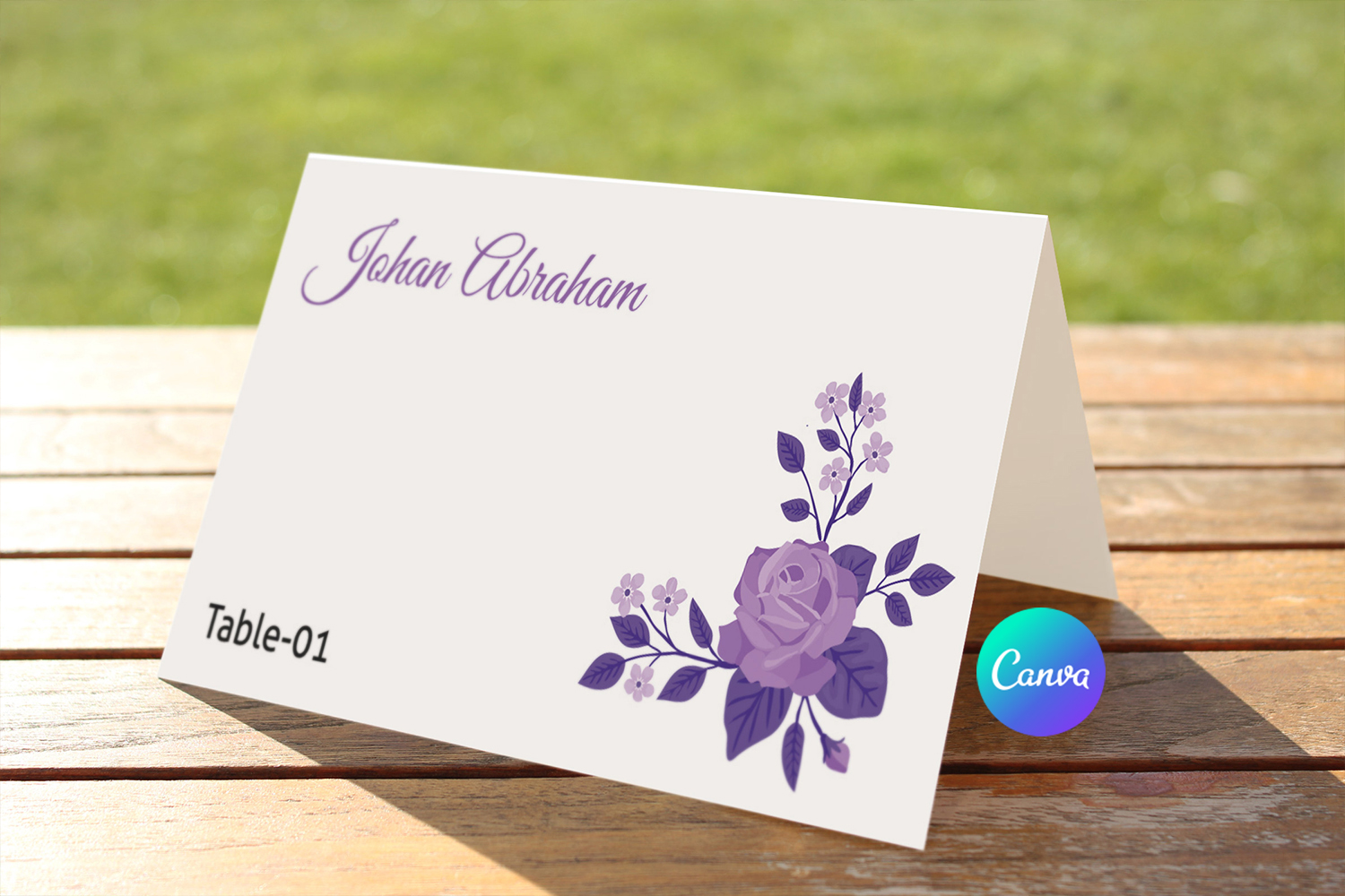
I love a card where you can tuck the meal mark right into the artwork. This floral template has a corner with enough open space that I dropped a small sprig icon next to the printed flowers and it read as part of the design. My maid of honor walked past a stack of them and asked what the little leaf meant, which told me servers would notice it on purpose but guests would not.
I printed a test sheet at the FedEx on Carlton because my home printer turns deep greens into mud. Held it up across the kitchen. The names read clean from ten feet, which is the only test I trust.
One gripe. The florals are dense, so if your venue lighting is warm and low, a pale symbol can vanish into the petals. I bumped my indicator a shade darker and printed a fresh batch. One wasted page. Lesson learned.
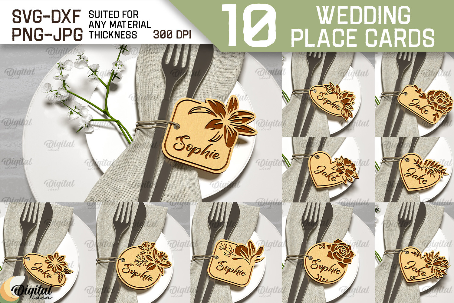
When you want the card to feel like an object, not paper
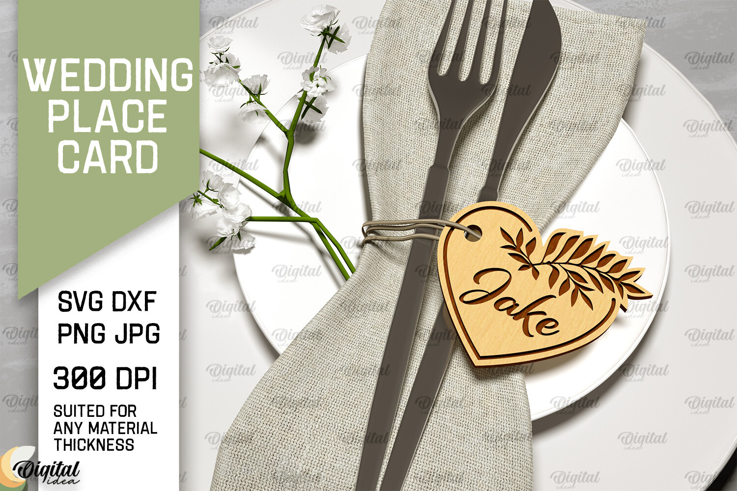
A friend used these wooden laser-cut cards for a fall reception and people kept pocketing them as keepsakes. For meal choice she painted a tiny dot on the back in three colors and gave the catering captain a key card. Worked great until two guests swapped seats and nobody noticed the dots had moved with them.
The wood feels heavier than you expect, in a good way. It does not flop over in a breeze the way cardstock does on an outdoor table. I tipped over a whole row of paper cards at my own reception when the patio door opened, so I notice these things now.
The catch is you cannot just print these at a copy shop. You need the cut done, and the symbol has to be painted or burned, which is a real evening of work. Plan for it. Do not start the night before like I did with everything else.
For the table that already has too much going on
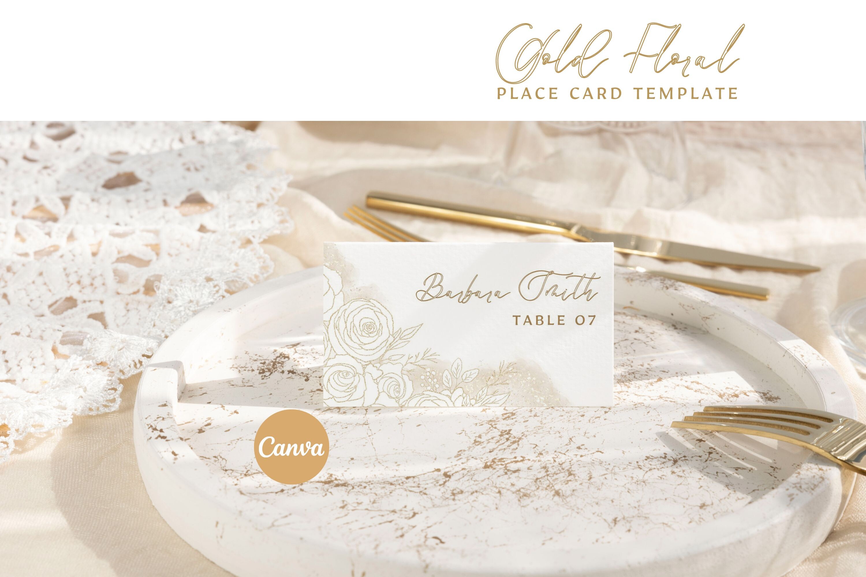
This is the one I would hand someone whose centerpieces are loud. The design is calm enough that a small meal symbol does not fight with anything. I set our chicken mark as a thin outlined circle in the bottom right and it looked intentional, like it belonged on the card from the start.
I typed in twelve names as a test, printed them on regular paper, and lived with them propped against the toaster for a day. By the second morning I knew the spacing held even with long double-barrel last names, which is where a lot of templates fall apart.
My one note is the default ink color runs a little gray on a home printer. Mine streaks anything darker than charcoal anyway, so I took the file to the copy shop on Beale and let their machine handle it. Came out crisp.
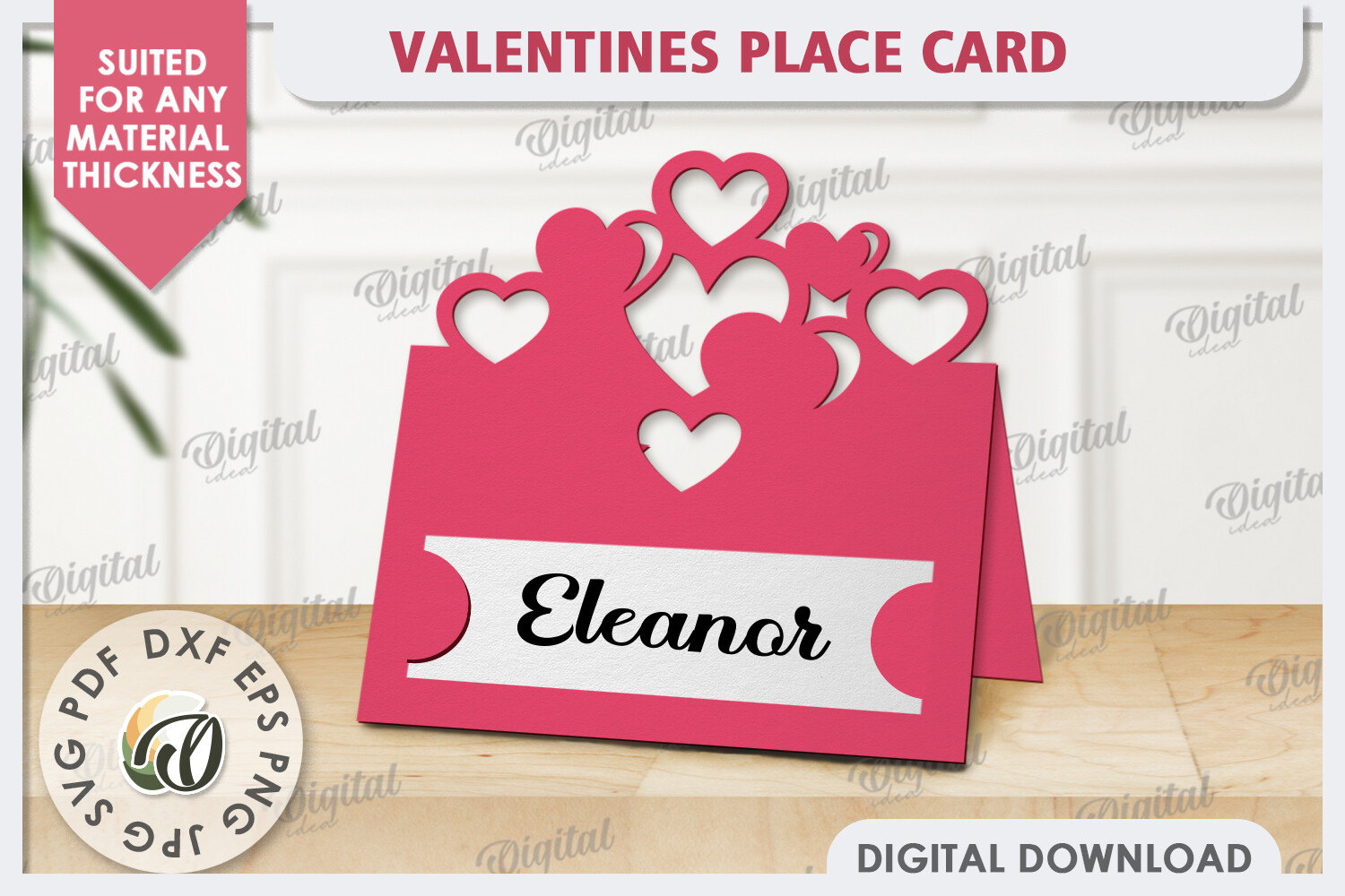
The cut design my cousin swore by
My cousin did her whole tablescape on a budget and these laser-cut cards were her one splurge. The cut pattern leaves little gaps that she used cleverly, threading a thin colored ribbon through for the meal code instead of drawing anything. Blue ribbon for fish, no ribbon for chicken. Her caterer found it charming and a little confusing, in roughly equal measure.
The shape of the cut catches light, so on her evening reception the cards glowed under the string lights. That part genuinely surprised me when I saw the photos.
What I would flag is the ribbon trick only works if someone has time to thread eighty of them. She did it over two nights with her sister and a bad movie playing. If you are short on hands, paint a dot instead and skip the threading.
Barely-there cards, one quiet mark
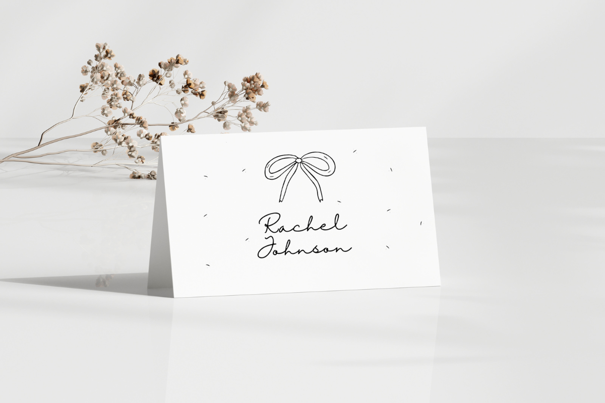
If your taste runs spare, this template gives you almost nothing to fight with. Just the name and a lot of white space. That white space is exactly where I would put the meal symbol, small, in a corner, so it reads as a design choice rather than a code.
I used a version of this for a coworker’s elopement dinner of sixteen people. Drew a tiny triangle by hand for the two vegans and left the rest blank. Took me fifteen minutes total. The simplest job I have ever done for someone.
The downside of minimal is there is nowhere to hide a mistake. A symbol that is even slightly off-center looks like an error, not a detail. I lined mine up with a ruler and still redid three. Slow down on these.
The bundle for when your guest list keeps growing
Guest lists never stop moving. Three weeks out we added eleven people and I was very glad I had a bundle and not a single design I had to re-buy. This laser-cut set gave me enough variety that I could assign a card style per meal type if I wanted, though I kept it simpler than that.
What I actually did was use one card shape for the whole room and reserve a tiny stamped symbol for the meal. The bundle meant I had spares when I inevitably ruined a few. I always ruin a few.
My honest complaint is bundles tempt you to overdo it. I almost ran three different cuts on one table before my fiance told me it looked like a sample fair. Pick one or two. Save the rest for the next friend who asks.
A paper-cut card for the crafty afternoon
This one is for people who actually like running the cutting machine. The paper-cut Love design is delicate, and I would not trust my home printer to do it justice, so I cut it on a borrowed Cricut at my neighbor’s kitchen table while she fed me iced tea and opinions.
For meal choice I used the cut-out itself, swapping a small heart for a small star on the fish cards. Subtle, and it photographed beautifully on the dessert table later. Guests just thought the variety was intentional styling.
The thing nobody tells you is paper-cut designs are fragile at the thin points. I tore two pulling them off the mat too fast. Go slow, use a weeding tool, and cut a few extra. You will need them.
Questions Brides Ask Me
How do place cards show meal choice?
Usually with a tiny mark the guest never has to think about. I drew a little leaf for chicken and a circle for fish in the corner of each card, then handed my caterer a key. Servers read the symbol, guest reads their name, nobody at the table is doing decode work over their salad.
A friend went a different route and used colored dots on the back. That worked too, until people swapped seats. Whatever you pick, keep it small and tell your caterer what it means before the day, not during it.
Symbols or colors?
I learned this one the hard way. Colors look slick in photos but they fall apart under warm dim lighting, where a navy dot and a black dot start to look identical to a server moving fast. Symbols hold up better in low light.
That said, colors are quicker if you are hand-marking eighty cards at midnight. My honest answer is symbols for an evening reception, colors only if your venue is bright and your caterer is fine with it. Ask them. They have opinions.
What does the caterer need?
Mine wanted two things and got grumpy when I forgot the second. One, a clear key telling her staff which mark means which plate. Two, a final headcount per meal that matches the cards. I gave her the key and forgot the count, and we had a slightly tense phone call the Wednesday before.
Drop both in an email a week out. Print the key on a single sheet and tape it inside the kitchen if you can. Servers will thank you, and so will the aunt who did not order the steak.
Before You Hit Print
The meal symbol is the least glamorous part of a place card and the part your caterer actually cares about. Pick a template where you can hide a small mark without wrecking the look, run one test page on plain paper, and squint at it from across the room before you commit to the good cardstock.
We got it wrong at the tasting and right by the wedding, mostly because I stopped overthinking the fonts and started thinking about the kitchen. Draw the leaf. Email the key. Then go back to obsessing over the seating chart, which is the part that will actually keep you up at night.