Our seating chart was beautiful and completely useless for the first ten minutes of cocktail hour. People walked up, stared at it, and then drifted off because they did not know it was the thing telling them where to sit. My aunt asked a bartender. The bartender pointed at the easel. It was a whole situation.
The fix cost me one extra sheet of cardstock. A small sign, propped right beside the chart, that said go look here. That is it. Once people knew the chart had a job, the clog at the front cleared up and the line moved. I wish someone had told me this before I spent an evening fussing over font pairings on the chart itself.
So here are the find your seat signs and chart pairings I would actually print again, plus the mockups I leaned on to see how the thing reads before committing. I always run one test page on plain paper and prop it on a chair across the room first. If I can read it squinting from the doorway, it stays. A few of the links below are affiliate links, so if you grab one it sends a little something my way. Costs you nothing.
A few of the links below are affiliate links. If you print something from one, it tosses a little something my way and costs you nothing.
The plain one I kept coming back to
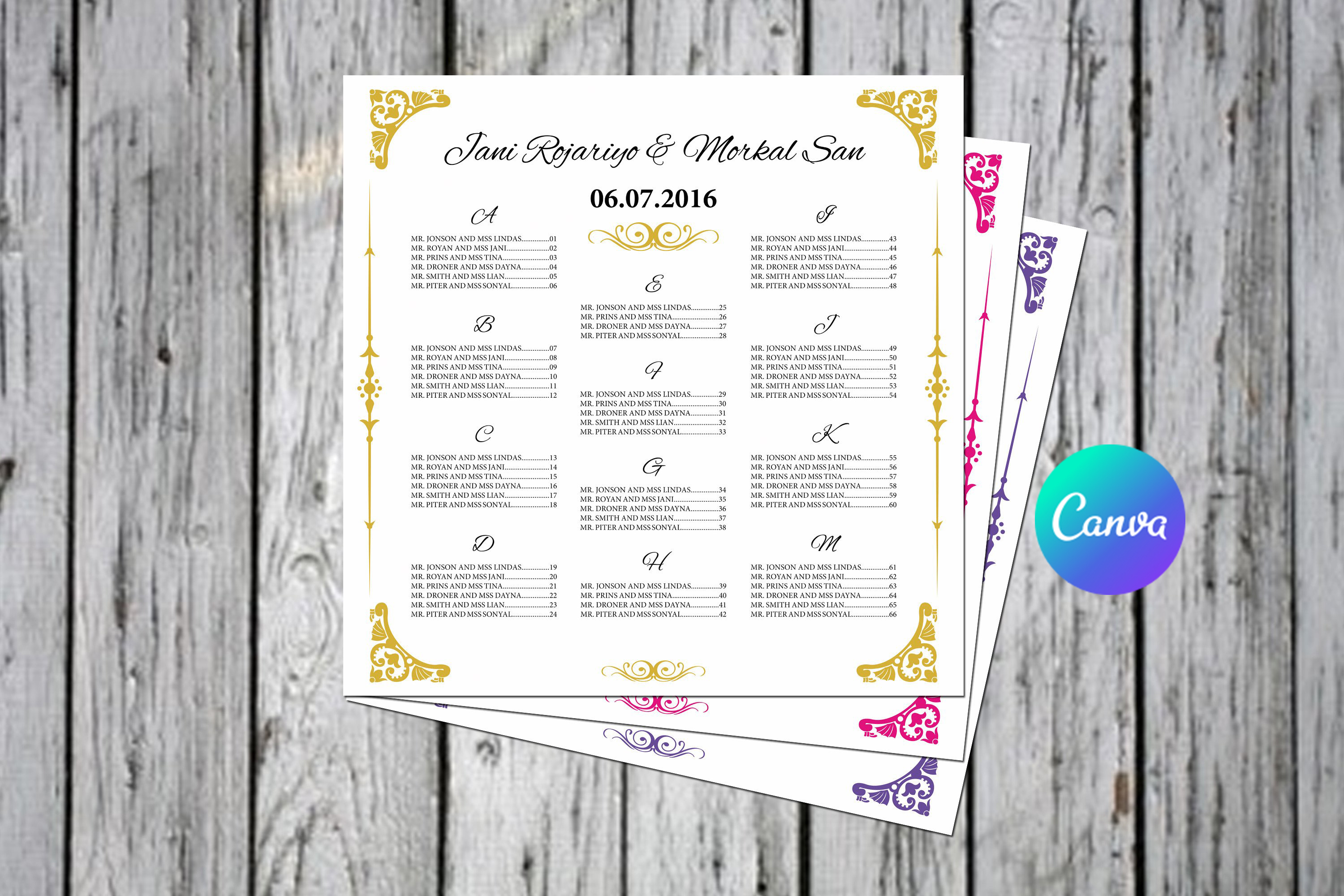
I tried about six charts and this is the one I stopped fighting with. You type the table names and the guest names, the columns hold their spacing, and it does not collapse into a mess when one table has nine people and another has four. I made my prompt sign as a cropped version of this same layout so the two matched without me thinking hard about it.
The headers print clean and dark, which matters more than it sounds. A friend used a different template and the table numbers came out so faint nobody could find their seat from more than a foot away.
One gripe. The default name spacing assumes everyone has a short name. We had a Konstantinos at table 5 and I had to nudge that line down a hair so it stopped touching the name above it.
When you want the sign to feel a bit softer
My cousin used the floral version for a garden reception in May and it suited the whole thing. The flowers sit along the top and down one edge, so there is plenty of open space for the actual names instead of petals crowding the text. She printed her find your seat sign on the same floral header and stood it on a little easel from a craft store.
We printed a test at the copy shop on Fulton because her home printer turns every pink into salmon. On real paper the colors held.
Watch the lightest blooms though. On regular printer paper the palest pink almost vanished. She bumped the saturation a touch before the final run and it fixed itself.
Greenery for the people who hate fussy
If florals feel like too much but a blank page feels like nothing, the greenery one lands somewhere comfortable. Eucalyptus along the border, names down the middle, room to breathe. I helped my maid of honor set hers up and we had the chart and the matching prompt sign done in an afternoon.
We printed the sign at 8×10 and the chart big, and the leaves scaled down without turning into green smudges, which I half expected.
The catch was the green. It read almost gray under her venue lighting, which was very warm and very dim. Print one at the actual venue light if you can. We could not, so we just went a shade darker to be safe.
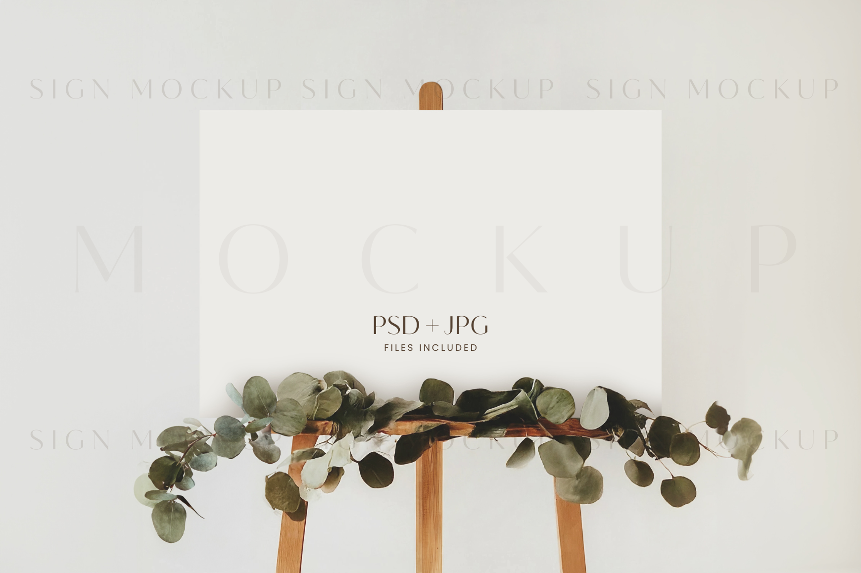
The set that gave me the prompt sign too
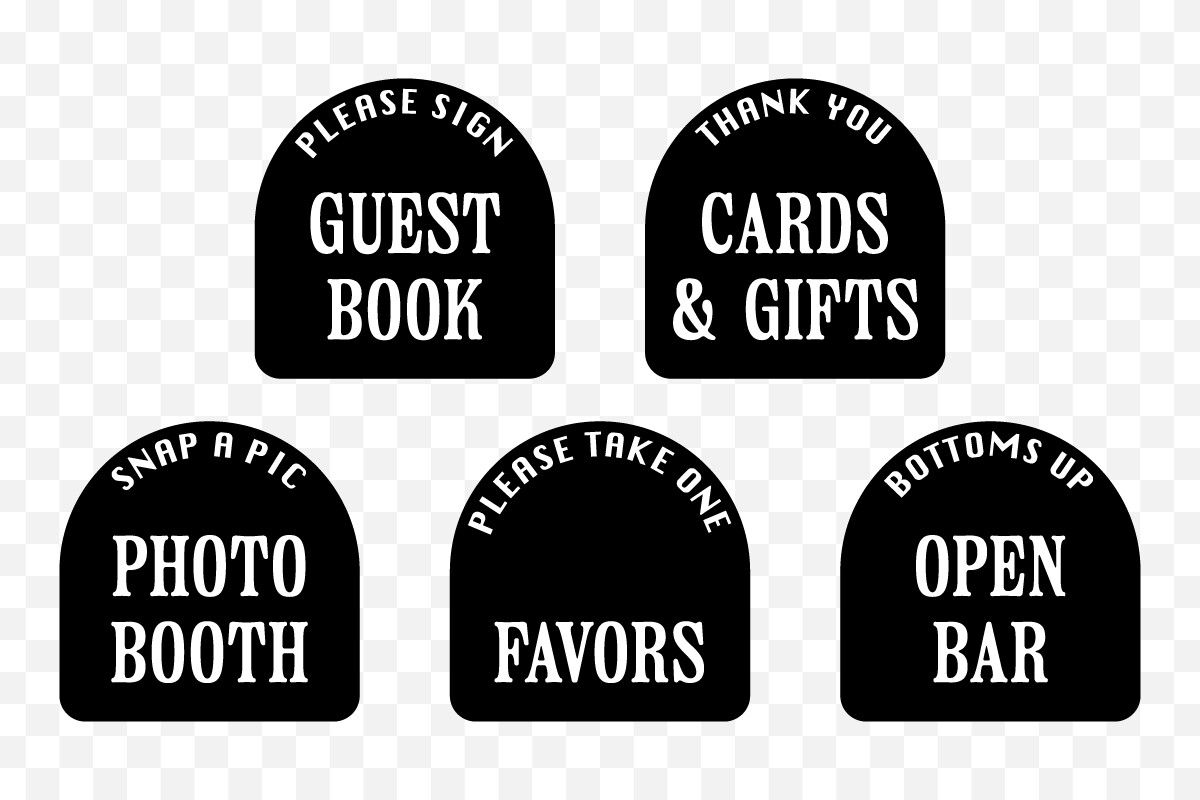
This is the one that actually solved my cocktail hour problem. It is a set of reception signs in a clean arch shape, and one of them is the find your seat sign that points people at the chart. I printed the arch sign, the bar sign, and a guestbook sign from the same set so the whole table of little signs matched.
The arch outline is thin and modern, and it photographs well, which my photographer mentioned later without me asking.
My one note is that the set runs on a tall vertical layout. If you have a wide horizontal frame already, you will be trimming or hunting for new frames. I had to buy two 5×7 frames the Tuesday before, which is exactly the kind of last minute errand I was trying to avoid.
Seeing it big before you pay to print it big
Here is where the mockups earned their keep. This one shows the chart at a real 36×24 poster size, so before I sent anything to print I could see whether my fonts held up at that scale or turned to mush. They almost did. The thin font I loved at letter size looked spindly blown up to poster width.
I dropped my own chart into the mockup, propped my laptop on a chair, and walked to the far wall to read it. Cheaper than printing a 36×24 and finding out in person.
The only thing is the mockup background is a specific styled scene, so your actual easel and floor will not look like that. Do not fall for the staging. Judge the text, not the pretty room behind it.
The welcome and seating combo I tested side by side

This pair lets you preview the welcome sign and the seating chart together, which sounds minor until you see your two main signs clashing. Mine did at first. The welcome sign font was rounder than the chart font and side by side it looked like two different weddings. I caught it in this mockup and swapped the welcome font to match.
I used it the same lazy way I use all of these. Drop in my files, screenshot it, send the screenshot to my sister for a second opinion.
Grumble of the day. The image files come at a fixed size, so if you want to zoom way in on one corner to check a typo, it gets soft. Proof your text in the original file, not in the mockup.
A bare mockup for the last gut check
Sometimes I just want to see the chart alone with nothing else competing for attention, and this plain seating chart mockup does that. No welcome sign, no styled clutter, just the chart on a stand so I can stare at the layout and ask whether a stranger could find table 7 in under five seconds.
I ran my final version through this the night before, on the kitchen floor again because old habits, and it caught one table I had accidentally listed twice.
The nitpick is it is one single view, so you cannot rotate or try a different angle. Fine for a final check. Not the one to use early when you are still deciding how the thing should sit in the room.
What People Keep Asking
What does a find your seat sign say?
Mine just said Find Your Seat, then a smaller line underneath pointing at the chart. That is genuinely all it needs to do.
A friend got cuter with hers, something like Grab a seat, not the one you came with, which got a laugh but confused a few older relatives who took it literally. If you want a clever line, keep the plain instruction right under it so nobody is left guessing.
Do I need one with a chart?
Short answer, yes, and I learned this watching my own guests wander past a chart they did not realize was for them. The chart tells people where to go. The little sign tells them to go look at the chart in the first place.
It is one more sheet of cardstock and ten minutes. Skip it and you get a quiet traffic jam at the entrance while everyone waits for someone braver to figure out the system.
What size should it be?
I did my prompt sign at 8×10 and propped it right next to the big chart on its own little frame. Big enough to notice from a few feet, small enough that it does not compete with the chart itself.
The chart is the one that needs to be large. I went 24×36 for ours because the guest list was long. If yours is short, a 18×24 reads fine and costs less to print at the copy shop.
Before You Print a Stack
The chart gets all the Pinterest attention and the little prompt sign gets none, but the sign is the part that made our entrance actually work. Print the matching pair, test both on plain paper first, and prop them across the room before you spend on cardstock.
If you only do one extra thing from this whole list, make the find your seat sign in the same font as your chart. That five minute match is the difference between two signs that belong together and two that look like they showed up to different weddings.