Our seating chart was the last thing I touched before the wedding, and the only thing I redid three times. First version had everyone’s last name in tiny gray text. You could not read it from more than a foot away. My cousin stood in front of it for a full minute, then gave up and just asked the bartender where she was sitting.
Here is the thing about a seating sign. It is doing a real job. Sixty people walk in, they are already a little lost, and this one piece of board tells them where to put their bag and who they are stuck next to for three hours. If it is too fussy or too small, it fails quietly and you get a line at the door. I printed mine at a FedEx on Garfield because home printers choke on anything that big.
So these are the seating templates I would set up again, or already did for somebody. I print a test page on plain paper first, prop it on a chair, and walk to the back of the room. If I can read the names from there, it ships. A couple links below are affiliate links, so if you grab one a little something comes back to me. No cost to you.
Some links below are affiliate links. If you download one for your day, I earn a tiny bit and it changes nothing on your end.
The one big sign I would print again
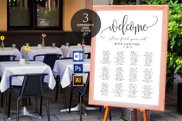
This is the version I hand people when they tell me they have eighty guests and no time. One board, names grouped by table, big enough to read from the doorway. You drop your list in and the layout holds. I did a friend’s last spring and we had it done in an afternoon at her kitchen counter, coffee going cold next to the laptop.
The spacing is what carries it. A lot of these jam the names too close and by table nine it looks like a phone book. This one keeps air between the rows, so an older guest can find their name without leaning in and squinting.
One thing. It wants a fairly large print to look right, and most home printers top out before that. I sent mine out at a copy shop on 24×36 and it ran me under ten bucks. Trying to tile it across letter sheets and tape them is a special kind of regret.
When you only need one tidy board
I set this one up for a coworker who was doing a forty-person backyard thing. She did not want a wall of names, just a clean single sign she could lean against a window. This one fits that. Smaller guest count, less chaos, and it still looks deliberate.
What I noticed is the type sits well even when you bump it up a few sizes. I tend to make everything bigger than the designer intended because half my relatives refuse to wear their glasses. It survived that without the alignment going sideways.
The quibble. The default color is a soft taupe that reads as nothing on warm-white cardstock. I swapped it darker before printing or the whole thing washed out under the porch lights. Took me one test sheet to catch it.
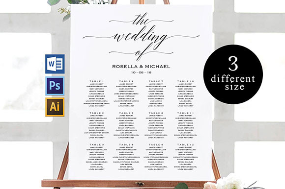
For the wedding with a dress code
My maid of honor had a black-tie thing at a hotel ballroom and the casual templates looked silly next to the chandeliers. This is the dressier one. Serif type, more space, the kind of layout that does not fight a formal room. She framed it in a thrifted gold frame and nobody guessed she printed it.
I printed a proof for her on regular paper just to check the spacing of the longer names. Some of her guests had full hyphenated last names and those are the ones that break a tight grid. This held them fine.
Fair warning, it leans elegant by design, so at a barn or a beach it might feel like it wandered in from the wrong party. Match it to the room or it sticks out.
The plain workhorse version
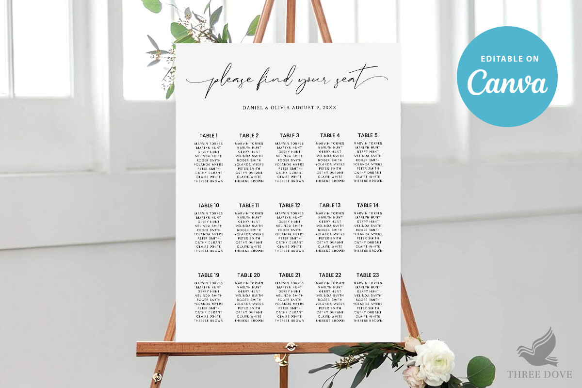
Not every wedding needs a statement sign. Sometimes you just need the information delivered, clean, no drama. This is that one. I think of it as the default I reach for when somebody is overwhelmed and just needs the seating handled so they can move on to the forty other things.
I used a version of this layout for my own reception after the first two attempts failed. Names by table, generous line height, nothing decorative getting in the way. Easy to update at 11pm when your aunt decides she is not sitting next to her ex after all.
The gripe is mild. It is a little bare on its own, so I added a small line of color at the top to tie it to my invites. Five minutes of fiddling. If you want fancy out of the box, this is not it, and that is sort of the point.
A matching set, so you stop hunting
This is the lazy-in-a-good-way pick. You get the seating sign plus the pieces that go around it, so the whole entry table reads like it was planned together. I love these sets because I am bad at making things match on my own. Left to myself I will use three different fonts and not notice until the photos come back.
A friend used this set for a fall wedding and the consistency is what people commented on. The welcome sign, the seating board, all the same family. It looked expensive. It was not.
The one snag is you are committing to one look across everything, so if you already bought a mismatched welcome sign you love, this fights it. I would pick the set first and build out from there, not bolt it on late.
Smaller party, warmer feel
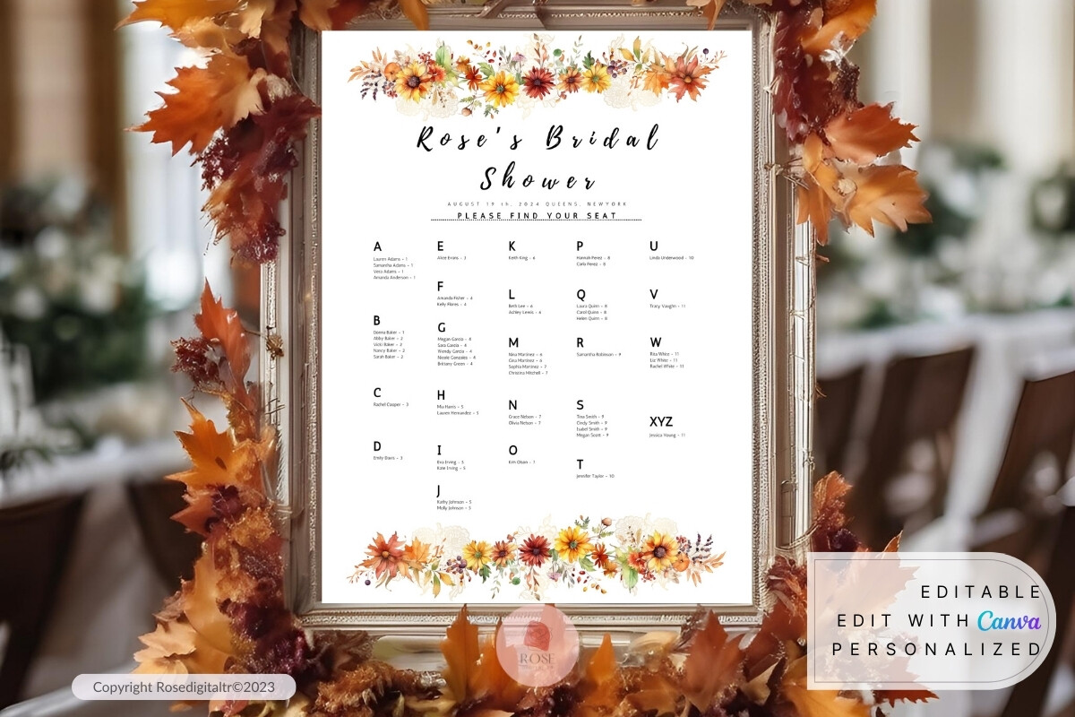
Not strictly a wedding, but I am putting it here because half of you are also throwing the shower. This is the autumn one, soft warm tones, made for a smaller room. I did one for my neighbor’s October shower and the colors actually matched the leaves outside the window, which felt like cheating in the best way.
A bridal shower seating sign is a smaller ask than a full wedding chart, so this one keeps it light. Fewer tables, more breathing room, a little seasonal warmth baked in. I printed it at home on a slightly heavier cardstock and it held up fine on a tabletop easel.
The catch is the palette is very much fall. Try to run it for a spring shower and the rust and amber feel off. Right season or skip it.
The moody one for a dim venue
Dark background, light text, the opposite of every other sign on this list. I was skeptical until a friend used it for an evening wedding in a old brick warehouse with low lighting, and it was the only thing in the room that did not disappear into the shadows. Light type on dark board glows under string lights.
This is the pick if your venue is dim or your whole aesthetic is on the darker side. It reads beautifully at night. I would not put it in a bright daytime tent though, where it can feel heavy.
Real talk on printing. Dark backgrounds eat ink and a streaky home printer will show every flaw across that much black. I sent this one out, no question. Worth the trip to avoid a board full of banding lines.
Things Brides Email Me About
What does a seating chart sign say?
Honestly, less than you think. A title line up top, then guest names grouped under their table. That is the whole job. I tried getting clever with mine and added little notes by some names, and it just made the thing hard to scan.
I sort alphabetically by last name when the crowd is big, and by table number when it is small and people kind of know who is where. A friend asked me this two weeks before her wedding and I told her, do not overthink the wording. People are looking for one thing, their own name.
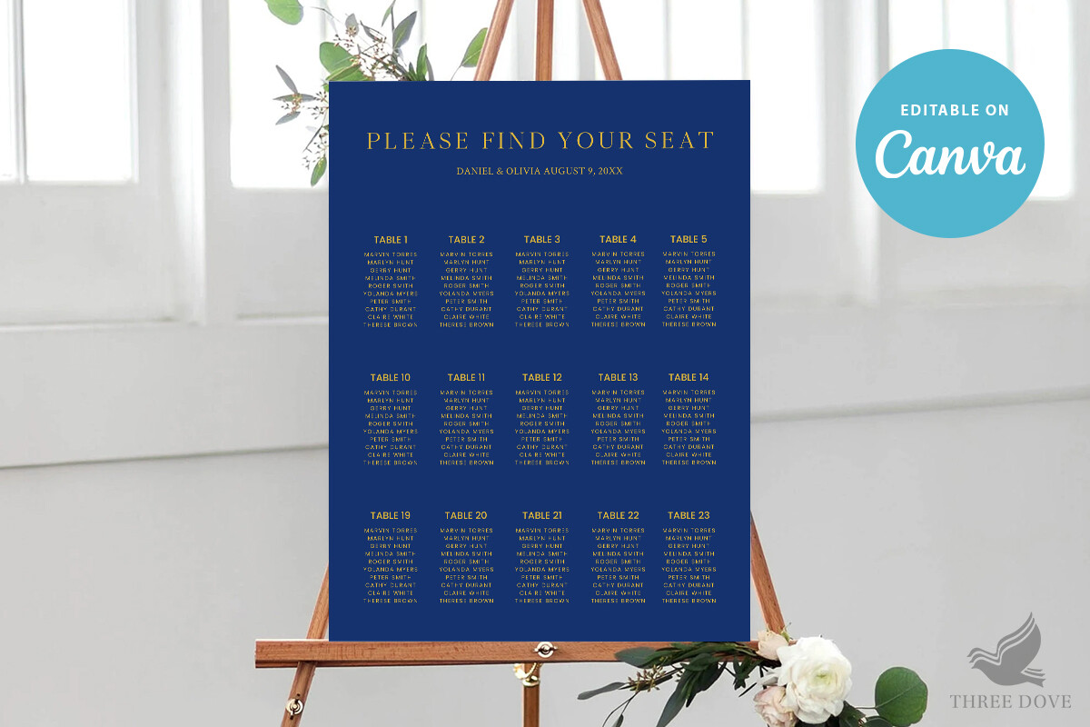
What size sign do I need?
Depends on your headcount, but I learned the hard way that small fails. My first one was letter sized for sixty people and you basically had to press your nose to it. Useless.
For most weddings I point people at 18×24 or bigger. If you are over a hundred guests, go to 24×36 and group by table so it does not turn into a wall of text. Prop your test print on a chair and read it from across the room. If you are squinting, size up.
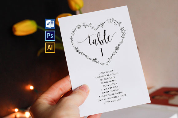
Sign or individual cards?
Yep, this comes up every time. A single sign is faster, cheaper, and you only print one thing. That is what I did and would do again for a budget.
Individual cards look lovely on the table and double as a little keepsake, but you are printing and cutting and arranging eighty of them, and someone always spills wine on a few. I helped a friend do cards once and we were trimming corners at midnight. If you have the time and the helpers, cards are sweet. If you do not, the sign does the same job and lets you sleep.
Before You Commit to a Template
None of these are complicated. The only real mistake I have watched people make is going too small or too pale, then wondering why there is a traffic jam at the door. Print a test page, walk to the back of the room, read it from there.
Whatever you pick off this list, run one plain-paper proof before you touch the good cardstock. Hold it up. Squint. If your name reads from the couch, you are done, and you can go back to worrying about the cake.