My seating chart cost me eleven dollars and one minor fight with my cousin Dana. She wanted a mirror with hand lettering. I wanted to still have grocery money in July. We landed on a printed board in a thrifted frame, and the day after the wedding she asked me where I had it made, like a stranger did it.
Here is the thing about a seating chart. It is the first thing every single guest walks up to and reads, so it is also the first thing that makes you look like you have your life together, even when you printed it the Wednesday before in a panic. Spend your real money on the wine. The chart can be paper.
These are the templates I actually opened and printed, plus the ones I have since handed to two friends who were drowning. I print one test page on plain paper first and prop it on a chair across the room. If I can read it standing by the door, it stays. A few links below are affiliate links, so if you grab one through me it tosses a little change in my pocket. Doesn’t add a cent to yours.
Some links below are affiliate links. If you download one for your day, I earn a tiny bit and it changes nothing on your end.
The plain workhorse I reach for first
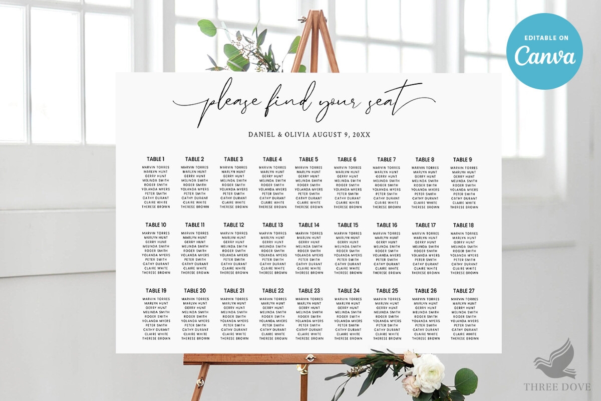
This is the one I keep going back to when a friend texts me at 9pm in tears about tables. You drop in your names, the columns hold their shape, and it does not explode when somebody RSVPs late and you have to shuffle table six. I built my whole guest list in it twice because my uncle changed his plus-one situation, and twice. The file just took it.
What I notice every time is how clean it stays at the top. The header line for your names sits where it should and does not crowd the first table. My one gripe, the default alignment is centered and I prefer mine pushed left so the A names line up like a real list. Two clicks to fix. Still annoying that I have to.
When my friend wanted color without paying for color
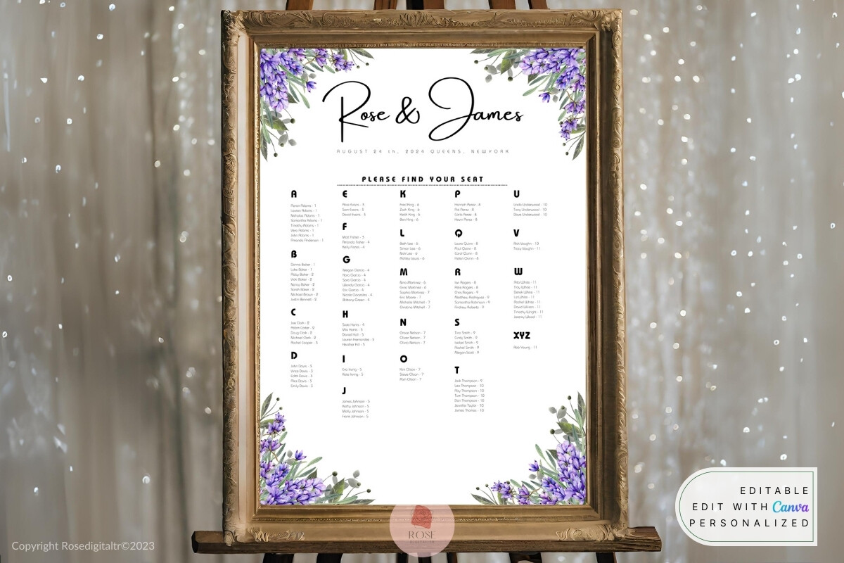
My friend Priya is getting married in a backyard full of lilac bushes, so when she saw this lavender one she made a noise I have only heard her make about dessert. It has a soft purple wash running down the side and a script header that does not look like a free font, which is the whole game.
We printed her test page at the FedEx on Garfield because her inkjet turns every purple into a sad gray. Came out warm and even. Heads up though, the lavender is light, so on a dim porch at dusk it can wash out under string lights. We bumped the saturation a notch before the real run and it held. Lesson cost her one sheet of cardstock.
The send-it-to-the-bride-who-can’t-design pick
I have a rule. If someone tells me they cannot design, this is the file I send, because there is almost nothing to break. You type names, you print, you are done eating dinner before your laptop overheats. It is built so plainly that even my mother-in-law managed it on her own, and she still double-clicks links.
The spacing between rows is the part I quietly love. Most charts cram the names so tight that Grandma squints, and this one leaves air between lines. My nitpick, there is no spot for table names like “The Greenhouse” if your venue does the cute named-table thing. You can wedge one in, but it is not built for it.
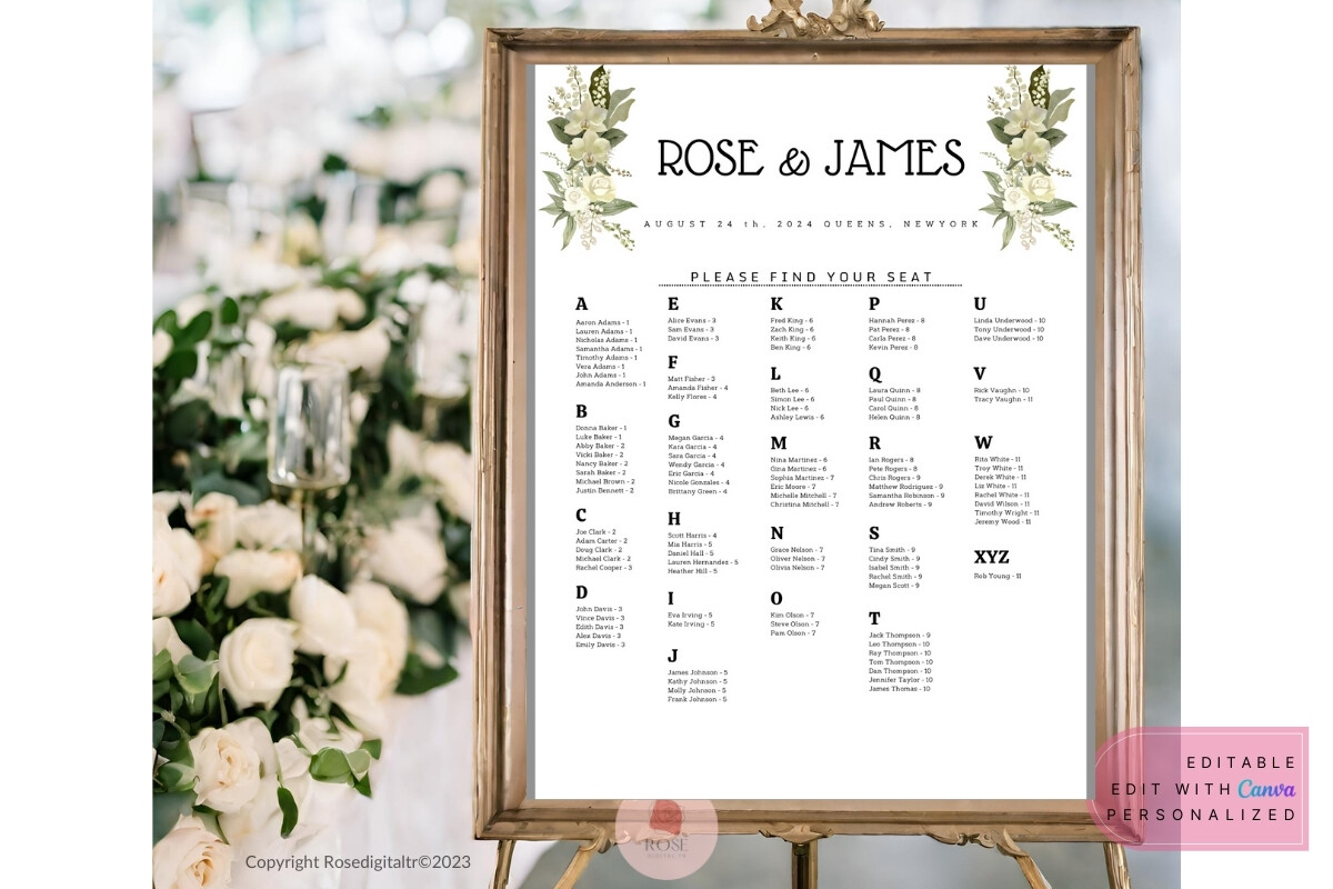
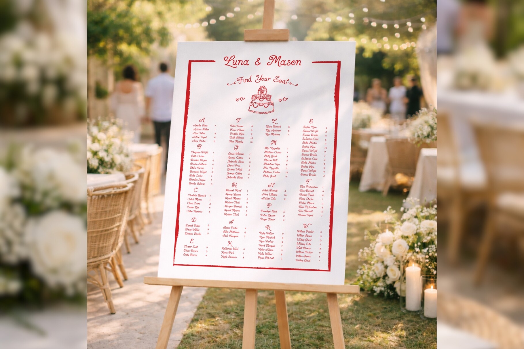
For the day I gave up sorting by table
Halfway through my own planning I realized guests do not care which table number they are, they just want to find their own name fast and go grab a drink. This one sorts everybody alphabetically into one long flow, and the night ran smoother for it. No clump of confused great-aunts blocking the entrance.
The layout on this version, the bd003 one, has a tidy line rule between letter blocks so the A people and the B people do not bleed together. I printed it on a slightly heavier stock so it would stand in the frame without curling. The catch, with a big list it runs onto a second page, and balancing the two columns so they end evenly took me a fussy ten minutes.
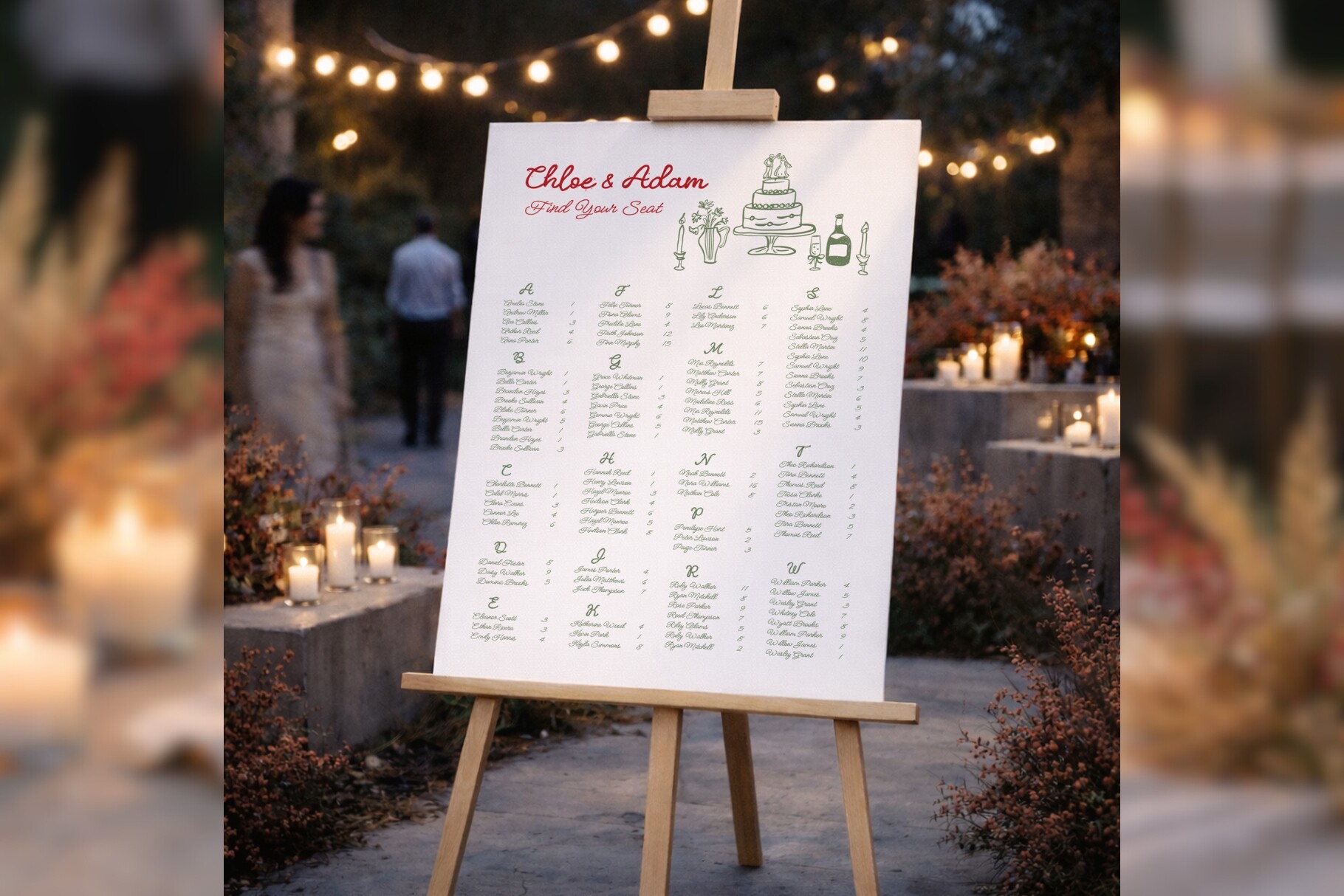
Its quieter sibling, for the smaller list
Same alphabetical idea, lighter touch. I used the bd002 layout for a thirty-person elopement-ish dinner my coworker threw, and it fit the whole crowd on one page without me shrinking the text into ant territory. Everyone could read it from arm’s length. That was the only requirement.
The header has a bit more flourish than its bd003 cousin, which suited her tiny vineyard thing. One small thing bugged me. The decorative bit up top eats vertical space, so if your list creeps past forty names you start fighting for room. Under forty it sings. Over forty, go grab the other one.
The cutting-machine rabbit hole I fell into
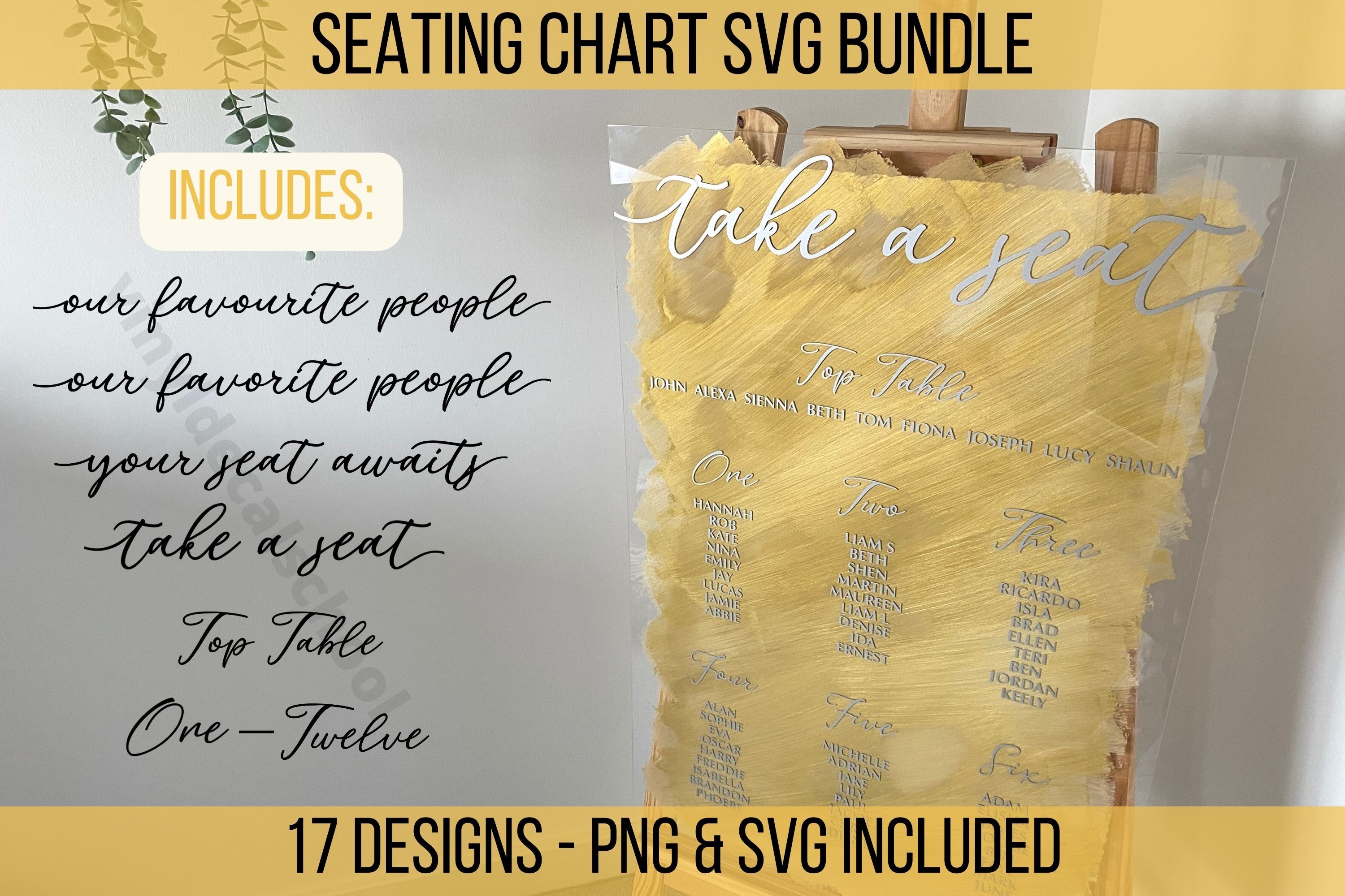
My maid of honor owns a Cricut and a frightening amount of vinyl, so this bundle was aimed straight at her. We pulled the files in and cut white lettering to stick onto a sheet of smoked glass from a thrift-store frame. It looked like the four-hundred-dollar mirror Dana had wanted, for about nineteen bucks and a Sunday.
The shapes cut clean and the letters weeded without tearing, which anyone who has cut tiny script knows is not a given. Now the honest part. This is not a print-and-go thing. If you do not own a cutting machine or know someone who will let you babysit theirs, skip it. We wasted a half-sheet of vinyl learning the mirror setting before our brains caught up.
The whole kit, for when one chart is never just one chart
By the time I was three weeks out I had a seating chart, a table-number list, and a panicked sticky note about who could not sit near my divorced uncles. This set covers more than the one board, so the pieces actually match each other instead of looking like three different weddings glued together.
I ran the matching table cards through my printer the same night as the main chart, half asleep, and the fonts lined up without me babysitting them. The thing I would flag, it gives you a lot of pieces, and if you only need the big board it is more than you will use. I left a couple of the inserts untouched. No regrets, just full folders.
What People Keep Asking
How do I DIY a seating chart cheaply?
Short answer, a template and a frame you already own. I spent eleven dollars total on mine because the frame came off my own hallway wall and the printing happened at a copy shop for the price of a coffee.
The trap is buying “DIY” supplies that cost more than just paying someone. I went down that road once, priced out a giant mirror and a calligraphy pen, and quietly put it all back. Paper in a nice frame reads the same from six feet away, which is the only distance anyone sees it from.
What do I print it on?
I print the test on whatever junk paper is in the tray, then the real one on heavier cardstock, somewhere around 80 to 110 lb cover so it stands in a frame without flopping. My home printer streaks anything dark, so the final copy goes to the copy shop on Garfield.
If you are sliding it behind glass, regular thick cardstock is plenty, the frame does the holding. If it stands alone on an easel, go heavier or it bows in a warm room. Mine started to lean by dessert at one wedding because I went too thin. Live and learn.
How do I avoid reprinting?
Print one. Just one. I learned this when I ran a full set of fifteen and my cousin texted that she was actually bringing a date, and there went my afternoon and my good cardstock.
So now I print a single test page on cheap paper, prop it across the room, and wait until the RSVP deadline has fully passed before I commit. Names change up to the last week, every time. I hold off on the real run until I am genuinely sure nobody else is going to surprise me.
Before You Print a Stack
None of this is the part of the wedding you will remember. You will remember the toast that went long and the song that made your dad cry. The chart just needs to get people to their chairs without a traffic jam by the door.
So pick one of these, print a test page, squint at it from across the kitchen, and move on with your life. I picked the plain one in a thrifted frame and the day after my wedding a stranger asked where I had it made. That is the whole goal. Spend eleven dollars and let them think it was a lot more.