The invitations were the one part of my wedding I did not print myself. I caved and ordered them. But assembling them, stuffing them, stamping them, that fell to me and a bottle of wine and my friend Priya, who showed up Saturday morning thinking it would take an hour. It took five.
Here is the thing I did not expect. The cards were easy. It was everything around them that ate the afternoon. The inserts kept sliding around. I licked so many envelopes my tongue went numb and we switched to a damp sponge from the kitchen. Three suites came back from the post office two weeks later because I underpaid postage by eleven cents each. Eleven cents.
So this is the stuff I leaned on, plus a few things I wish I had bought before that Saturday instead of after. A handful of these are affiliate links, so if you grab one through me it tosses a little change in my direction. Doesn’t cost you a thing.
Quick note, a couple of these are affiliate links. If one ends up at your reception, it helps keep this little blog running and you pay the same.
The box that kept my whole suite from sliding around
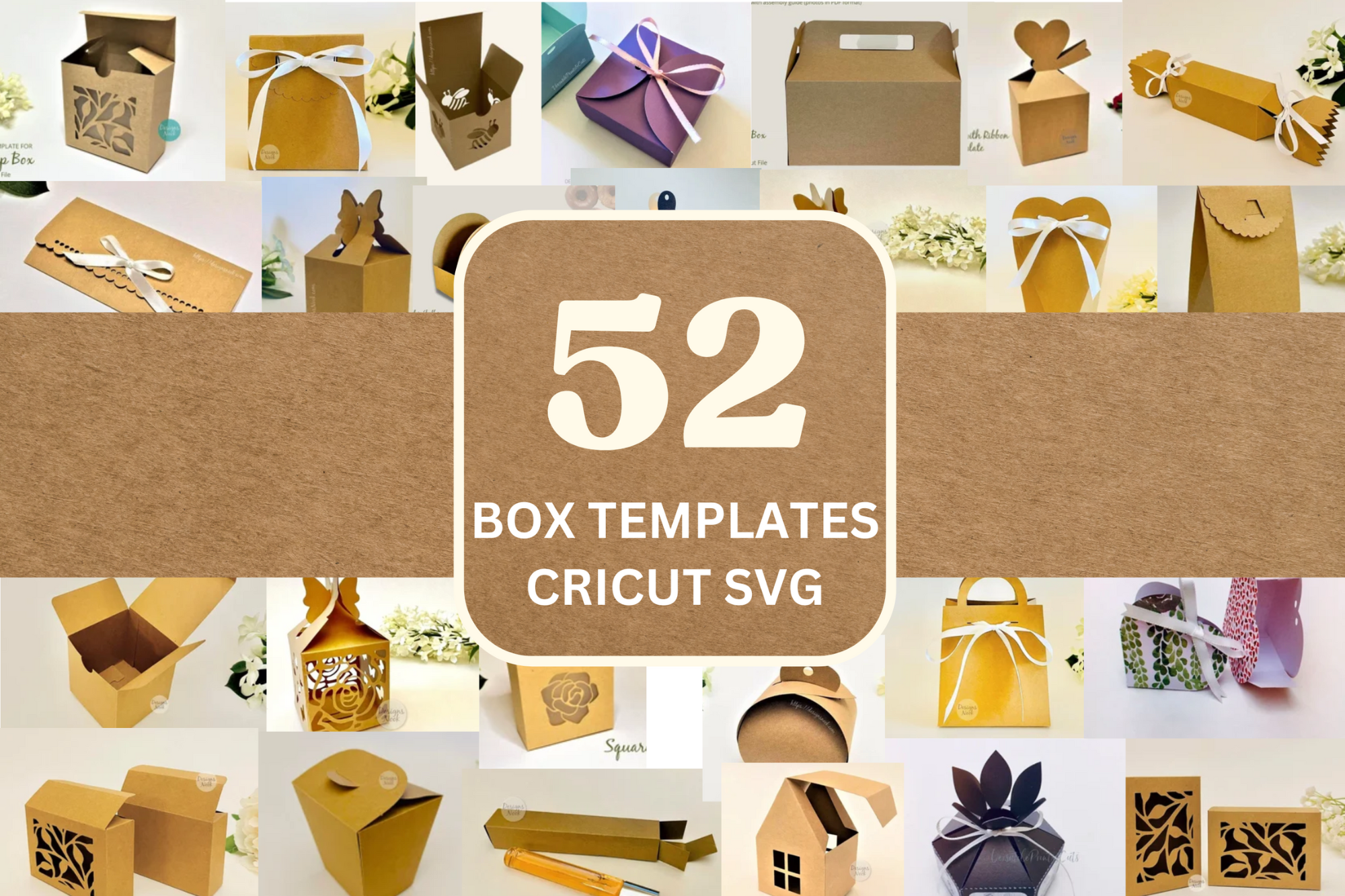
Priya’s idea, not mine. About an hour in, with cards and inserts and little vellum slips drifting all over the rug, she said we should just box the fancy ones for the parents and the bridal party. So I cut a few small boxes from this set on my Cricut while she kept stuffing the regular envelopes.
There are fifty-something templates in here and I used exactly two of them. A flat little tray for the suite and a lidded one I ended up filling with the welcome-bag stuff later. The score lines actually line up, which I was not expecting after the last SVG set I bought folded like a drunk.
One gripe. Some of the bigger boxes assume thicker cardstock than I had on hand, so my first tray was floppy at the corners. I doubled the wall on the next cut and it held. Fiddly, but once you find your one box you reuse it forever.
I slipped a tiny newspaper in and people lost it
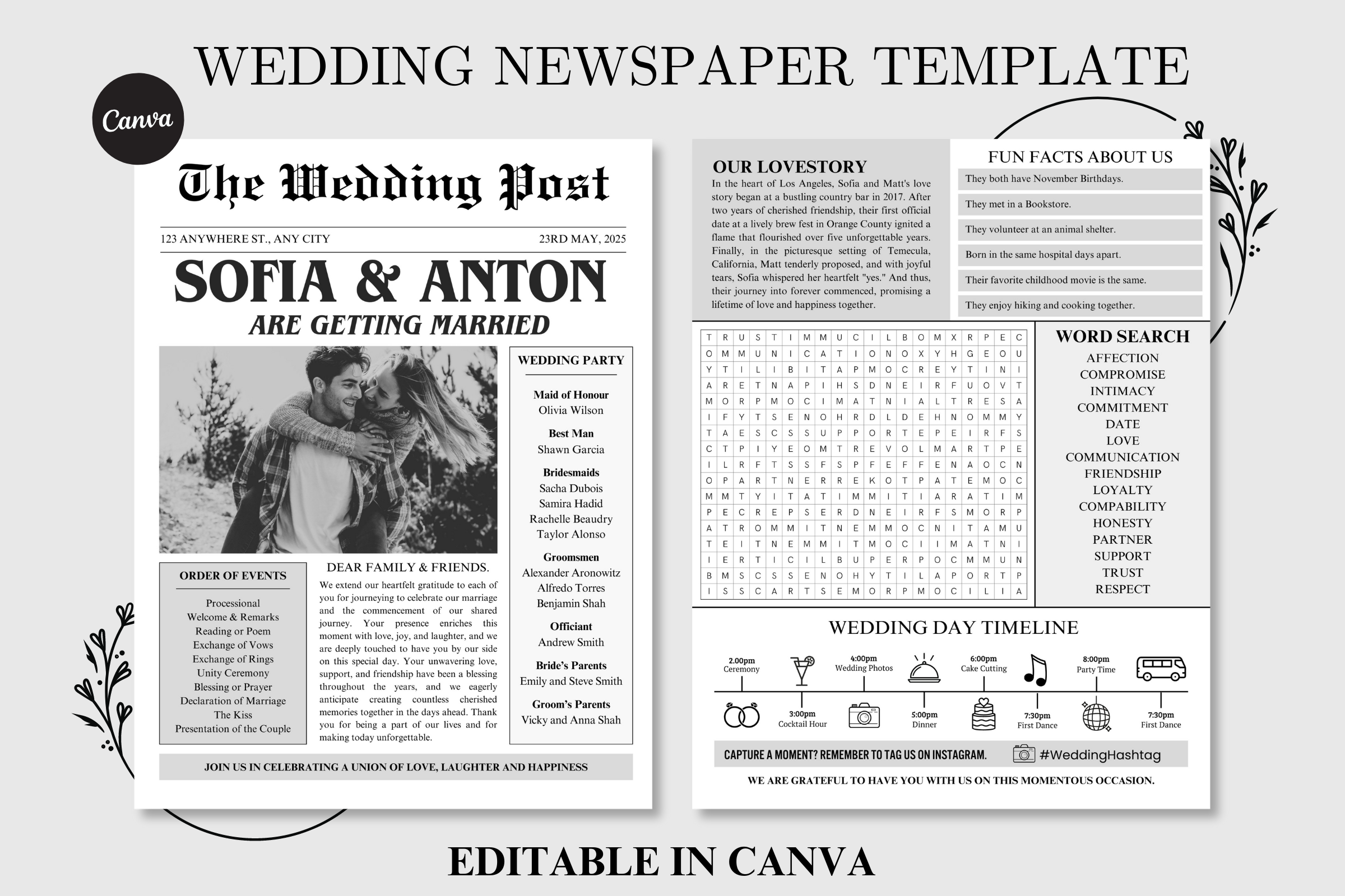
This was the insert that made the whole suite feel like ours. A little folded newspaper, headline and all, with our names in the masthead and a goofy story about how we met on it. I typed our nonsense in, printed a sheet on plain paper first to check it read across the room, then ran the real ones.
Folding forty of these by hand is where Priya and I started doing the thing where you stop talking and just work. I tucked one behind the main card in each envelope so it peeked out when you opened it. My aunt called me crying about the obituary section we wrote for our single years. Worth every fold.
The catch is the columns are tight. If you write long, like I did, it spills onto a second page and the fold gets awkward. I cut my met-cute down to two sentences and it sat flat. Edit ruthlessly before you commit a stack.
Frames I dropped around every card so nothing looked naked
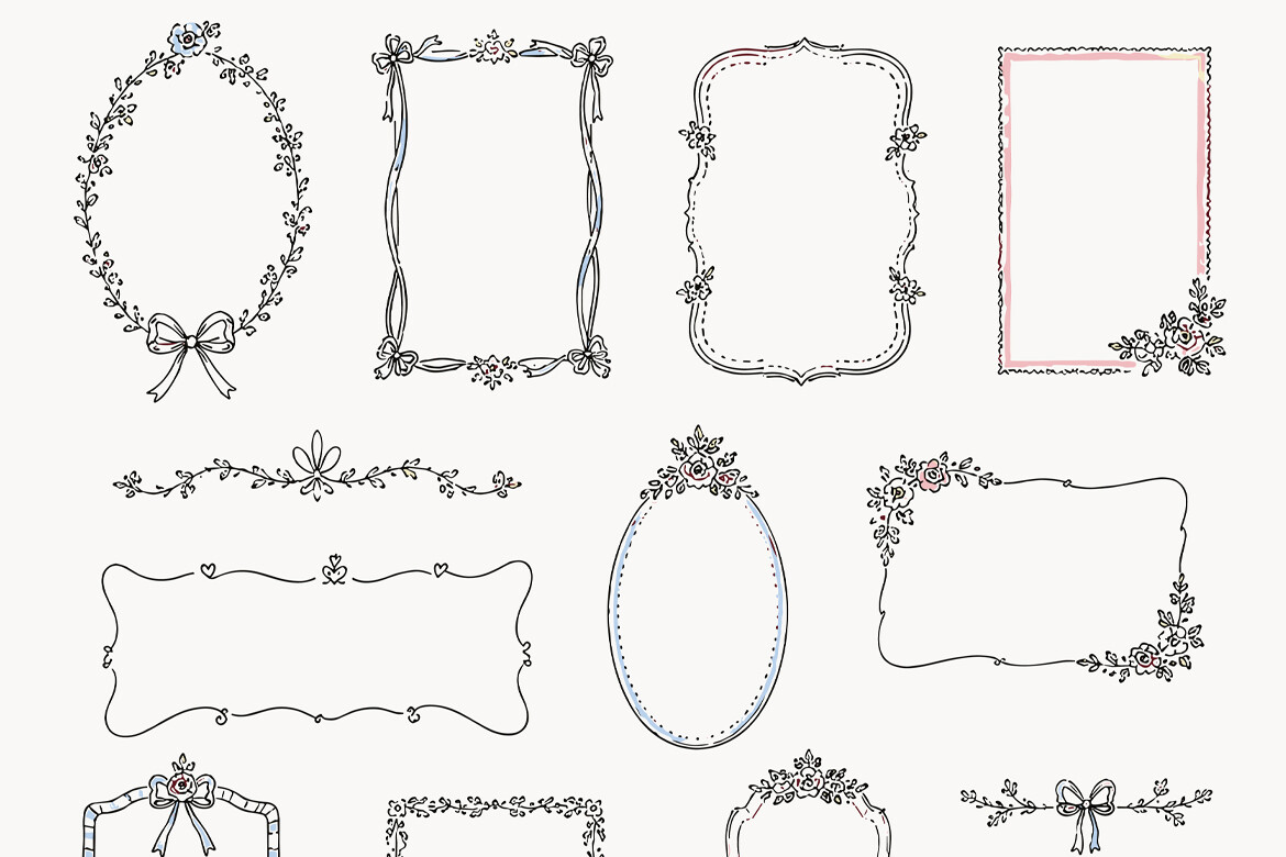
My RSVP cards looked sad. Just text floating on a rectangle. I dug out this frame and floral set and dropped a thin border around the RSVP, the details card, the directions slip, and suddenly they looked like they belonged to the same family instead of three random printouts.
I matched one corner flourish across all the inserts so when you fanned them out in the envelope they rhymed. That little bit of glue, visually I mean, was what made the stack feel assembled and not just collected. Took me twenty minutes in the design app, no skill required, I promise.
Downside, there are a lot of files in here and the previews all blur together. I spent longer hunting for the frame I wanted than actually using it. Pick your two or three early and ignore the rest or you will scroll for an hour.
The soft pink stuff for the suites going to the girls
I made a second version of the suite, prettier and a little fussier, for my bridesmaids. This bundle is all bows and ribbons and that whole coquette thing my friends were deep into that year. I pulled the bow motifs onto the envelope flaps and the inner card and it read as a love note instead of an admin packet.
I hand-delivered those at brunch the Sunday before, in the little boxes from the Cricut set, and watched four grown women squeal over an invitation they were technically already attending. The art set carried it. I barely added anything.
My one note, it skews very pink and very sweet. For the suites going to grandparents and coworkers I swapped back to the plainer frames. Lovely for the right person, a lot for everyone else. Pick your audience before you print.
The font I typed every single name in
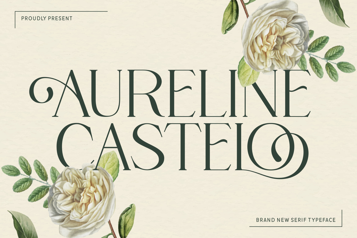
Whatever font your suite ships with, the addressing is on you, and that is where this serif earned its keep. I set every guest name on the outer envelope in Aureline Castelo and it pulled the printed cards and my hand-fed envelopes into looking like one deliberate thing.
I ran them through my printer one envelope at a time, which sounds insane and was, but it beat my handwriting by a mile. The capital letters have this slight old-money slant that made even my cousin’s six-word name look intentional.
Here is what cost me a page. The thin weight prints faint on cream envelopes, so a few names came out ghostly under the kitchen light and I almost mailed them. Bump to the medium weight before you run the stack. One ruined envelope taught me that, cheaply.
A second typeface so the headlines didn’t match the names
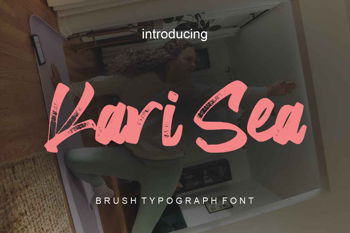
Two fonts, that is the trick nobody tells you. I used Aureline for the addresses and Kari Sea for the headers inside, the You’re Invited and the names on the main card, so the suite had a little contrast instead of one font doing all the jobs and looking flat.
Kari Sea has this looser, almost handwritten swing to it that softened the formal serif. I set our two names in it big across the top of the newspaper insert and it tied the casual piece to the fancy ones. Sounds small. Made the whole envelope feel less stiff.
The quibble, the lowercase letters get a bit loopy at small sizes and turn mushy. I kept it to headlines and big names only and used the serif for anything in fine print. Stay large with this one and it sings.
The font that saved my map and directions card

The directions insert is the card everyone forgets and then desperately needs at 4pm on the day. I rebuilt mine with Sweet Home for the little headers, Parking, Ceremony, The After Bit, and the rounded shapes made a boring logistics card feel friendly instead of like a tax form.
I printed our venue’s cross streets, Hawthorne and Sixth, and a doodle of a parking arrow, then set the section labels in this font so the eye landed where it needed to. My uncle, who gets lost in his own neighborhood, made it on time. I credit the card.
One thing, it is casual, almost playful, so it clashed with my formal main invite when I tried it there. I kept it strictly to the directions and reception inserts where a little warmth helps. Right tool, wrong card if you push it onto the formal stuff.
Things Brides Email Me About
How do I assemble an invitation suite?
Honestly? I dumped everything on the floor and learned by failing. The way it finally clicked for me was working in one direction, biggest card down, smaller stuff layered on top facing up, then the whole thing slid into the inner envelope so the front faces you when you open the flap.
What actually saved my afternoon was the assembly line. Priya did all the stuffing, I did all the licking and stamping, and we did not switch jobs. The first hour we both did everything and it was chaos. Pick a station and stay there.
What order do the cards go in?
I got this backwards on the first eleven, so trust me. Biggest piece on the bottom, which is the actual invitation, then each smaller card stacked on top in descending size, all of them face up. The RSVP card and its little envelope ride on the very top so it is the first thing your guest grabs.
The part that tripped me was the inserts facing the wrong way. I had a few where you opened the envelope and the back of the invite stared at you. Everything faces the same direction as the flap. I redid eleven of them after Priya pointed it out and tried not to cry.
How do I handle postage?
Three of mine came back. Eleven cents short, each one, because I weighed a single card and not the loaded envelope with all the inserts and the little newspaper. Take one fully stuffed, sealed suite to the post office and have them weigh that exact thing before you stamp the rest.
Also, square or chunky envelopes cost extra, the clerk had to tell me that to my face. And buy a few more stamps than you think. I ran out at the counter with four left to mail and had to drive back the next morning.
Before You Commit to a Template
If I did it again I would still order the printed cards and still assemble them myself, just with the post office weighing one stuffed envelope first and a sponge instead of my tongue. The suite is not hard. It is forty small repetitive jobs that all hit on the same Saturday.
Buy the fonts and the frames before assembly day, not after like I did. Get a friend, feed them lunch, split the stations, and put on something you both know the words to. Mine went out late and a little uneven and people still taped them to their fridges.