We had 84 guests and a budget that did not love that number. I added up the quotes from three stationery shops one night at the kitchen counter, then I closed the laptop and texted my friend Priya, who had printed her own a year before. She told me to stop crying about it and just buy a good template. So I did.
The trick I wish someone had told me sooner. DIY invites are cheap on paper and expensive in time, and the time part sneaks up on you around card number forty when your back hurts and the trimmer is dull. Pick a template that does the layout work, print one test page on plain paper, and hold it across the room before you spend a cent on the nice stock.
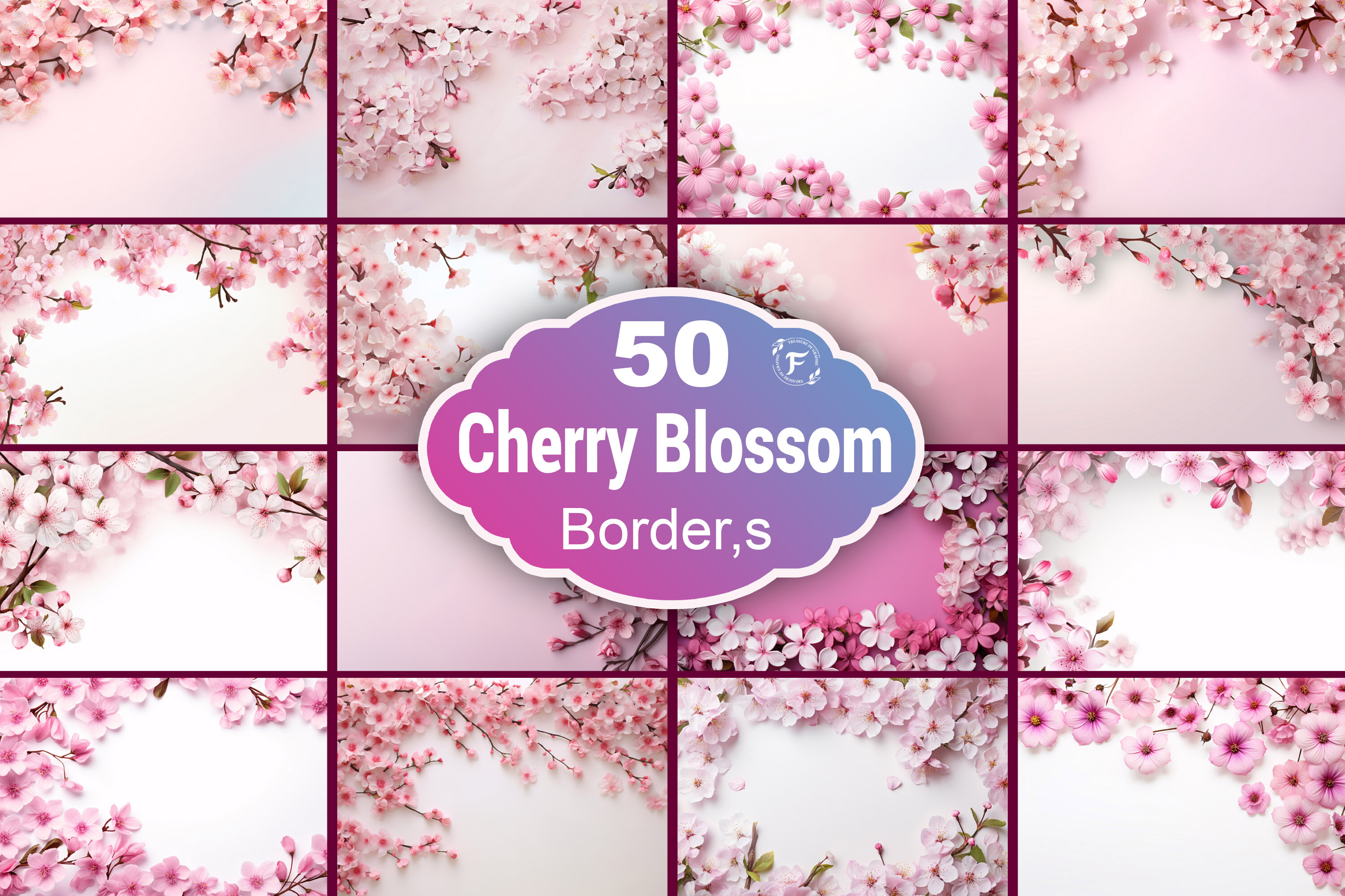
These are the files I actually opened more than once, plus the florals I layered over them when our plain text looked too bare. I print a test, tape it to the cabinet, and live with it for a day. If it still reads when I walk past it with coffee, it stays. A couple of links here are affiliate links, so if you grab one it tosses a little something my way at no cost to you.
Quick note, a couple of these are affiliate links. If one ends up at your reception, it helps keep this little blog running and you pay the same.
The A6 card that started our whole DIY rabbit hole
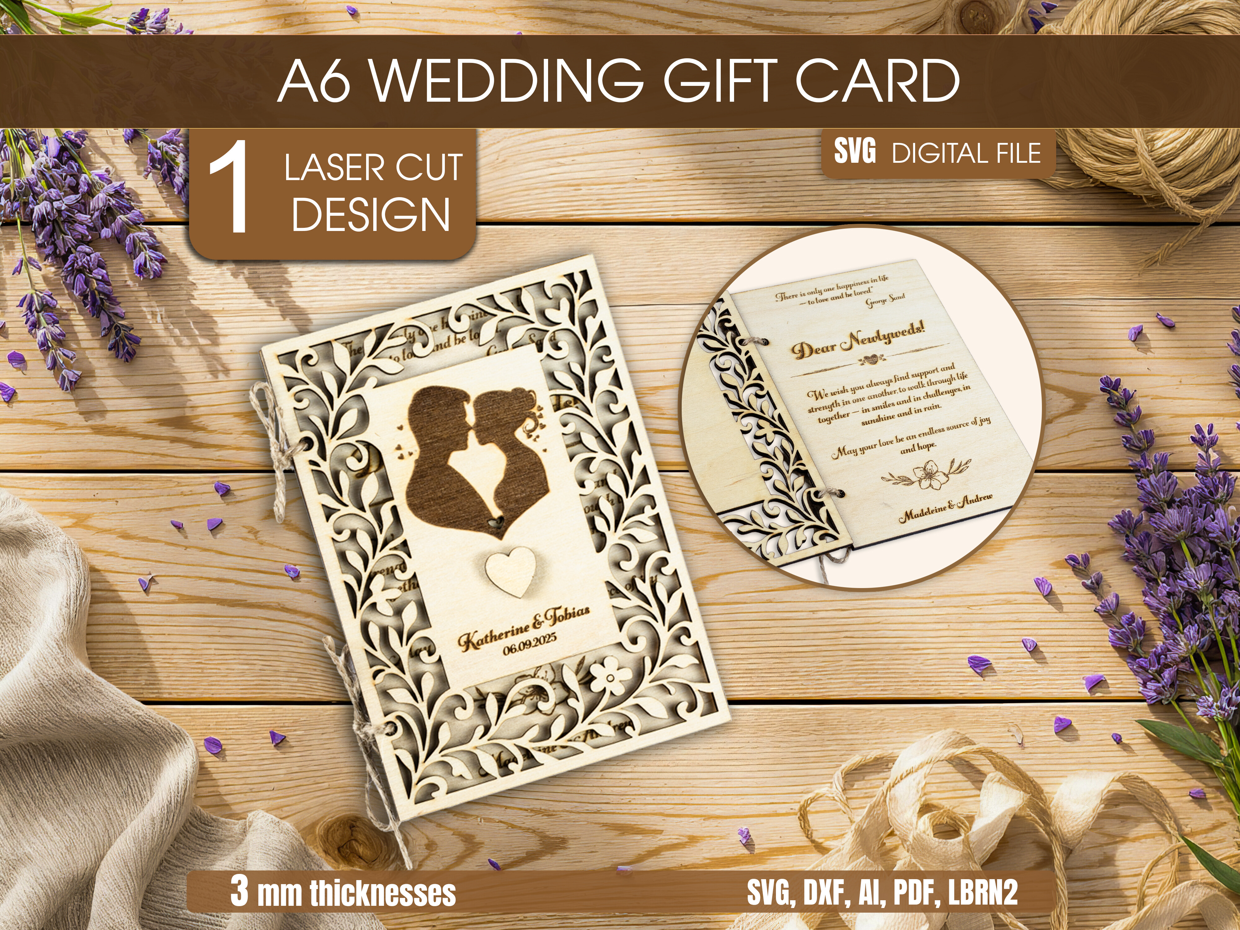
This was the first file I bought, mostly because A6 is small enough that you get a lot of cards out of one big sheet of cardstock. I typed our names and the date in, lined up four to a page, and ran them through the trimmer. Felt almost too easy after the spreadsheet panic.
The SVG part mattered more than I expected once I wanted to change the gold accent to a dusty blue to match the napkins. I recolored it in five minutes instead of redrawing anything. My printer at home streaks on anything with heavy ink, so I took these to the copy shop two blocks over and they came out clean.
One gripe. The default margins sit a hair tight for a home cutter, so I nudged everything in by an eighth of an inch before I committed to a stack. One wasted sheet taught me that.
When our plain text looked sad, this florals set saved it
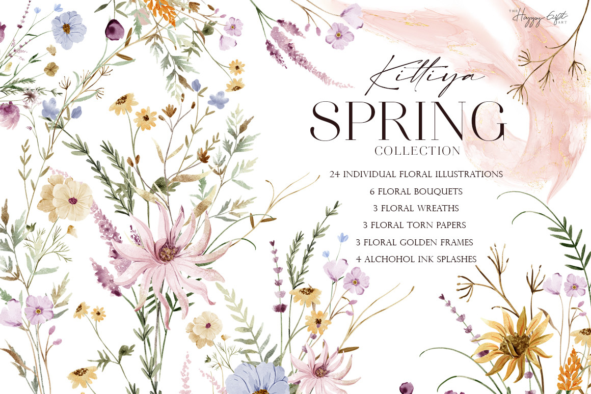
Our first draft was just black words on cream and it read like a dentist appointment. Priya glanced at it and said it needed something growing on it. I dropped a few stems from this collection along the bottom edge and suddenly it looked like a wedding and not a notice.
I used the lighter sprigs for the actual invite and saved the fuller blooms for the RSVP cards, which gave the suite a little rhythm without me designing a thing. We got married in May, so the spring feel was not a stretch.
Watch the file sizes if you layer a bunch of them. My laptop chugged when I stacked six high-res flowers on one card, and I had to flatten the design before it would print without hanging.
The bold red ones I almost talked myself out of

I kept circling these poppies and kept deciding they were too much. Then my maid of honor, Dani, saw them on my screen and told me to stop being a coward. We used one single poppy in the corner of each invite and it became the thing people mentioned.
Red is the color that fights your printer the hardest. The home one turned the petals brick brown, so I gave up and paid the copy shop the extra for their good machine. Worth every quarter.
My one note is that you want to keep them sparse. I tried a full border of poppies on the save the dates and it looked like a soup can label. Pulled it back to one bloom and it landed.
For the cousin who got married by actual water
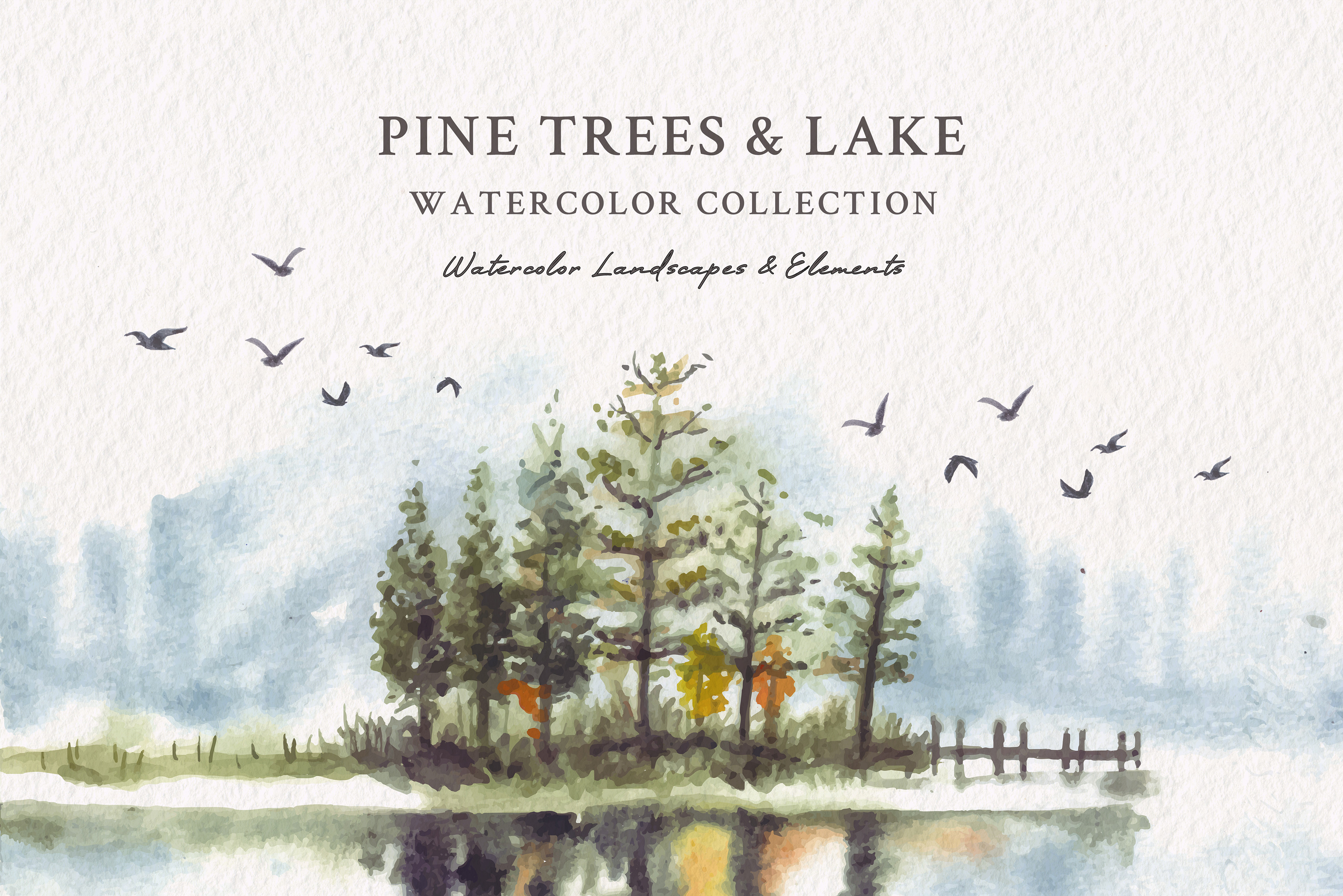
I did not use this one for my own invites. My cousin Maeve had a lakeside thing up north and asked me to help with her stationery over a long phone call, so we built her suite around this watercolor scene instead.
The soft edges of the pines did a lot of the mood for her, which meant we could keep the text simple and small. We printed her invites on a slightly toothy matte stock so the watercolor would not look glossy and fake, and it held up.
The blues run a touch cool on a home printer. Maeve warmed the whole image a few points before printing or it would have looked like January instead of a summer wedding by the dock.
Fourteen blue wreaths and the one I used on everything
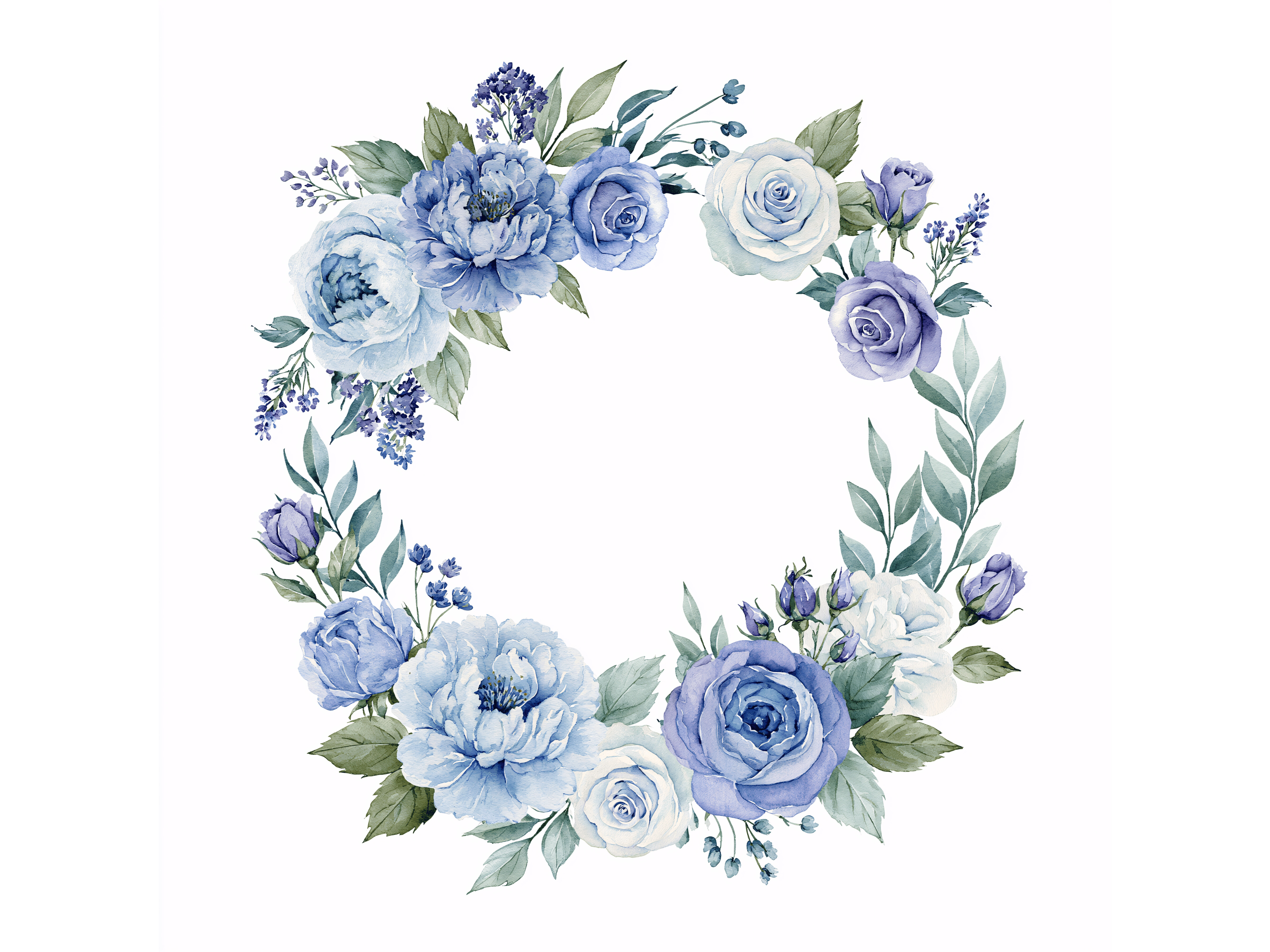
You get fourteen of these and I will be honest, I used maybe three. But having options meant I could match the wreath to each piece, a slim one for the invite, a fuller one looping around the menu later.
Because they are JPG, they came with white square backgrounds, which I forgot about until a wreath landed on my cream card with an ugly little box around it. I had to knock the white out before it sat right. Took a few minutes per file, annoying but fine.
The blue here leans dusty rather than navy, which suited our daytime look. If your wedding is darker and more formal, these might read too soft, so test one against your real stock first.
The ready-made border for people who do not want to design
Some nights I did not have the patience to place individual flowers, and that is exactly when this border earned its spot. It is already laid out as a frame, so I dropped my text inside it and called it done.
My neighbor Theresa, who swears she cannot use a computer, managed this one with zero help, which is the highest praise I can give a template. The blossoms run light pink and play nice with cream and blush.
The inner space is a little narrow, so a long ceremony address can crowd it. I shortened our venue line to fit rather than shrink the font into eye-strain territory.
The emerald and gold pack I saved for the fancy cousin
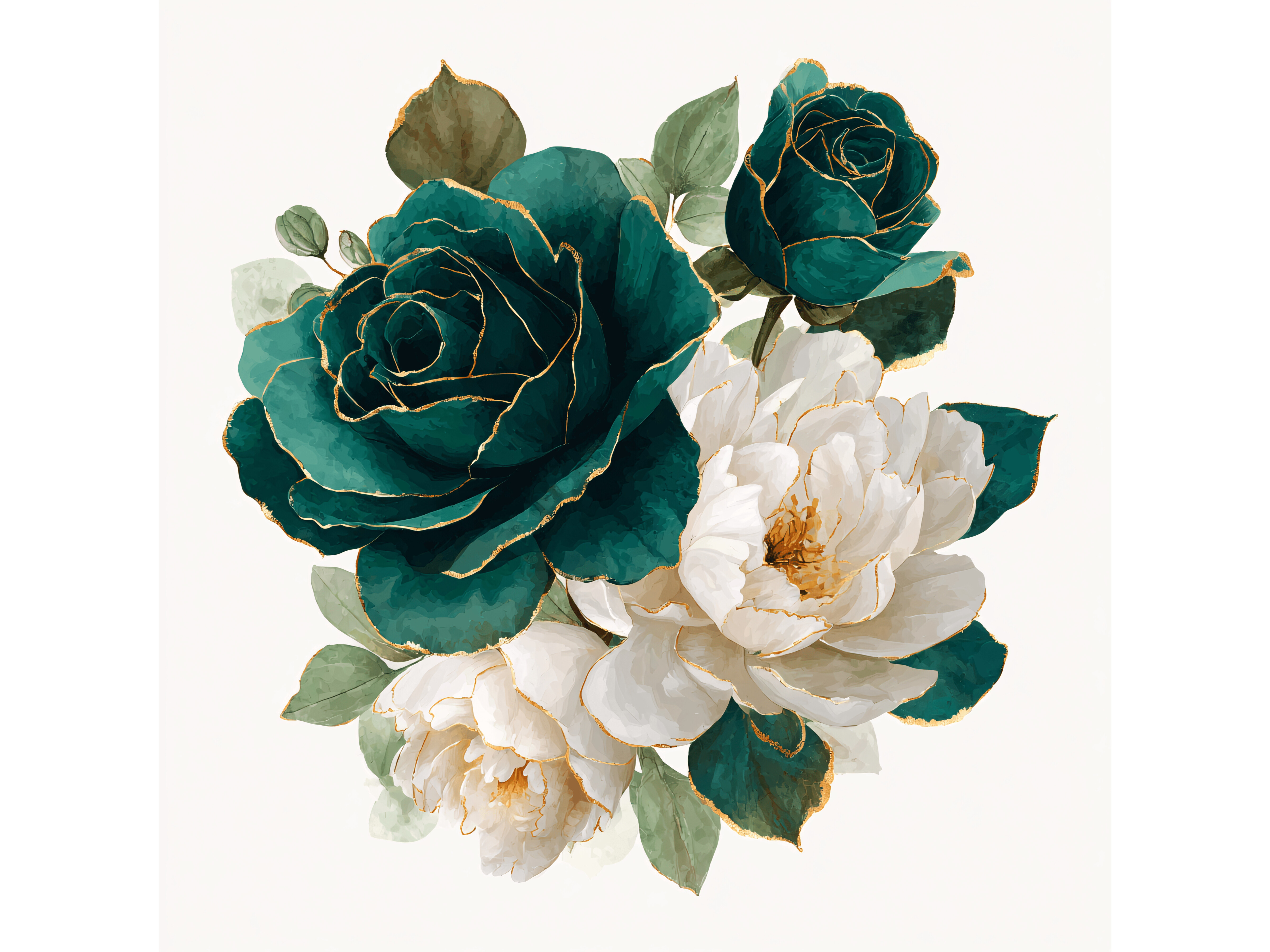
These felt richer than the rest of what I had, so I held them back for Maeve’s rehearsal dinner cards, the one part of her weekend that leaned formal. Deep green with gold lines reads expensive even when the whole project cost about thirty bucks.
Gold is a liar on a home printer. It comes out as a flat mustard yellow, not metallic, so if you want it to actually shine you either go to a print shop with foil or you accept the matte version, which honestly still looked good on dark stock.
Like the blue set, these arrive as JPGs with backgrounds, so plan a few minutes to clean those up. I batched all fourteen in one sitting with a podcast on so it would not feel like a chore.
Things Brides Email Me About
How do I DIY wedding invitations?
I start by buying one good editable template instead of fighting a blank page, then I type in our names, date, and venue and leave the design alone. After that it is print a test on plain paper, hold it across the room, fix whatever looks off, and only then buy the real cardstock.
The order matters more than the tools. I learned that when I bought a hundred sheets of nice stock before I had finalized the layout, then changed the font and had to live with cards I did not love. Test cheap, commit late.
Is DIY actually cheaper?
Short answer, yes, but. My whole suite ran about forty dollars in templates, florals, and copy shop printing for 84 guests, versus the three hundred plus the shops quoted me. The money saving is real.
The catch is your weekend. Trimming and assembling a hundred cards took Priya and me an entire Saturday and two sore thumbs. If your time is tight and your guest count is high, the savings can quietly disappear into the hours you spend, so be honest with yourself about that before you start.
What is the hardest part?
Honestly? The trimming. Everyone warns you about the design and nobody warns you about cutting a hundred cards straight at midnight with a dull blade. Around card sixty mine started drifting crooked and I did not notice until I had a stack of slightly wonky rectangles.
Get a fresh blade or a proper guillotine trimmer, not the little craft one. I borrowed Dani’s good one halfway through and the difference was night and day. Wish I had started with it.
Before You Commit to a Template
If you take one thing from all this, take the test page. Plain paper, one print, tape it up, walk away for a day. That little habit caught every color problem and tight margin before it cost me real cardstock, and it is the only reason our invites came out looking like we knew what we were doing.
We spent about forty dollars and one tired Saturday, and a guest later asked which shop had made them. I told her the copy shop on Glade Ave and left out the part about the floor and the dull trimmer. Some things you keep.