Our invitations cost me forty-one dollars and one minor argument about kerning. I had quotes from two stationers in town, both north of four hundred, and I just could not make the math work with a venue deposit looming. So I sat on the floor with a roll of cardstock and figured it out the slow way.
Here is the thing people get wrong. A printable can read clean and ordered, like you hired someone, or it can scream kitchen table at midnight. The gap is not talent. It is the paper, the trim, and resisting the urge to swap the font to something with curls at 1am.
These are the seven I either used myself or handed to a friend who was panicking eight weeks out. Not the whole Pinterest board I hoarded. A couple of links here are affiliate links, so if you grab one through me it tosses a little change in my direction. Doesn’t cost you a cent.
Full disclosure, a few links are affiliate links. Use one and a few cents come back to me, never anything added to your price.
The wood-look one that fooled my aunt
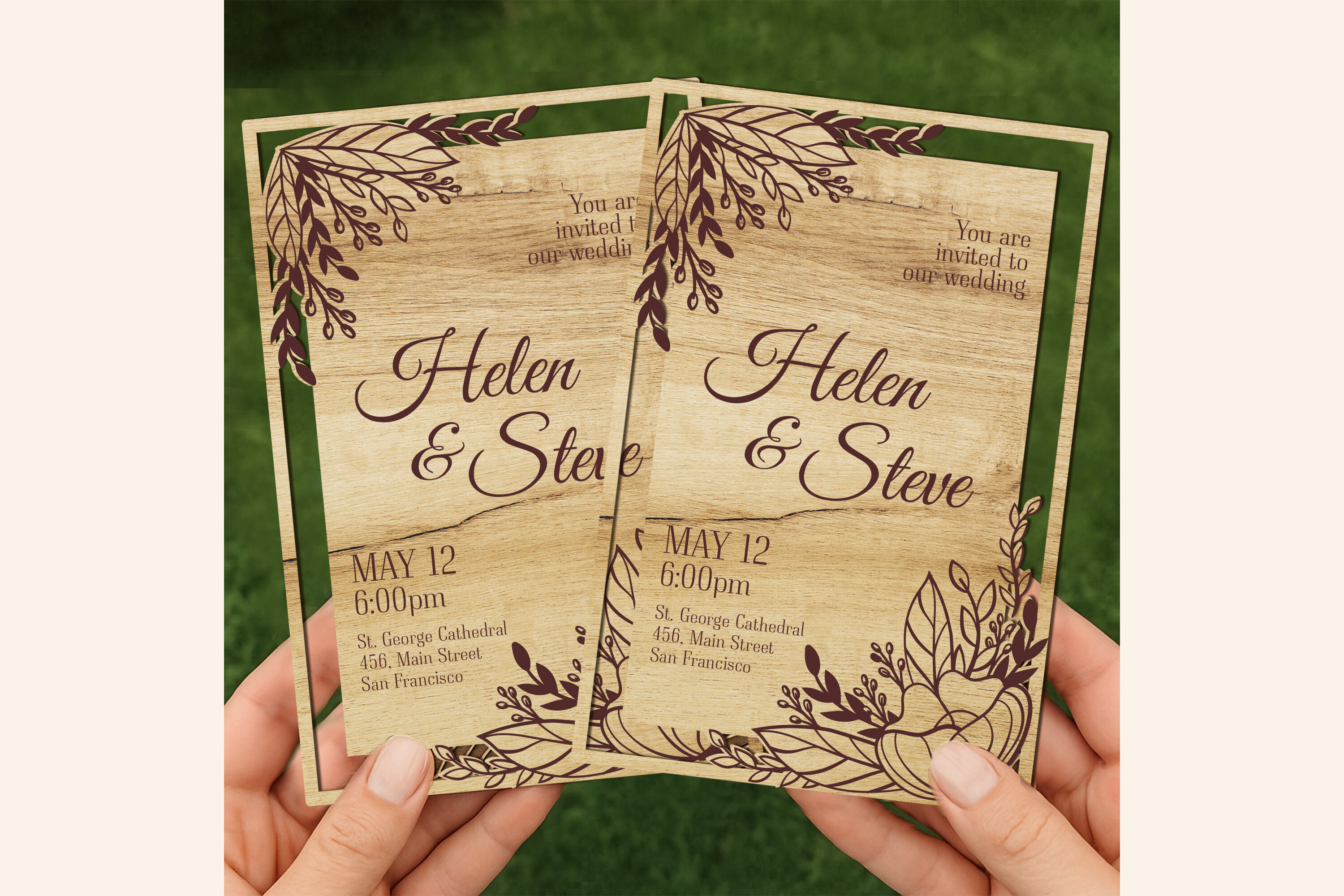
My friend Priya wanted rustic without spending rustic money. This wood-grain card was what I sent her at 11pm when she was spiraling. She printed it on a warm cream stock, not bright white, and the texture sat right on top of the grain instead of fighting it.
What I’d flag. The grain prints heavy if your printer leans dark, and Priya’s first batch came out almost muddy near the corners. She ran one test page, dialed the saturation down a notch, and the second pass looked like real veneer. Her aunt genuinely asked where she bought them.
So, one wasted sheet. After that, smooth sailing.
A save-the-date you text, not mail
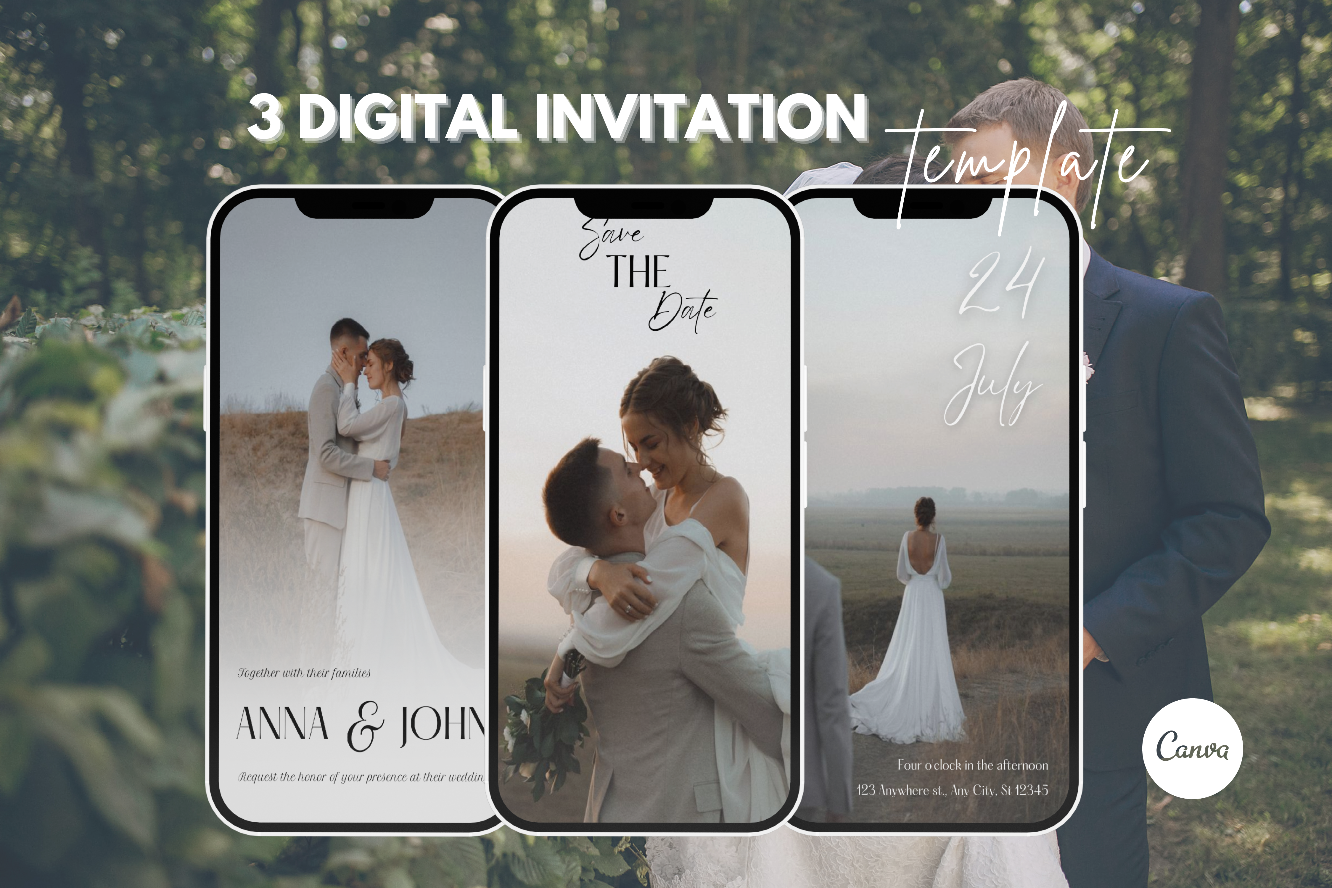
Half our guest list lived three time zones away and I was not paying postage twice. We used this video save-the-date for the early heads-up, then mailed the paper invite later to the people who actually needed a stamp.
I built ours during a lunch break, dropped in two phone photos and the date, and sent it in a group thread. Replies came back in about an hour. My cousin watched it four times because the song slapped, apparently.
The catch is keep it short. My first version ran long and people thumbed past the actual date. Cut it to fifteen seconds and lead with the when.
Cottagecore without the craft-fair look
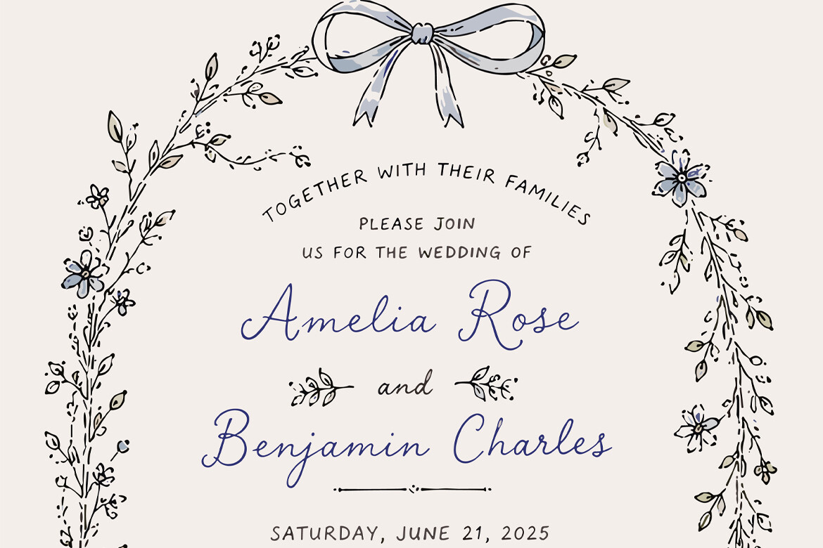
I have a soft spot for the cottagecore stuff, but a lot of it tips into twee fast. This set has the pressed-flower feel and still keeps the text legible from across a room, which matters more than you’d think when Grandpa is holding it at arm’s length.
I made a copy for a coworker getting married in an apple orchard upstate. She printed on a slightly toothy matte stock and the florals looked painted on rather than stuck on. The wording layout left her room for an RSVP line without it feeling crammed.
One gripe. The default green runs a hair neon on some printers. She nudged it toward sage before the real run and it settled down.
When you actually own a cutting machine
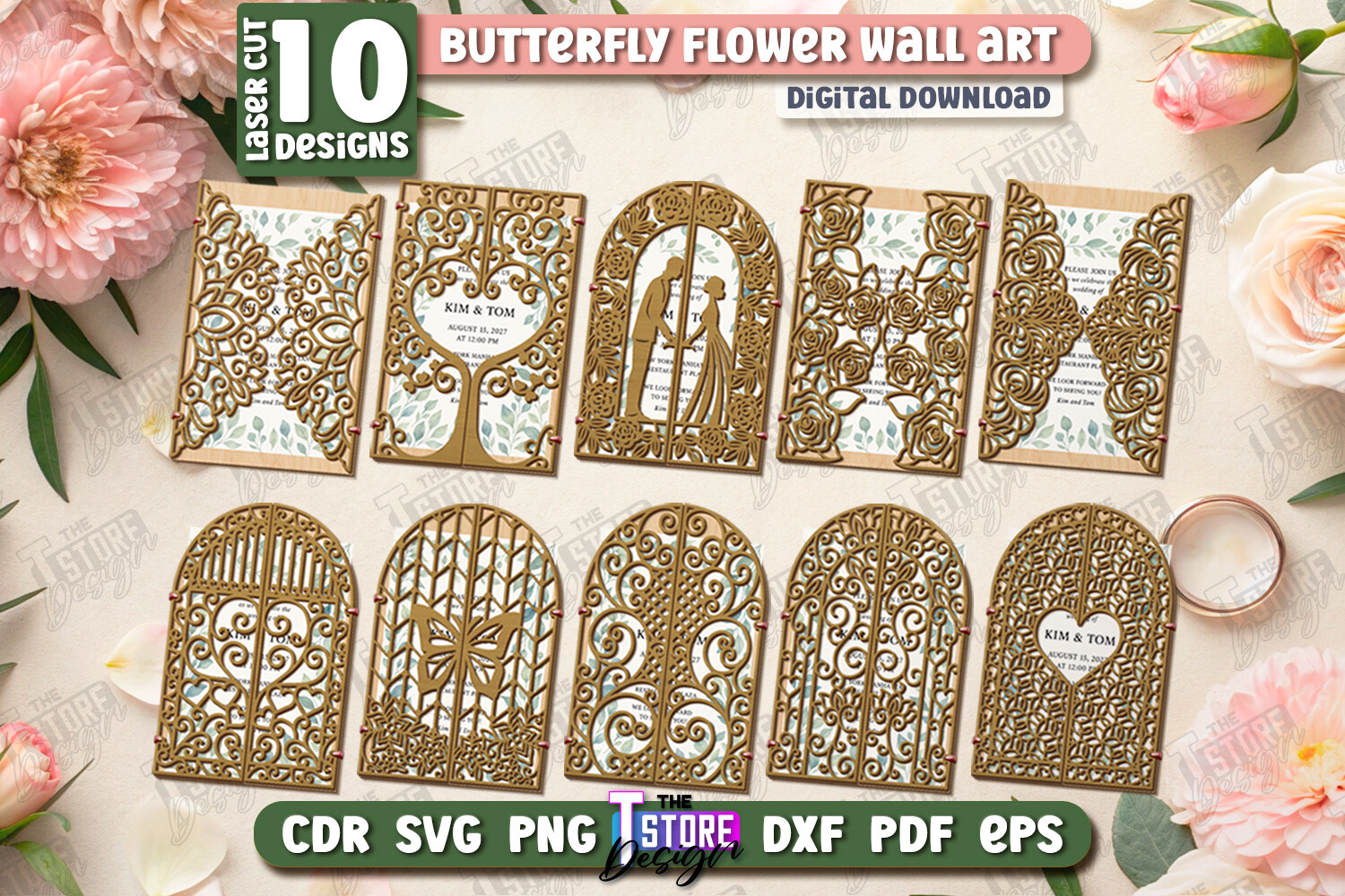
This bundle is not for a home inkjet and a pair of scissors. It is cut files. My maid of honor has a little CNC setup in her garage, the kind she swore she’d use more than twice, and she ran these for her own December wedding.
The lacy edge came out crisp on a medium chipboard, though she had to slow the feed rate down because the thin tabs were snapping at speed. Took her a few scrap pieces to find the setting. Once she did, a whole stack of forty took an evening with a podcast on.
Skip this one if you don’t have the machine. No shame, just buy the flat printable instead and save yourself a Saturday.
Dusty blue, the safe bet that isn’t boring
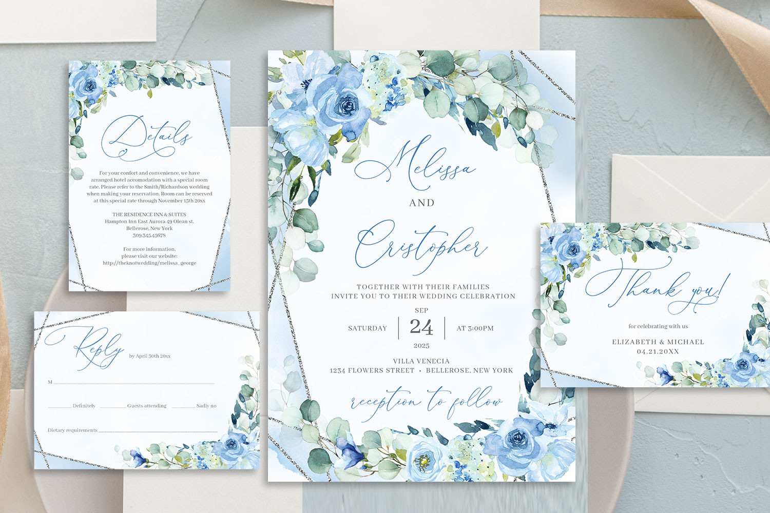
If you want one I’d hand to someone who hates fussing, it’s this. Dusty blue plays nice with almost any season and the florals are restrained, no jungle. I used a near-identical palette for our own day so I’m biased, fine.
My neighbor printed her set at a FedEx counter on their nicer cardstock because her home printer streaks anything cool-toned. Forty cards ran her under twenty bucks and they came out flat and even, no banding. The matching set means the RSVP and details cards already speak to the main invite.
Mild annoyance, the blue can shift a touch gray under fluorescent shop lighting. Ask for a single proof before you commit to the stack.
The fancy laser look, faked on a budget
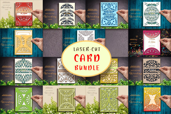
Not everyone has the CNC. This bundle gets you most of the laser-cut drama as a flat printed design, so a regular printer and a steady hand do the job. I tried it for a friend who wanted the ornate vibe without buying a machine she’d use once.
We printed the intricate border on a heavier 110lb stock so it didn’t feel flimsy where the pattern got dense. Trimming the curvy bits was the tedious part, I won’t lie. A craft knife and a metal ruler beat scissors here by a mile.
The filename has a typo, weeding instead of wedding, which threw me for a second when I searched. The actual design is fine. Just smile at the spelling and move on.
The one for a tiny tea-party reception
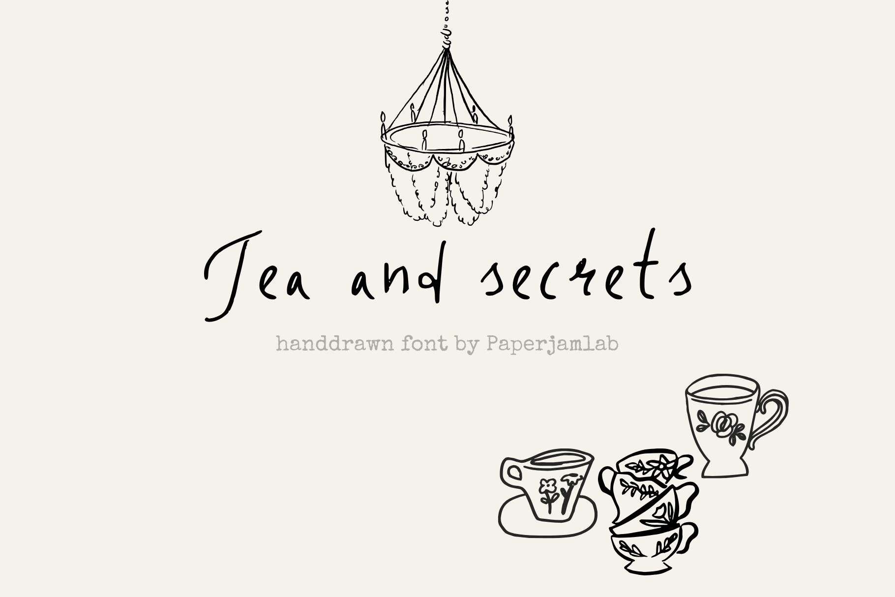
We had a small day, more long lunch than gala, and this is the kind of invite that fits that. Tea and Secrets has a quiet, gathered-around-a-table feel rather than ballroom formal. I’d reach for it for a backyard or brunch wedding.
A college friend used it for her thirty-person elopement-plus-tea afterward. She printed on a soft ivory and tucked a hand-written line at the bottom of each. The layout left a clean margin for that, which a lot of templates don’t.
Fair warning, it reads delicate, so don’t pair it with a loud envelope. She tried a bright coral liner first and it fought the whole thing. Switched to kraft and it clicked.
Things Brides Email Me About
Do printable invitations look cheap?
Honestly? Only if you let them. Mine cost forty-one dollars and a stationer in town quoted me four-fifty for basically the same look. Three guests asked who my designer was.
What tanks them is bright copy paper and a crooked trim, every time. Spend the saved money on decent cardstock and a paper cutter and nobody can tell.
What paper should I use?
I learned this the hard way after a batch came out floppy as a flyer. Go for cardstock in the 100 to 120lb range. The 65lb stuff feels like a school handout the second someone picks it up.
Matte hides home-printer streaks better than glossy. And if your printer is moody with dark colors, like mine streaks anything past gray, just take the file to a copy shop counter. A proof there runs you a dollar.
How do I trim them cleanly?
Skip the scissors. I tried scissors on my first ten and they wandered, every single cut a little off. A guillotine paper cutter or a craft knife with a metal ruler is night and day.
Good templates print faint crop marks at the corners. Line up to those, not your eye. And cut a couple scrap sheets first to find your rhythm before you touch the real stack, because there is no undo on cardstock.
Before You Commit to a Template
I’d do the printable route again tomorrow. The trick was never the design files, it was treating the paper and the trim with the same care I gave the dress. One test page, held up across the room, squinted at. If it reads from the couch, you’re set.
Grab whichever of these fits your day and run a single proof before the full batch. Worst case you waste a sheet at home and learn your printer’s mood. Cheap lesson, ask me how I know.