We sent our invitations eleven weeks before the wedding, which is late, and I know it is late because three people texted to ask if they had missed it. I typed our names into a template at 10pm on a Tuesday, fixed the date twice because I kept writing the rehearsal date by mistake, and printed one test page on the back of an old grocery list. Held it up. Squinted. Good enough.
The thing about editing your own invites is that it is genuinely easy until it is not. You change the names and it feels like magic for about four minutes. Then you try to nudge one line of text and the whole layout slides sideways and you are sitting there at midnight wondering why the RSVP date is now overlapping your last name. A good template does not do that. A bad one will ruin a Thursday.
These are the ones I have actually opened and used, or handed to a friend who then used them. I edit them, print a plain-paper proof first, and live with it taped to the cabinet for a day before I buy the nice paper. A few of the links below are affiliate links, so if you grab one through me it tosses a little change my way. Doesn’t add a cent to your end.
Quick note, a couple of these are affiliate links. If one ends up at your reception, it helps keep this little blog running and you pay the same.
The Sartyan Canish set I keep handing to people who panic
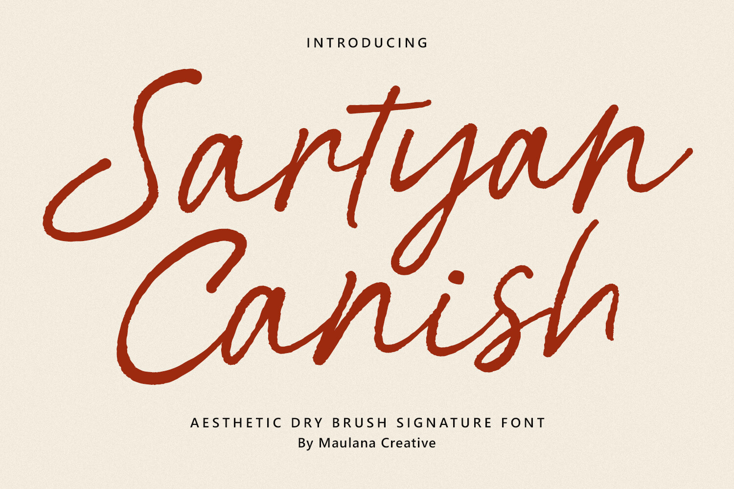
I sent this one to my cousin Priya when she called me three weeks out, mid-spiral, convinced she had to hire someone. You open it, swap the names, and the spacing just holds. She did her whole batch in an evening and texted me a photo of them fanned out on her bed.
What I noticed first was that it does not break when you retype a long name. Priya’s fiance has a hyphenated last name that runs about as wide as the card, and it stayed put instead of bumping the date down into the corner. I have used templates that fall apart over one extra letter. Not this one.
My one gripe. The default text color is a soft gray that looked great on my screen and printed almost invisible at the copy shop on Marsh Street. Darken it before you commit to a stack. Cost me one wasted sheet to learn.
Bright watercolor florals for the couple who said ‘nothing stuffy’
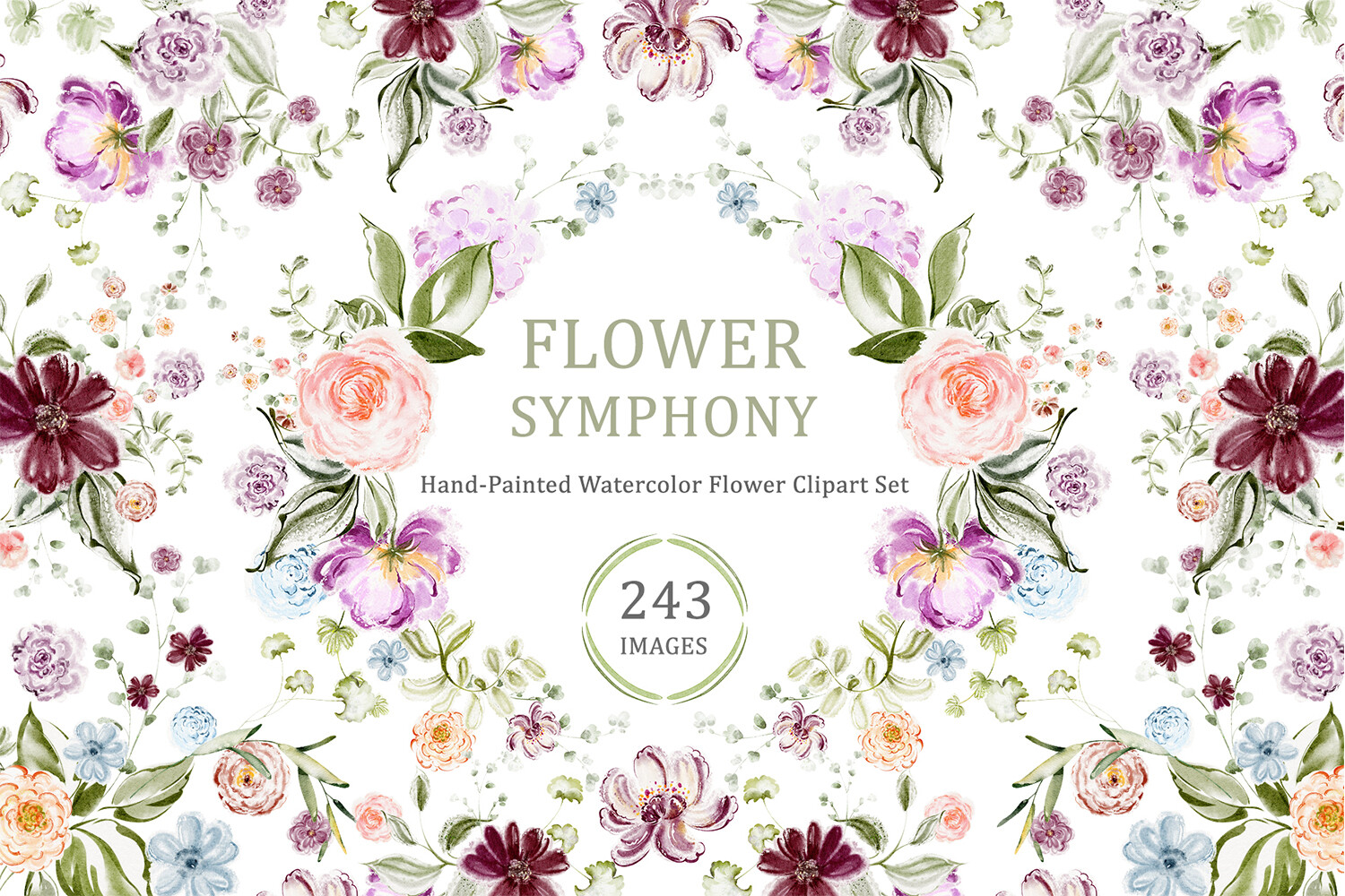
A coworker getting married in a backyard wanted color without it looking like a kid’s party. I pulled these up for her on my lunch break and she went quiet for a second, which from her means yes. The flowers feel painted, not clip-arty, and they sit around the text instead of fighting it.
She printed hers at home on a midweight matte paper, nothing fancy, and the petals still read soft instead of muddy. I was a little surprised, honestly, because home printers tend to flatten anything with a gradient. These held up.
One catch worth flagging. The brightest blooms eat ink. She ran low halfway through forty cards and had to drive out for a cartridge the night before her own shower. Print in two batches if your ink is already on the way out.
A cherry blossom border that does the decorating so you don’t
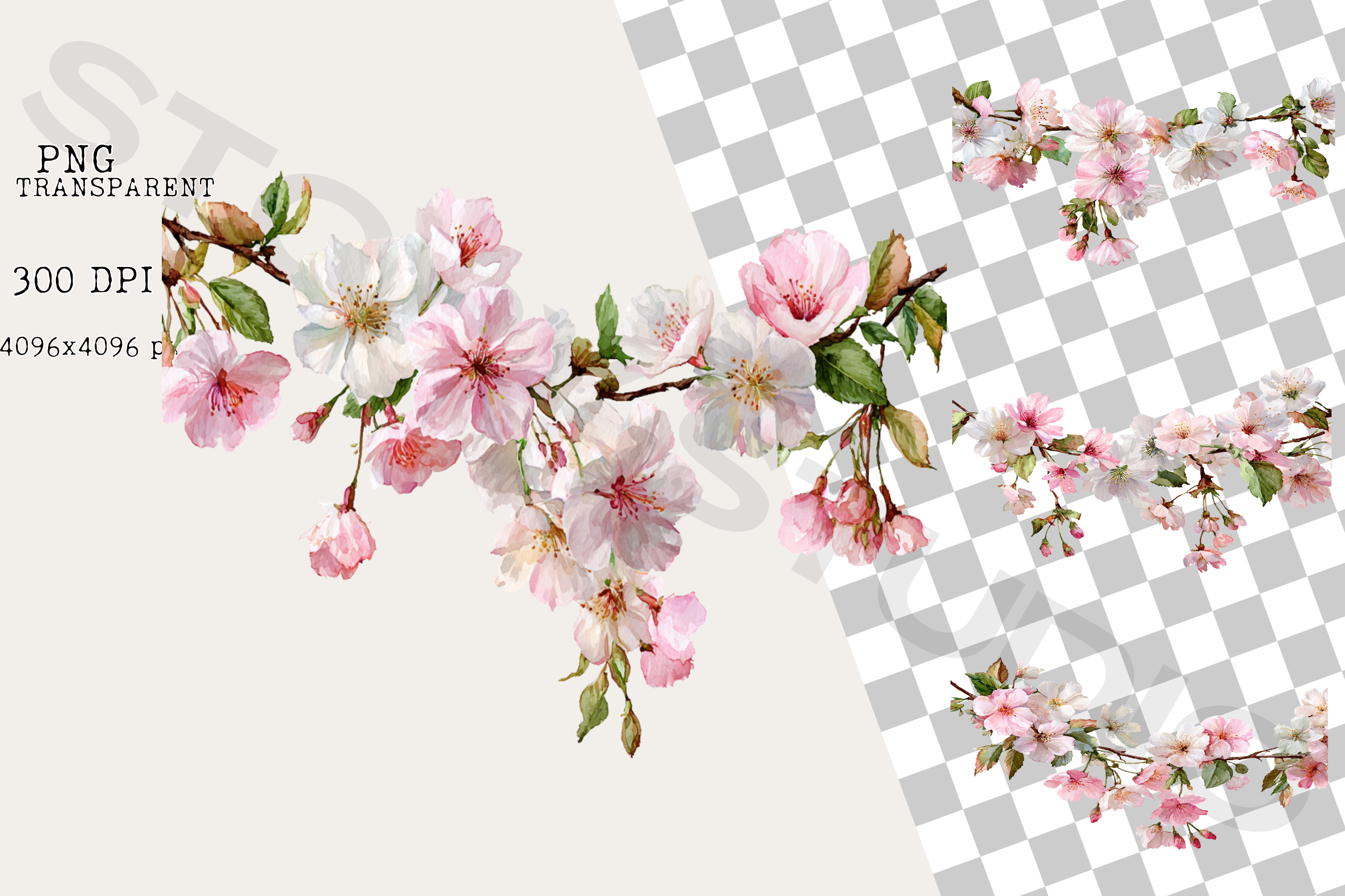
I am bad at design. I know I am bad at design, so I gravitate to anything with a built-in frame, and this blossom border is exactly that. You type in the middle and the edges already look finished. I used it for the shower invites I made for my maid of honor and people assumed I bought them.
The blossoms run light pink along the border with little gaps where the petals thin out, so it never feels heavy. I printed mine on cream cardstock, about 110lb, and the pink warmed up nicely against it. On bright white it looked a touch cold. Cream if you have it.
The nitpick. The border sits close to the paper edge, so if your printer can’t go borderless you will lose a sliver of petals on each side. I trimmed mine down with a paper cutter and nobody could tell.
The floral frame PNG I drop on top of everything
This is the one I keep going back to because it drops right onto a card you already made. I layered it over a plain invite my neighbor had typed up in a hurry, and suddenly her flat little text card had a soft frame around it and looked like it belonged to a set.
Because it sits on a transparent background, it floats over whatever color you put behind it. I tried it on pale sage and on a sort of dusty blue, and both worked. The flowers stayed crisp when I scaled the frame up for a larger card too, which I half expected to go fuzzy.
My small annoyance. There is only the one frame, so if you want it on three different sizes you are nudging and resizing each time. Not hard, just fiddly at 11pm when you want to be done.
A trifold pocket that makes a $0.40 card feel like mail you keep
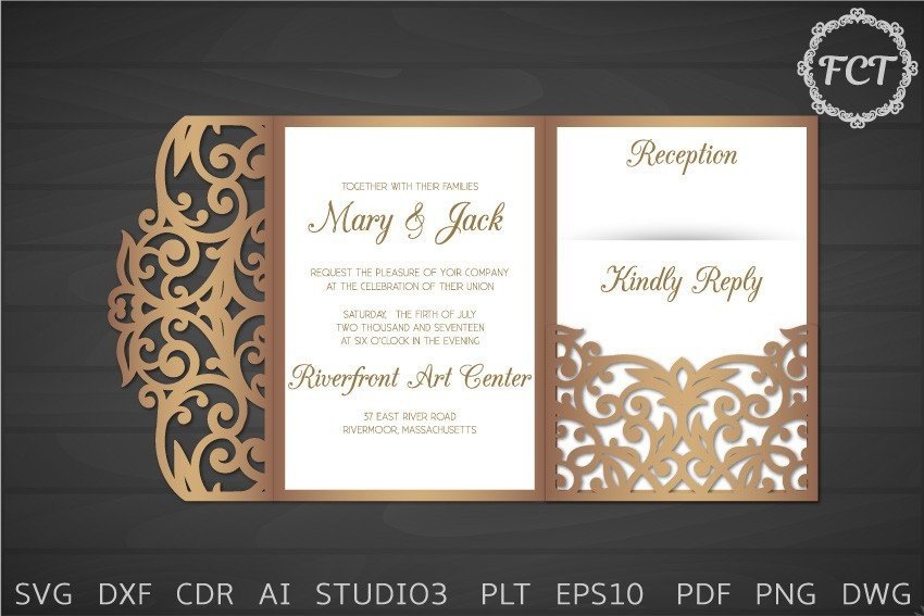
I went down a small rabbit hole over pocket invitations because I wanted the RSVP and the directions to tuck inside instead of arriving as a loose pile that people lose. This trifold cuts on a machine, folds into a pocket, and holds the extra cards snug. My sister-in-law made hers for a fall wedding and they felt heavier in the hand than anything I sent.
You run it through a cutting machine, fold along the scored lines, and the side flaps lock the inserts in. She did sixty over two evenings while watching reruns. The fold lines were clean enough that she didn’t need a bone folder, though she used the edge of a butter knife anyway out of habit.
The heads up. It eats cardstock. Each pocket is one full sheet before you even print the insert, so price out your paper before you commit. She ran short and finished the last eight in a slightly different shade. You can see it if you line them up. Nobody else did.
A Mr & Mrs monogram I stuck on things I never planned to
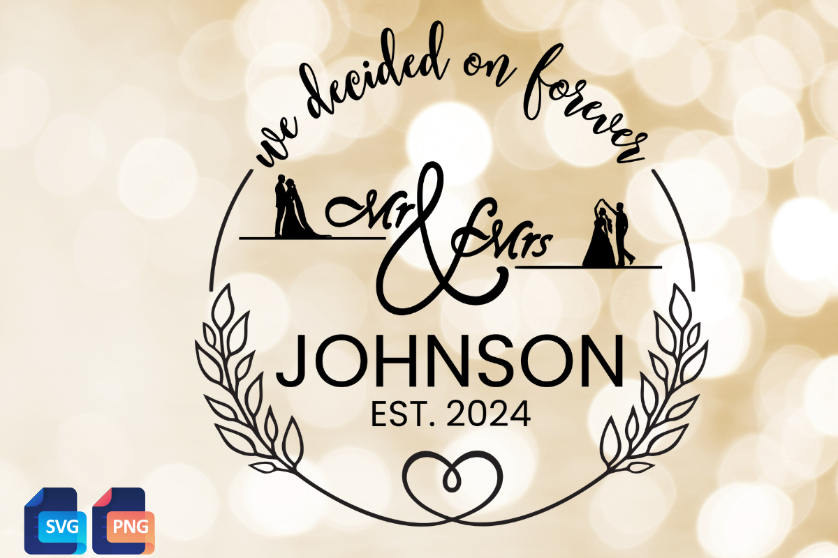
I bought this for the invites and then used it on five other things, which is how these go. It is a clean Mr & Mrs monogram you can drop onto a card corner or cut out of vinyl. I put it on our welcome sign, the one that later fell off the easel, so it has been through some things.
On the invitations I shrank it down and tucked it under our names as a little seal at the bottom. Tiny, but it pulled the card together so the whole suite felt like it matched. I also cut it in gold vinyl for a card box and it weeded clean, no tiny bits tearing off.
One thing. The lettering is on the thin side, so at very small sizes on a home printer it can break up. I bumped the weight a hair before printing the small version. Took a test page to notice, and then it was fine everywhere.
Eucalyptus sprigs for when you want green but not a whole garden
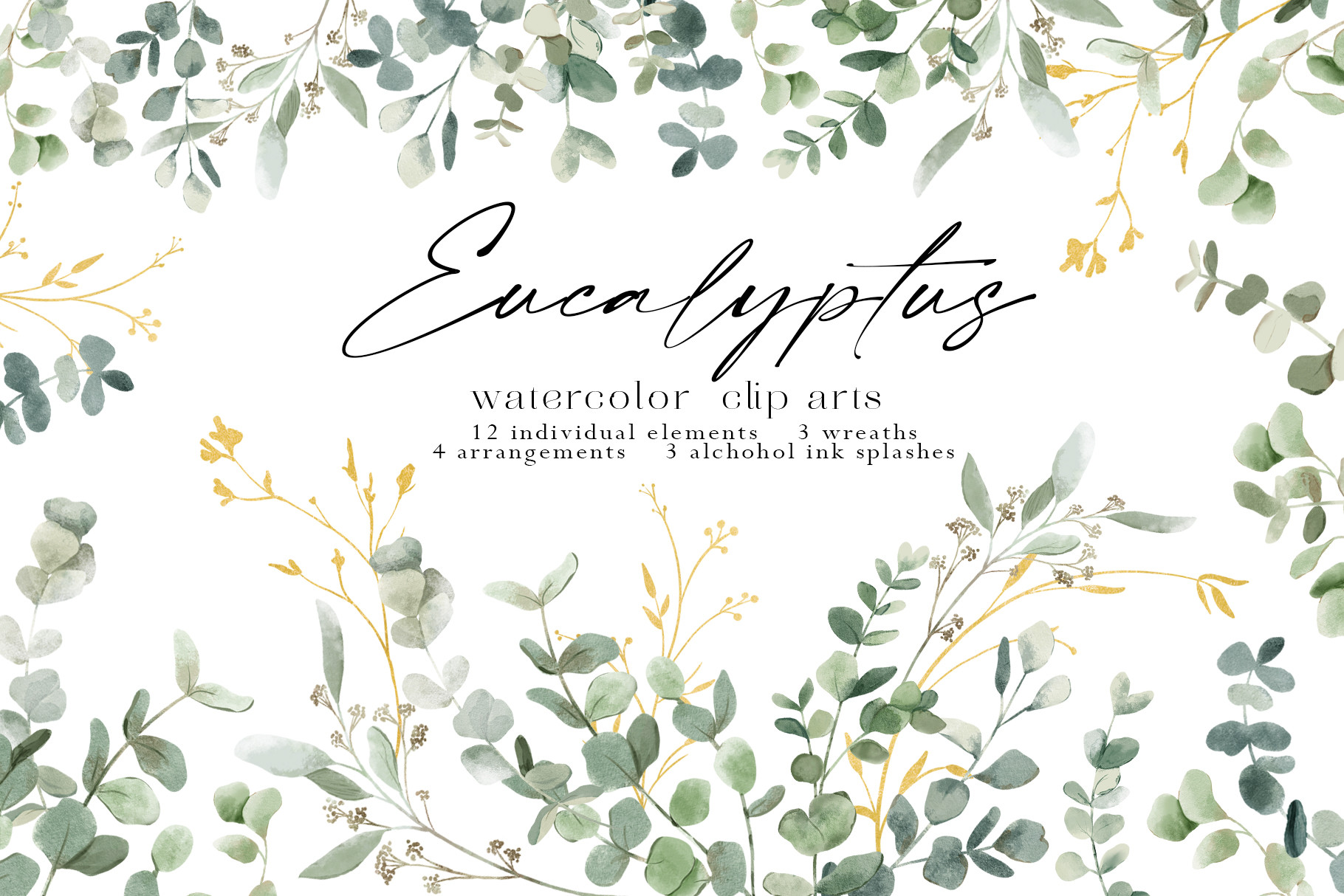
Half the weddings I’ve helped with wanted greenery and nothing else, and this eucalyptus set is what I reach for. Soft sage sprigs you scatter in the corners or run down one side. I used a couple on our menu cards and a friend used the same ones on her invites so the two pieces felt related without being identical.
The leaves come as separate sprigs, which I like, because you can place one in a corner instead of being stuck with a fixed bunch. I printed mine on plain matte and the green stayed gentle instead of going neon, which is the usual home-printer trap with anything sage.
The gripe. There are several sprig shapes and they are not labeled, so I spent a few minutes clicking through to find the one that curved the right way. Minor. Once you find your two favorites you just reuse them.
Things Brides Email Me About
Where do I get an invitation template?
I get mine as digital downloads and edit them on my own laptop, no studio, no appointment. The ones I linked up top are the templates I have actually opened and printed from, so start there if you don’t want to wade through a thousand options.
A friend asked me this last spring and I realized the real answer is just: pick one you can edit without it breaking, and skip the rest. I have pinned forty pretty ones I never touched. The two I used were the two I could actually change the names on without the layout sliding around.
Can I edit it myself?
Yep. You type your names and your date right over the placeholder text and that’s most of the work. I did mine on a Tuesday night with zero design background and the worst thing that happened was I typed the wrong date and had to redo it.
Honestly the only place people get stuck is moving things around. Changing the words is easy. Dragging a whole line somewhere new is where layouts go sideways, so I try to keep my edits to the text and leave the positions alone unless I really have to.
What size do I print?
I print most invites at 5×7, which fits standard envelopes you can grab anywhere, and that’s saved me a real headache more than once. The first set I made I sized them oddly and then could not find envelopes that fit. Drove to two stores. Never again.
If you’re doing the pocket trifold, that one’s a full sheet folded, so check its own size before you buy paper. For everything else, run one test page first and hold it up across the room. If you can read it from the couch, you’re set.
Before You Commit to a Template
None of this has to look homemade unless you let it. Print one proof on cheap paper, tape it somewhere you’ll walk past, and give it a day before you buy the good cardstock. That single habit caught every mistake I almost mailed out, including a date that was off by a week.
Start with one template, get the names right, and let the rest follow. If you only grab one thing from this list, make it the one that matches the wedding you’re actually having, not the one you pinned at 1am. I still have the test page from ours stuck to a cabinet door. Crooked tape. Worth it.