My cousin Dana texted me a photo of a $9 invite sample once and asked if it was worth ordering 80. It was nice. It was also going to cost more than her caterer’s deposit, which is a sentence that still makes me laugh. So I sent her three template links instead and we spent a Sunday at her kitchen table arguing about fonts.
Modern suites are the easiest kind to fake well at home, in my experience. Lots of white space, one or two type sizes, almost no fussy little flourishes to misalign. The catch is that clean designs punish you when something is off by a millimeter. A crooked line on a busy floral card disappears. A crooked line on a stark minimal one is all anyone sees.
These are the ones I kept coming back to, either for my own thing or for the friends I keep getting roped into helping. I always print one test page on plain paper, prop it against the toaster, and walk to the far end of the kitchen to see if it still reads. If it does, I commit. A few of the links here are affiliate links, so if you grab one it tosses a little something my way, no extra cost to you.
Quick note, a couple of these are affiliate links. If one ends up at your reception, it helps keep this little blog running and you pay the same.
Two little parrots, because we are not above a love-bird motif
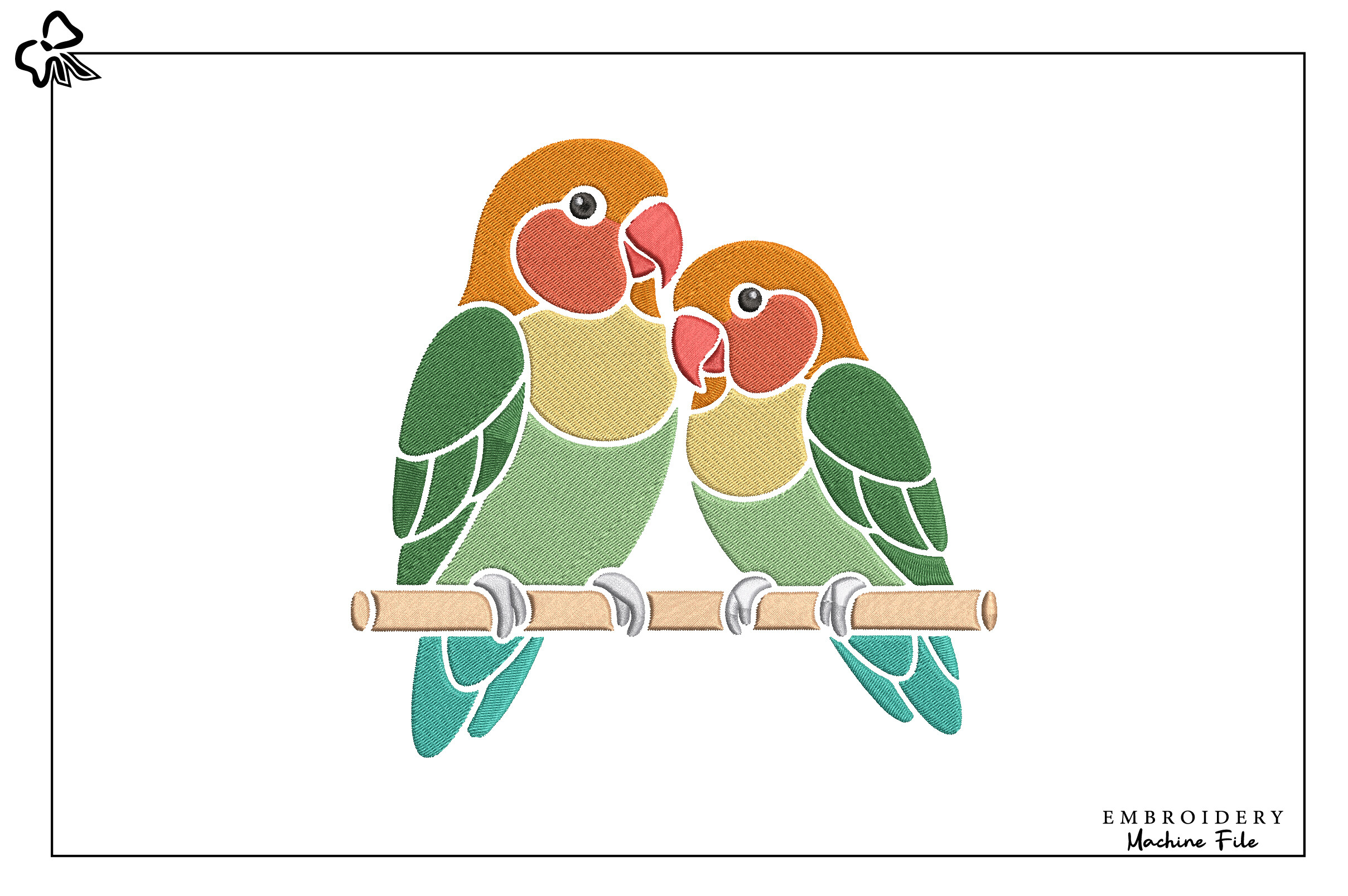
Okay, embroidery on a modern suite sounds like a contradiction, and Dana said exactly that. Then she stitched these two lovebirds onto a plain linen ring pillow and it was the one handmade thing in the whole room that people actually touched. The pair sit facing each other, small enough that they read as a quiet little mark and not a craft-fair explosion.
I used the design flat too, exported as an image and dropped it tiny in the corner of the menu cards. Worked better than I expected against all that white. It gives a stiff modern layout one warm spot to land on.
My one gripe. The default thread colors lean very bright, almost primary, and on cream fabric that looked off to me. I swapped to a muted sage and a dusty coral before running the machine. Test stitch on a scrap first, please, I learned that with a ruined tea towel.
Soft frames for people who want minimal but not bare
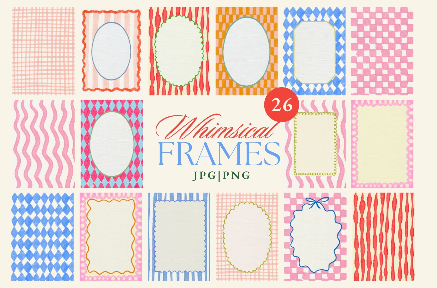
This bundle saved a friend’s bridal shower stationery in about an hour. She wanted modern, then panicked that modern looked too plain to her grandmother. These watercolor frames sit around the edge of a card and leave the middle open for your type, so you get the clean center and a little softness at the border.
I dropped one around a welcome sign, bumped the size to 18 by 24, and printed it at the FedEx on Caldwell because my home printer cannot handle anything that big without streaking. Came out lovely. Nobody asked who designed it, which is the highest compliment a printable gets.
The nitpick. There are a lot of frames in here and some of the busier floral ones fight a truly minimal layout. I stuck to maybe four of the lighter ones and ignored the rest. Pick your two or three and move on, or you will spend an evening previewing all of them like I did.
The card that stands up on its own, no easel required
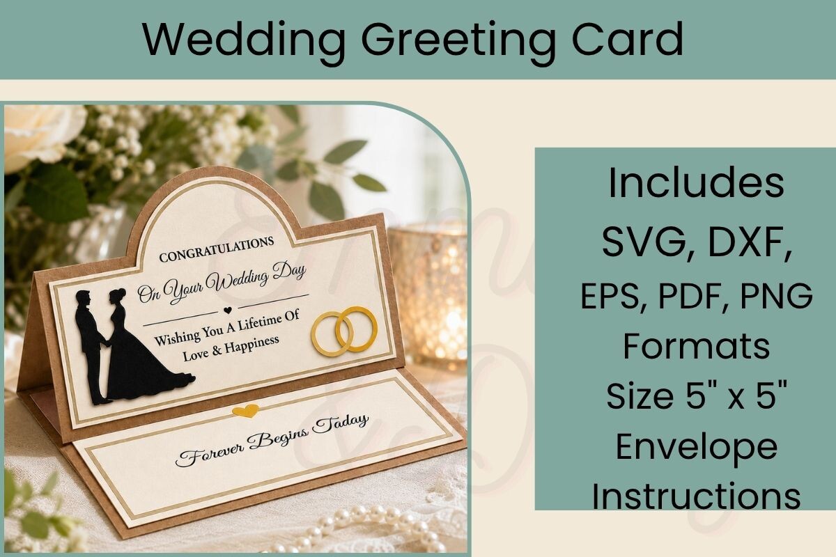
I am bad at gifting cards. They flop over. This one folds into a little standing easel shape so it props itself up on a gift table or a mantel, and that small thing makes a flat printed card feel like an object. I cut mine on a borrowed Cricut while house-sitting, which is its own story.
For a modern suite I kept the front nearly empty, just the couple’s names in one weight, and let the fold do all the visual work. People picked it up to figure out how it stood. Good sign.
Here is the honest part. The cut file has a few tiny score lines that my machine wanted to cut straight through the first time, and I wrecked two sheets of heavy cardstock before I caught the setting. Check that scores are set to score and not cut. Use 80 lb stock at least, the thin stuff buckles and the easel will not hold.
When the couple wants Amalfi and the budget says backyard
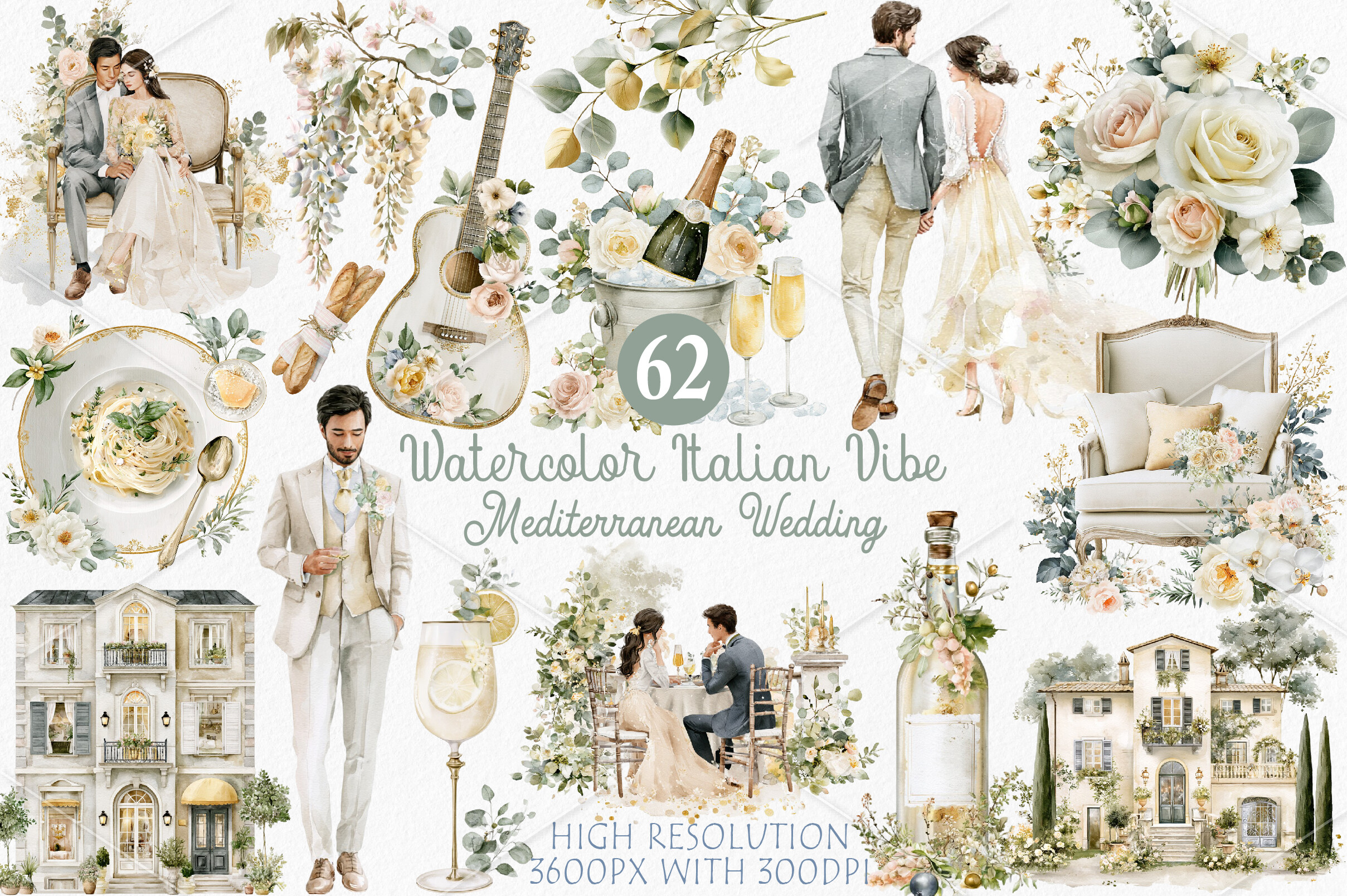
A coworker is doing a lemon-and-blue Italian theme on a Wisconsin budget, which I respect enormously. This set leans into that warm Mediterranean look, terracotta tones, a bit of citrus, type that feels sunny without going full novelty font. It still reads modern because the layouts stay simple under the color.
We printed the invite and a matching menu on a warm white stock, not bright white, and the off-white made the terracotta look intentional instead of muddy. That was a happy accident after one ugly test on copy paper.
The complaint. The color palette looks rich on screen and runs darker on a home printer, so the deep blues came out almost black on her first pass. She nudged the brightness up and dropped the saturation a hair before the real run. Test one, always.
The boring backgrounds that quietly hold everything together
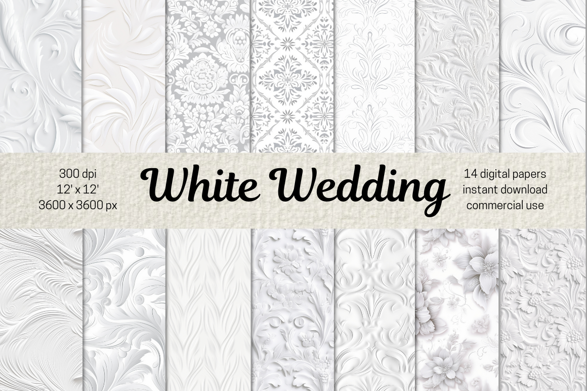
Nobody gets excited about a paper bundle and then everybody uses it constantly. These are subtle white-on-white textures, faint marble, a soft linen weave, a barely-there geometric. You put them behind your text and suddenly a flat card has a little depth without anyone clocking why.
I used the linen one under our table numbers and the marble behind the bar menu. Same suite, slightly different feel per piece, no extra design effort. That is the whole appeal for me, you set it once and stop thinking about it.
My small frustration. A couple of the textures are strong enough that black 11 point text gets a touch hard to read on them. Stick to the faintest two for anything with a lot of words, and save the busier ones for signage where the text is huge anyway.
A blush corner for the suite that needs one soft moment
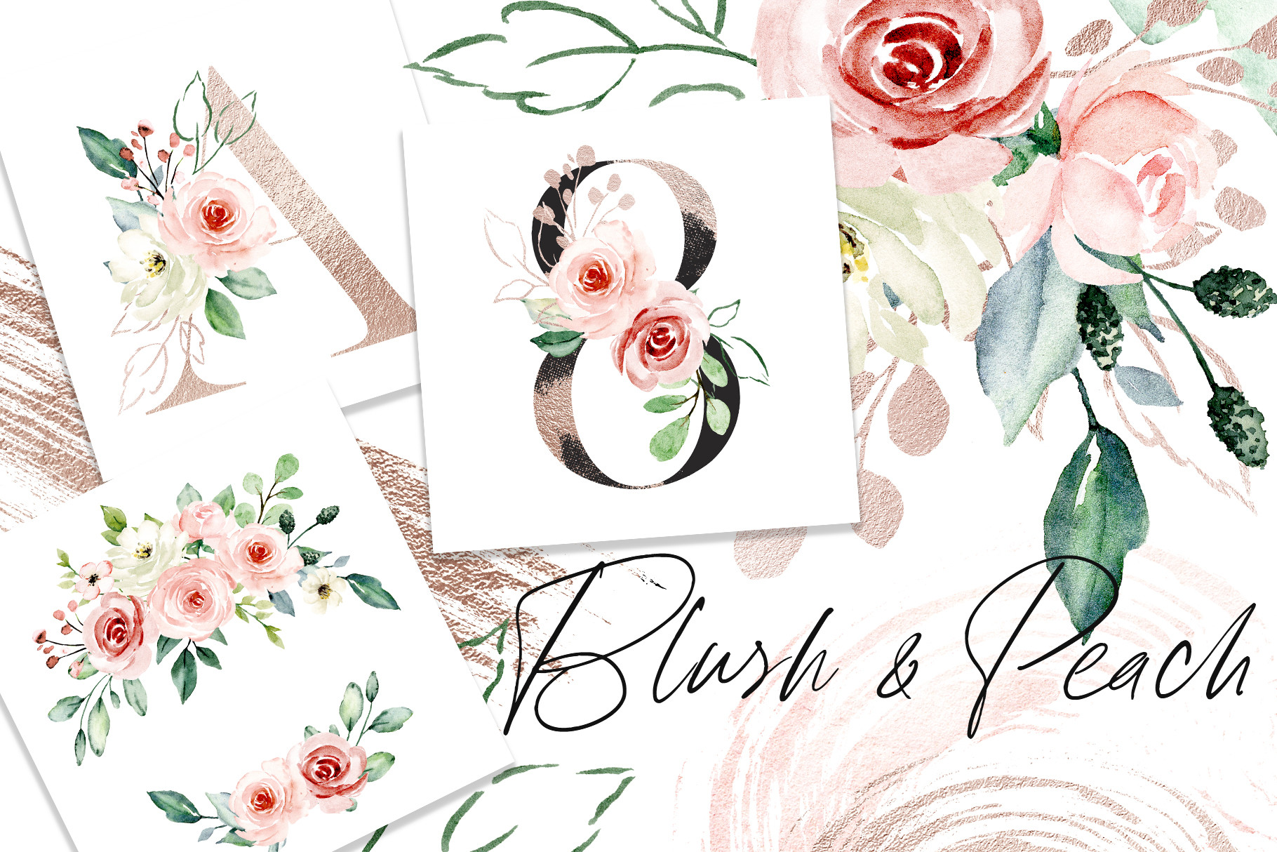
My maid of honor is allergic to anything she calls fussy, but she still wanted one gentle touch on her otherwise stark invites. These pink and peach watercolor sprigs were the compromise. Small clusters you tuck into a corner or run lightly along the bottom, not a full wreath swallowing the page.
I scaled one down and put it in the lower right of the RSVP cards. Tiny. It softened the whole stack without making it look like a different theme. Dropped a matching sprig on the favor tags too and called it a set.
The gripe. The peach skews almost neon at full saturation on a screen and printed weirdly orange the first time. I pulled the saturation down and it landed where I wanted, proper dusty peach. Print a swatch strip before you trust the colors on your monitor.
Checkerboard daisies, the unexpected one I keep recommending
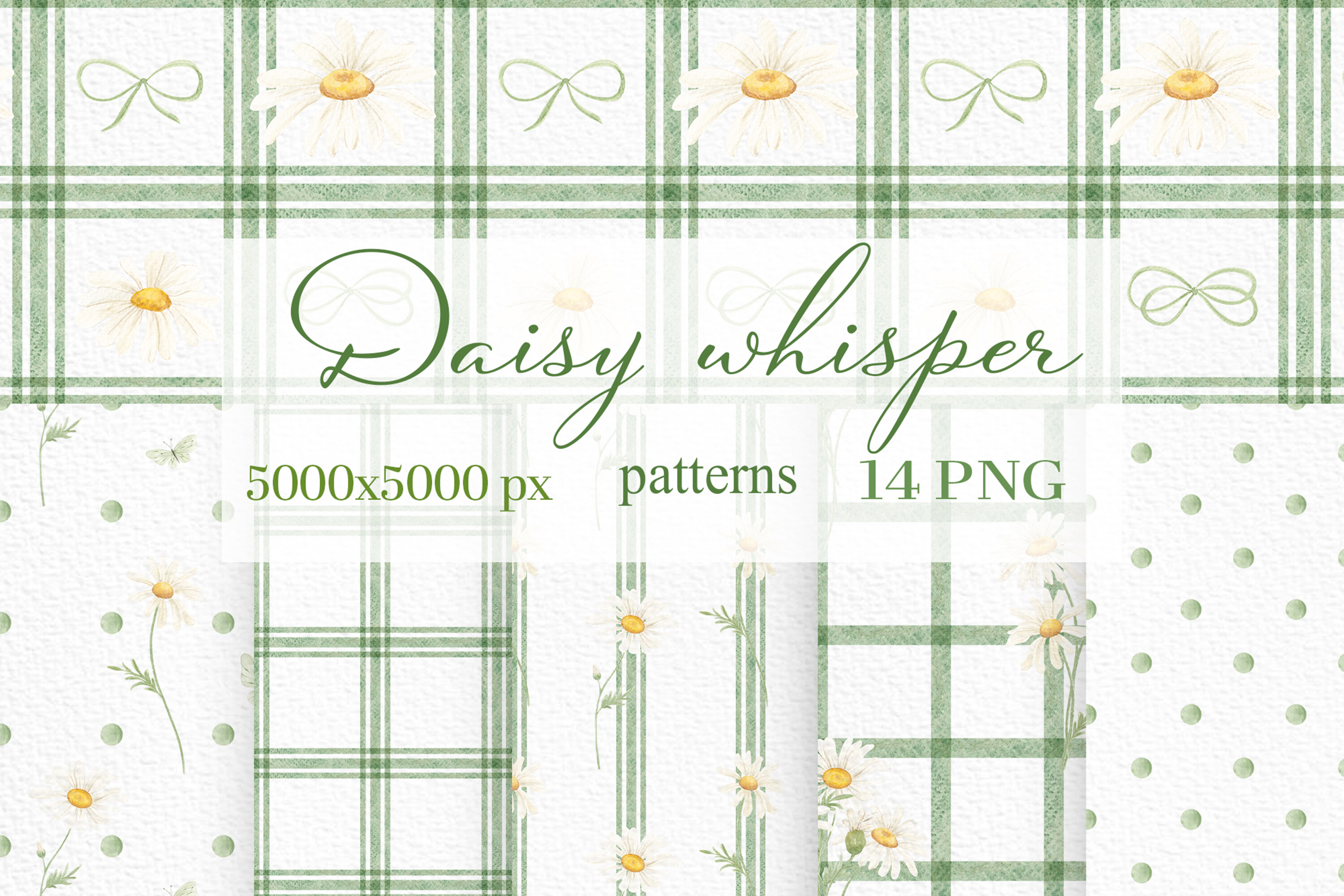
This is the file I did not think I needed and now push on everyone. A retro checkerboard, but the squares are tiny daisies, so it reads modern and playful at the same time. My neighbor used it on the back of her invites and as the envelope liner, and that one repeating pattern tied the mailed pieces together for basically free.
I also ran it as a thin border strip across the top of the program. Just a sliver. Enough to nod to the pattern without shouting it. People kept the envelopes, which never happens.
The catch, and it is a real one. The checker pattern at small sizes can moire on a cheap inkjet, that shimmery distorted look. It printed clean at the copy shop on heavier stock but went funny at home. If you only have a home printer, scale the pattern up a bit so the squares are larger and you should dodge it.
What People Keep Asking
What is a modern invitation suite?
Honestly? It is just the whole set of matching pieces, invite, RSVP, details card, maybe a menu, done in a clean stripped-back style. When my cousin asked me, I showed her hers next to my mom’s ornate gold-foil one from 1994 and she got it in two seconds. Lots of white space, simple type, almost no decoration. That is the look.
The suite part only means the pieces look like siblings, same fonts and spacing across all of them. You do not need every piece either. I skipped the details card entirely and nobody noticed.
Do modern suites use color?
Yep, plenty do. I think people hear modern and picture stark black and white, but a single warm color like the terracotta in that Italian set still counts as modern as long as the layout stays simple. The restraint is in how few colors, not zero.
What I avoid is loading a clean design with three or four competing tones. Pick one accent, maybe a soft neutral with it, and stop there. The first invite I designed had four colors and it looked like a coupon flyer.
How do I keep it from looking cold?
This was my actual fear, that minimal would read as cheap or unfeeling. The fix that worked was one warm element against all the clean lines. A little watercolor sprig in the corner, those stitched lovebirds, a textured paper behind the text. Just one.
Warm paper helps too. I switched from bright white to a soft cream stock and the whole suite stopped feeling clinical, same design, completely different mood. Cost the same, by the way.
Before You Print a Stack
If you only test one thing before you order cardstock, test the color on your actual printer, because every single product above tried to print darker or brighter than it looked on my screen. I have a small drawer of wasted first attempts to prove it.
Start with a paper bundle and one accent file, those two stretch the furthest across a suite. Then add the standing card or the embroidery if you have a free Sunday and a cousin willing to argue about fonts. Dana still owes me for that one.