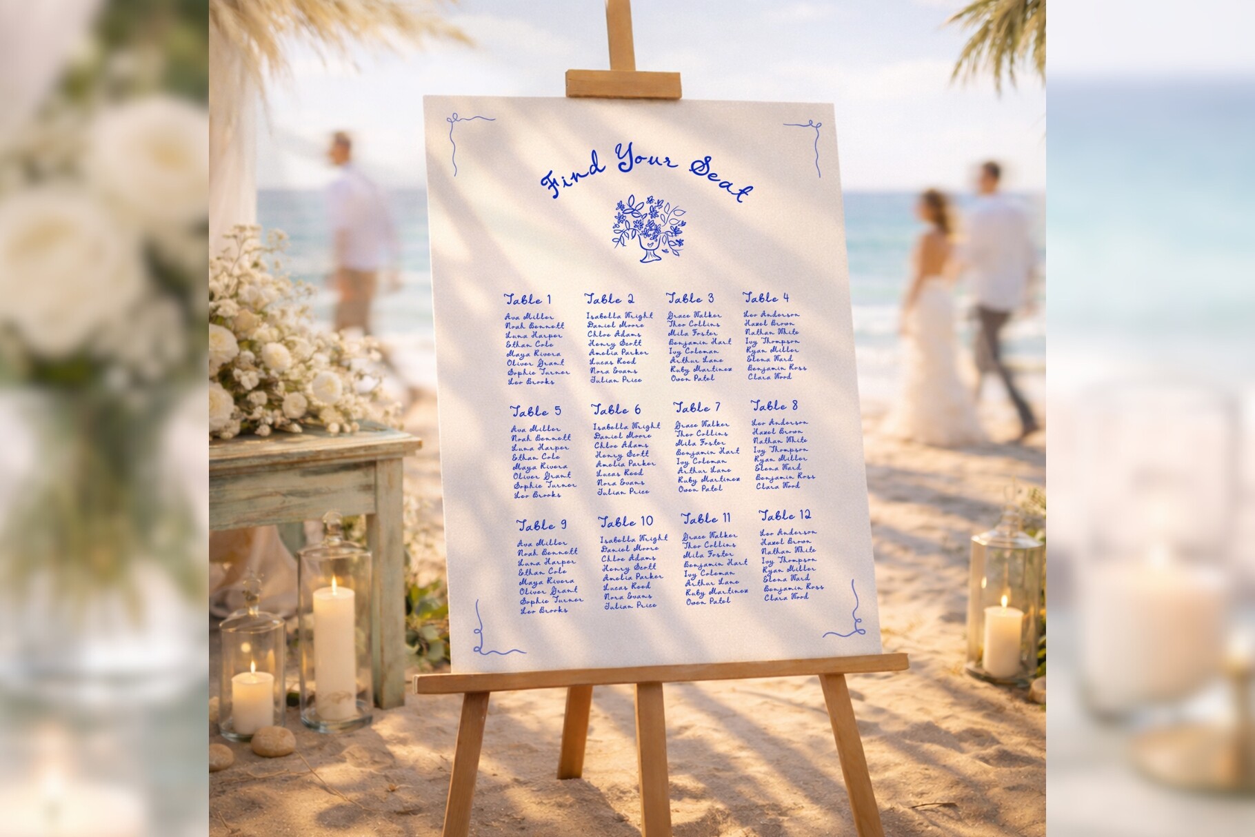
My first attempt at a seating chart was a single foam board I wrote on by hand with a gold paint pen. It looked great up close. From the bar, it looked like a ransom note. My friend Priya stood in front of it for a full minute trying to find her name, then gave up and asked a waiter. That is when I learned a chart is not for you. It is for the woman in heels who has had two glasses of wine and just wants to know where to sit.
The whole point is that people read it once, fast, and walk away. If anybody has to lean in or take out their phone flashlight, you have made art instead of a tool. I redid mine the week of the wedding on a borrowed laptop at my parents’ kitchen table, and the second one took twenty minutes because I started from a template instead of my own handwriting.
So below are the formats that hold up across a room, plus the ones I would print again. A couple of these links are affiliate links, so if you grab one through me it kicks back a few cents. Doesn’t change your price.
Heads up, some links here are affiliate links. Grab a template through one and I get a small cut, no extra charge to you.
The one I’d hand a panicking bride three days out
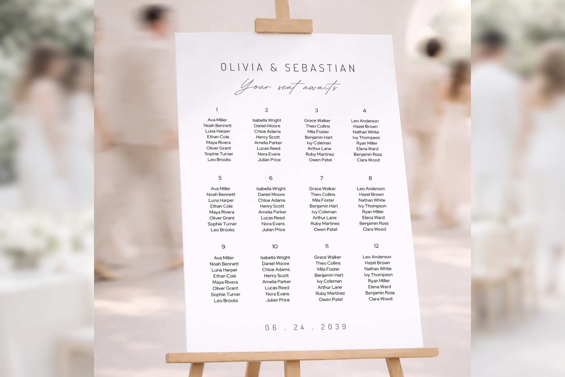
I keep coming back to this one because the type sits big and clean, and big is the only thing that matters from fifteen feet away. I typed our table groups in, didn’t touch the layout, and it stayed put. No reflowing into a mess every time I added a name.
My maid of honor borrowed it for her own wedding after she saw mine. She printed it as one large piece at a print shop near her office and propped it on a thrifted gold frame.
My one gripe. The default header is a touch fancy and got a little lost in a low-light barn. I swapped it for something heavier and it read fine. One test print to catch that, no big deal.
When your venue is already loud and the wall just needs to be quiet
This is the stripped-down one. Names, tables, nothing else fighting for attention. I used a version of this for a coworker who got married in a gallery space, where anything ornate would have clashed with the art already on the walls.
The spacing is the quiet hero here. It does not cram, so even a long guest list breathes instead of stacking up like a spreadsheet. I printed a test page on regular paper, taped it to my closet door, and read it from bed. Passed.
If your list runs past about a hundred and twenty, you will be shrinking text to fit one sheet, which defeats the whole readable thing. Split it across two boards at that point. I found that out the hard way.
Soft and pretty without making Grandma squint
There is a sweet spot between plain and overdone, and this lands close to it. Enough flourish to feel like a wedding, not so much that the names disappear into the decoration. My aunt, who is seventy-eight and refuses to wear her glasses to events, could read it. That is my actual gold standard now.
I mocked it up with our names on a Tuesday night, lived with it on the fridge for two days, then printed the real one on heavier stock so it wouldn’t curl on the easel.
The lettering does run a bit light in the names section. For a dim reception I bumped the weight a notch before the final print. Costs you one wasted page to figure out.
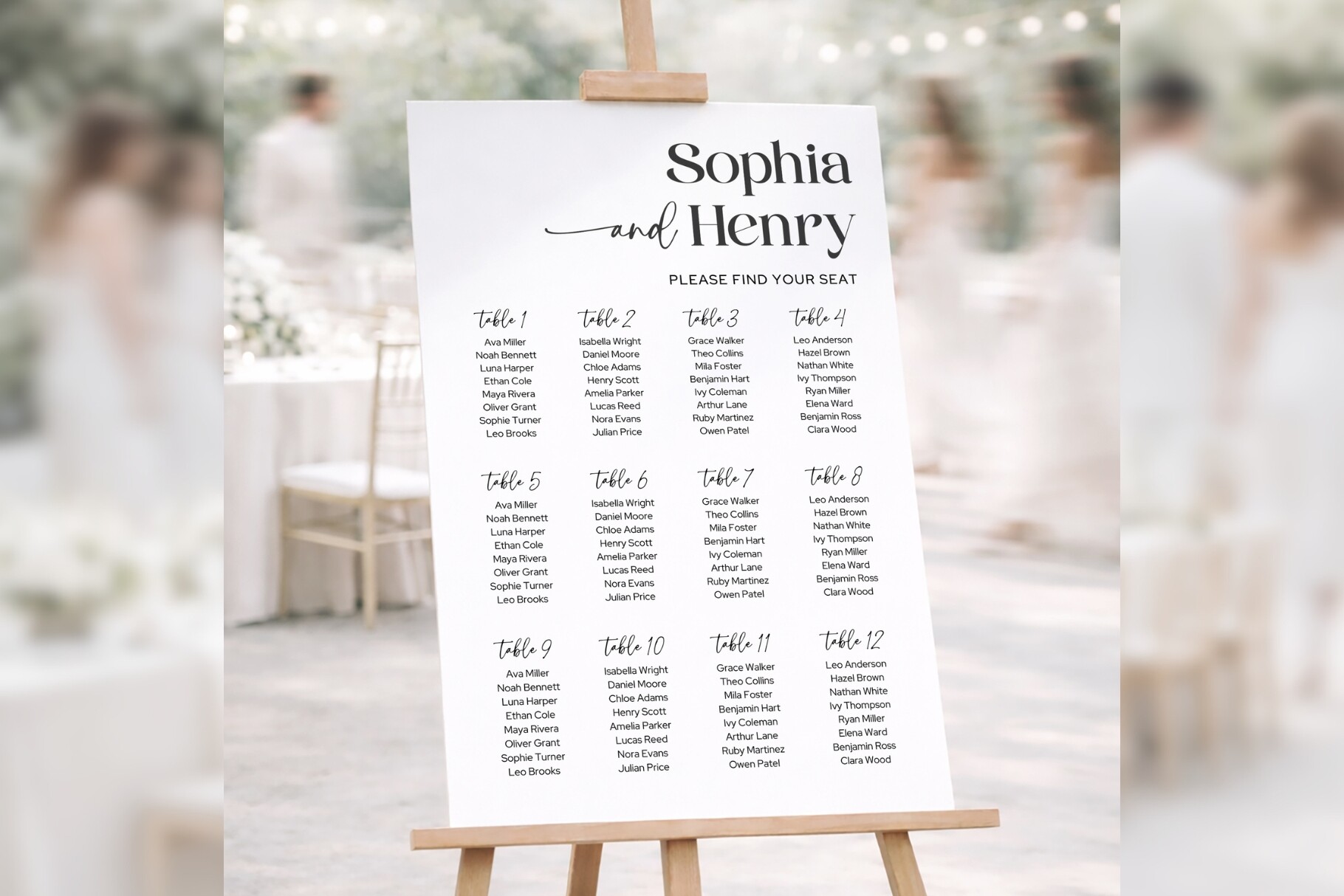
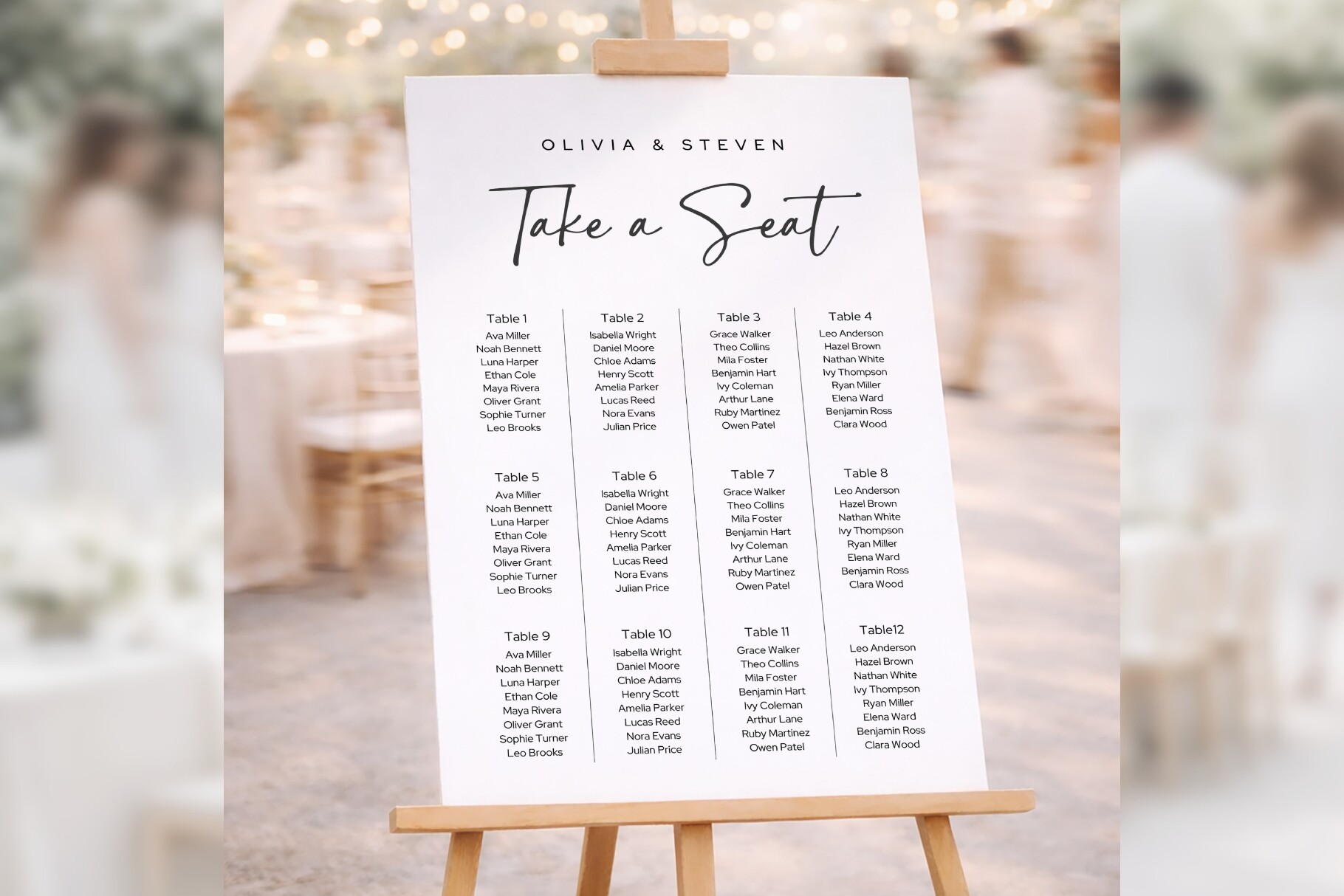
The safe pick I’d give someone who hates fiddling
Some people do not want options, they want to type names and be done. This is the one for that person. It is balanced enough that you cannot really break it, which I appreciated at 1am when my judgment was gone.
I helped my neighbor set hers up over coffee. We had it filled in before her mug went cold. She printed it at the copy place on Ashby and clipped it into a flat frame she already owned.
The color palette it ships in is a little safe, almost beige. If your wedding has an actual color, recolor the accents first or it will read generic against your flowers.
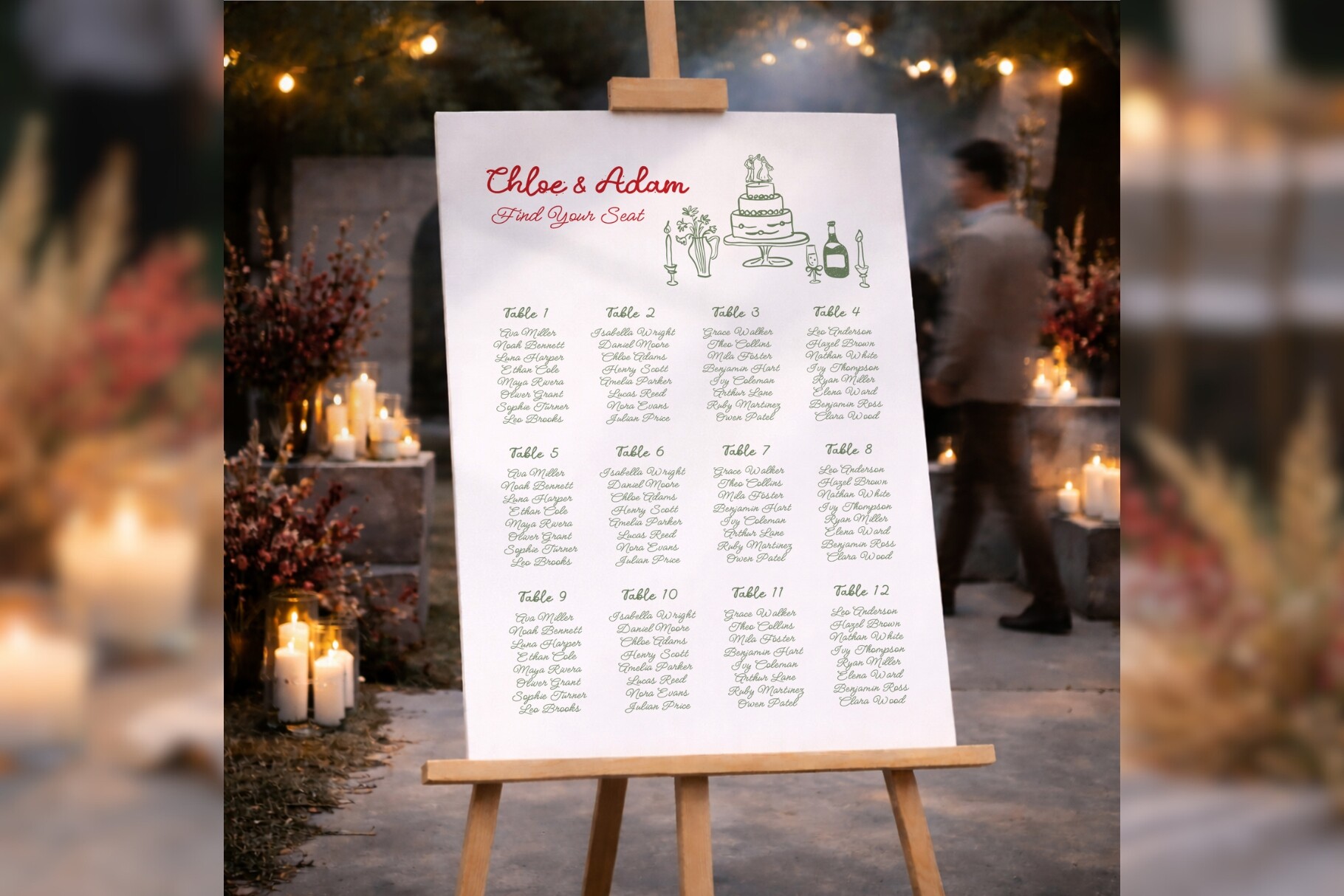
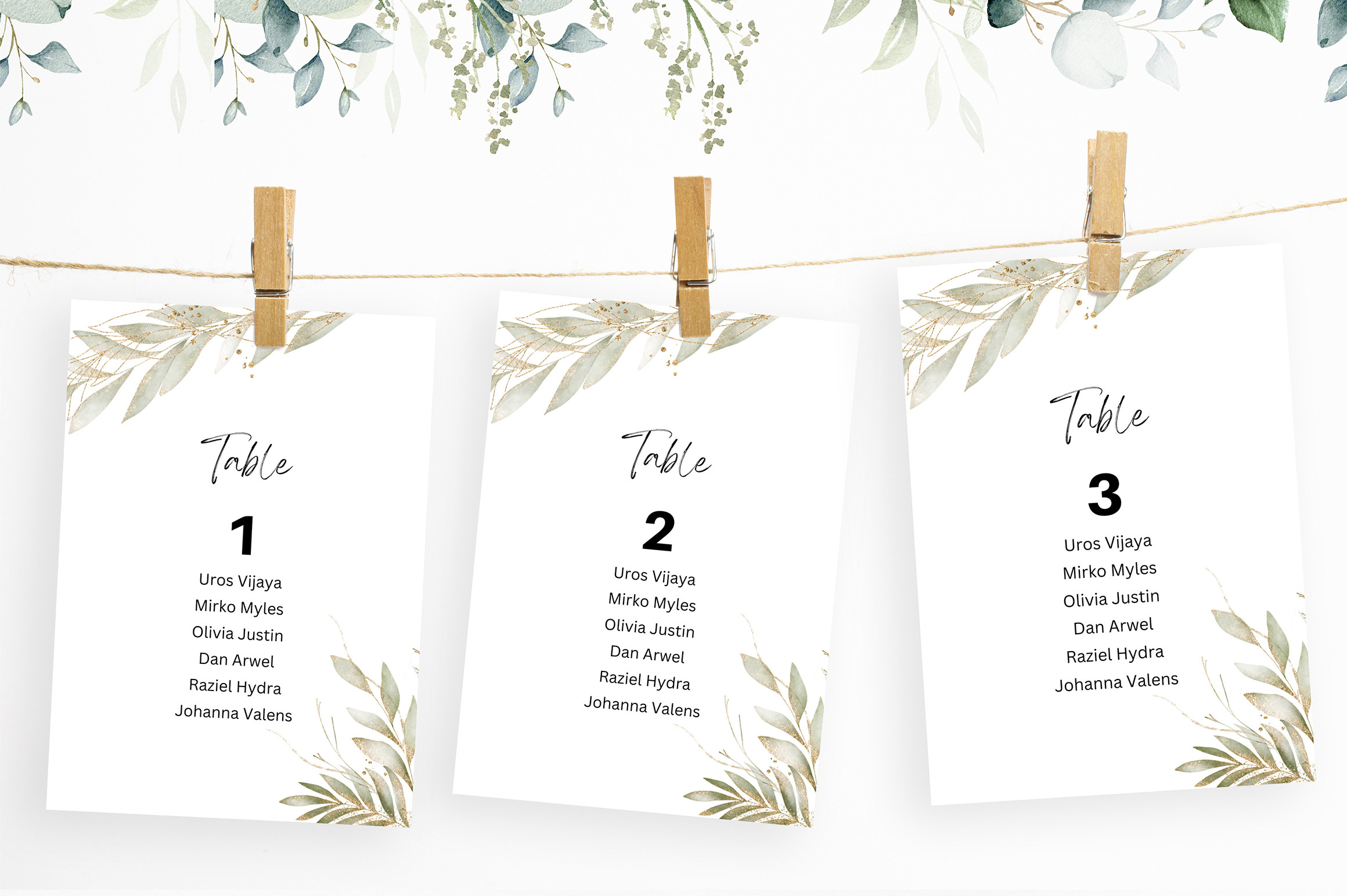
For the couple whose whole wedding is a little bit handmade
If your invites had a sketchy, illustrated feel, a slick chart will look like it wandered in from a different wedding. This one has that drawn-by-hand warmth without you actually needing to draw, which, after my paint-pen disaster, I will never attempt again.
I almost used a version of this for ours. Our save-the-dates had little ink drawings on them and this matched the mood better than anything crisp and modern would have.
Watch the readability though. Hand-drawn styles love thin strokes, and thin strokes vanish from across a room. I’d size the names up more than feels necessary and print a test before you trust it.
The plain-Jane base I rebuild every time I’m helping a friend
This is my default starting point when someone texts me in a panic. It is clean and open enough that you can push it in any direction, formal or casual, with twenty minutes of poking at fonts and colors.
I’ve now set this one up for two different friends. Same template, two completely different weddings, because the bones are flexible. One went moody and dark, one went garden-party pastel.
Because it is so open, you do have to make a few choices yourself. It is not going to hand you a finished look. If you want zero decisions, grab one of the more styled ones above. If you like tinkering, this is the playground.
The flowy script one, with a warning attached
Script charts photograph beautifully and that is exactly why people pick them. I get it. The looping letters feel romantic on screen. I set one up for my cousin’s reception and it looked incredible in the listing photos.
Then we hung it. From the back of the room the script ran together and her guests bunched up at the front squinting. We saved it by keeping the script only for the headers and the table numbers, and setting actual names in a plain, readable face underneath.
So I’d say use it, but split the difference. Script for flourish, simple type for the part people actually need to read. Learned that one in real time, in front of a hundred people.
What People Keep Asking
What is the easiest seating chart format?
Honestly? Grouped by table, big bold names, nothing fancy. A friend asked me this two weeks before her wedding and I told her to forget anything alphabetical or cute and just list table 1, table 2, with the names plain underneath.
The one you can fill out at midnight without crying is the easiest one. Type names into a template, print one test page, read it from across the room. If it works, you’re done.
Alphabetical or by table?
Alphabetical, every time, if you want a calm cocktail hour. People find their own last name in two seconds and go. By-table makes them scan every single table hunting for themselves, which is fine for ten guests and chaos for a hundred.
I did by-table for mine and watched a small traffic jam form. By-table looks lovely as a display, sure. But the alphabetical list is the one that actually moves people to their seats.
How big should the chart be?
Bigger than you think. I stood across my living room, roughly the depth of a real reception, and held up test prints until the names read without leaning in. For most guest lists that landed me around eighteen by twenty-four inches.
The real test isn’t a measurement, it’s the squint test. Print it, back up to where your bar will be, and squint. Can’t read it from there, size it up. I redid mine once over this exact thing.
Before You Print a Stack
None of this needs to be precious. Pick a layout your tipsiest guest can read in one glance, print a test on cheap paper first, and back away from it across the biggest room you have. If the names hold, you’re set.
I still have my second chart, the one that actually worked, folded in a box in the closet. The paint-pen disaster went in the recycling the morning after. Start from a real template, size the names up, and you skip the part where a waiter has to find Priya’s seat for her.