My welcome sign fell off the easel during the processional. Right as my cousin was walking down the aisle, it slid sideways and landed face down in the grass. I had taped it. I had not taped it enough. A groomsman picked it up and propped it against the easel leg and that is where it stayed for the rest of the night, leaning, slightly muddy.
Nobody noticed except me. That is the thing about the welcome sign. You agonize over it for weeks, you pick the font, you reprint it because the first one had a typo in your own last name, and then it sits at the entrance doing one quiet job. It tells people they are in the right place. It sets the mood before anyone finds their seat.
I have printed a pile of these for myself and for friends since, mostly at the copy shop on Burnet because my home printer eats anything bigger than a sheet of letter paper. Below are the ones that held up. A couple of the links are affiliate links, so if you grab one a little something comes back to me. You pay the same.
Full disclosure, a few links are affiliate links. Use one and a few cents come back to me, never anything added to your price.
The classic vertical one I keep coming back to
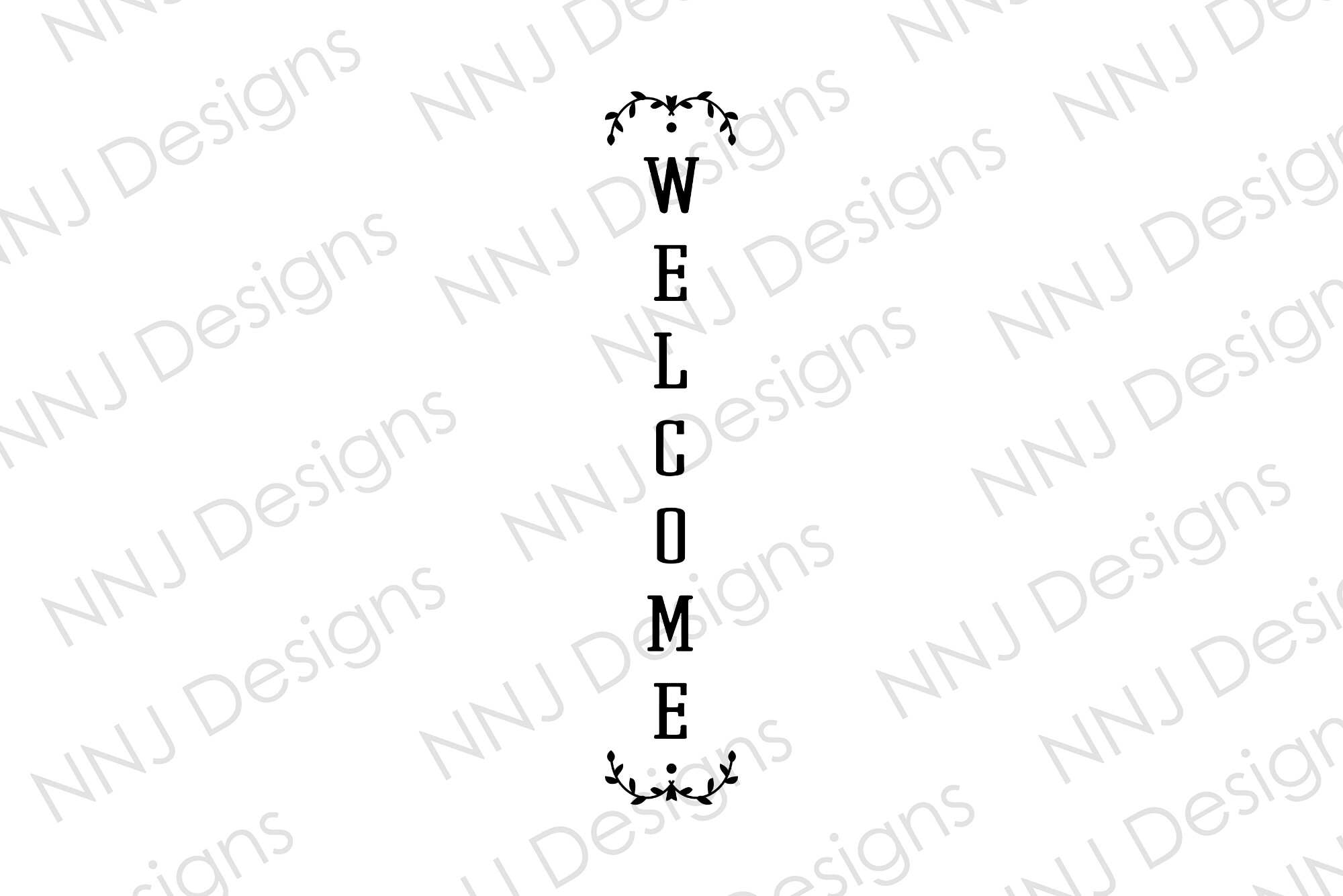
This is the standard tall sign, the shape you picture when someone says welcome sign. I made one for my friend Priya last spring. She wanted her venue address and the date stacked under the names, and this one let her do that without the lines crashing into each other.
We printed it as an engineering print at a print shop, the big cheap kind that comes out matte and a little gray. Cost her under ten dollars for a poster-size sheet. She mounted it on foam board from the craft store and it looked like it cost a hundred.
One gripe. The line spacing is set tight, so if you add a long venue name it gets cramped fast. Priya nudged the spacing up a notch before she sent it off and it breathed a lot better.
Round, for when a rectangle feels too stiff
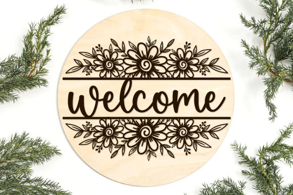
I love a round sign. They photograph differently, softer somehow, and they fit those circle wood backings everyone sells now. My maid of honor used this exact one and hung it from a shepherd’s hook with twine instead of putting it on an easel.
She cut hers on a vinyl machine and weeded it onto a stained pine round her dad made in his garage. Took her an evening and a glass of wine. The result was the kind of thing people asked her about all night.
Watch the diameter though. A round sign reads smaller than a rectangle of the same width because of all that empty corner space you are not using. She went bigger than she planned and it was still on the modest side.
Same energy, smaller party
Not everything is the wedding itself. This one is sized and worded for a bridal shower, which I appreciate because reusing a wedding sign for the shower always feels a little off. I printed this for my coworker’s shower in her backyard.
We ran it at home on regular paper first to check the names, taped that test page to her kitchen cabinet, lived with it overnight, then printed the real one at the copy shop. The good version went in a thrifted frame she spray painted gold the weekend before.
The only thing I would flag is the font weight. It ships on the delicate side, which is pretty in daylight but it disappeared a bit once we moved it under the patio string lights. Bump it heavier if your space is dim.
The polished one for a friend who can’t design
This is the one I send to people who tell me they are hopeless with anything design related. You drop your names in, the layout holds itself together, and it does not unravel the second you change the date. My neighbor used it and she had never opened a design tool in her life.
She typed in the two names and their wedding date, printed a test on plain paper, held it across the living room and squinted at it from the couch. Still readable. That is my whole test. She committed to the cardstock after that, 110 pound, the heavy stuff.
One catch worth knowing. The margins are generous, which I like, but it means the printable area is a touch smaller than the sheet, so center it carefully or you get more white space on one side than the other. Took me a wasted page to notice.
For the dinner the night before
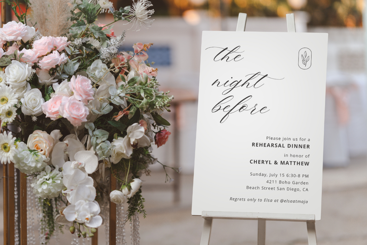
The rehearsal dinner gets forgotten in all the wedding day fuss, and then suddenly it is the night before and you have nothing for the door. This sign is made for exactly that evening. I wish I had found it before my own, when I scribbled something on a chalkboard at the last minute and it looked it.
A friend used this for her welcome dinner at a little Italian place that let her bring her own decor. She printed it at FedEx around the corner, slid it into a frame from her bookshelf, and propped it by the host stand. Done in an hour.
My one note. The wording leans casual, which suits a rehearsal dinner, but if your night before event is fancier you will want to swap a few words. She changed welcome to join us and it fit her group better.
Hand-drawn look without the shaky hand
I cannot hand letter to save my life. My e’s all lean different directions. So this one is a small miracle for me, because it has that drawn, sketched quality already built in and I just type underneath it. Looks like someone with talent sat down with a pen. Nobody did.
I made this for my sister’s vow renewal, which she swears was not a second wedding even though it absolutely was. We printed it on a soft ivory cardstock to lean into the handmade feeling, and the texture of the paper sold the whole thing.
The one thing. Those hand-drawn elements have fine little lines, and a streaky printer will mangle them. Mine streaks anything darker than gray, so I took it to the copy shop. On a good printer it is lovely.
For the couple who refuses to take it seriously
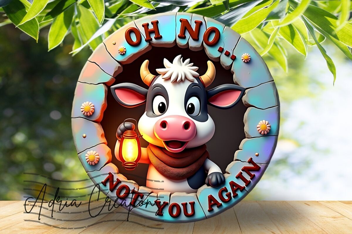
And then there is the cow. I put this in here for the people whose whole vibe is a joke, because not every wedding wants soft florals and a calligraphy serif. My old roommate is marrying a guy who proposed at a county fair, and a goofy 3D cow on the welcome sign is somehow exactly right for them.
It is a png with a little dimension to it, so it pops off the page more than flat clip art. She is planning to print it big and stick it at the barn entrance where they are having the reception. I have seen the mockup. It made me laugh out loud at my desk.
Fair warning, it is loud and it is silly, so it is not for a black tie ballroom. But if your people would find it funny, it commits to the bit harder than anything else here.
Questions Brides Ask Me
What does a wedding welcome sign say?
Mine said our two first names, our wedding date, and the word welcome at the top. That is the safe version and it works. A friend asked me this last month and I told her to keep it short, because the sign is read from across a lawn, not up close.
Some people add the venue or a tiny line like so glad you are here. That is fine too. Just resist cramming your whole love story onto it. I have seen that and people walk right past because it looks like a wall of text.
What size should it be?
Bigger than you think. I learned this the hard way. My first attempt was a 16 by 20 and it looked apologetic next to the easel. The sweet spot for a sign people read while walking up is around 18 by 24 or 24 by 36 for a poster.
Round signs are sneaky. A 24 inch round reads smaller than a 24 inch tall rectangle because of all the empty corners you lose. Go up a size if you are doing a circle.
Printable or hand-painted?
Honestly? Printable, unless you already letter beautifully or you have a friend who does and owes you a favor. Hand-painted is lovely when it is good and it looks like a ransom note when it is not, and you find out which one you are at 11pm two days before.
I print mine and tell nobody. Nobody has ever guessed. The trick is heavier cardstock or a real print shop, not your home printer on copy paper, which curls and looks cheap the second it is on an easel.
Before You Hit Print
Pick the sign that sounds like you and your person, print one test page on plain paper, and hold it up across the room before you spend money on the good stock. If it reads from the couch, it reads from the door.
And tape it down. Tape it more than feels reasonable. Trust me on the muddy easel.