Nobody told my guests the ceremony started at five. I figured the invitation said it, so why repeat myself. Then half the chairs were empty at 5:02 because everyone was still in the parking lot deciding if it was rude to walk in. A little sign by the door would have fixed that. I made one for the reception instead, the night before, and propped it on a chair near the bar.
Here is the thing about a timeline sign. It is the cheapest piece of stationery you will print and the one people actually read. They stand there with a drink, squint at it, and figure out whether they have time to find the bathroom before the toasts. You are not explaining your wedding. You are answering the one question everyone has, which is “how long until I can sit down.”
So these are the templates and sign blanks I kept open in tabs while I figured out my own. Some I printed, some a friend used at her August wedding and I stole the idea. A couple of the links below are affiliate links, so if you grab one a little something comes my way. Doesn’t cost you anything.
Quick note, a couple of these are affiliate links. If one ends up at your reception, it helps keep this little blog running and you pay the same.
A garden flag does the timeline if your wedding lives outside
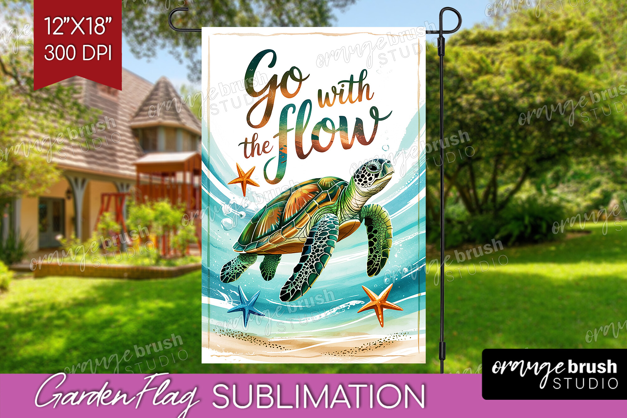
My friend Dana got married in her aunt’s backyard in late June and there was nowhere to lean a normal sign. Wind would have taken it. She used this garden flag layout instead, printed the events on it, and staked it right at the gate where people walked in. Worked better than the easel I lent her, which blew over twice.
You type the times down the middle and it reads from a few feet back, which matters when guests are filing past it single file. Ceremony 4. Toasts 6. Sparkler send-off 9. Done.
One gripe. The fabric look is great outdoors but it does not love a home printer if you size it down to paper. Dana sent hers to the copy shop on Cordell and had it printed on the heavier stock. On her inkjet the green went muddy.
The round laser-cut blank for a wedding that is a little woodsy
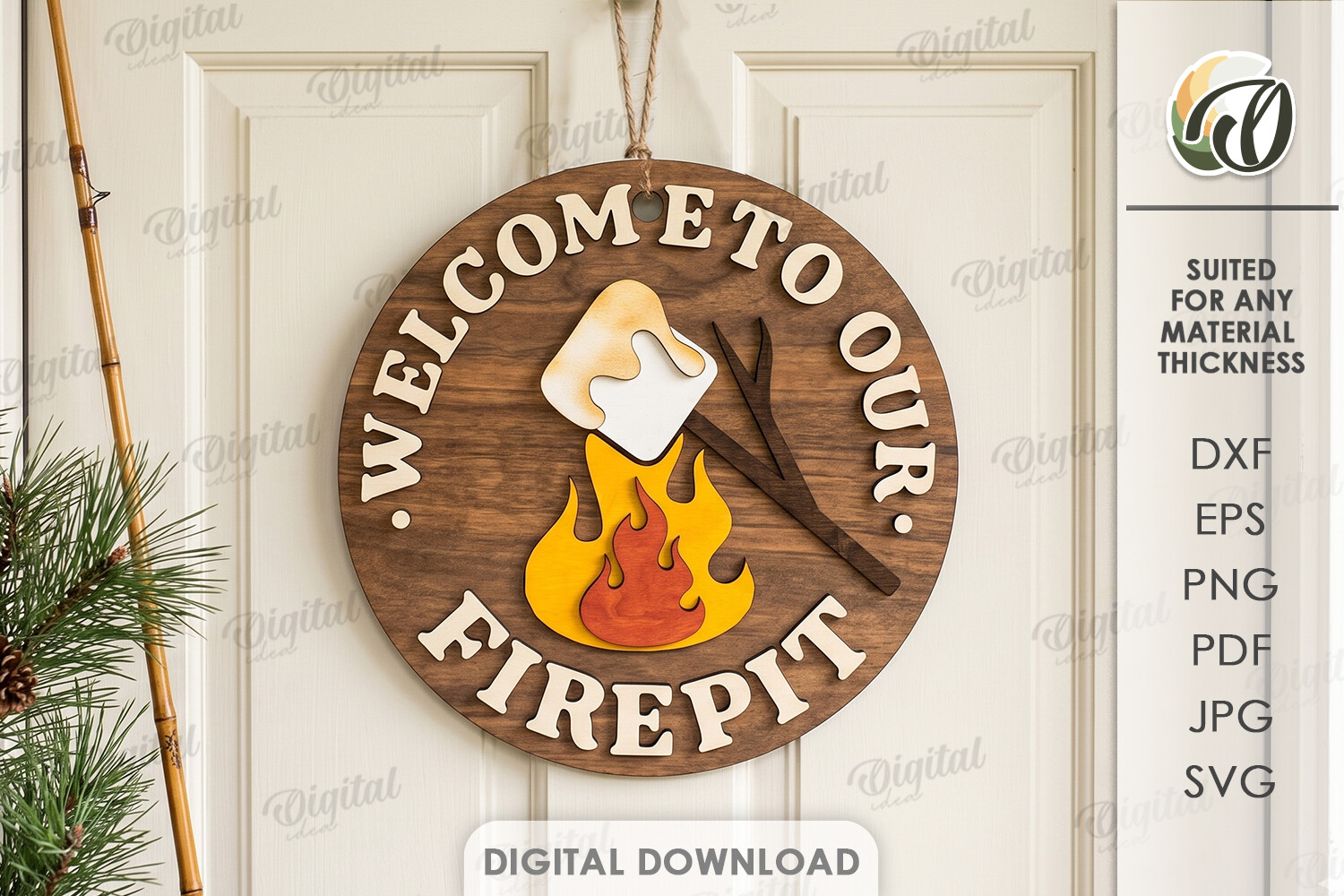
A coworker did a campground wedding, actual cabins and a fire pit, and a flat rectangular timeline would have looked wrong leaning on a log. This round laser-cut sign was the answer. She had the blank cut and added the order of events in vinyl across it.
Round is harder than it looks for a timeline because you only get so many lines before it gets cramped. She kept it to four. Arrive, vows, dinner, s’mores. That last one got the biggest laugh of the night.
The catch is you need a cutting machine or a friend with one to do the lettering, this is the blank, not a print-and-tape. If you are doing everything on a kitchen printer this one is not for you, and I say that as someone who owns nothing fancier than a six-year-old inkjet.
Pair the timeline with a guestbook prompt so the table earns its space
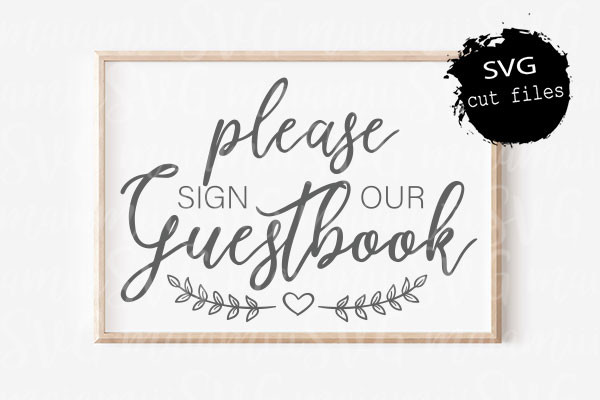
Here is a trick I wish I had used. Put your order of events sign on the same little table as the guestbook, and the timeline pulls people over while they wait their turn to sign. I learned this watching my neighbor’s reception, where both signs sat together and there was always a small friendly clump there.
This guestbook SVG is the second half of that pairing. You cut it, frame it, set it next to the timeline. People read when the cake is, then think oh right, I should sign the book.
One thing. It is an SVG, so you are cutting it, not printing it flat. I tried to shortcut once and print a similar file and it came out fuzzy at the edges. Cut it the way it is meant to go.
A small heart cut for the corner of the sign that feels bare
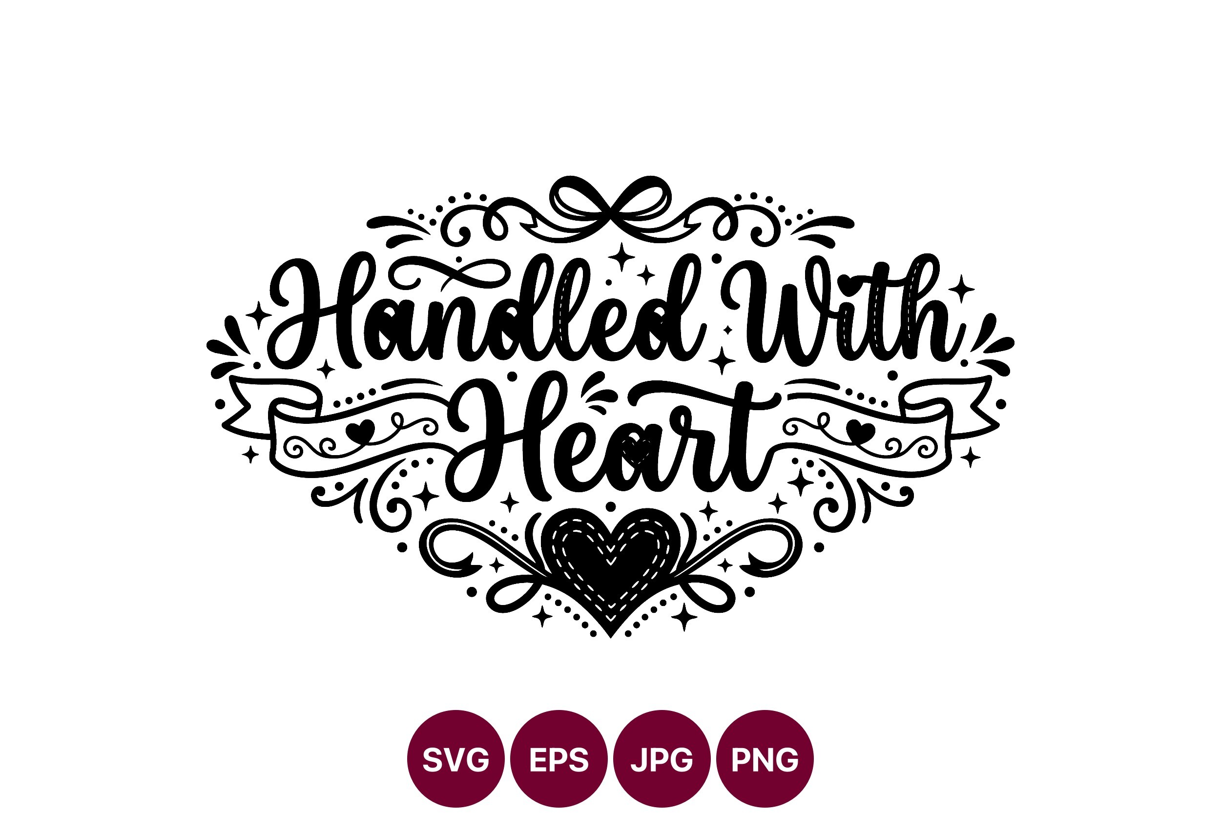
My first timeline sign looked like a spreadsheet. All times, no warmth. A friend who does crafts told me to drop a tiny graphic in one corner and the whole thing softens. This handled-with-heart design is the kind of thing I mean.
I cut a small one and tucked it under the last line of my reception schedule, bottom right, where there was empty space anyway. Took five minutes and the sign stopped looking like a parking notice.
My one note, keep it small. I sized mine too big the first cut and it fought with the text for attention. Second try, half the size, and it just sat there quietly doing its job in the corner.
Holiday-weekend wedding? This round bundle saved my July couple
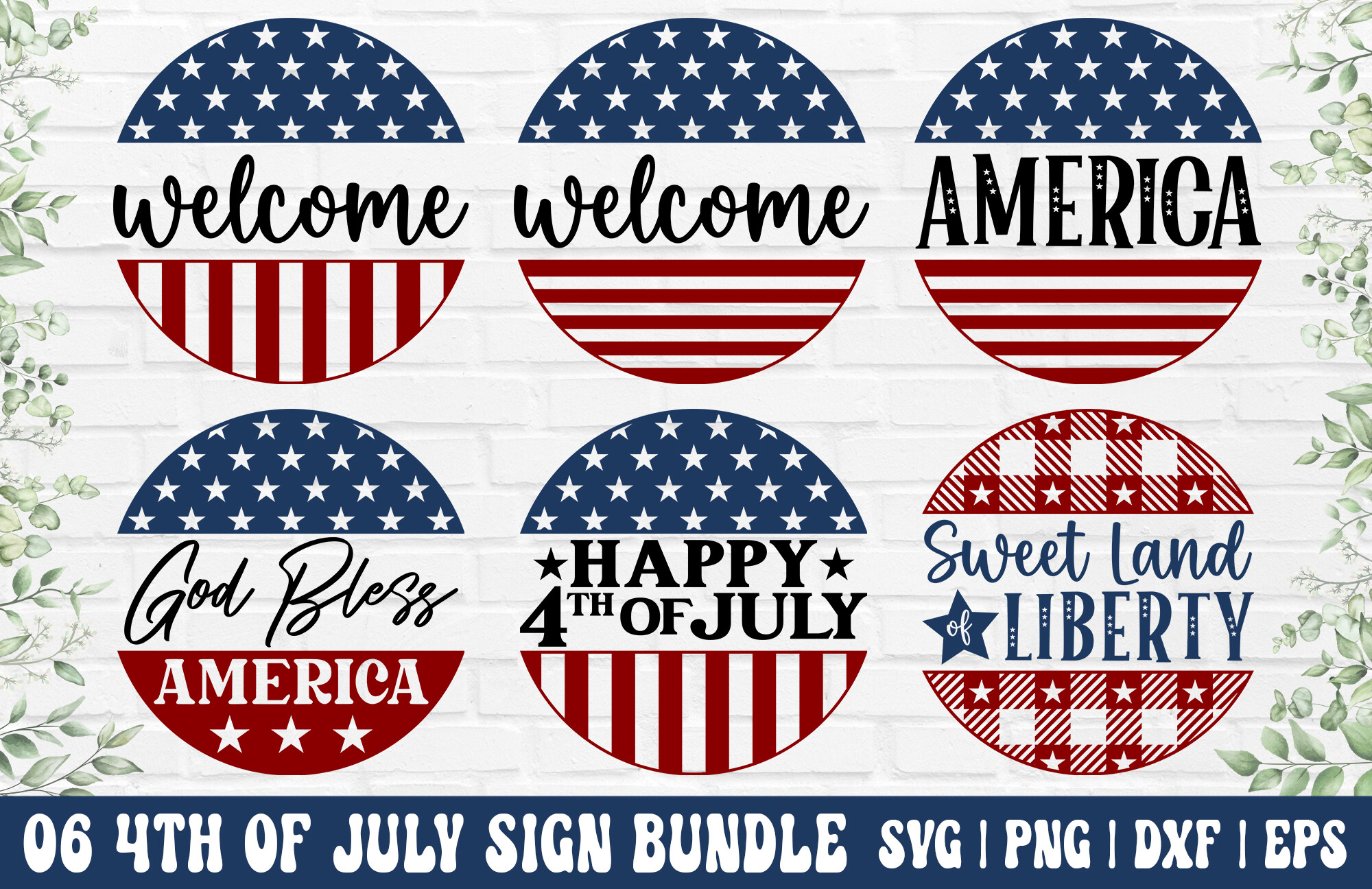
If you are getting married on the Fourth, your timeline sign basically has to acknowledge it, because half your guests planned a long weekend around your date. A bride I helped used this round sign bundle and worked the holiday right into the schedule. Ceremony, dinner, and then “fireworks, both kinds.”
The bundle part is the useful bit. You get a few sign layouts, so the timeline matched the welcome sign matched the bar sign without me designing three separate things at midnight.
The red runs hot on a home printer. She did a test page and the red looked almost orange, so off to the copy shop it went. The blue was fine. Just the red.
When the timeline needs a bit more flag-waving
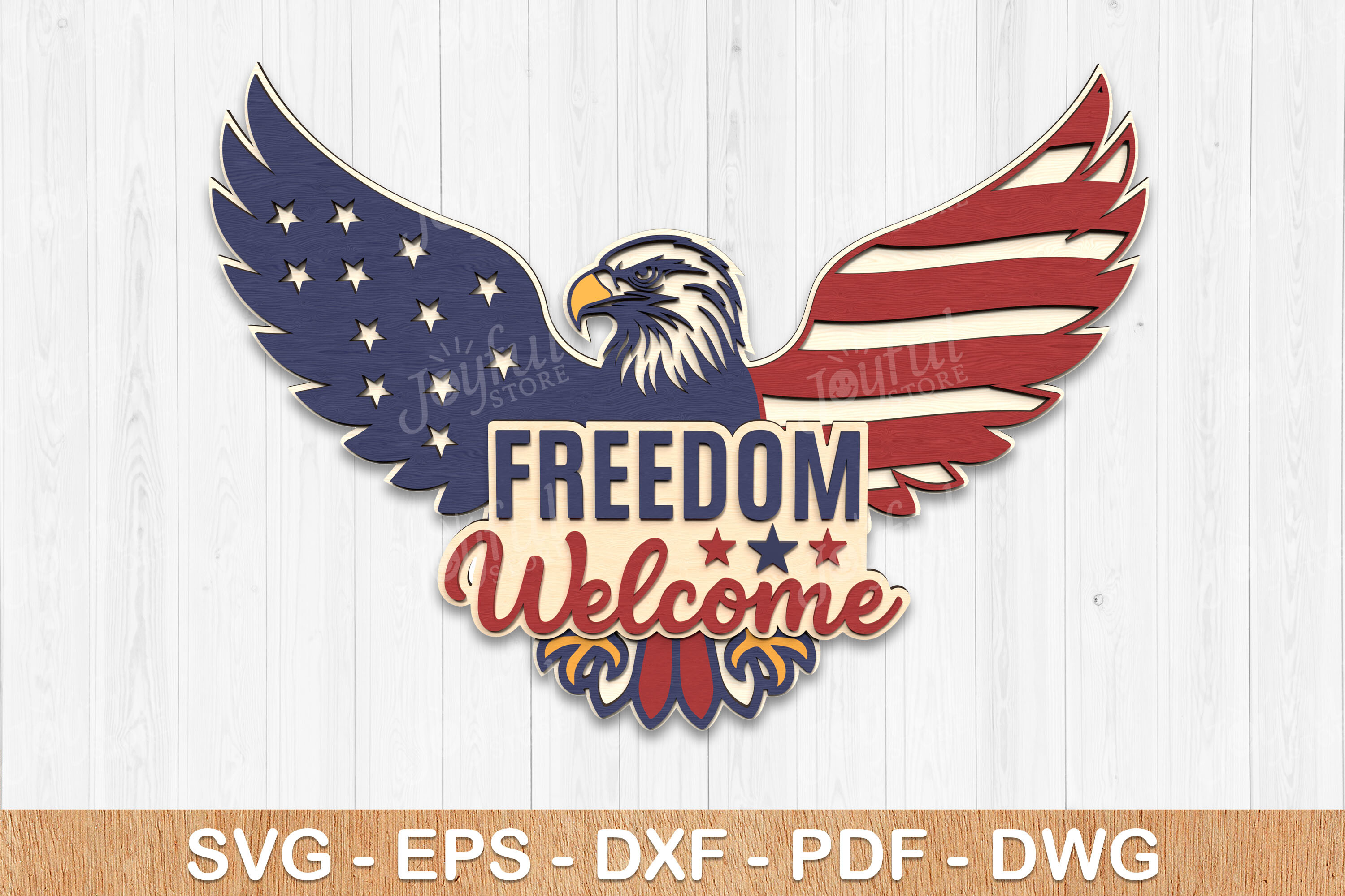
Some couples lean all the way into a patriotic theme and a tasteful little heart in the corner is not going to cut it. This eagle sign is for them. I would not put it at a garden wedding, but for a backyard barbecue reception on the third of July it fits.
You can use the sign as-is for decor or pull the layout and drop your order of events over the open space in the middle. The friend I think of who would love this is my uncle’s neighbor, who flies three flags year round.
It is busy, so be careful. If you cram a full eight-line timeline over an already loud design nobody can read either one. Keep the schedule to the big moments and let the eagle have its room.
The farmhouse bundle I would actually reach for again
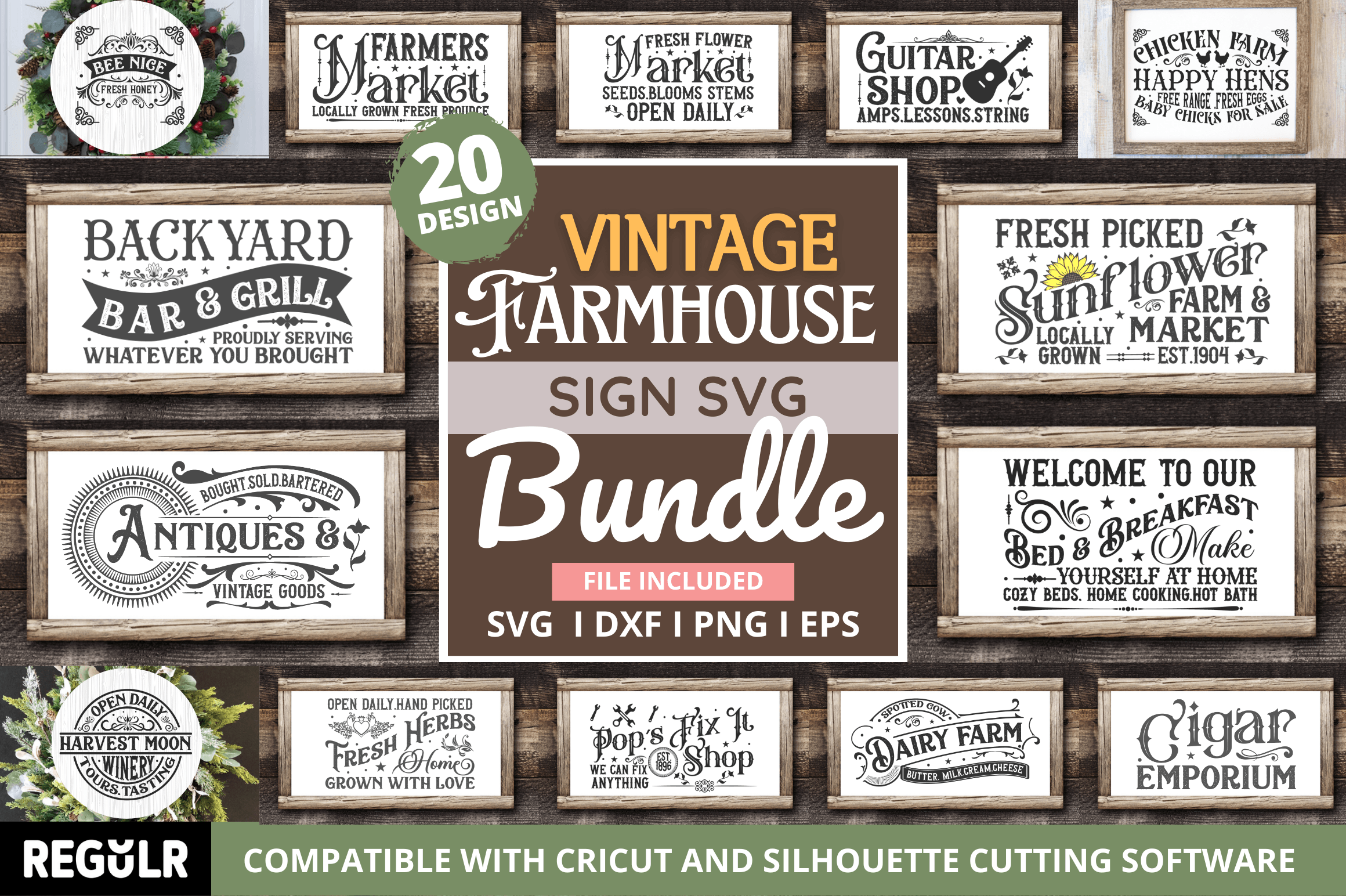
This is the one closest to what I used for my own reception. Plain, a little rustic, lots of room for text, which is exactly what a timeline needs. The bundle gives you several sign styles so your order of events doesn’t look like a stranger next to your other signage.
I printed mine at home for once, on the cream cardstock from the craft store two towns over, and it actually held up. Taped it to a thrifted frame I already had and leaned it on the dessert table.
The font ships a touch light for a dim barn. I bumped the weight one notch before printing the final stack, after one washed-out test page told me to. Small fix, big difference once the string lights were the only light in the room.
Things Brides Email Me About
What goes on an order of events sign?
Honestly, less than you think. Times and the big moments, that’s it. Ceremony, cocktails, dinner, first dance, last call. I tried to list every single thing on my first draft, including “cake cutting 8:15,” and it looked like a bus schedule.
Leave off anything guests don’t act on. They do not need to know when the photographer does the family shots. They need to know when food happens and when the music stops.
How detailed should it be?
Short answer, not very. If a guest has to stand there and read for more than ten seconds, it’s too much. Four to six lines is the sweet spot. A friend asked me this exact thing and I told her to write it out, then cross off half.
The one place to add detail is anything surprising. Outdoor ceremony, a gap before dinner, a shuttle leaving at a hard time. That stuff goes on. The obvious stuff stays off.
Where do I put it?
Wherever people stand around with a drink and nothing to do. By the bar, near the guestbook, at the entrance. I put mine by the bar and it was the most-read thing at my wedding by a mile.
Don’t bury it on a gift table in a corner. I did that with my welcome sign and watched maybe four people notice it all night. Eye level, near a bottleneck, where they’re already pausing.
Before You Commit to a Template
A timeline sign is the rare wedding thing that earns its keep and costs almost nothing. Print a test page, hold it across the room, squint. If you can read it from there with a drink in your hand, your guests can too.
Keep it to the moments people care about and put it where they’re already standing. That’s the whole job. Mine was a taped-together cream rectangle on a thrifted frame and it did more work than the flowers.