Our bar sign was a chalkboard I borrowed from a coffee shop and lettered myself with a paint pen at the kitchen table. By drink three my handwriting got loose. By the end of the night somebody had added a heart next to the gin and tonic and I never found out who. I keep that photo on my phone.
Here is the thing about a bar menu at a wedding. It is the sign people actually stand in front of and squint at, sometimes for a full minute while the line backs up behind them. So if your fonts are fussy or you crammed eight drinks onto a card the size of a postcard, that is where it falls apart. I have watched a friend’s cousin hold a menu two inches from her face trying to read what “The Hitched” was made of.
So these are the bar and drink menu printables I would grab. A couple I used, a couple I helped set up for friends after mine. Some of the links are affiliate links, which means if you buy through one it tosses a little change my way. Doesn’t cost you a thing.
Some links below are affiliate links. If you download one for your day, I earn a tiny bit and it changes nothing on your end.
Two drinks, his and hers, and the chaos that followed
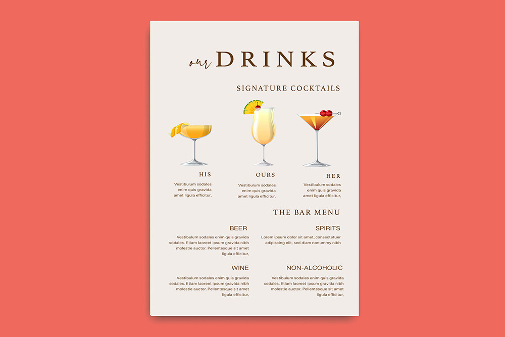
This is the layout I’d hand a couple doing the classic two-signature-cocktails thing. His and hers, or two named after the dogs, whatever. It gives each drink its own little zone so the names don’t smush together, and that mattered for us because ours had long names nobody could pronounce sober.
I printed a test on plain paper and stood across the kitchen. Read fine. The real one I did on a heavier ivory stock from the shop on Marigold Street because my home printer leaves these faint roller lines on anything pale.
One gripe. The space for the drink description runs a hair short, so if your cocktail has five ingredients you’ll be trimming words. I dropped “freshly squeezed” and nobody mourned it.
When you just want a sign that says relax, it’s free
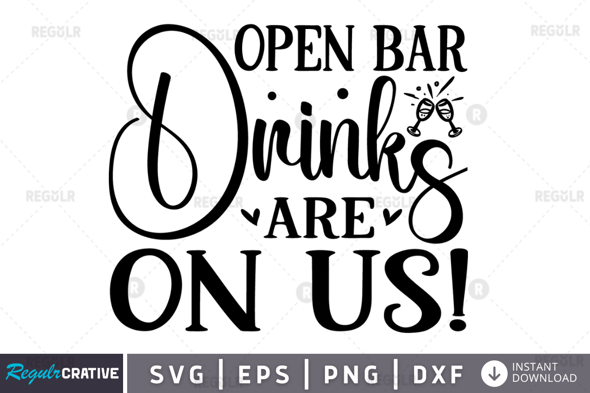
Sometimes you don’t need a menu, you need one cheeky line on a board by the entrance so Uncle Rob stops asking if there’s a tab. This is the “drinks are on us” cut file for exactly that. I helped my maid of honor weed it on her little Cricut at midnight, the week before her thing.
We stuck it on a piece of stained plywood her dad had in the garage. Took maybe an hour, mostly because we kept losing the tiny letter centers in the carpet.
The catch with cut files is the fine bits. The apostrophe in “us” was so small it lifted off the transfer tape twice. If you’re newish to vinyl, fatten the weeding margins or just expect to fish a stray dot of vinyl out of the rug.
The plain one I send people who panic about design
Not everyone wants florals and flourishes. My coworker wanted her bar card to look like a real restaurant menu, clean, no curlicues, and this is the one that did it. You type your drinks in and the spacing sorts itself out. She had it done on her lunch break.
She printed a stack at a print shop near her office, the FedEx by the train station, on a matte cardstock. Looked sharp propped in a thrifted brass frame.
My one note. The default font is on the thin side, so under the dim string lights at her venue it almost disappeared from a few feet back. She bumped the weight up before the final run. One wasted page to learn that, which is cheap.
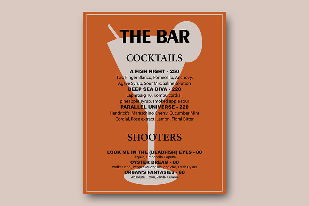
The workhorse card I actually printed twice
If I had to pick one straightforward printable bar menu to point a friend at, it’s this. No bundle, no extras, just a solid card you fill in and print at home or hand off to a shop. I set it up for a friend’s backyard reception in about twenty minutes while she made coffee.
We ran four cards total so people at both ends of a long bar could read without crowding. Printed them on regular cardstock from the craft store, the 110lb white, and they held up fine even after a few got splashed.
The niggle. The margins sit close to the edge of the page, closer than I like, so a home printer that grabs paper crooked will clip the top line. I fed every sheet one at a time. Annoying, but the cards came out clean.
The grab-everything pack for the indecisive among us
This one’s a whole set, happy hour cards plus the bar menu pieces, and I’d reach for it if you haven’t locked your style yet or you want signage that matches across the night. My cousin used it for a cocktail-hour-then-dinner setup and the pieces all spoke to each other, which she cared about more than I expected.
She printed the happy hour cards small, tent-folded them, and scattered them on the high-top tables. The big menu went by the bar. Same fonts throughout, so it read as one thing.
Fair warning, a bundle is more files to sift through, and she did spend an evening figuring out which template was which. Once she had it sorted it went fast. The first hour was a lot of opening and closing windows.
The soft purple one that matched a garden too well
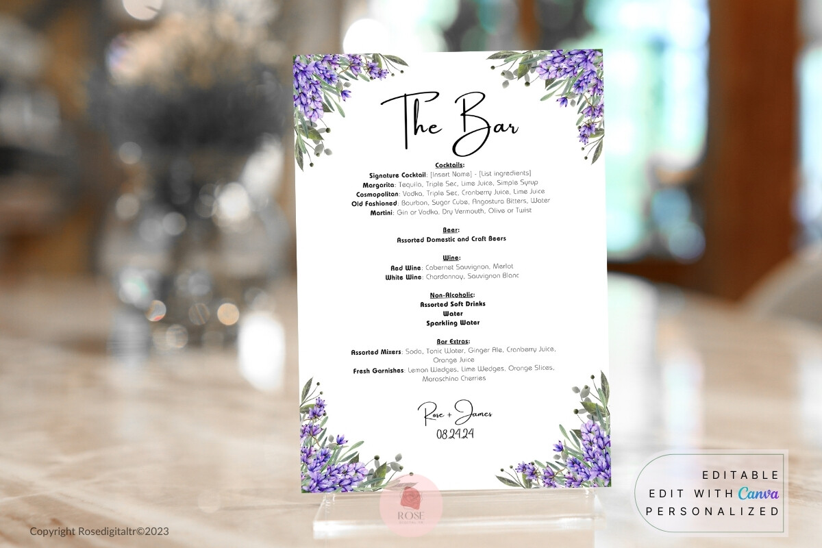
For anyone leaning into a soft, garden palette, this lavender bar menu is the move. A neighbor of mine got married in her in-laws’ yard in late June, lilacs everywhere, and this slotted right in. I helped her tweak the names and we were done before her tea went cold.
She printed it on a slightly textured stock, eggshell, and the purple came out muted and pretty rather than loud. Held it up across the patio, still readable, which is my whole test.
The one thing. Pale colors and home printers are a gamble, the lavender on hers printed lighter than on screen. She ended up taking it to a shop to get the color right. If your printer runs cool, plan for that.
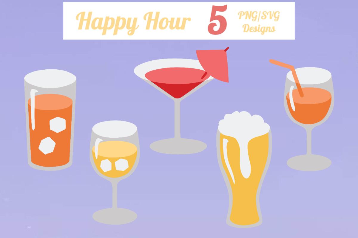
Little cocktail drawings for when words aren’t enough
This is the add-on rather than the main event, a set of bartender and drink illustrations you can drop onto a sign to give it some life. I used a couple of the little glass drawings on our reprinted menu after the chalkboard era, mostly to fill an awkward empty corner.
The martini one ended up tiny in the bottom right of the card and people genuinely pointed at it. Cost me nothing extra, just a few minutes nudging it into place.
Where it bit me. The illustrations come at one size and scaling them up too far got fuzzy on the print. Keep them small, like accent-small, and they stay crisp. I learned that after printing one blown-up version that looked like a wet stamp.
The Questions I Get Most
What goes on a wedding bar sign?
Honestly? Less than you think. The drinks you’re offering, what’s in the signature ones, and maybe a line about beer and wine being available. That’s it.
A friend asked me this while she was trying to list every single mixer she owned. I told her to cut it to the two or three drinks people would actually order and let the bartender field the rest. Her sign went from a wall of text to something you could read in one glance, and the line moved faster too.
How do I name signature drinks?
Tie it to something only your people would get. We named ours after the street we met on and the dog. Easy to say, meant something to us, and it gave guests a thing to ask about.
I’d steer away from anything too clever to pronounce after a few rounds. We learned that the hard way. “The Beaumont” turned into “the boozy one” by nine o’clock and frankly that was a better name anyway.
What size for a bar menu?
Depends where it’s sitting. A single card in a frame on the bar, I’d go 5×7 or bigger so the back of the line can read it. If you’re scattering little ones on tables, half that is fine.
My rule, and it’s not scientific, is print one, prop it where it’ll actually live, then walk to the far end of the room and squint. If you can read it from there, you’re set. If you’re leaning in, go bigger. I’ve reprinted a too-small one the morning of and would rather you didn’t.
One Last Thing
None of this is the part of the wedding anyone remembers in ten years. But it’s the sign your guests genuinely stand in front of, drink in hand, deciding what to order, and a clear one keeps the line happy. Pick a template that reads from across the room and don’t overthink the rest.
I still have that borrowed chalkboard photo, mystery heart and all. Print a test page first, prop it up, squint from the couch. If it works from there, you’re done, go enjoy your own party.