My cousin called me in a small panic last spring because her invitations came back from an online printer looking gray. Not black. Gray, like a photocopy of a photocopy. She had three weeks and a deposit she could not get back. We ended up redoing them ourselves on a Sunday, and the second batch read formal across the room. That is the whole trick with black and white. It either looks like a tuxedo or it looks like a tax form, and the difference is almost all in the contrast.
I keep coming back to black and white because it does not date and it photographs clean. No color to clash with your flowers, no trend you regret in a year. But it punishes a cheap printer harder than anything else. A pale gray on warm paper, your lines go fuzzy, and suddenly the most formal palette in the world reads soft. I print a test page first, every single time, on whatever junk paper is in the tray.
So below are the files I trust for this look. A few I used myself, the rest I have handed to friends who do not design and watched come out fine. Some of these are affiliate links. If you grab one it kicks a little back to me, and it does not change your price at all.
Full disclosure, a few links are affiliate links. Use one and a few cents come back to me, never anything added to your price.
A thin floral frame that does not fight your names
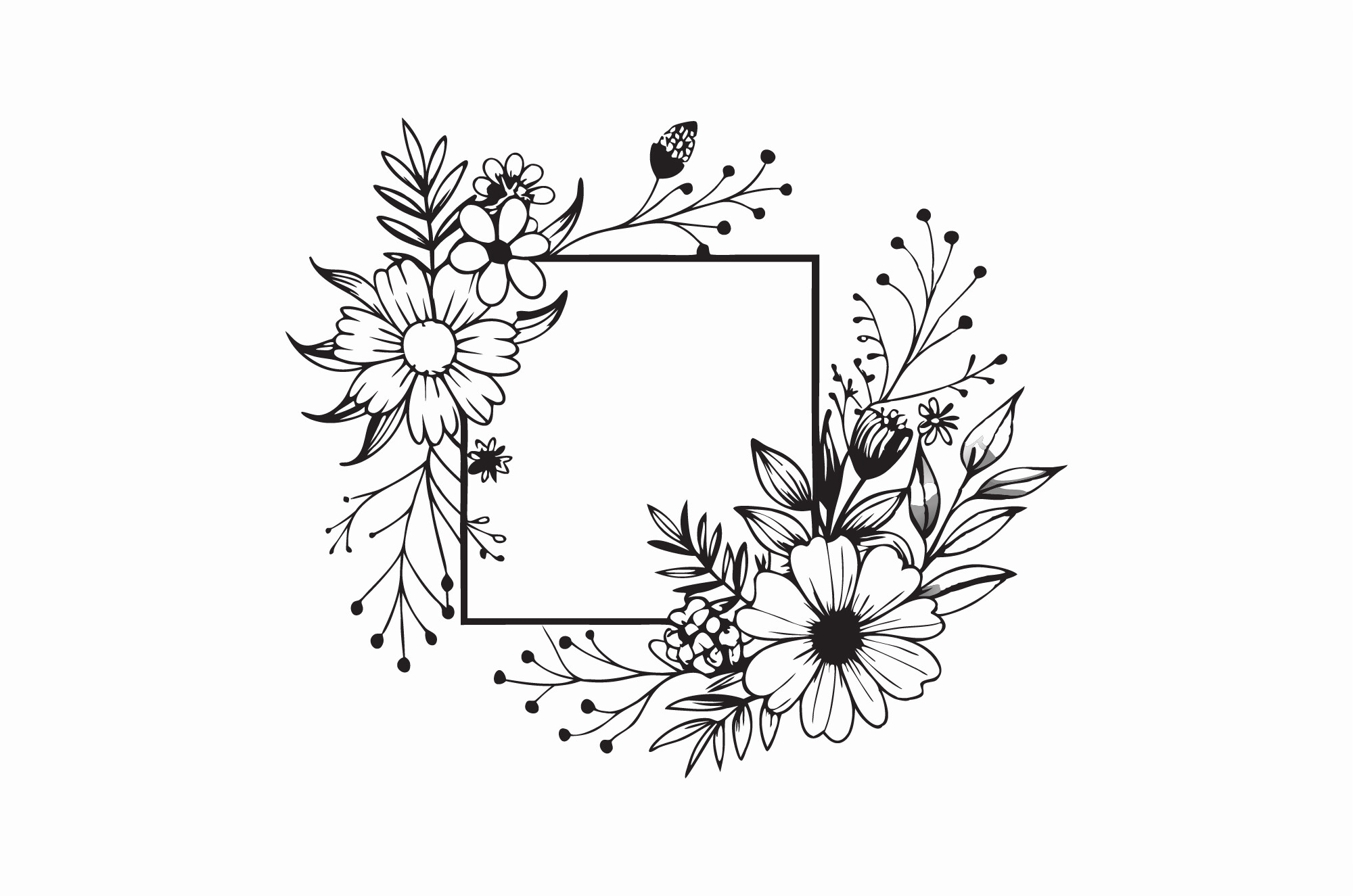
I sent this to my cousin first, the one with the gray invitations. A simple black border with a little floral running through the corners, nothing loud. You drop your names in the middle and the frame just holds them. She typed hers, printed one on plain paper, and we knew in about a minute it was the one.
The corners are where these usually go wrong. Most frames pile on so much detail that your printer smears the corners into a blob. This one stays open. We ran the real batch at a FedEx counter near her office because her home printer could not hold a crisp black line.
One gripe. The default frame sits a hair too close to the page edge for a home tray, so I nudged everything in about a quarter inch before the real run. Easy fix, but check it before you commit a stack.
Little black bows for the parts that feel too plain
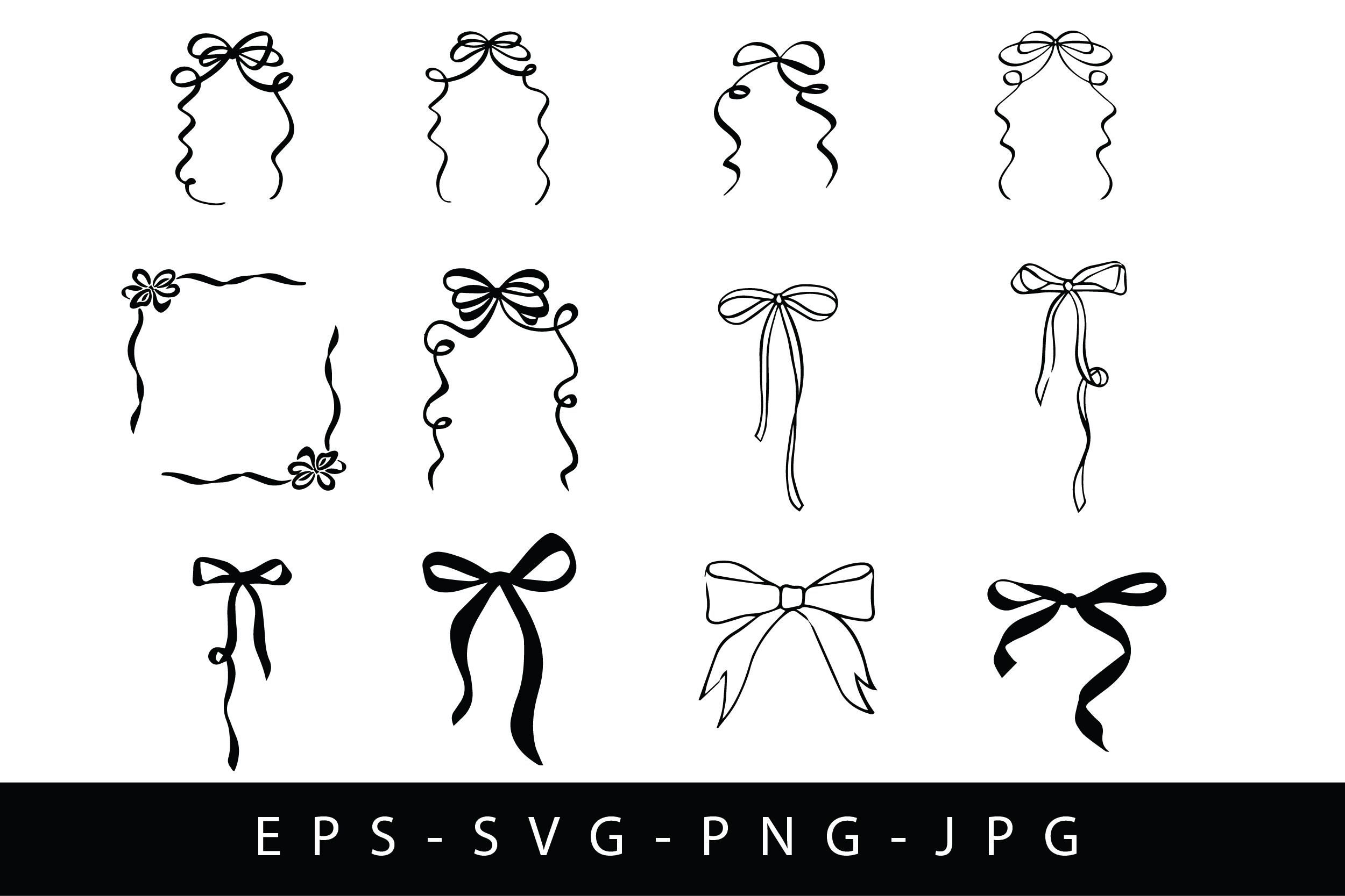
Black and white can tip into stark if you are not careful, and these bows pull it back without adding color. I scattered two tiny ones on a set of menu cards for a friend’s rehearsal dinner. Just at the top corners. They softened the whole card and nobody could tell why it looked finished.
They come as separate little shapes so you place them where you want, which I like because I always end up wanting fewer than I think. Started with five on a card. Cut it to two. Two was right.
The catch is sizing. At full size a bow looks like a kid drew it on. I shrank mine down small, almost a footnote, and that is when they read elegant instead of cute.
Lace flourishes when you want quiet, not loud
This one I used on my own save-the-dates years ago, before I knew anything. A delicate lace flourish, white space doing most of the work, one motif at the top of the card. It reads old and formal in the best way, like something your grandmother would have kept in a drawer.
Because it is so fine, it needs a real printer. I learned that at home when mine streaked the lace into a mess at 11pm the Thursday before mailing. Took them to a copy shop on Beale the next morning and they came out sharp. Worth the eight dollar trip.
My one note. Keep it to a single flourish per card. I doubled it once thinking more lace meant more formal, and it just looked busy. One is the whole point.
A whisper of pink for the people who want a little softness
Not everyone wants pure black and white, and my maid of honor was one of them. She wanted formal but not cold. A few pale pink blooms in the bottom corner of an otherwise black and white invite, and it warmed up immediately without going girly.
I like that the blooms are soft enough to live next to sharp black type. They do not compete. We put one cluster at a bottom corner and left the rest of the card clean, and that restraint is what kept it formal.
Watch your printer with the pinks though. Mine ran them a shade darker than the screen, more dusty rose than blush. Print a test, hold it up, decide if you love that shift before you order ink for a hundred cards.
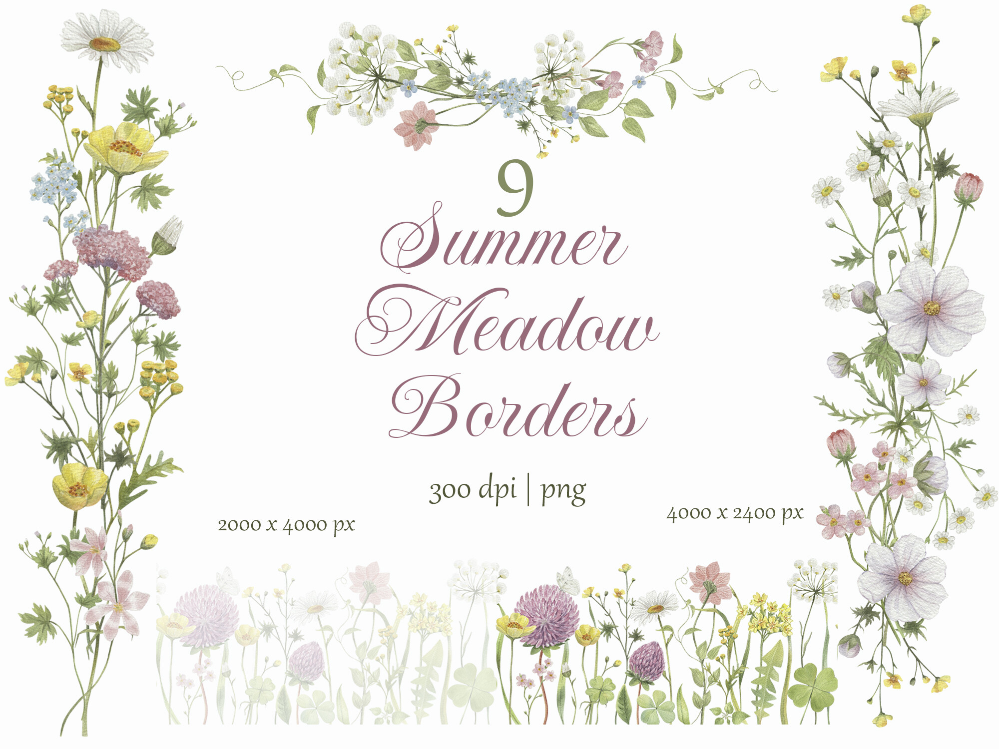
Botanical line work for a garden ceremony that still wants formal
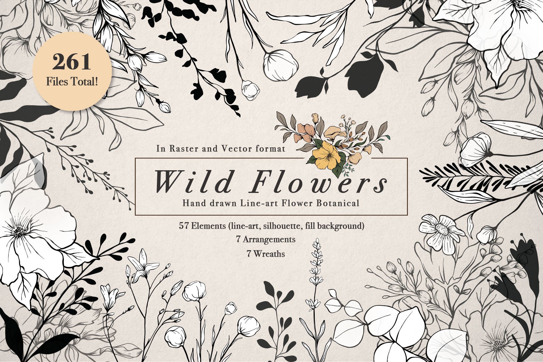
A coworker getting married in a botanical garden asked me for something that nodded to the venue without going full floral riot. These fine line wildflowers in black did exactly that. Thin, drawn, almost like a sketch, and they hold up against serious type.
We ran them along one edge of the invitation, like a margin of stems, and left the center alone. Black line on white reads formal even with flowers all over it, which surprised her. Surprised me too the first time.
My gripe is the line weight. A few of the stems are so thin a home printer just drops them. I bumped the contrast and printed at a shop, and the missing lines came back. On a laser printer they were fine straight away.
Ready-made borders for when you cannot face designing one
Borders are the part that breaks people. You spend an hour trying to space a frame and it ends up lopsided. These come already built, so you just slide your text inside and you are done. I gave this set to a friend who swears she cannot design anything, and she had a finished invite before her coffee went cold.
The meadow ones are soft watercolor, so they pair oddly well with strict black text, that contrast of loose and tight. We picked the most muted border in the set for a black and white look and ignored the brighter ones.
One thing. A couple of the borders run wider than a standard invite, so they got clipped on the first print. I scaled the border down to fit the card rather than cropping it, which kept the corners intact.
One bold stroke when black and white needs a jolt
This is the rebel of the bunch. A single hot pink brush stroke under the couple’s names, everything else black and white and severe. My neighbor did this for her city hall wedding and the invitation looked like a gallery card. Formal, but with one loud breath of color.
Use it sparingly is the only rule. One stroke. We tried two and it looked like a paint accident. One stroke under the names, and the whole thing snapped into something intentional.
The pink prints hot, no surprise, and home printers often cannot hit that saturation. Hers came out a sad salmon at home, so she sent the file to a shop on Carr Street and got the real punchy pink. Costs a few dollars more for that one color to land.
The Questions I Get Most
Are black and white invitations too formal?
Honestly? They can read very formal, but that is a feature you can dial down. I worried about this for my own wedding and it turned out the warmth comes from the wording, not the colors. A stiff black and white card softens the second you write it in plain, friendly language instead of stuffy script.
If you want it less formal, add one soft element. A tiny bow, a pale bloom, a rounded font for the names. My neighbor kept hers all black and white for a city hall do and it suited the courthouse perfectly. Depends entirely on where you are getting married.
Can I add color accents?
Yep, and most of the files here let you. The trick is restraint. I have watched people add three accent colors to a black and white invite and turn it into a circus. One color, used once or twice, is the sweet spot.
My maid of honor added pale pink blooms to one corner and stopped there, and it stayed formal. A single hot pink stroke can work too if you are braver. Just print a test, because color almost never comes out of a home printer the way it looks on your screen.
What font fits?
I learned this one the hard way. I picked a delicate thin serif at 1am for my save-the-dates and it vanished on dim cardstock. So my real answer is, pick a serif with enough weight to survive your printer, then test it across the room before you trust it.
A classic serif for the names and a clean simple font for the details is hard to mess up. Skip the swirly script for anything small like dates and addresses, because it turns into mush at that size. Two fonts, max. Three and it starts to look like a flyer.
One Last Thing
If you do one thing, print a test page before you order a thing or buy the good cardstock. Black and white lives or dies on a sharp black, and your home printer might not have it in it. Mine does not. I have a copy shop two minutes from my place that I trust with anything dark, and that eight dollar habit has saved me more wasted cardstock than I can count.
Any of these files will get you a formal card if you keep it simple and let the white space sit. Pick one, type your names, hold the test up across the room, and squint. If it still reads from the couch, you are done.