Our first draft of the invitation said “request the honour of your presence” and my fiance read it out loud and laughed. We are not honour-of-your-presence people. We met in line at a taco truck. So I scrapped it and started over, and the wording I landed on took longer than the dress.
Here is the thing nobody warns you about. The words on a wedding invitation are eight or nine lines total, and you will agonize over every single one. Who is hosting. What time. Can people bring a date. I sat at my kitchen table with three printed drafts and a glass of wine and read them to my maid of honor over speakerphone until one of them stopped sounding weird.
So below are the lines we actually used, plus the ones friends sent me when they were stuck. I print every wording test on plain paper first and read it from across the room, because what looks fine on a screen reads stiff on a card. A few of the design links are affiliate links, so if you grab one it tosses a little something my way. Doesn’t cost you a thing.
Quick note, a couple of these are affiliate links. If one ends up at your reception, it helps keep this little blog running and you pay the same.
The first card we sent had one of these behind the names

For our save-the-dates I wanted the wording to feel loose, not stamped. We went casual right out of the gate: “We’re getting married! Save the date.” Then our names, then “details to follow.” That was it. Four lines. And to keep it from looking like a memo I dropped one of these glitter brush strokes behind our names so the text had something soft sitting under it.
I printed a test on copy paper and held it up. The stroke read warm, the names popped, and the whole thing stopped looking like a Word document. My friend Dana used the same trick for a navy invite and just recolored the stroke to gold.
One gripe. The glitter is a real PNG glitter, so on a cheap home printer it can go a little muddy. I sent mine to the print shop on Carroll and it came out crisp. At home it looked like wet sand.
Where I figured out the hosting line, finally
The hosting line broke my brain for a week. My parents paid for part of it, his mom for part, and we covered the rest, so I had no idea whose name went up top. I called my aunt, who has been to a hundred weddings, and she said just write “Together with their families.” So that is what we used. “Together with their families, Nora and Sam invite you to celebrate their marriage.” Done. No politics.
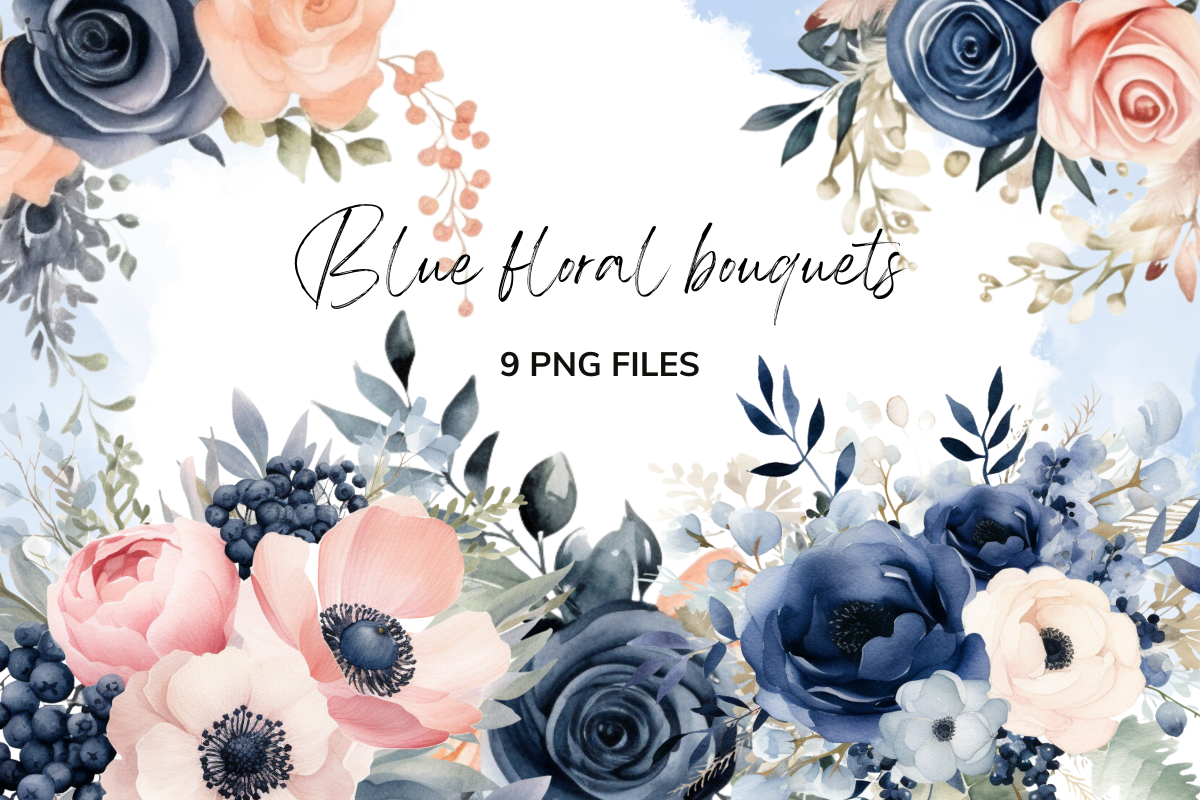
If your parents are footing the whole bill, the classic line still works: “Mr. and Mrs. James Whitfield request the pleasure of your company.” I helped my coworker word hers that way because her dad really wanted the formal version, and honestly it looked beautiful with these navy florals running down the side.
The navy is deep, almost ink. My one note: it eats thin fonts. I had to bump the font weight so the names didn’t disappear into the flowers. Took two wasted sheets to notice.
The little line that fixed our time and dress code mess
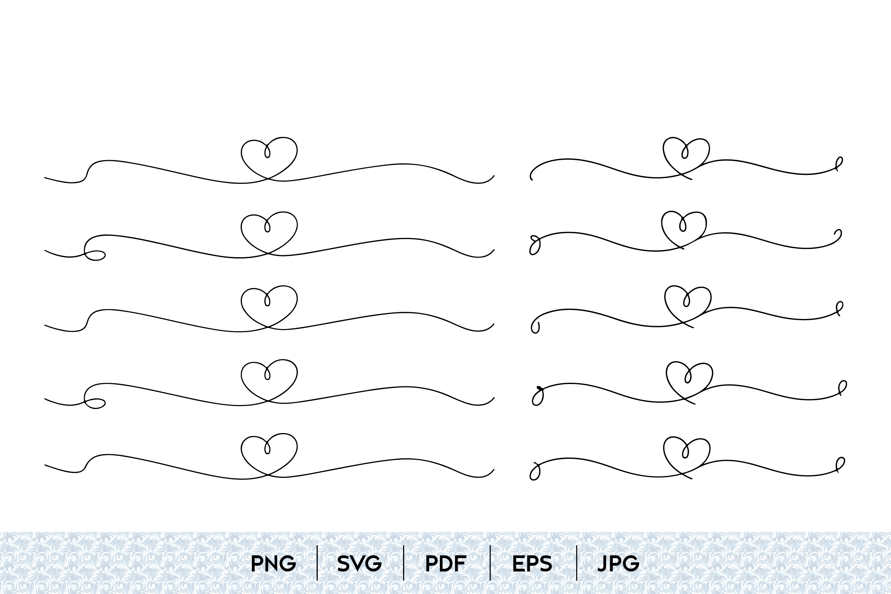
Our time-and-dress-code section looked cramped. I had “Half past four in the afternoon” and “Cocktail attire” smashed together and it read like fine print. So I stuck one of these little heart dividers between the ceremony time and the dress code line, and suddenly each part could breathe.
For the wording itself we kept it plain: “Ceremony at 4:30 in the afternoon, dinner and dancing to follow. Garden cocktail attire.” My one regret is not adding “the lawn is grass, ladies” because three people wore stilettos and aerated the venue. Live and learn.
The set is continuous line art, so it scales clean and doesn’t pixelate when you shrink it down to divider size. I used the smallest heart. The bigger ones felt like clip art.
What I put at the top of the formal version
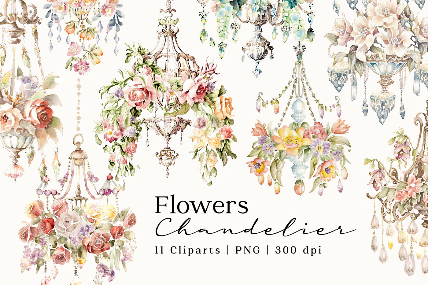
When my friend Priya wanted a black-tie invite, plain dividers weren’t going to cut it. She needed something that announced the tone before anyone read a word. We used this chandelier watercolor centered at the top, and under it the formal wording: “The honour of your presence is requested at the marriage of.” The chandelier did the heavy work of saying dress up before the words even got there.
We printed her a proof on matte cardstock and the watercolor held its bleed nicely, none of that flat printed look. She paired it with deep burgundy ink and it looked like it cost a fortune. It did not.
Gripe: it is a tall graphic, so it pushes your wording down the card. On a smaller invite size you lose room fast. She went up one card size to fit it.
The shape I built the whole layout inside
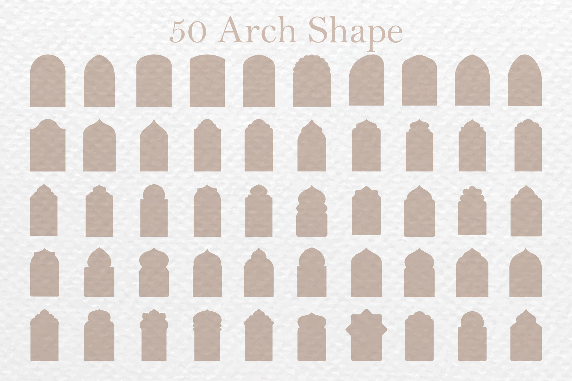
I am not a designer, so framing the wording was the part I dreaded. Then a friend who does this for a living told me to put everything inside an arch. I dropped this arch vector in, centered all our lines inside it, and the whole invitation suddenly had a spine. Names at the top of the arch, date in the middle, time and address at the base.
It is an SVG, so I scaled it to fill the card without it going blurry, and I recolored the outline to match our sage palette in about a minute. Best two dollars in the whole project.
One catch. If you fill the arch with a solid color, your home printer will guzzle ink and probably streak. I left mine as a thin outline and printed it at the copy place near the train station. Way cheaper, way cleaner.
How we worded the plus-one without sounding cheap
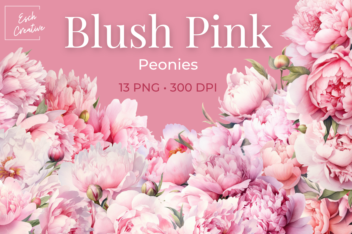
The plus-one question is the most awkward line on the whole card, and I rewrote ours four times. We did not want a free-for-all but we also did not want to sound stingy. What worked was putting it on the RSVP card, not the invite: “We have reserved ___ seats in your honor.” People fill in their own number and it self-regulates. My sister-in-law used the softer “Adult reception to follow” line to handle the kids question the same gentle way.
For her RSVP cards she ran these blush peonies along the bottom edge and the whole awkward seat-count thing suddenly felt warm instead of administrative. Peonies have that effect.
The blush is genuinely blush, not hot pink, which I appreciated. My only note: it is light, so on ivory cardstock it nearly vanishes. On white it sings. Test it on your actual paper first.
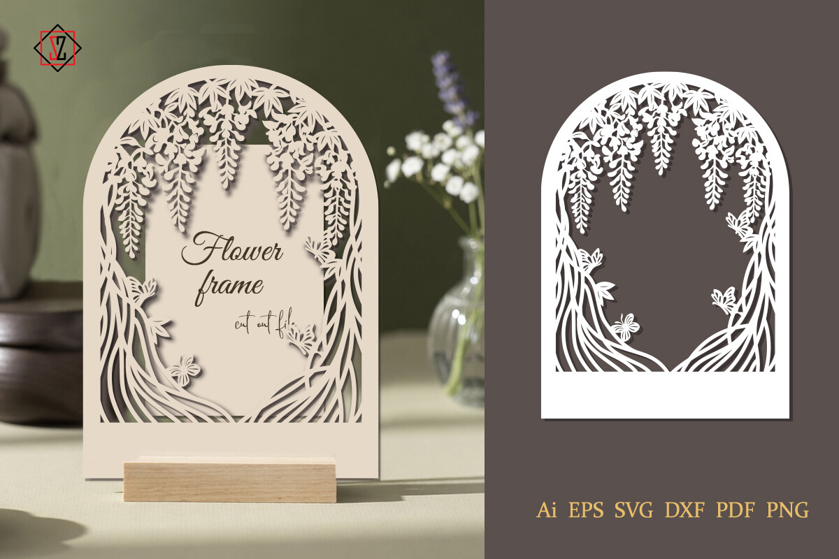
The detail card where I hid the website link
Nobody wants a giant URL crowding the main invitation. So we shoved all the logistics, the website, the hotel block, the parking situation, onto a separate little details card. The wording stayed friendly: “For directions, registry, and all the boring stuff, visit norandsam dot com.” That line made my grandmother laugh, which was the goal.
I framed that card with this lupine cut file. It is a cut file, so I actually ran it through my machine and made a few real cut-out detail cards for the head table, then used the same frame flat-printed for the rest. One file, two jobs.
Gripe: lupines are tall skinny flowers, so the frame is more vertical than wide. On a landscape card it fought me. I rotated my whole layout to portrait and then it sat right.
What People Keep Asking
How do I word a wedding invitation?
Honestly? Start by writing it the way you’d text it to a close friend, then formalize from there. When I was stuck I wrote “Nora and Sam are getting married, come watch, food after” and then slowly dressed it up until it sounded like a card and not a group chat.
The bones you actually need: who’s hosting, a request line (“invite you to celebrate” or the fancier “request the honour of your presence”), the two names, the date, the time spelled out, the place, and a reception line. Seven things. Get those down and the rest is just deciding how formal you want to sound.
What is the hosting line?
I had no clue about this one until my aunt explained it. The hosting line is just the first line that names who is throwing the party, traditionally whoever pays. “Mr. and Mrs. Whitfield request the pleasure of your company” means her parents are hosting.
But nobody actually splits the bill cleanly anymore, so the line everyone reaches for now is “Together with their families.” That’s what we used because three different people chipped in and I was not about to rank them on a card. It sidesteps the whole thing.
How do I mention dress code?
Short answer, put it on the lower corner of the invite or on the details card, never buried in a paragraph. A friend asked me this and I told her people genuinely do not read the middle of a card, they scan the corners.
Keep it to two words if you can. “Cocktail attire.” “Black tie.” “Garden formal.” We added “the ceremony is on grass” as a hint and I wish I’d made it louder, because the heels-in-the-lawn situation was a whole thing. If your dress code is unusual, your wedding website is the place to spell it out in full.
Before You Print a Stack
I still have one of our test invitations taped inside a cabinet door, the version with the typo where we invited people to our “marraige.” I keep it because it reminds me how many drafts it took to get eight lines right.
My advice, steal the lines that fit and print one on plain paper before you commit to the nice cardstock. Read it from across the kitchen. If it sounds like you and not like a greeting card factory, you’re done. Go pour the wine.