We sent our save the dates in March, three weeks late, because I kept changing the font. My fiance found me at the kitchen table at midnight with eleven test prints fanned out like a card trick, and he picked the one I’d already thrown in the recycling. He was right. I fished it back out.
Here’s the thing about modern save the dates. They look the simplest, so people think they’re the easiest to get right, and then they print a name in a typeface that’s two sizes too small and you can’t read it from arm’s length. Clean is harder than busy. There’s nowhere to hide a wobble. One crooked line on a card with a hundred swirls, nobody notices. One crooked line on a white card with eight words, that’s all anyone sees.
So these are the seven I either used or sent to a friend last spring when she froze up over her guest list. I print one on plain paper first, prop it against the toaster, walk to the doorway, and read it from there. If I can, it ships. A couple of links below are affiliate links, so if you grab one it kicks a little back to me. Doesn’t cost you anything.
Quick note, a couple of these are affiliate links. If one ends up at your reception, it helps keep this little blog running and you pay the same.
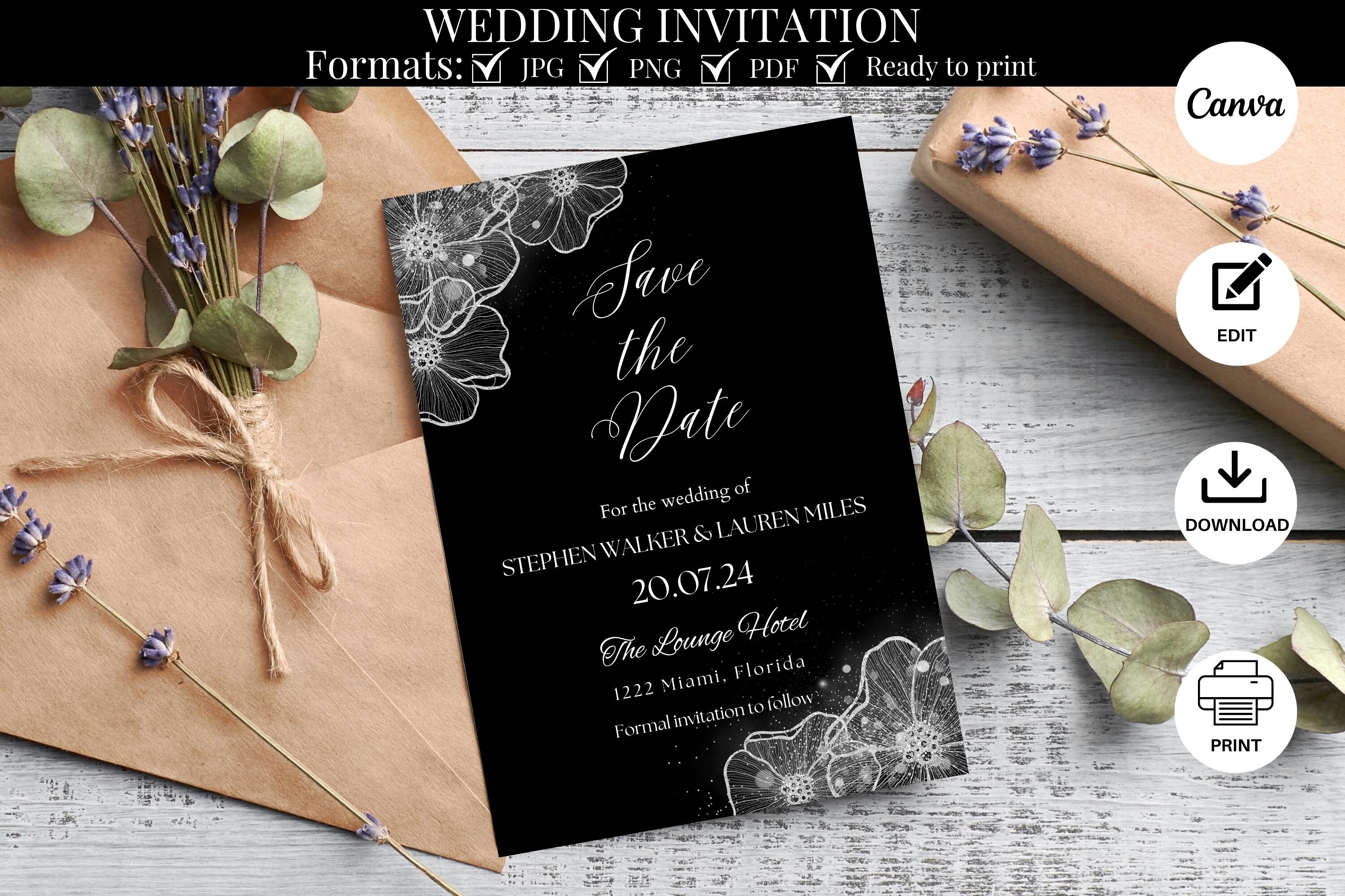
Script that doesn’t go full wedding-cake on you
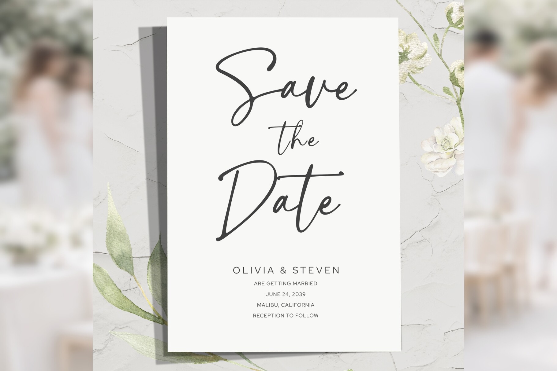
I’m wary of script. Half of them look like a perfume bottle. This one keeps the swoop on the names and goes plain block for the date and the website, which is the whole reason it reads from across the room. I typed our names in, printed it on copy paper, and my roommate guessed both of them right from the couch without squinting. That was my test, honestly.
It held up when I changed the date too. We had to bump our wedding back a week after the venue double-booked, and I dreaded reopening the file. Took two minutes. Nothing slid around.
One gripe. The flourish on the capital letter runs close to the top edge, so if your printer eats margins like mine does, nudge everything down a few millimeters before you commit to the nice paper. I learned that on a sheet of 110lb I can’t get back.
The fancy one, for when you’ve got a guy with a Cricut
My cousin Dana has a laser cutter in her garage that she mostly uses for coasters, and this is the file I sent her when she offered. The cut-out border is delicate. Like, snowflake delicate. It came off the machine and I held it up to the window and it looked like something you’d actually pay a stationer for.
This is not the print-at-home-on-a-Tuesday option. You need the cutter, or a friend with one, and patience for the bits that snap if you breathe on them. We wrecked two before Dana figured out the speed setting.
Worth it in person, though I’d only send these to the people who’d notice. We did about twenty for close family and printed plain ones for everyone else. Nobody compared notes. The catch is the weeding, picking out the tiny cut pieces with tweezers at her kitchen counter for an hour while we ran out of wine.
Skip the post office entirely
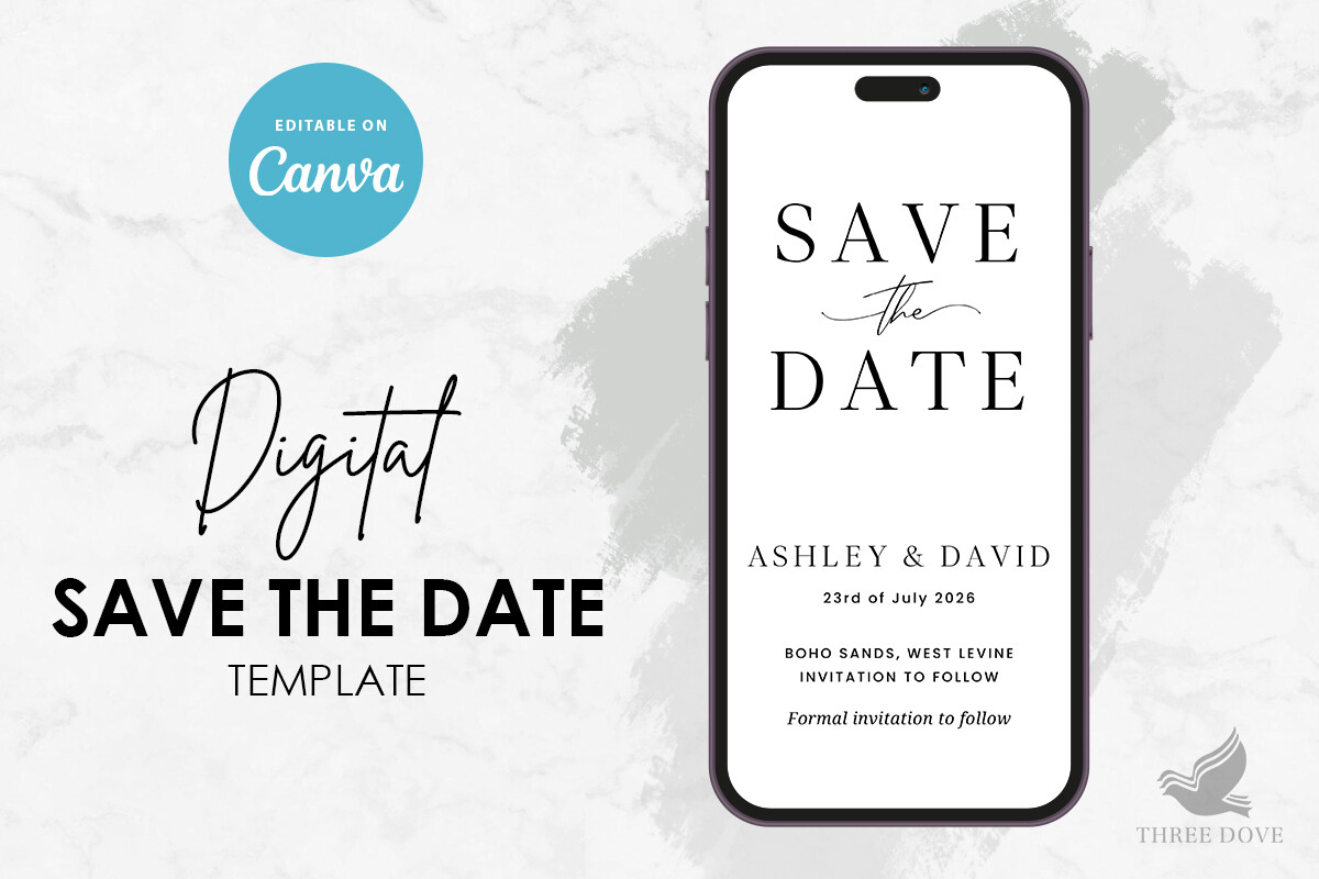
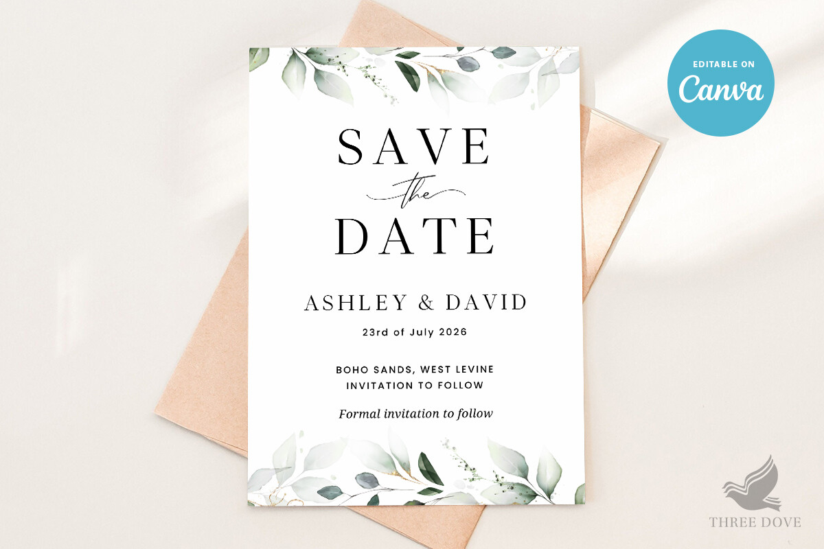
Half our guest list lives in their group chats, so for the under-thirty crowd we just texted the card. This is the one I formatted for a phone screen. Names big, date bigger, our wedding site link tappable right there. My maid of honor got hers, screenshotted it, and it went straight into the bridesmaids’ chat before I’d finished the rest of the list.
I sized it for Instagram stories too, because a few people wanted to post it. Plugged in our details, exported, done in one sitting on a Sunday.
The annoying part. The default text color came out a pale gray that vanished on darker phone settings, and my dad swore he never got it. He did. He just couldn’t see it. Bump the contrast first and save your dad a phone call.
A little leaf, before the leaves take over your whole wedding
Greenery’s everywhere right now and it tips into overgrown fast. What pulled me to this one is restraint. A sprig in the corner, a sprig at the bottom, and a clean middle where your words live. I printed a stack for my neighbor’s backyard wedding in June and the green picked up the actual hedge behind her ceremony chairs, which she did not plan and which I took full credit for.
The color prints true, which is rare. Greens go muddy or neon on home printers more than any other shade. This one stayed leaf-green on her old inkjet.
My one note. The leaf art sits where a return address usually goes, so if you’re mailing these in window envelopes, check the alignment before you run forty. She didn’t. We hand-labeled the lot at her kitchen island the night before, which is its own kind of fun at 11pm.
One file, two jobs
This set comes with the save the date and a matching invite, same fonts and spacing across both, so when the real invitations go out months later nothing looks like it wandered in from a different wedding. I’m a sucker for that kind of tidiness. I used a matched set for my own and people commented, which they never do about stationery.
You fill in the save the date now and the invite sits in the folder waiting. I came back to it in fall, opened the second file, and it already knew our colors.
The quibble. There are a lot of layers in the invite file and it took me a minute to find which text box was which. Read the little note that comes with it before you start clicking, or you’ll move the wrong thing like I did and spend ten minutes undoing.
The one that made my grandma laugh
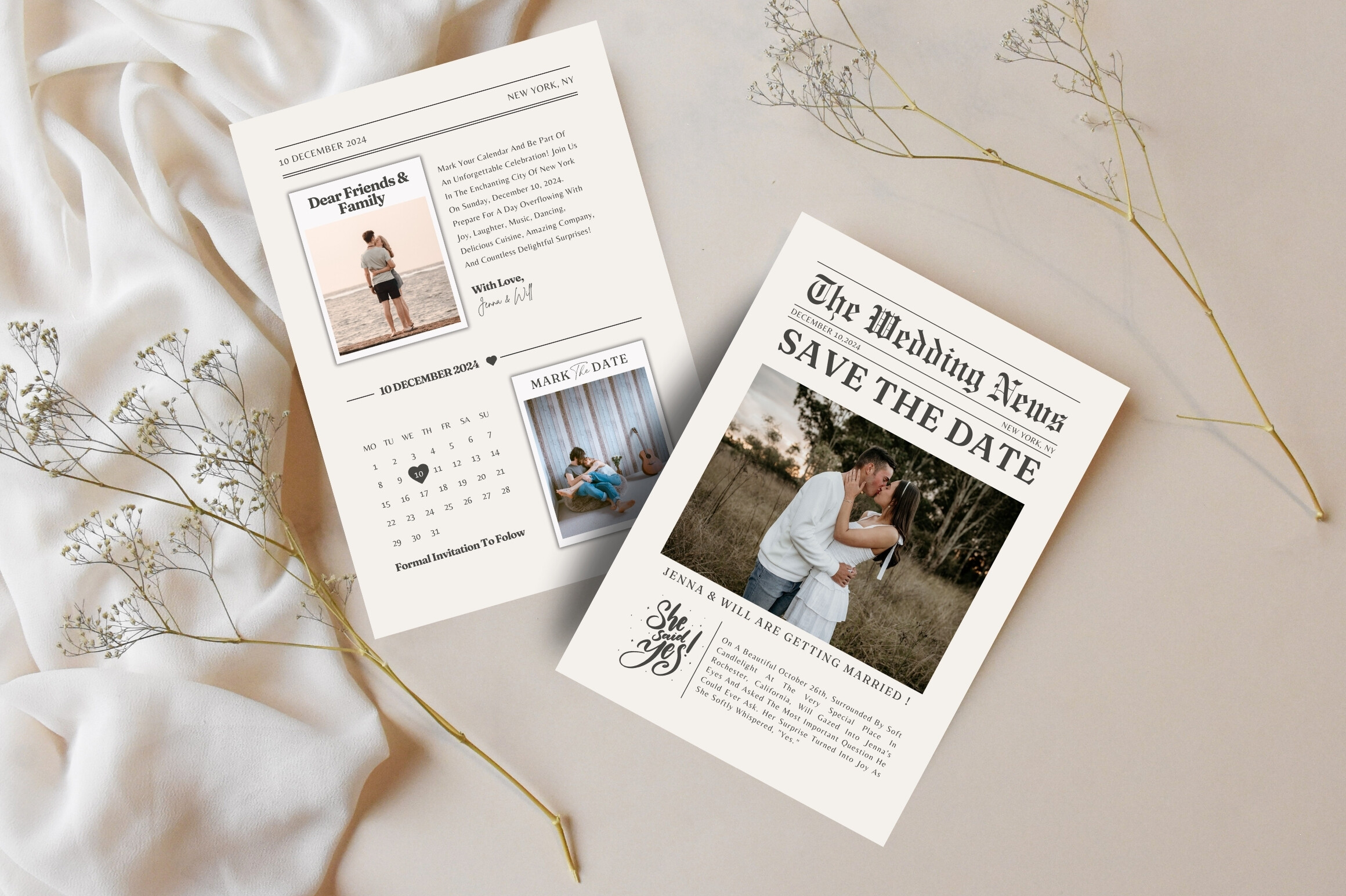
Okay, this is the playful pick. It lays out your news like an old front page, headline and columns and a fake masthead with your last names. We did these for a friend who got engaged on April 1st and leaned all the way into it. The headline read like breaking news. Her grandmother actually laughed at the kitchen table, which is a high bar for a piece of paper.
You drop your story into the columns, swap the date, and it reads like a real little paper. I printed a proof on plain stock and the columns held without me touching the spacing.
The downside is word count. The template wants more text than a normal save the date, so if you’re not into writing a goofy paragraph about how you met, this one’s a slog. We wrote ours over takeout and it took the whole evening, mostly because we kept rewriting the headline.
Circle the date, literally
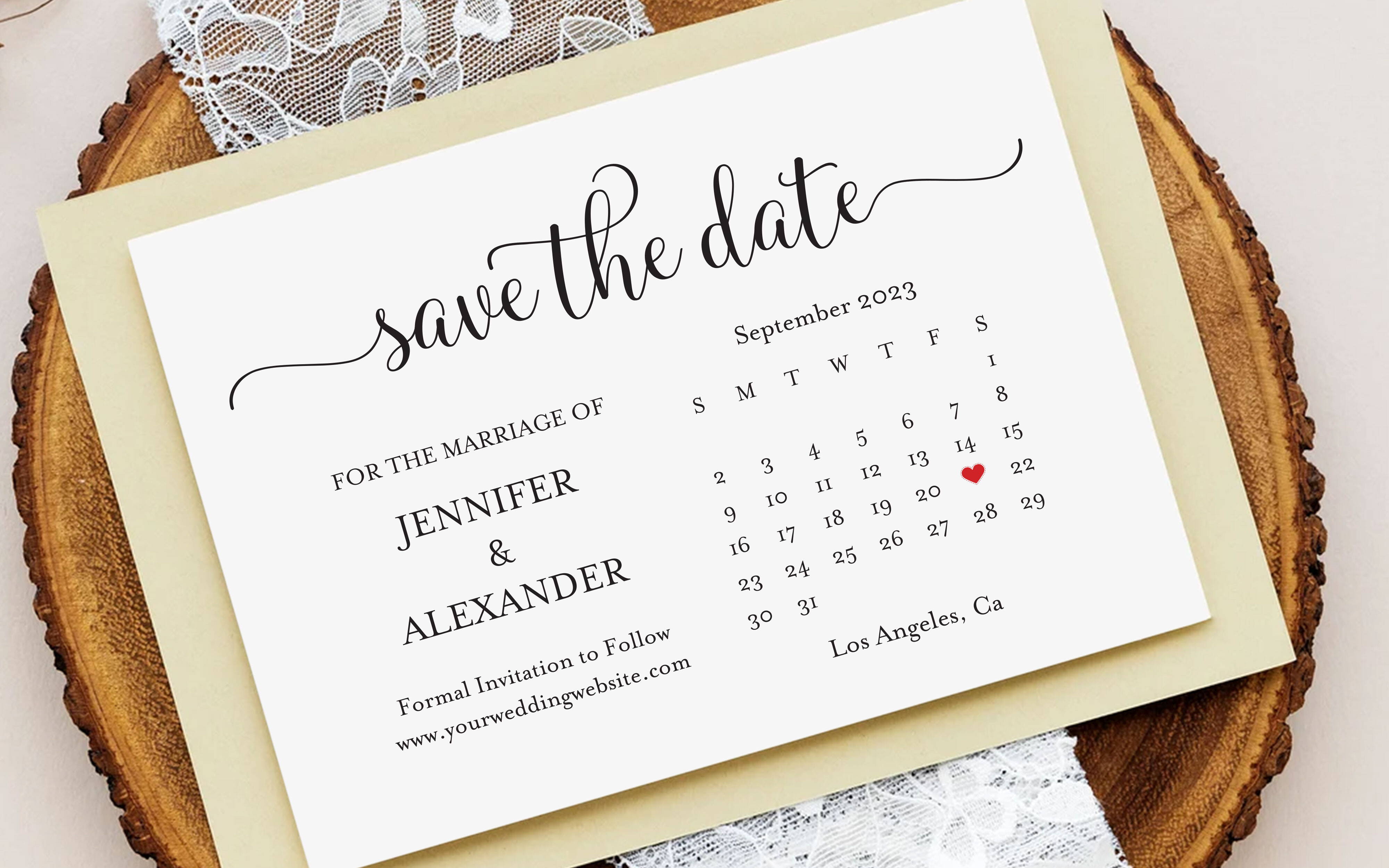
Some people need to see the actual square on the actual month or it doesn’t land. My coworker is one of those. This one shows a little calendar grid with your day circled, and it sat on her fridge for eight months under a magnet shaped like a lemon. She told me she looked at it more than she looked at any invitation she’s ever gotten.
You set the month, circle the day, add your names. I printed a test and the grid lined up clean, no wonky boxes.
What tripped me up. Getting the right month showing means editing the day numbers if your starting weekday’s different, and I put a 31 where a 30 should’ve been on the first pass. Mailed none of those, thank goodness. Count the squares before you print the batch.
What People Keep Asking
What is a modern save the date?
A friend asked me this over coffee and I struggled to answer cleanly. Mostly it’s the look. Lots of white space, a strong typeface, one idea instead of six. Mine was our two names, the date, and the city, and that was it. No doves, no scrollwork.
The ones I keep coming back to feel calm. You can read them in a second and they don’t try to do four things at once.
Do modern designs need a photo?
Nope. We didn’t use one and I never regretted it, mostly because our engagement photos weren’t back yet and I was out of time. A few of the cards above are all type, no picture, and they look intentional.
That said, if you’ve got a photo you love, a clean single shot with your words next to it works. My neighbor did that and it was lovely. It’s a coin flip, not a rule.
What colors are modern?
Honestly? Less color than you’d think. Black on white reads the most modern to me, then soft neutrals, a sage green, a dusty terracotta. I mailed mine in a warm gray and people thought I’d spent a fortune.
The trap is going too bright on a home printer. I tried a bold blue once and it came out the color of a swimming pool. Test one sheet before you trust the screen.
Before You Print a Stack
If you do one thing, print a single test page on plain paper and read it from across the room before you buy the good cardstock. That habit saved me more wasted sheets than any design tip ever did.
Any of these seven will do the job. Pick the one that sounds like you, change the date when your venue inevitably reschedules, and don’t pick a new font at 1am. That’s the part I keep doing anyway.