We sent save the dates eight months out because my fiance’s aunt books flights like she’s running from something. I had a Tuesday off, a coffee, and a folder of templates I’d been hoarding since the engagement. The plan was to knock it out in an afternoon. The plan was wrong by about two test pages.
Here’s the thing about doing your own save the dates. The card itself is the easy part. It’s the trimming, the paper, the trip to mail them that quietly drains a whole day, and one bad guess on cardstock can cost you a reprint of the entire stack. I redid mine once. Not because the design was off, because I bought paper that curled in the heat and looked like cereal box by the time it hit the mailbox.
These are the templates I’d hand a friend who’s panicking the week she gets the venue. A few links below are affiliate links, so if you grab one, a little something comes back to me. Doesn’t change your price.
Quick note, a couple of these are affiliate links. If one ends up at your reception, it helps keep this little blog running and you pay the same.
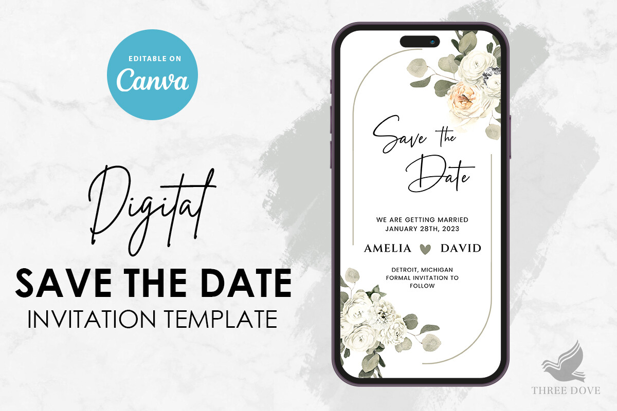
The floral one I sent first, before I overthought it
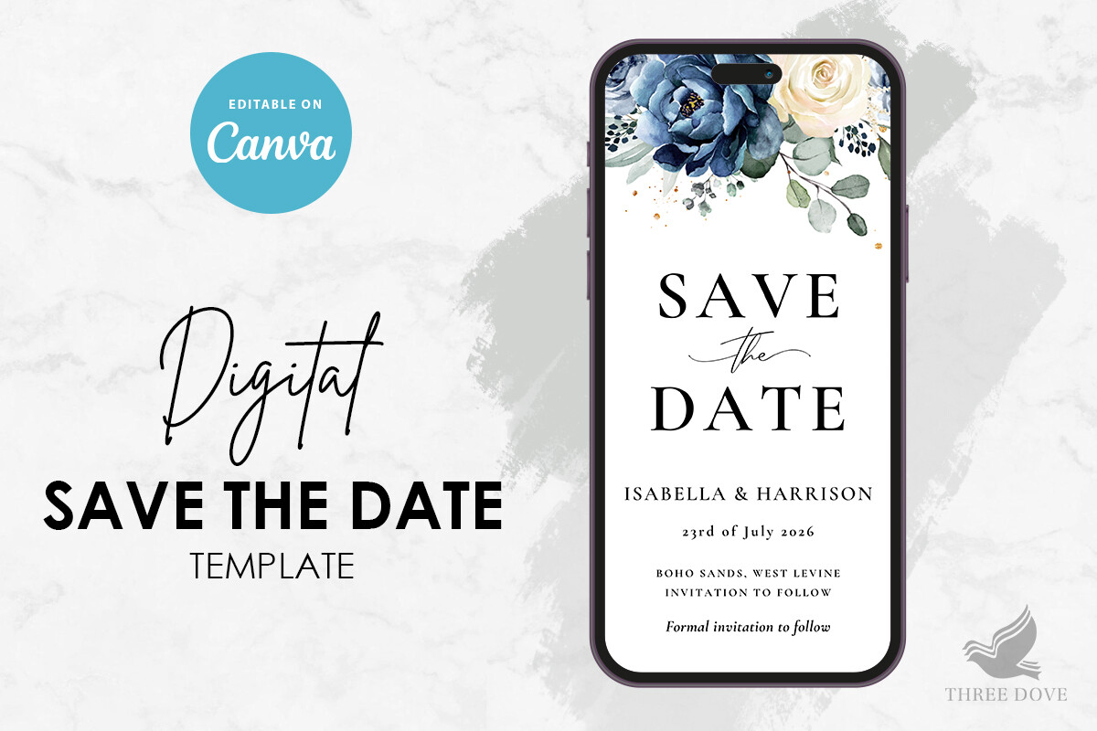
I typed our names in on a Sunday, printed one on the cheap multipurpose paper I keep by the printer, and propped it against the toaster to look at while I made eggs. The flowers don’t crowd the text, which is rare. A lot of floral templates bury your wedding date under a peony and you don’t notice until it’s too small to read across a kitchen.
The color held up at the copy shop too. I printed the real batch on a slightly heavier matte stock and the greens stayed green instead of going swamp.
One gripe. The placeholder date font is a touch smaller than the names, so I bumped it two points before the real run. My aunt needs to see that date from across her living room without her readers.
When you want zero fuss and a clean rectangle
My maid of honor is allergic to anything frilly, so when she got engaged I sent her this one. Just type, print, done. No fighting a border that runs off the edge. She did hers at a FedEx near her office on her lunch break and texted me a blurry photo of the proof from the parking lot.
It reads well in black on white, which is the whole point. I tried a soft gray version too and it printed fine at home, no streaking, and my home printer streaks everything.
The catch is it’s so plain that cheap paper shows. I learned to spend the extra dollar a sheet here. On flimsy stock it looks like a memo, not a save the date.
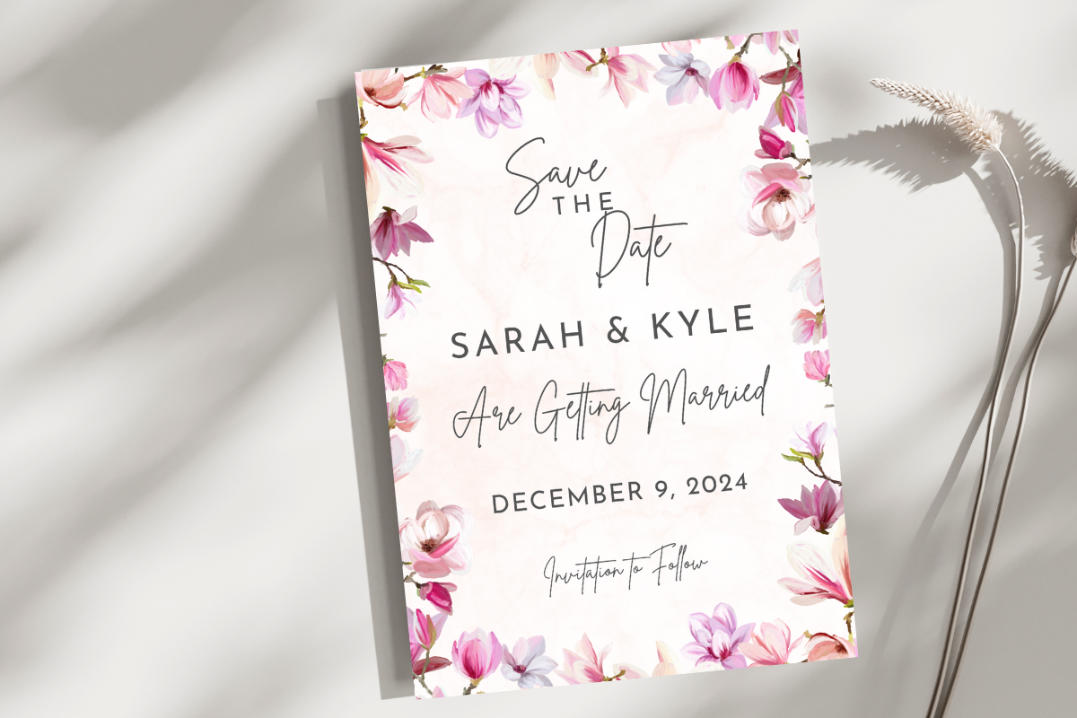
A second floral pick, for the people who want more bloom
Some folks want the flowers to be the event. My cousin did. She wanted it to feel like the garden she was getting married in, so I set her up with this one and we edited it together over the phone, both of us squinting at the spacing.
It prints richer than it looks on screen, which surprised me. We did a test page on regular paper, taped it to her fridge, lived with it two days, then went heavier for the mail run.
My one note. There’s a lot going on near the corners, so if your printer eats the margins like mine does, nudge everything in a hair first. We lost one corner flower on the first proof and didn’t catch it till page three.
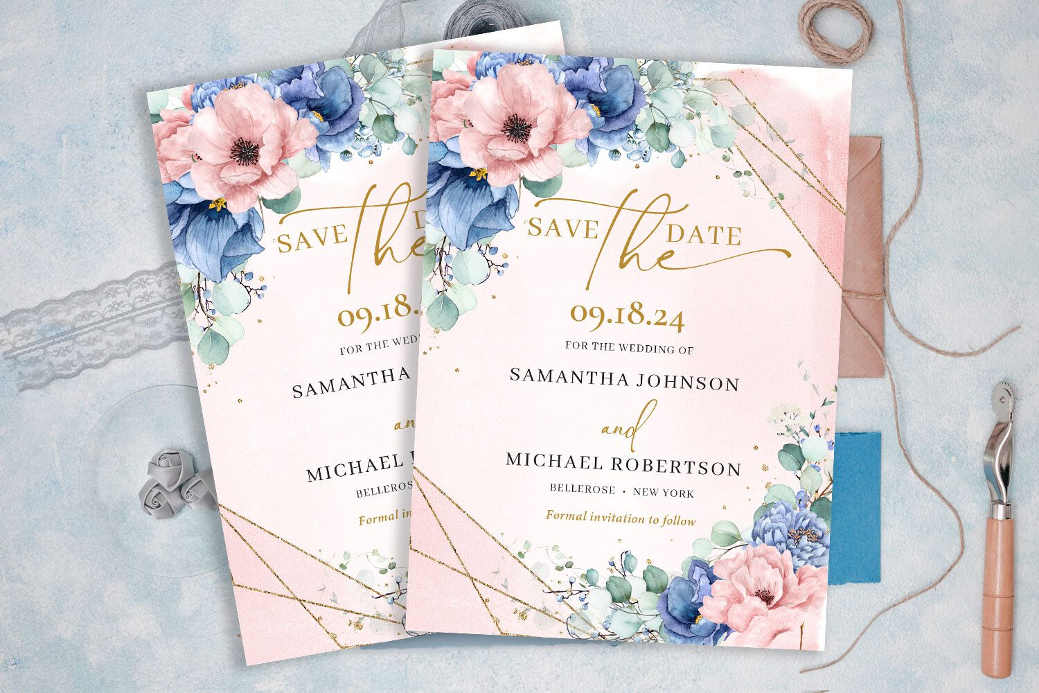
Dusty blue without buying a whole new theme
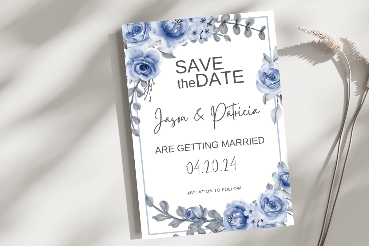
I have a soft spot for blue florals because that was almost my color before I changed my mind for the eighth time. A coworker actually used this one. Her venue was a navy-and-cream sort of place and this slotted right in without her having to design a thing.
She printed at a small print shop on Carroll Street that does cardstock cheap if you go before noon. The blue came out true, not that washed-out periwinkle you get when a printer’s low on cyan.
The quibble. The blue is on the darker side, so light gray text on it can vanish. She swapped the date to a deeper shade so it didn’t disappear into the petals.
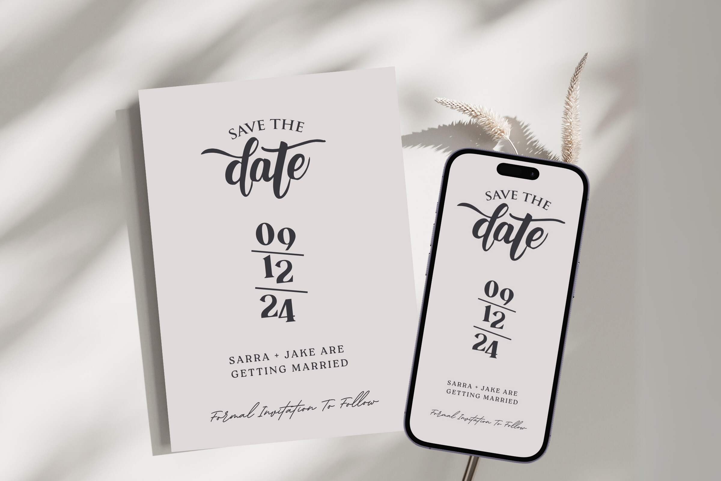
The workhorse for the bride who’s already exhausted
This is the one I send when someone says they don’t have time to be cute about it. You change the words, you print, you move on. I tested it the week I was also dealing with a caterer who ghosted me, so I needed something that wouldn’t fight back.
The spacing holds when you change a long name to a short one, which sounds small until you’ve watched a template explode because your last name has fourteen letters.
Gripe of the day. It ships a little understated, almost too quiet. I added a thin line under the date to give it a heartbeat. Took me thirty seconds.
Soft pink that doesn’t read like a baby shower
Pink scares people off because they picture a nursery. This one stays grown-up about it. My neighbor borrowed it for her fall wedding, of all things, and it worked because the pink is muted, more dried-rose than bubblegum.
She printed hers on a warm ivory stock instead of bright white and it softened the whole thing. We figured that out by accident because the shop was out of white that afternoon.
The one thing. On glossy paper the pink goes loud and a bit candy. Matte keeps it calm. I’d skip the shiny stuff entirely here.
Can’t pick between blue and pink? This one didn’t either
I flip-flopped between blue and pink for my own wedding for months, so a template that just uses both feels like a small mercy. My sister-in-law grabbed this for a spring date and it matched her hydrangeas without her trying.
The two tones balance instead of clashing, which I did not expect from a freebie-looking palette. We printed a proof at the library, of all places, on their pay-per-page machine, and even that ugly printer made it look decent.
My nitpick. With two colors going, cheap paper makes them muddy where they meet. Go matte and a bit heavier and they stay separate. I ran one test on thin stock and the blue bled pink at the seam.
What People Keep Asking
How do I DIY save the dates?
Pick a template you can type your own names into, print one test on plain paper, and hold it across the room to see if it reads. That’s the whole loop. I print at home for proofs and take the real batch to a copy shop because home printers and good cardstock don’t get along.
Give yourself a buffer day. The card takes ten minutes. The trimming and the post office trip are what ambush you.
What paper should I use?
A medium matte cardstock, somewhere around 110 lb cover, is my safe answer. Heavy enough to feel like an event, not so heavy your printer chokes. I’d stay off glossy for anything with soft colors because it goes loud.
I ruined a stack once on a thin stock that curled in summer heat in the mailbox. Cheap lesson. Buy a small pack first and run one card before you commit to fifty.
How do I avoid mistakes before printing?
Print one. Just one, on regular paper, and check the corners and the date specifically because that’s what printers clip and what tired eyes skim past. Then make someone who isn’t you read it out loud. My fiance caught a wrong year I’d read past four times.
And do it during daylight. I approved a proof at midnight once and the spacing I swore looked fine looked drunk in the morning.
Before You Print a Stack
None of this is hard, it’s just fiddly, and fiddly is what eats your evening when you’re already juggling a venue and a guest list that keeps growing. Get the template right, buy paper you’ve actually tested, and the rest is mostly patience and a sharp trimmer.
Start with one card, one test page, one honest look across the room. If it reads from the couch, you’re done. Go mail them and go to bed.