My seating chart spent the morning of my wedding leaning against a wall because the easel I borrowed had a wobbly leg. We found out at 9am. My cousin shoved a folded napkin under the short foot and that was the whole fix. It stayed up. Nobody noticed the napkin.
The chart itself was the easy part. Getting it to stand somewhere people could read it without crowding, in a room where the light hit it wrong until almost five, that took more trial than I want to admit. I moved it three times during setup. Once into a sunbeam that washed out every name.
So this is less about the prettiest chart and more about where you put it and what keeps it from face-planting. I print a test page on plain paper first and tape it where I think the real one goes, then walk to the back of the room and squint. If I can read it from there, good. Some links below are affiliate links, so if you grab one a little something comes my way. Costs you nothing.
Full disclosure, a few links are affiliate links. Use one and a few cents come back to me, never anything added to your price.
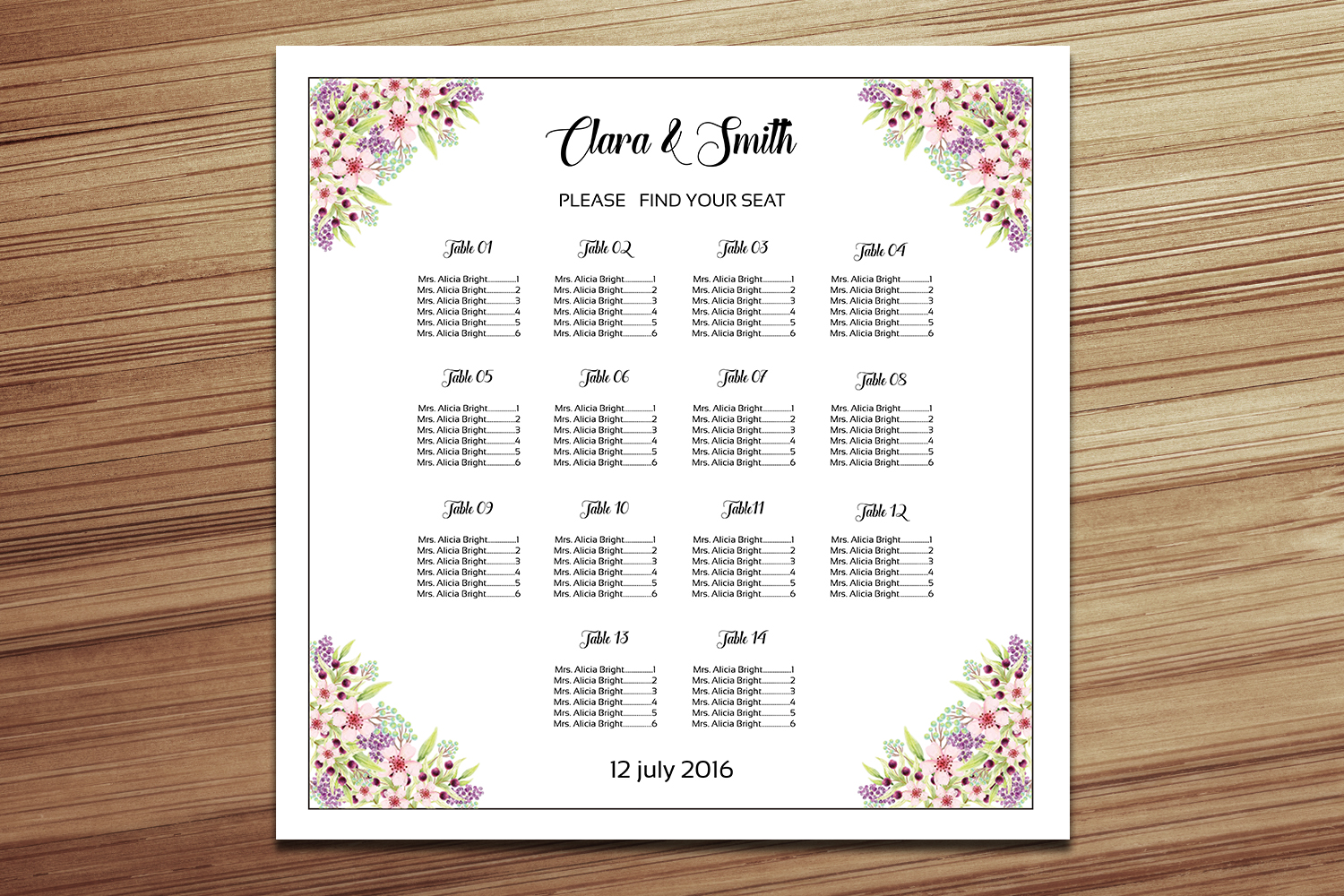
The one I keep handing to friends who panic
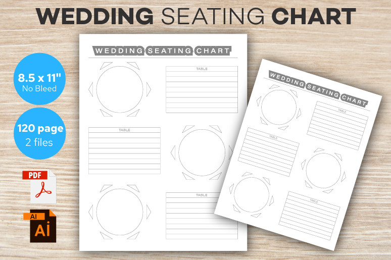
A friend texted me four days out saying she had no chart and no plan. I sent her this. She typed in her names that night and printed it at a FedEx counter on her lunch break. Done. The layout holds steady even when you cram in a last-minute table eleven, which is exactly what she had to do.
I like it propped on a tall floor easel, the wooden kind, because the proportions read well from a distance. We tested ours against the wall first to find eye level. Turned out the comfortable spot was lower than I assumed.
One gripe. The header sits a touch high, so if your easel has a back lip you lose a sliver of the top line. I nudged the whole block down before printing. Two minutes.
Florals that earned their spot on the mantel
This is the one I would put on an actual surface instead of a stand. A mantel, a sideboard, the top of an upright piano if your venue has one collecting dust in the corner. The floral border has enough going on that it does not need an easel to feel finished. I leaned ours against a stack of two flat books wrapped in linen and it looked deliberate.
My maid of honor used this exact template for her backyard thing in March. She set it on a console table by the gate so people read it walking in, drink in hand, before they even hit the lawn.
The catch is the florals are pale. In a bright room they fade. I bumped the saturation a hair in the free editor before printing and it held up much better on the good cardstock, which I ran at 110lb.
Greenery for the people doing everything outside
If your reception is on grass or under a tent, this one fits the mood without trying. The greenery reads as calm rather than busy, and it does not fight with real plants if your venue already has ivy crawling up everything. I taped a test print to a porch post during a windy afternoon to see how it sat against actual leaves. It blended.
I would stand this on a metal A-frame, the heavier kind, because anything outdoors needs weight at the base. My neighbor learned that when hers cartwheeled into the pasta station.
The one thing I would change is the font. It ships a little delicate, which is lovely indoors but vanishes in full sun. Print a sample, walk it out to where the chart will actually live, and check it at the time of day your guests arrive. I did this at four because that is when our doors opened.
The odd one out that solved my place-card mess
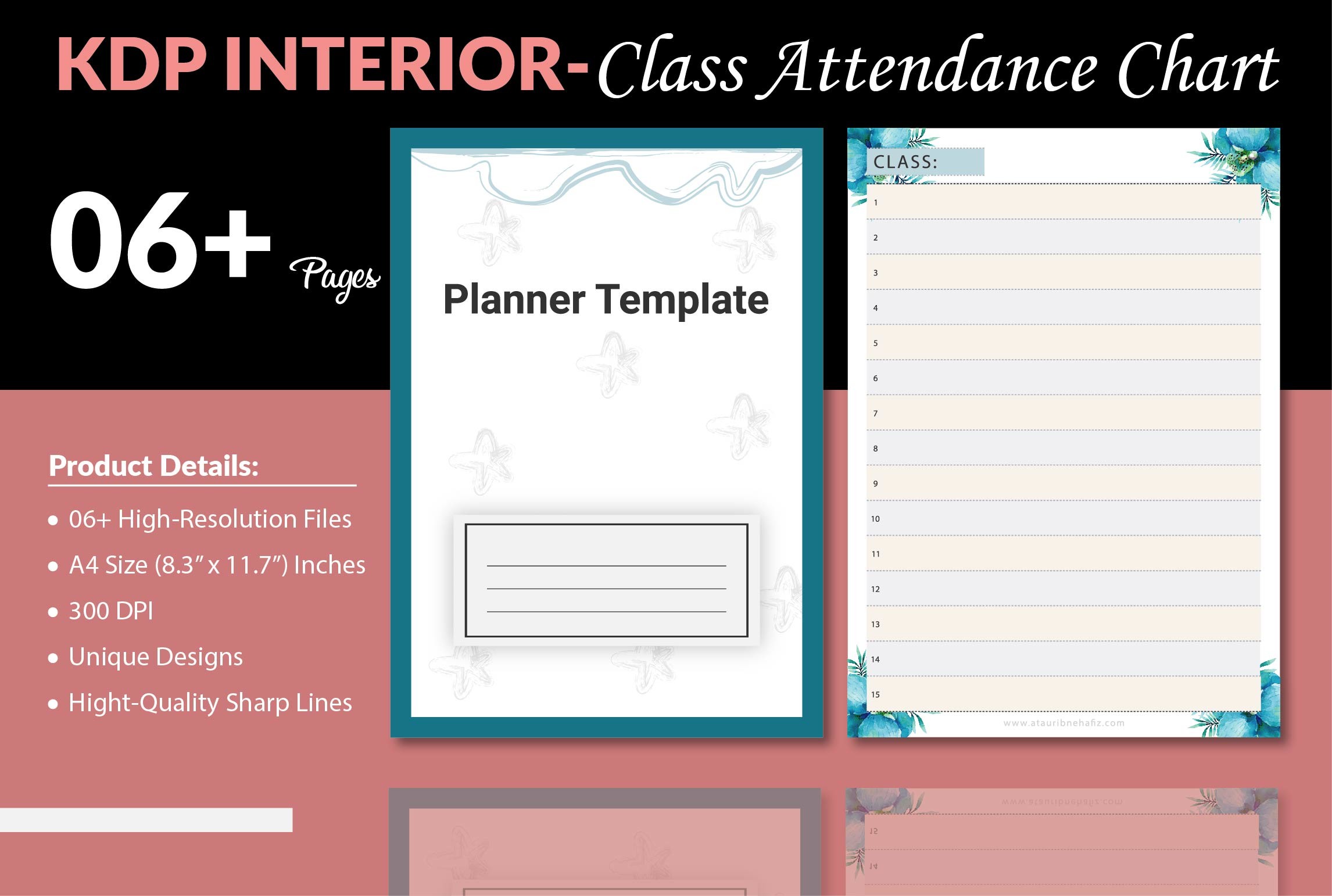
This is not a seating chart, full stop. It is a class attendance grid, and I almost skipped it entirely. Then I realized the columns line up neatly for tracking who actually RSVP’d against who you seated, which is the part that drove me genuinely insane the week before. I printed it, scribbled all over it, and kept it on the fridge as my master list while I built the real chart.
Nobody at the wedding ever sees this. It lives behind the scenes. But it kept me from seating my uncle at a table that did not exist, which I had done on an earlier draft.
Fair warning, it is plain. Gridlines and boxes, no flourish. You are not displaying this. I used it strictly as a worksheet and that is the only thing I would recommend it for.
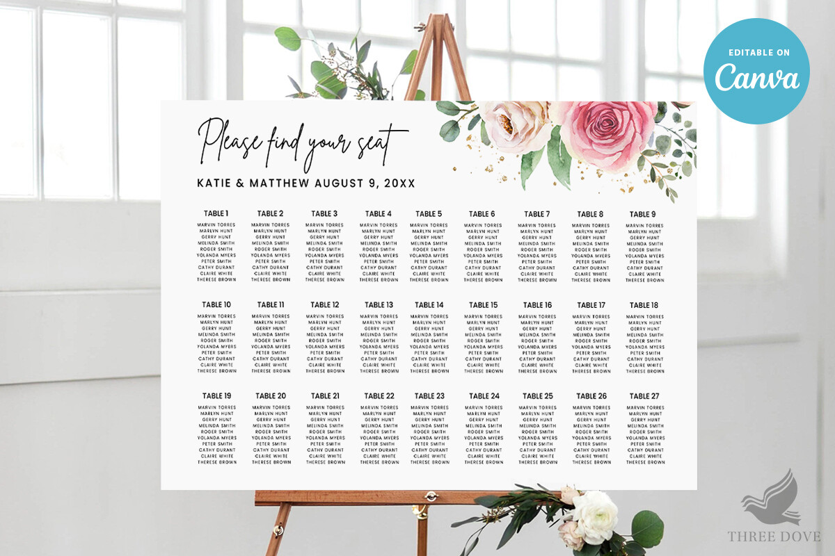
Clean lines for a chart that has to survive a crowd
Some venues funnel everyone past the chart at once, all eighty people at the same five minutes, and a fussy design just creates a traffic jam while folks squint. This one is stripped back enough that you read your table number and move. I tested that theory at my own reception by standing across the room and watching how long people lingered. The simpler the chart, the faster they cleared.
I mounted ours on foam board with spray adhesive so it could lean on a flat easel without curling at the corners. Cardstock alone tends to bow once the room warms up. Mine started lifting by the second hour.
The spacing is generous, which is the whole point, but it means long guest lists run onto a second sheet. If you have over a hundred names, plan for two boards side by side. I split mine A through L and M through Z. Worked fine.
What I reached for when the lighting fought back
Our reception room had one of those moody amber fixtures that makes everything look like a sepia photograph, charming until people cannot find their names. This template runs high contrast, dark text on light ground, which is the only thing that survives bad lighting. I held a test print under our venue’s actual bulbs during the walkthrough and most charts I tried turned to mud. This one stayed legible.
I propped it on a small tabletop easel right under a clip-on warm light we borrowed from my friend’s photography kit. Lit from the side, not straight on, so the cardstock did not glare back at everyone.
My only nitpick is the margins run a bit tight to the edge. My home printer clipped the bottom row on the first pass, so I had the copy shop on Cherry Street do the final run. They scaled it to fit and it came out clean.
The simple one I would actually use again
This is the closest to what I printed for my own wedding, the one held together with midnight patience on my kitchen floor. Uncomplicated, easy to edit, forgiving when you change your mind about table assignments for the fourth time at 11pm. I did exactly that. Twice.
I like it on a wooden tripod easel near the entrance, low enough that people do not have to reach up, with the bottom of the board around chest height. We measured against a few guests during setup to land on that. My tall cousin and my short aunt disagreed, so I split the difference.
The quibble is small. The default font weight is thin, same trap as a few of these, so if your space is dim bump it before you print a stack. I wasted one sheet figuring that out. Cheap lesson, learned again.
The Questions I Get Most
How do I display a seating chart?
Honestly, the move that worked for me was treating it like a sign, not a frame. I propped mine on an easel near the entrance so people hit it before they got to the bar, because once drinks are involved nobody reads anything carefully.
A friend asked me this last spring and I told her to print a plain test page, tape it where she thinks it goes, then walk to the far corner and read it. If she could, the spot was right. She moved hers twice doing that before setup even started.
What holds it up?
An easel, usually, but the kind matters more than people think. Indoors a wooden tripod is plenty. Outdoors you want a heavy metal A-frame with weight at the base, because a breeze will absolutely take a light one down. My neighbor’s tipped into the food table and she still brings it up.
If the chart is on cardstock alone it bows once the room warms, so I mount mine on foam board first. For a flat surface like a mantel I just lean it against a couple of wrapped books. Looks intentional, costs nothing.
Will it survive outdoors?
Short answer, with some help. Paper hates sun and wind, both. I learned this taping a test print to a porch post on a gusty afternoon, watching it flap and curl while I figured out it needed backing and shade.
If you are outside, mount it on foam board, weight the easel base, and put the whole thing where the light is soft, not in a sunbeam that washes the names to nothing. I moved mine out of a four o’clock sunbeam the day of and it saved the chart from looking blank from ten feet away.
One Last Thing
None of this is about the fanciest chart. It is about where it stands and whether your gran can read it from her chair without getting up. Test it in the real room, at the real hour, with the real light. That is the part I skipped my first try and regretted by noon.
Grab whichever template fits your vibe, print one page on plain paper, and go squint at it from across the kitchen. If it reads, you are done. If it does not, you found out for the price of a sheet instead of in front of a hundred people.