The seating chart was the thing that almost broke me. Not the dress, not the budget spreadsheet I color-coded and then never opened again. The chart. Because it is not really about tables, it is about who is mad at whom and which uncle cannot sit near which cousin without bringing up 2009. I moved name cards around my coffee table for three nights like I was solving a crime.
Here is what I wish somebody had told me. The seating part is a people problem, and the chart part is just a print problem, and you should not let the first one make you scared of the second. I kept stalling on the actual design because I thought it had to look like the ones on Pinterest with the gold foil. It does not. Mine was black text on cream cardstock and three people told me it was their favorite thing at the reception.
So I pulled the ones I actually used or have since handed to friends who were spiraling the same way I did. I print a test page on plain paper, prop it against the toaster, and back away until I am standing in the kitchen doorway. If I can read it from there, my guests can read it from their seats. A couple of the links here are affiliate links, so if you grab one it tosses a little change my way. No extra cost to you.
Full disclosure, a few links are affiliate links. Use one and a few cents come back to me, never anything added to your price.
The grid that did my thinking for me
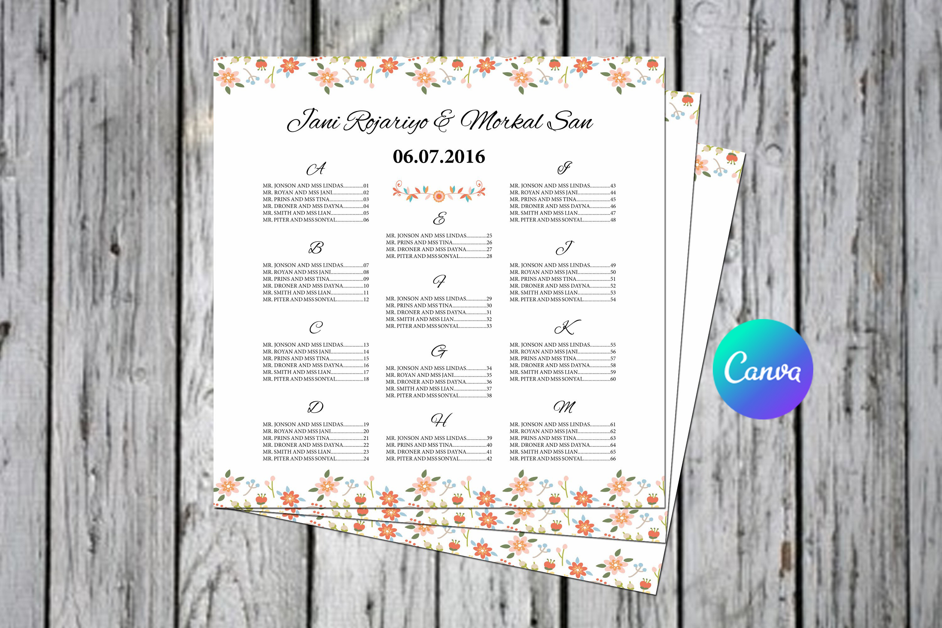
I started with this one because it lays everything out as a table, table number down one side and names filling in next to it, and that structure is exactly what my brain needed at the point I had given up on creativity. You drop your names in the boxes and the rows hold their shape. I had been trying to free-style the layout in a blank document and it kept sliding into a mess every time I added a guest.
What made it stick for me was reordering. My cousin’s plus-one dropped out the week before, so I deleted one cell and the whole table just closed the gap without me rebuilding anything. I printed mine at the FedEx on Garner Street, two copies, one for the entrance and one taped inside the catering tent so the servers knew the deal.
One gripe. The default rows are a hair tight if you have long names, and I have a maid of honor with a hyphenated last name that ran into the next column on my first pass. Widen the row height before you print a batch. One ruined sheet taught me that.
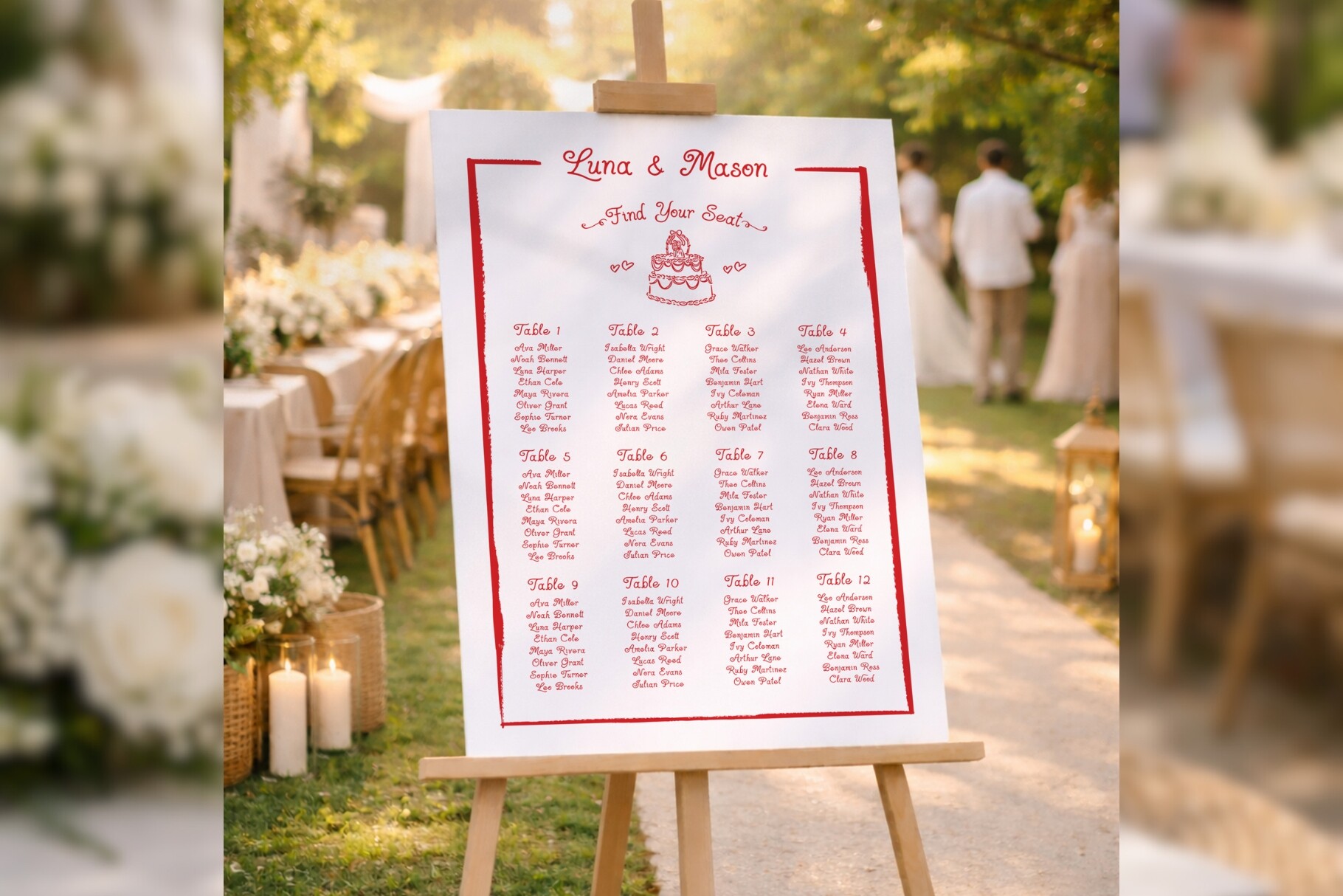
A single sign instead of a wall of cards
After the table version I tried this as a poster-style sign, one sheet, everyone listed under their table, propped on an easel by the door. I liked it because it skips the whole escort-card pile that I always end up reorganizing twice. Guests walk up, scan for their name, move on. Less stuff to print, less stuff to lose.
I made a small one first, like 11 by 17, to live with for a few days on my dining room table. Read fine up close. The font is clean and it did not crowd the edges, which is more than I can say for half the templates I tried.
The catch is volume. If your list runs past 120 people this sign gets dense and you are squinting. I had about 90 and it was comfortable. Past that I would split it into two signs or size it way up at a print shop, because nobody wants to hunt for their name in a paragraph.
When I wanted it to feel like something, not just function
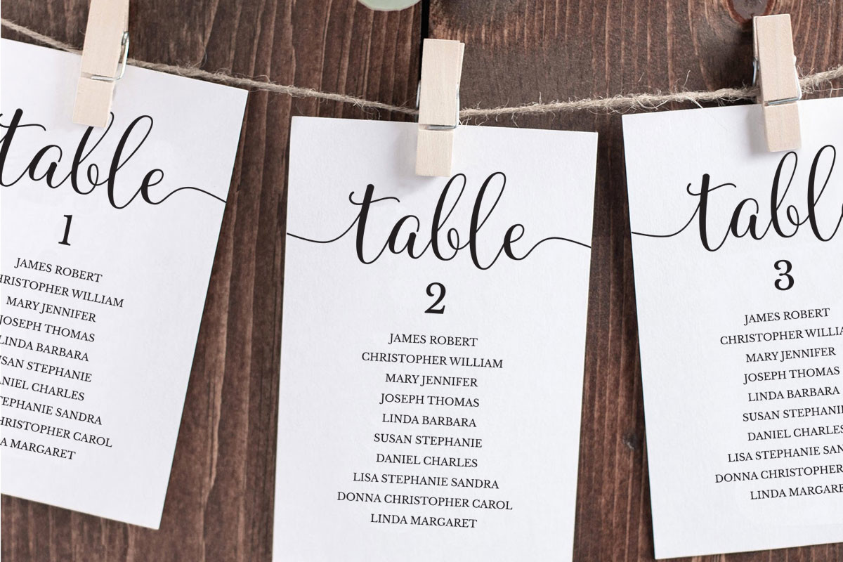
This is the hanging photo style, where the chart becomes individual cards or tags you string up, and I will be honest, I did not use this at my own wedding because I ran out of weekend. But I helped my neighbor Priya set hers up last fall and it was the prettiest entrance I have seen at a backyard reception. Cards clipped to twine between two shepherd’s hooks, swaying a little in the wind.
We printed the tags on a heavier cardstock, I think 110 lb, so they did not curl in the humidity. Priya wrote table numbers on each by hand for that homemade look, which I would not have had the patience for, but it was her day.
Real talk on the downside. This one is labor. You are cutting, punching holes, clipping, and if it is breezy you are also re-clipping the ones that blow down. We lost maybe twenty minutes to a gust. Build in time, or assign it to a bridesmaid who likes crafts.
The smaller cousin I tested at the shower first
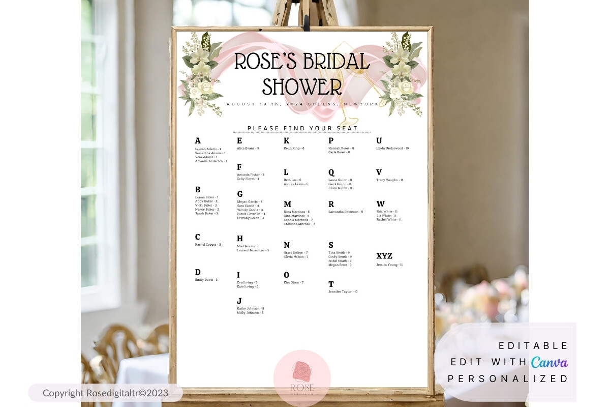
Before the wedding I had a bridal shower to host for a friend, and I used this scaled-down version as a low-stakes trial run. Forty people instead of two hundred, so if I botched it, who cares. Turns out it was a smart way to figure out my whole printing setup without the wedding-sized panic riding on it.
It is sized and worded for a shower, lighter and a little softer, and I set it on a little wooden stand by the gift table at my friend Dana’s place. People actually used it instead of milling around confused, which at a shower is a small miracle.
My one note is that it leans very feminine in the default styling, lots of soft type, so if your shower is more of a casual brunch vibe you will want to swap the heading font. Took me two minutes once I stopped fighting it and just changed it.
The big one I sent off to a print shop and stopped worrying
At some point I accepted that my home printer was never going to do a large chart justice, and this poster template is built for exactly that, one big sheet you hand to a print shop. I uploaded the file to a Staples a few towns over, picked it up matte the next morning, and it looked like I had spent real money. I had not.
The layout holds up large, which is the thing that scares me about scaling stuff up, because text that looks fine on letter paper can go fuzzy at poster size. This one stayed crisp. I framed mine in a thrifted frame I painted white the Tuesday before, and propped it on an easel.
Watch your file size when you export. My first upload was too low-res and the shop emailed me to flag it before they printed, which honestly saved me. Bump the resolution before you send it, or you get a soft, sad-looking poster.
For the friend who wanted flowers without paying a florist for them
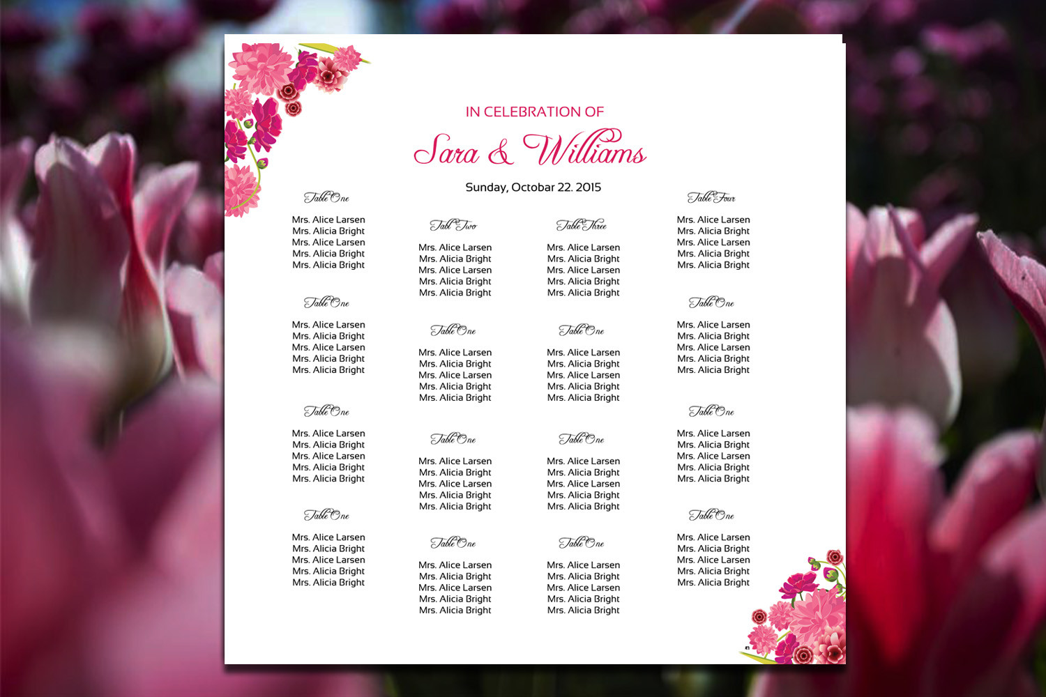
My coworker Steph wanted greenery and blooms all over her stationery but her florist budget was already gone, so I pointed her at this floral version. The flowers are printed right into the design, so she got the look without buying a single real stem for the sign. She nearly cried, which felt dramatic for a seating chart, but here we are.
We printed it on a slightly textured cardstock that made the floral edges look almost painted. It tied into her invitations without us having to match anything by hand, and the color came out true on the copy shop printer, which is not always a given with anything pink.
The gripe here is ink if you go the home-printer route. All that floral color is heavy on cartridges and Steph’s printer streaked the first one. We took it to the print shop instead and it was night and day. If your design has a lot of color in it, do not fight your home printer, just outsource the final.
The plain workhorse I keep coming back to
I will end on the unglamorous one, because this is the version I actually recommend most often. It is a straightforward chart, no fuss, just clear and readable, and after all the foil and florals it is the one that does the job without making you cry over font choices at midnight. I have sent it to three friends now and none of them complained.
You type names in, it stays aligned, you print it. I made mine on plain cream cardstock from the craft store down the road, the 65 lb pack, nothing fancy, and it read perfectly from across the room when I did my doorway squint test.
The one thing is it is plain by design, so if you want personality you have to bring it yourself, swap a font or add a little border. I added a thin line at the top and called it done. Sometimes the boring template is the one that gets finished, and finished beats fancy in a drawer.
The Questions I Get Most
How do I start a wedding seating chart?
Honestly? I started with paper scraps and the names of the two relatives who cannot be near each other. I wrote everybody on sticky notes and shoved them around my coffee table until the obvious problems sorted themselves out. The fancy template comes after, not before.
My advice is to lock in your tricky pairs first, the divorced parents, the friend group that splintered, then fill in the easy people around them. Once the puzzle is solved on paper, dropping names into a template takes an evening. Do not buy a pretty chart and then try to plan seating inside it. That is backwards and I learned it the slow way.
When should I finalize seating?
I finalized mine about ten days out and that felt right, because that is roughly when your final headcount actually stops moving. RSVPs trickle in late no matter how firm your deadline was. Mine did. Two yeses turned into nos in the last week.
So I would build the chart early but leave the printing for the very end. I had the layout done weeks ahead and just kept it open, updating cells as people flaked or un-flaked. The actual print run happened the night before, on my kitchen floor, with my husband holding cardstock flat. Cut it that close on purpose, because reprinting a chart twice is a waste of cardstock and patience.
How do I handle last-minute changes?
Yep, this happened to me and I almost lost it. A cousin’s plus-one bailed the day before and I had already printed. What saved me was that the template I used let me delete one cell and the table just closed up, so I reprinted one sheet instead of starting over.
That is the whole reason I push the editable grid styles. Pick something where moving one name does not blow up the layout. And keep a couple of blank place cards in your bag the day of, because someone always shows up that you swore was a no. I handwrote two names at the reception and nobody could tell.
One Last Thing
The chart felt like the biggest deal in the world while I was making it, and then at the reception people glanced at it for four seconds and went to find the bar. That is the truth of it. All those nights of moving sticky notes around, and the thing did its job and got ignored, which is exactly what it is supposed to do.
So pick one of these, do a test print on plain paper, and back up until you can read it from across the room. If it passes the doorway squint, you are done. Mine was cream cardstock and black ink and held together with midnight stubbornness, and I would print the same one again.