My invitations went out three weeks late because I kept second-guessing the paper. Not the design. The paper. I stood in the aisle at the craft store on Burnet holding two stacks of cardstock for what my cousin later called an embarrassing amount of time, and I bought the wrong one anyway. The cheaper one. It curled.
Here is the thing about elegant. It almost never comes from the expensive choice. The invitations that made my guests text me were the ones with a ton of empty space and one nice font, and they cost me maybe a quarter each once I figured out where to print. The fussy ones I tried first, with a script font and a border and a little wax-seal graphic crammed in the corner, those looked cheaper. Funny how that works.
So below are the templates I actually printed, plus a couple I bought for friends after mine turned out okay. A few are affiliate links. You grab one, a little something comes back to me, and your card costs you the same as if you’d found it yourself.
Quick note, a couple of these are affiliate links. If one ends up at your reception, it helps keep this little blog running and you pay the same.
The one I’d hand a nervous bride first
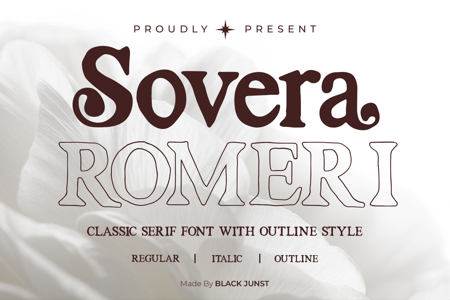
Sovera Romeri is the set I send people who panic at the word “design.” You drop your names in, the layout already knows what to do, and there is real margin around everything so your home printer won’t shave a letter off the edge. I did a test run on plain paper at my kitchen table and held it across the room. Still readable from the doorway. That’s my whole test.
The spacing is what got me. So many invitation files push the text to the brink and then your printer eats it. This one breathes. I ran the final stack at the FedEx on Rundberg because anything I print at home comes out faintly gray, like it’s tired.
One gripe. The default type runs a hair light. If your reception is candlelit, nudge the weight up before you commit to good stock. I lost one sheet learning that.
Soft, romantic, and weirdly hard to mess up
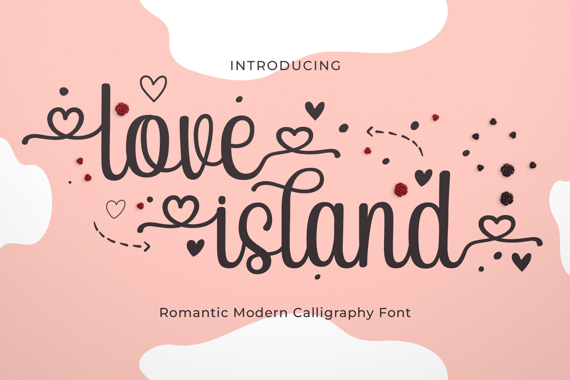
Love Islan leans into the romantic-watercolor thing without going overboard with it. I was nervous it’d read as busy, but the color sits in the background and lets your wording stay the loudest part of the card. My maid of honor used this for her own wedding after she saw mine sitting on my counter for a week.
What surprised me was how it held up on matte stock. Watercolor files usually need a fancy paper to look right. This printed clean on the basic linen cardstock from the craft store, no fuss, no muddy edges.
The catch is the file wants you to keep the background art exactly where it is. I tried scooting it over to fit a longer venue name and it threw the balance off. Just shorten your text instead. Trust me on that one.
The shape that made mine look intentional
Arch Shape is the trend I rolled my eyes at and then used anyway. The arched frame at the top does something to a plain card. Suddenly it looks like you planned it, not like you typed it at 11pm. Which, for the record, I did.
I printed these on a heavier cream stock, around 110 lb, and they felt like an actual invitation instead of a flyer. My fiance held the cutter while I trimmed because I cannot cut a straight line to save my life. We got a clean curve eventually.
My one note. The arch eats vertical space, so if you have a lot to say, dates, a website, a long address, it gets cramped fast. I moved the extra details to a tiny separate insert card and it solved itself.
Small, sweet, and easy on the ink cartridge
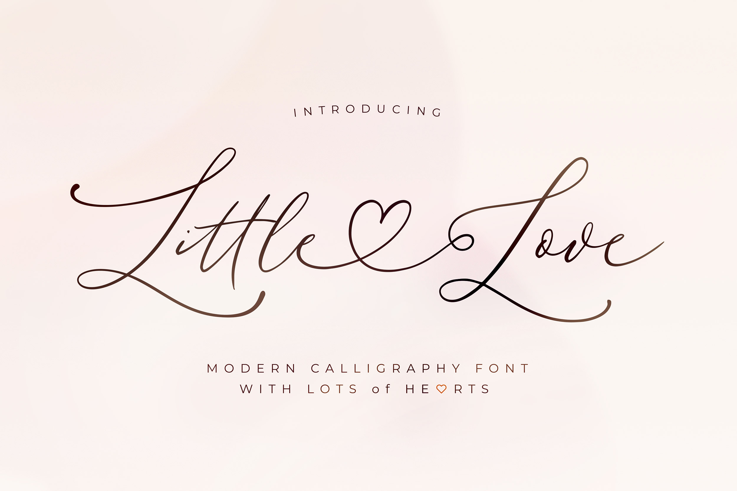
Little Love is the minimalist one, and minimalist here actually means minimalist, not just one decoration removed. Mostly white, a thin line, your names. I almost skipped it for being too plain. Then I printed a sample and it was the one my sister-in-law stole for her own save-the-dates.
Because there’s so little ink on the page, a stack of these is cheap to run. I did fifty at home one Sunday and barely dented the cartridge. That never happens to me.
Downside, plain cards live and die by the paper. On thin stock this looked flimsy, like a receipt. Spend the two extra dollars on a textured cardstock and it goes from forgettable to the thing people keep on the fridge.
When you want a little drama without a script font
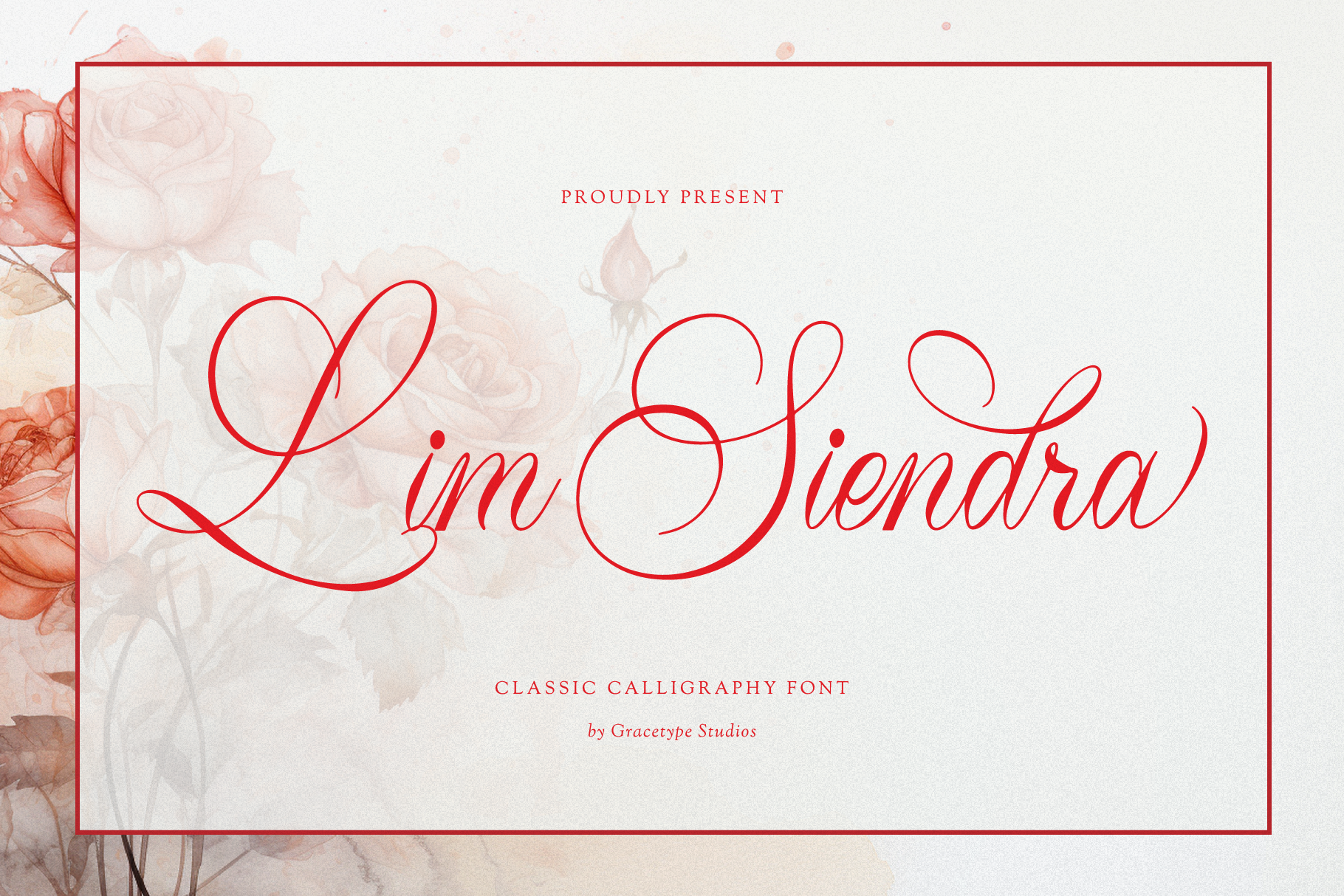
Lim Siendra has more going on, a serif headline with some real character, and I reached for it when a friend wanted hers to feel formal but not stiff. It threads that needle. Looks like the kind of invitation that comes in a thick envelope, prints like a normal file.
I’ll be honest, I bought this one for her, not me. She mailed forty and got compliments on the typeface specifically, which tells you the font is doing most of the work here. She printed at a copy shop near her office on a slightly warm white stock.
The nitpick. The headline font is so distinctive that if you swap in a different one for the body, things clash a little. Keep the pairing it ships with. I learned that the messy way helping her at her kitchen table.
The grown-up, magazine-looking option
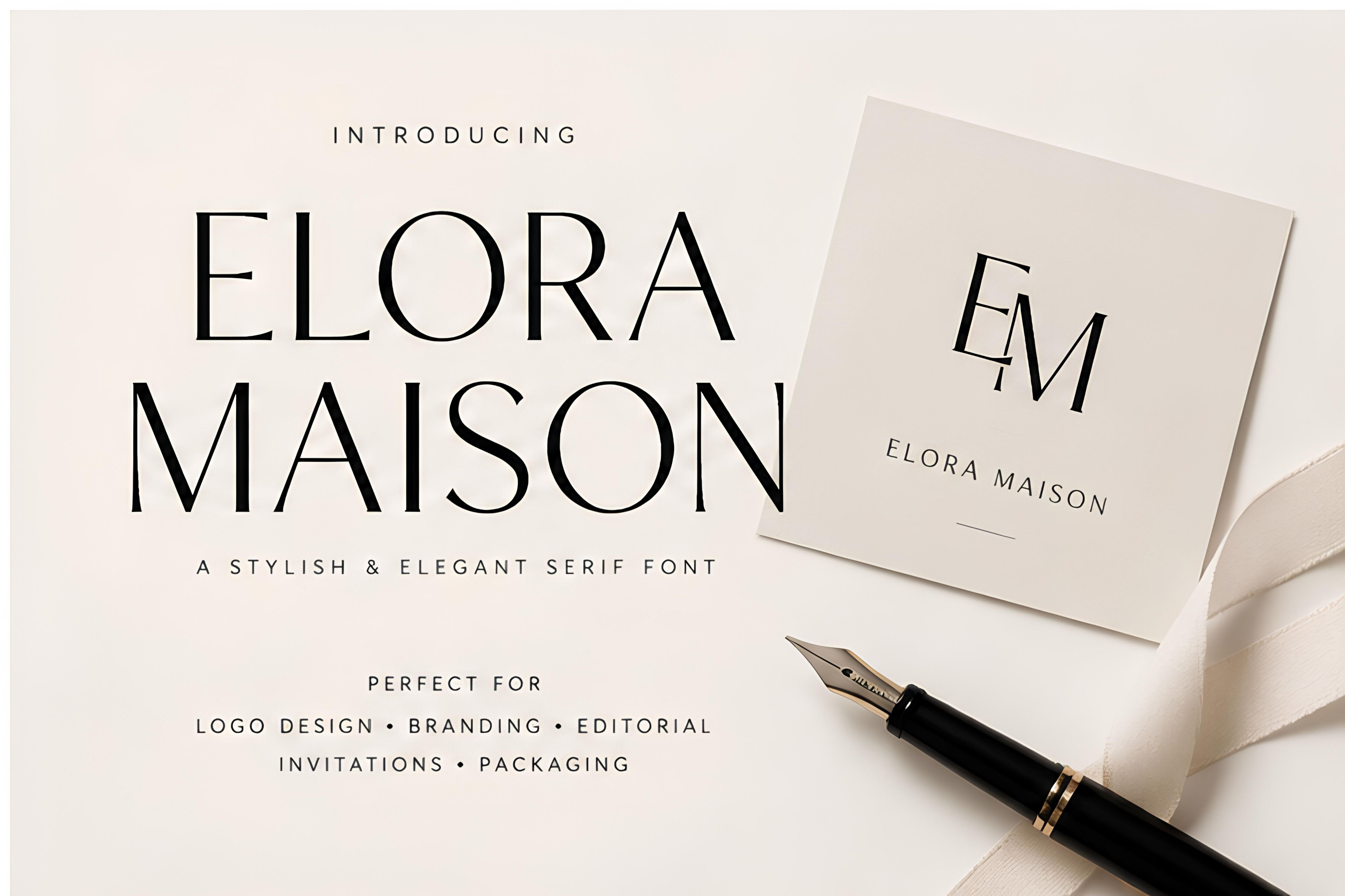
Elora Maison is the one that looks like it belongs in one of those wedding magazines I bought and never finished reading. Lots of negative space, a refined layout, the type of thing that reads expensive while costing you almost nothing once it’s printed. My coworker used it and three people asked her who her stationer was.
I tested it on a sample sheet first, taped it to a wall, and lived with it for two days before saying yes. It still looked good on day two, which is the bar. Half the things I love at first glance annoy me by Thursday.
One thing to watch. It’s built around a specific text alignment, and centering everything throws the whole feel off. Leave it where it is. I poked at it and immediately wished I hadn’t.
Clean lines for the couple who hates fuss
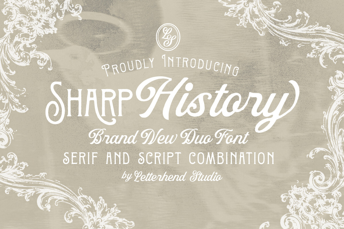
Sharp History is for the bride who wants structure, crisp edges, a tidy grid, nothing floral. My neighbor is an architect and this is the only invitation file she didn’t critique to death. That’s a real endorsement if you knew her.
It prints sharp on basically anything, which is rare. I ran a test on the cheap copy paper I keep for drafts and even that looked deliberate. On good stock it’s quietly impressive without trying to be.
The gripe, the layout is precise enough that a typo really shows. I sent a friend’s proof to print with a wrong date because everything looked so polished I stopped reading carefully. Read it out loud before you hit print. Out loud. I mean it.
What People Keep Asking
What makes an invitation look elegant?
Honestly? Space. The cards I thought looked cheap were the ones I’d stuffed full of borders and graphics and a swirly font. The ones people complimented had a ton of white space and one good typeface.
I figured this out comparing my early drafts side by side on the floor. The emptier one won every time. Pick a nice font, give it room, and resist the urge to add more at midnight.
Do I need foil?
Nope. I almost paid for real foil printing and then saw a sample of foil-look gold and couldn’t tell the difference from across a table. Your guests are looking at the card for maybe ten seconds.
A friend did actual pressed foil and it was lovely up close, but it tripled her cost. If your budget is tight, a gold-tone accent in the file prints fine and nobody at the reception is inspecting it with a magnifying glass.
How do I look expensive on a budget?
Spend on the paper, save on everything else. That’s the trick I’d give my younger self. A simple free-looking design on heavy textured cardstock beats a fancy design on flimsy stock, every single time.
I printed a plain template on 110 lb cream stock for under thirty dollars total and people assumed I’d hired someone. The design was the cheap part. The weight of the card in their hands did the convincing.
Before You Print a Stack
If you take one thing from this, let it be the paper aisle. I wasted weeks fiddling with fonts when the real difference was the cardstock I almost didn’t buy. Print a test page, hold it across the room, and if it still reads from the couch, you’re done.
Mine went out late and slightly crooked because I trimmed them myself at the kitchen table. Nobody noticed. They noticed the card felt nice in their hands, and that cost me a few extra dollars, not a few extra hundred.