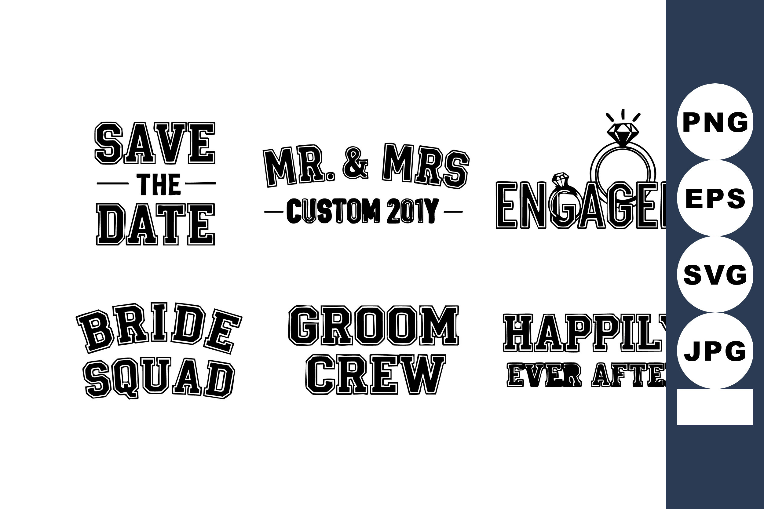
My friend Priya wanted her save the dates to look old. Not costume-old, not sepia-filter old. She kept saying she wanted them to feel like something pulled out of a shoebox in an attic, and I knew exactly what she meant and had no idea how to get there. So I printed about nine versions on the back of grocery receipts before I touched the cardstock.
Here is the thing I figured out on her kitchen counter. Vintage on a screen and vintage on paper are not the same animal. A design that looks beautifully faded on a glowing monitor can print muddy and gray and sad. We learned that around card number four, which I taped to her cabinet and walked away from for an afternoon before deciding it looked like a parking ticket.
These seven made the cut. A couple I printed at home, a couple went to the print shop on Custer because my printer cannot do warm tones without streaking, and one I just sent as a file and let the universe handle it. A few links below are affiliate links, so if you grab one a little something comes back to me. Doesn’t cost you a penny.
A few of the links below are affiliate links. If you print something from one, it tosses a little something my way and costs you nothing.
The one that nails the typewriter look
Start here if you want vintage without a single flower or flourish. It leans entirely on the lettering, that slightly uneven typeset look like a Linotype machine ran it in 1940. Priya almost skipped this one because the preview looked plain, then we printed it on ivory and it stopped us both.
I ran a test on regular copy paper first, held it across the room, squinted. It read clean from the doorway, which is my whole test. The text spacing gives the letters air so nothing crowds.
My one gripe. The default ink color is a true black that kills the old feel. Knock it down to a warm dark brown before you print a stack. Cost me one page to learn that, which is the cheapest lesson in this whole list.
Gold leaves, for when you want a little shine
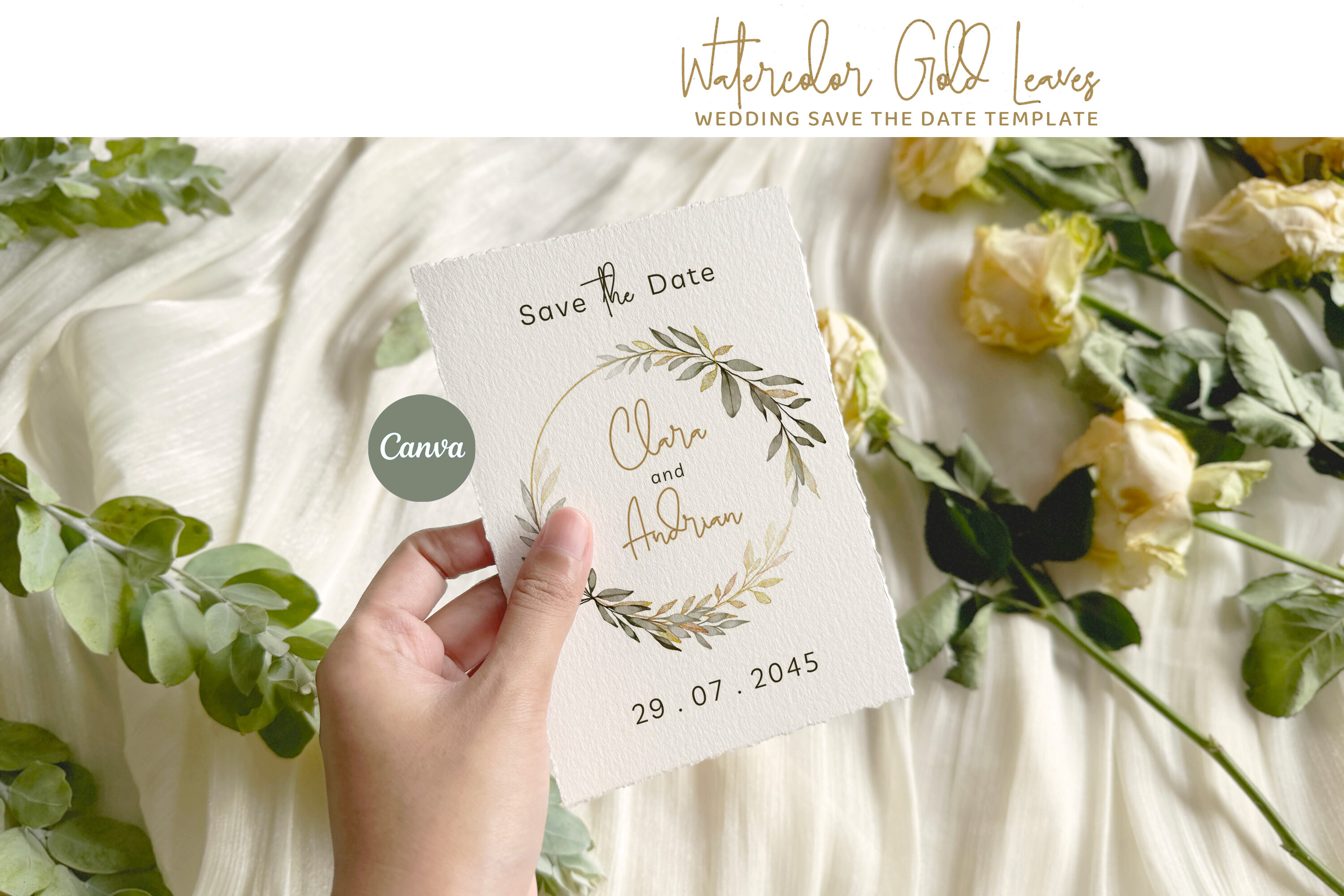
This was the one Priya’s mom reached for, which tells you something. The gold leaf border does the work and you keep the center calm. We did not print this one in gold ink at home because home gold ink is a lie, it comes out mustard.
We sent it to the shop and asked for a soft metallic on cream. It came back looking like money, in the good way. The leaves curl around the corners so the date sits in the middle with room.
Watch the contrast if your venue lighting is dim. Pale gold on cream can vanish under tungsten bulbs. Bump the saturation a notch and you are fine.
Laser cut, the splurge that earned it
Okay, this one is not a print-at-home situation, so set your expectations. The cut pattern is the whole point and your home printer obviously cannot slice paper. I sent this off to be cut and got back something that felt like an heirloom the second I held it.
Priya put hers in a vellum sleeve and the light came through the cut edges. Her aunt cried, which was not the plan but I’ll take it.
The catch is cost and lead time. Order these weeks early, not the Tuesday before. We almost missed the window because I sat on the file for ten days like a goose.
Pressed-flower vibes without a garden
If you want vintage to mean botanical, this is the soft one. The flowers look pressed and a touch washed out, like they spent forty years in a book. I love that they kept the colors muted instead of going bright and cartoonish.
I printed this at home on a textured matte stock and the texture sold it. The grain catches the muted ink and makes it look painted on. Glossy paper ruins it, so do not.
The florals run a little close to the top edge. If your printer clips margins like mine does, nudge the whole layout down a few millimeters first or you lose a petal off the top.
The text-it-out option that still feels old
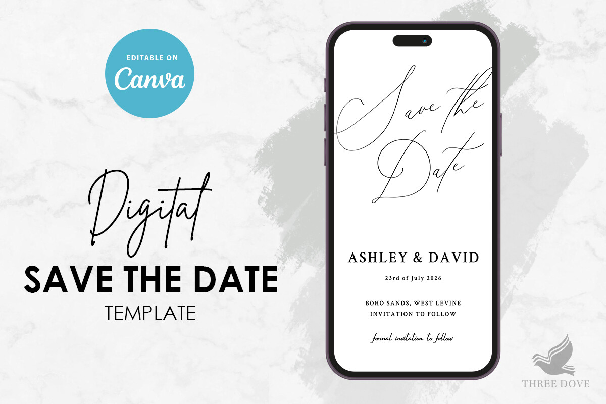
Not everyone is mailing paper, and Priya had a chunk of guests who live in their phones. This one she set up for the screen and texted out, and it still carried the vintage feel because the type and the worn texture survive on a glowing display.
She changed the date twice when their venue shifted and it never broke or shoved the layout around. That matters more than it sounds when your plans wobble.
The only thing. On a tiny phone screen the finer texture flattens out, so check it on an actual phone before you blast it to two hundred people. Looked great on the laptop, lost some grit on the handset.
The plain workhorse I keep coming back to
Some couples want vintage to whisper, not announce. This is that card. It is the most pared-back of the bunch, just good type and a thin rule line, and it is the one I would hand someone who says they hate fussy.
I typed our friends’ names in for a demo and it took maybe four minutes. The fields just behave. Printed flat on cream, held it to the fridge, lived with it overnight, kept it.
My quibble is the supplied font sits a hair thin for a dim room. Bump the weight one step before you print the full run. One wasted sheet, then smooth sailing.
Soft greenery that doesn’t fight the old look
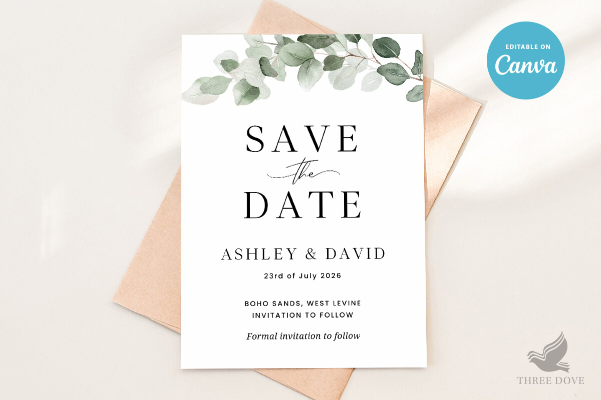
Greenery usually reads fresh and modern, which is the opposite of what we wanted, but this one pulls it backward in time. The leaves are drawn in a faded eucalyptus tone so it sits next to the typewriter card without clashing. Priya used this for her garden-venue crowd.
We printed it on warm white at the shop on Custer and the green came out sage instead of neon, which was the whole worry going in. On my home printer the same green went highlighter, so learn from me.
Watch the green-on-green if you go pale. It can wash into the background. Darken the leaves a touch and the date holds its own.
The Questions I Get Most
What makes a save the date look vintage?
Honestly? It is almost never the picture. Priya kept hunting for the perfect old photo and the thing that actually did it was the lettering and the paper. A worn typeface, slightly imperfect, plus an off-white or cream stock with some texture.
The other half is what you do NOT do. No bright white paper, no glossy finish, no crisp modern sans-serif. I taped a glossy test print next to a matte one and the glossy one looked like a coupon. That comparison settled it for us.
What fonts fit?
Anything that looks like a machine or a hand made it a long time ago. Typewriter faces, old serifs with thick-and-thin strokes, a bit of a hand-lettered script for the names. The ones I steer people away from are the geometric modern fonts, they fight the whole mood.
I learned to stop mixing too many. We used two on Priya’s card, one for the names and one for everything else, and the moment I tried a third it turned into a ransom note. Two is plenty.
How do I match my invites later?
Pick your font and your paper color now, write both down, and reuse them. That is the trick. Priya saved the exact cream shade and the two fonts in a note on her phone so when invites came around months later she was not guessing.
You do not need the invite to be identical, just from the same family. Same type, same paper tone, maybe echo one floral or the gold border. A friend asked me this last spring and she went totally different on the invites and it looked like two separate weddings. Keep one thread running through both.
One Last Thing
Priya mailed the typewriter ones and texted the digital version to the phone people, and nobody could tell she spent under a hundred bucks on the whole batch. Her aunt still has the laser-cut one on her fridge.
My advice after all those test prints. Pick one of these, run a single page on cheap paper, and hold it across the room before you commit to the good cardstock. If it reads from the couch, you are done. Then go deal with the seating chart, which is a whole other midnight.