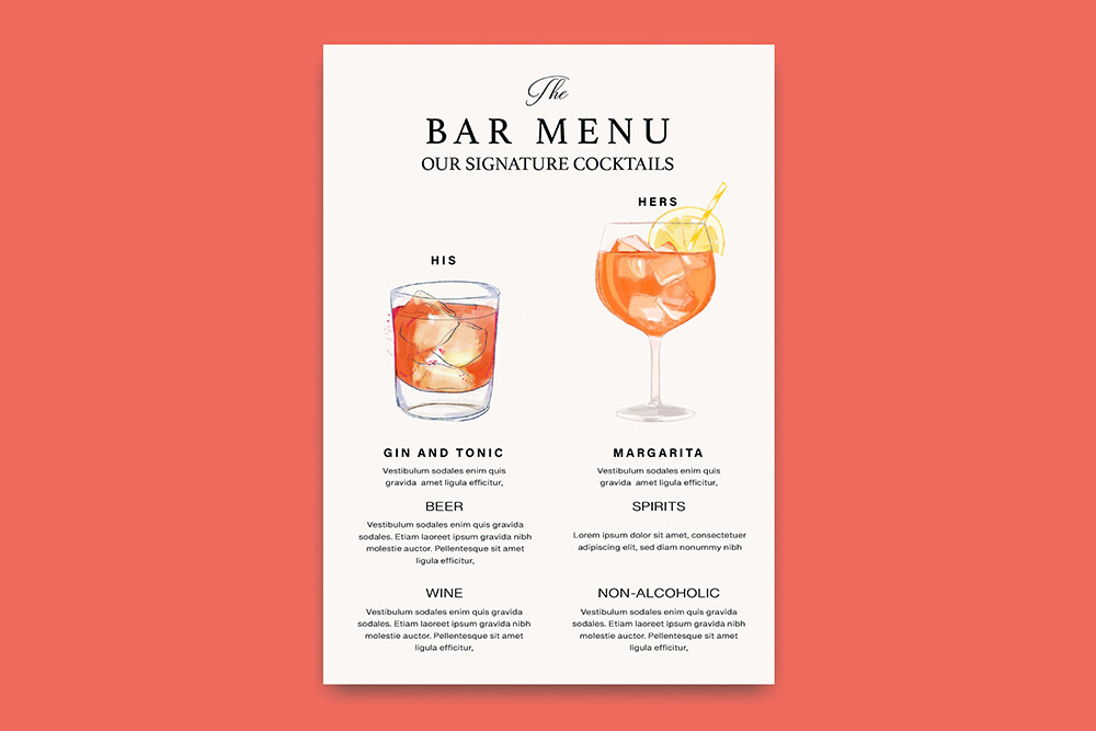
We almost skipped a signature drink sign. The bar was a folding table my cousin borrowed from her church, and I figured people could just ask the bartender what was in the punch. Then my maid of honor pointed out that nobody asks. They squint, they guess, they grab whatever is closest, and three of them end up holding the same thing.
So I made two. One for his drink, an old fashioned he renamed something dumb after his dog. One for mine, a grapefruit gin thing I drank way too many of. I printed both the Wednesday before, on the heavy cream cardstock left over from the invites, and propped them in two dollar-store frames. They sat on the bar all night and people actually read them. A few even said the names out loud.
These are the ones I would print again, plus a couple I borrowed off friends after the fact. I always run one test page on plain paper first and stand it up where the bar will be, then walk to the other side of the room to see if the drink name still reads. Some of the links here are affiliate links, so if you grab something it tosses a little back to me. No cost to you.
A few of the links below are affiliate links. If you print something from one, it tosses a little something my way and costs you nothing.
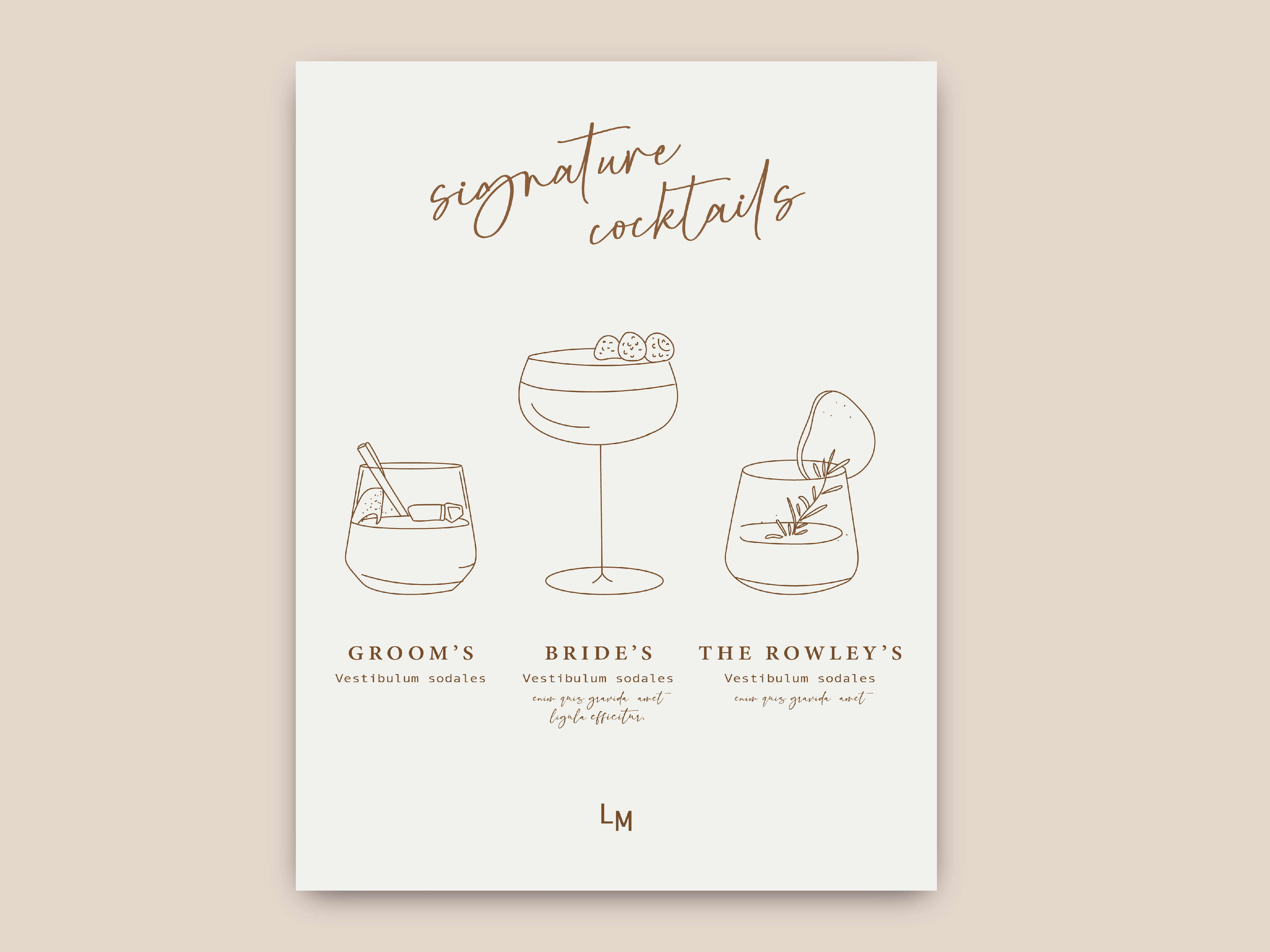
The hand-drawn one that made his old fashioned look fancy
This is the set I reach for when the couple wants the drinks to feel a little hand-made instead of typed out. The little sketched glasses sit next to each name, so even a plain whiskey drink looks like somebody thought about it. I typed in his name, her name, and the two cocktail names, and the spacing handled itself.
I did his side first. Called it the Wet Nose, after the dog, which the bartender hated reading aloud all night. Printed it on the cream cardstock around 10pm, taped it to a chair to live with it, and changed the drink name twice before I committed.
One thing. The hand-drawn glasses are thin gray lines, so if your printer is low on a cartridge they come out faint and ghosty. I caught mine on the test page and swapped in the spare. Would have looked like a smudge otherwise.
When you have more than two drinks and a real list
Not every bar is just his and hers. My friend Dana had four pours plus a mocktail for her pregnant sister, and two little frames were not going to hold all that. This menu lays the whole bar out in one column, name on top, what is in it underneath, clean and readable.
She filled hers in at her kitchen island the night before, printed it tall, and slid it into a five-dollar acrylic stand from the craft store on Bell Street. People walked up, read the list, picked, done. No bartender bottleneck.
The catch is length. Cram in five drinks with long ingredient lines and the text shrinks to where Grandma squints. Dana cut hers to four and dropped the garnish notes. Read fine from a step back after that.
A weird little flag that ended up by the cooler
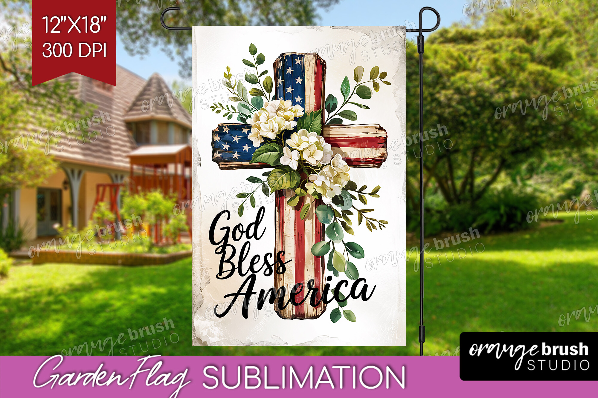
This one is not a wedding thing on paper, it is a July 4th garden flag, and I almost did not mention it. But my neighbor had a backyard wedding the first weekend of July and stuck one of these in the grass right by the drink cooler, and it tied the whole patriotic-but-not-tacky thing together.
She printed the design and had it run onto fabric at a print shop downtown, then clipped it to a cheap garden stake. Took maybe twenty minutes of fuss. Sat next to a galvanized tub of cans and looked intentional.
Obvious downside, it only works if your day is actually near the 4th, or you genuinely love red white and blue. Off-season it looks like you grabbed it from the porch. For her summer drinks corner though, it was the right kind of silly.
Split-letter monogram for the couple who wanted their initials everywhere
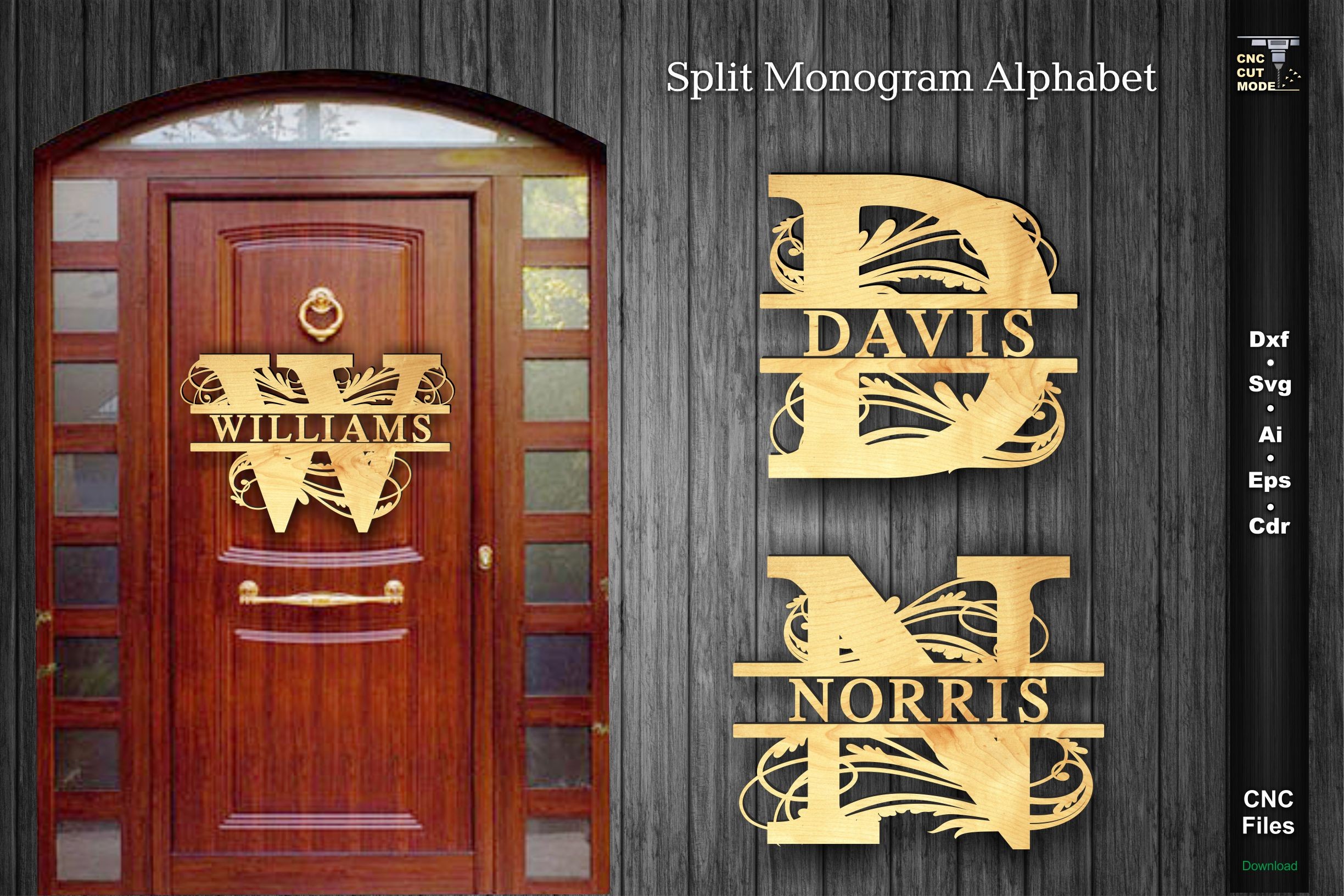
Some couples want the bar to match the rest of the day, and a split-letter monogram does that without you designing anything. The two initials sit on either side of a center line, and you can park your last name or the drink names right in the middle.
My coworker used hers above the bar and again on the welcome table, same file, just resized. She printed the bar one small to fit a tabletop frame and the welcome one big at the copy shop near her office. Cost her under four dollars total.
Mine pickier note is the center spacing. Long last names crowd the split letters and it starts to look cramped. She shortened hers to just the initials in the middle and it breathed again.
The timeline sign that quietly told people when the bar closed
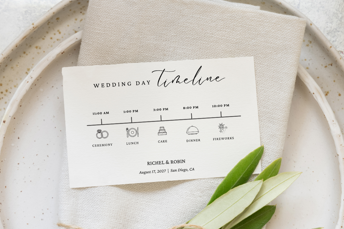
Funny enough, a timeline sign solved a drink problem for me. Guests kept asking the bartender when last call was, so I added a line to the day-of itinerary, bar closes at ten, and propped it right next to the drink signs. Did double duty.
I filled in ceremony, dinner, first dance, and the bar hours, printed it the Thursday before on the leftover cream stock, and stood it in a frame at the entrance. People read it on the way in and stopped pestering the poor guy pouring.
The one gripe, the default font is a touch formal and tight. Our venue was dim and the smaller lines went murky. I bumped the size a notch and reprinted one page. Cheap fix.
A simpler timeline if the fancy one feels like too much
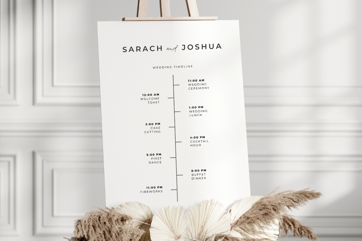
If the detailed itinerary feels like a lot, this is the stripped-back version. Bigger text, fewer lines, the kind of thing you can read from across a loud room while holding a drink in one hand. I sent this one to a friend who panics at anything that looks like a form.
She typed in four time slots, nothing else, printed it on plain bright-white paper because she was out of cardstock and it was 11pm, and honestly it held up fine in a frame. Nobody could tell it was regular printer paper from two feet away.
Watch the margins though. She ran the first one and the bottom time got clipped by her home printer. Pulled the text up a hair, printed again, sorted. One wasted sheet.
The plain template I keep coming back to for everything
This is the one I send people who say they cannot design. It is about as plain as a sign gets, which is exactly why it works for drink names, you type the cocktail in and the layout leaves it alone. I used it for the his-and-hers names at my own bar.
I made two copies, changed one word on each, his drink, my drink, and printed them side by side. Same frame style, same cardstock, so they looked like a pair without me matching anything by hand. Did it in maybe ten minutes between other panic tasks that week.
My nitpick is that plain means plain. If you want anything decorative you are adding it yourself in another program, and I did not have the patience for that at midnight. For two clean drink names though, it was the easy yes.
The Questions I Get Most
How do I name signature drinks?
Honestly? I overthought this for a week and then named ours after the dog in five minutes. The names that landed at every wedding I have been to were either an inside joke or just His and Hers spelled plainly. My coworker called hers The Slow Yes because that is how long it took him to propose, and people loved asking about it.
Keep it short enough to read on a sign from across the bar. Long clever names get cut off or skipped. If you are stuck, name the drink after where you met or a pet and call it done.
What goes on the sign?
The drink name and what is actually in it. That second part matters more than you think. A friend skipped the ingredients to look minimal and spent her whole reception watching guests poke at a mystery red drink nobody trusted.
Name on top, two or three ingredients underneath, that is plenty. I added one tiny line about which was sweeter so nobody got surprised. Skip the long descriptions, people are reading this with a plate in one hand.
What size for the bar?
I learned this the hard way. My first sign was 5×7 and it vanished behind a bottle of gin and a stack of cups. Useless. For a bar where stuff piles up in front of it, go bigger, an 8×10 in a frame or a tall acrylic stand that sits above the clutter.
If it is two small his-and-hers signs flanking the drinks, 5×7 each is fine because they sit out at the edges. One central menu though, size it up. Print a test page, set it where the bar goes, and check it from where people will line up.
One Last Thing
None of this is the part guests remember by name, but it is the part that makes a folding table look like a real bar. I spent maybe twelve dollars on frames and cardstock for the whole drink corner, and got more photos out of two little drink signs than I expected.
Pick one template, print a test page on whatever paper is in the tray, and stand it up where the actual bar will be. If you can read the drink name from across the room with one eye closed, you are done. Go drink the thing you named.