Our bar was a folding table from my uncle’s garage with a tablecloth thrown over it. The only thing that made it look on purpose was the sign propped next to the cups. I printed that sign at a copy shop on Ashby the morning of, still in my running shorts, and the guy behind the counter asked if I was nervous. I said no. I was lying.
Here is what nobody warns you about bar signage. People do not read it from where you think they will. They read it half-drunk, from four feet back, while someone behind them is reaching for a beer. If the font is cute but thin, it disappears. If the drink names are clever but tiny, your cousin asks the bartender what a French 75 is anyway, and now the line is backed up to the dance floor.
So these are the ones I would print again, plus a couple I tested and have opinions about. I run one page on plain paper first and tape it to a wall, then I walk to the far side of the room and squint. A few of the links are affiliate links, so if you grab one a little something comes my way. Doesn’t cost you a thing.
Quick note, a couple of these are affiliate links. If one ends up at your reception, it helps keep this little blog running and you pay the same.
The one I’d hand a friend who froze up
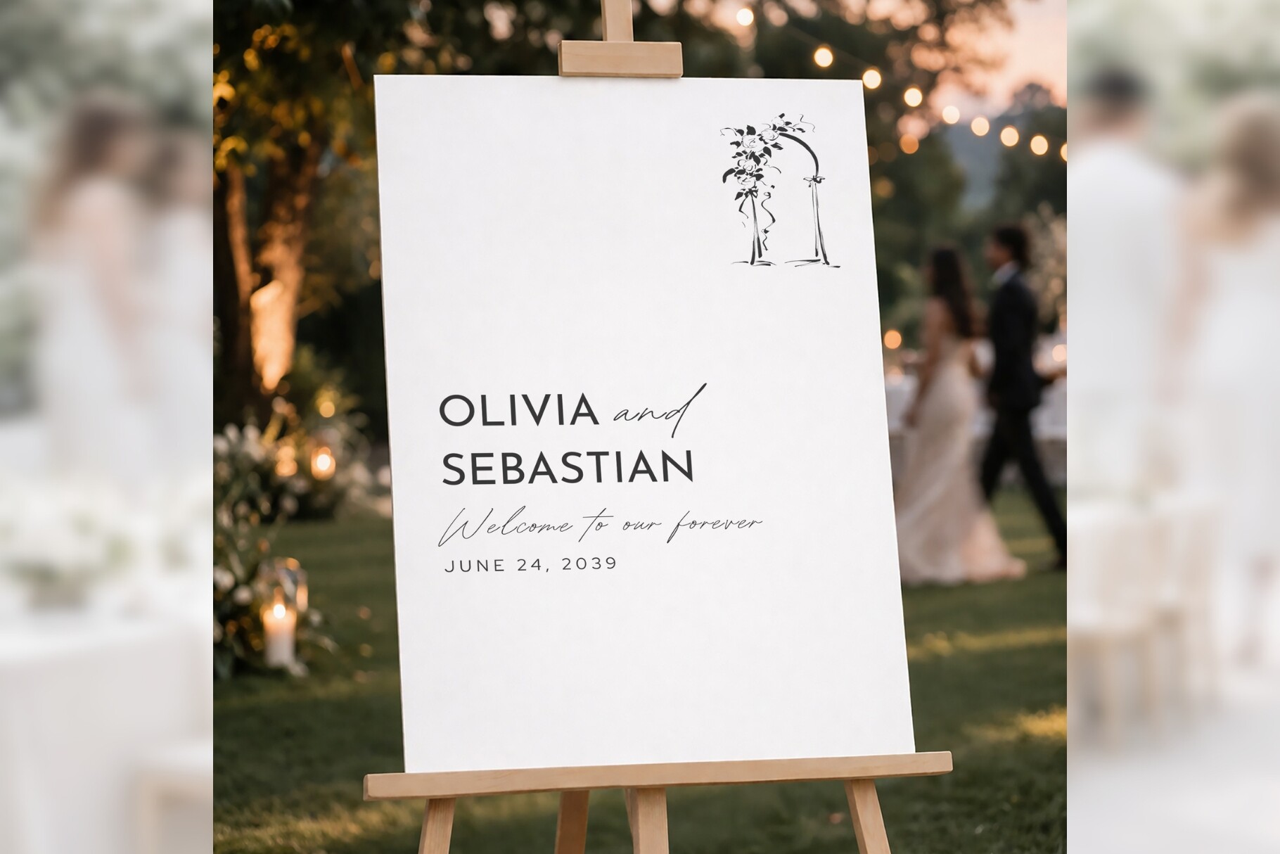
My friend Priya called me in a small panic three days out because she had nothing for her bar table and zero design instincts, her words. I sent her this. Leafy border, plenty of open space in the middle, and you just drop your own text in where the drink names go. She had it printed by that night.
I also ran one myself, on plain paper, taped above my coffee maker for two days to make sure I didn’t hate it. The botanical edge does a lot of the work so your typing doesn’t have to be fancy. One nit. The leaves crowd the top corners a hair, so if you write a long header like a full signature-cocktail name it bumps into them. I shortened mine. Took ten seconds.
Greenery that doesn’t fight the drink list
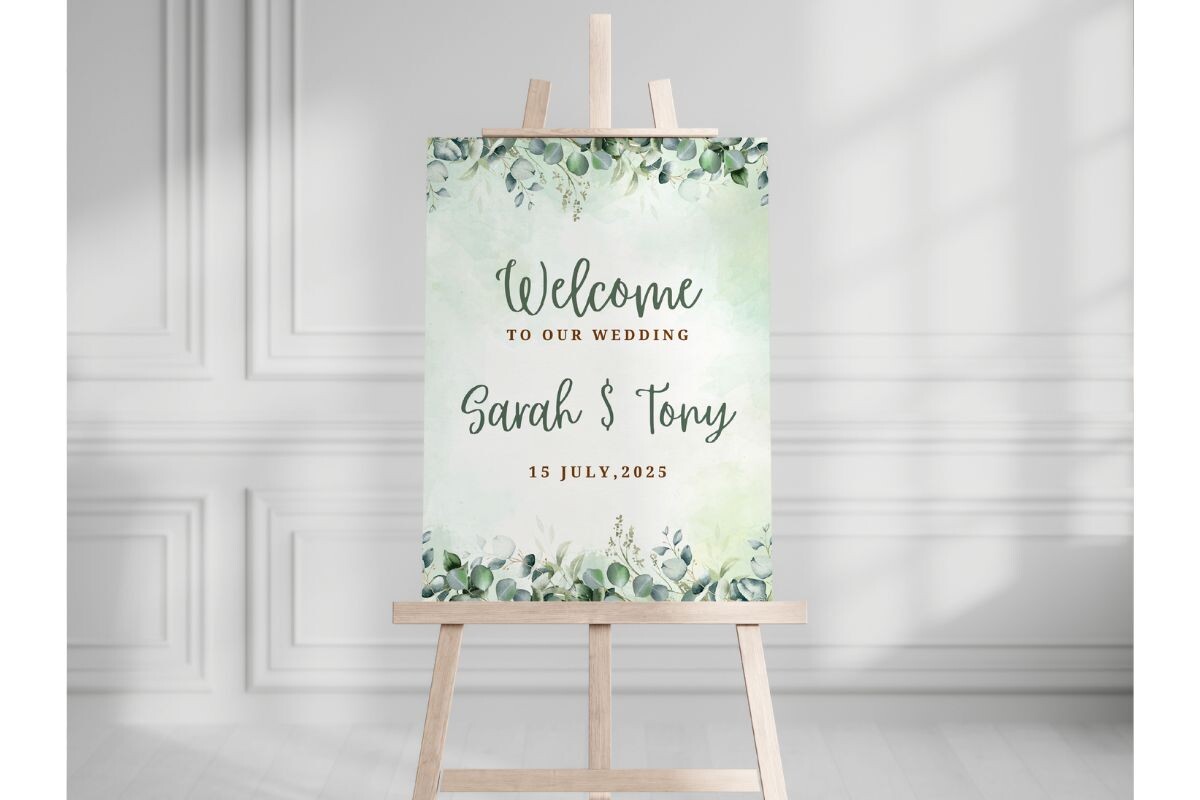
If your bar is already busy, bottles, a tip jar, that one rogue lime that rolled off, you want a sign that stays calm. This greenery layout is softer than the botanical one. Lighter touch on the edges, more room down the center for a list.
I used a version of this for the wine-and-beer-only corner at my reception, because we were not paying for a cocktail bar and I refused to pretend otherwise. Typed “red, white, or whatever’s cold” and called it done. The greenery printed clean on matte cardstock. On glossy it picked up glare under the string lights, so test your paper. The green can read a touch yellow on a cheap printer too, mine streaks anything with a lot of ink, so I ran it at the shop.
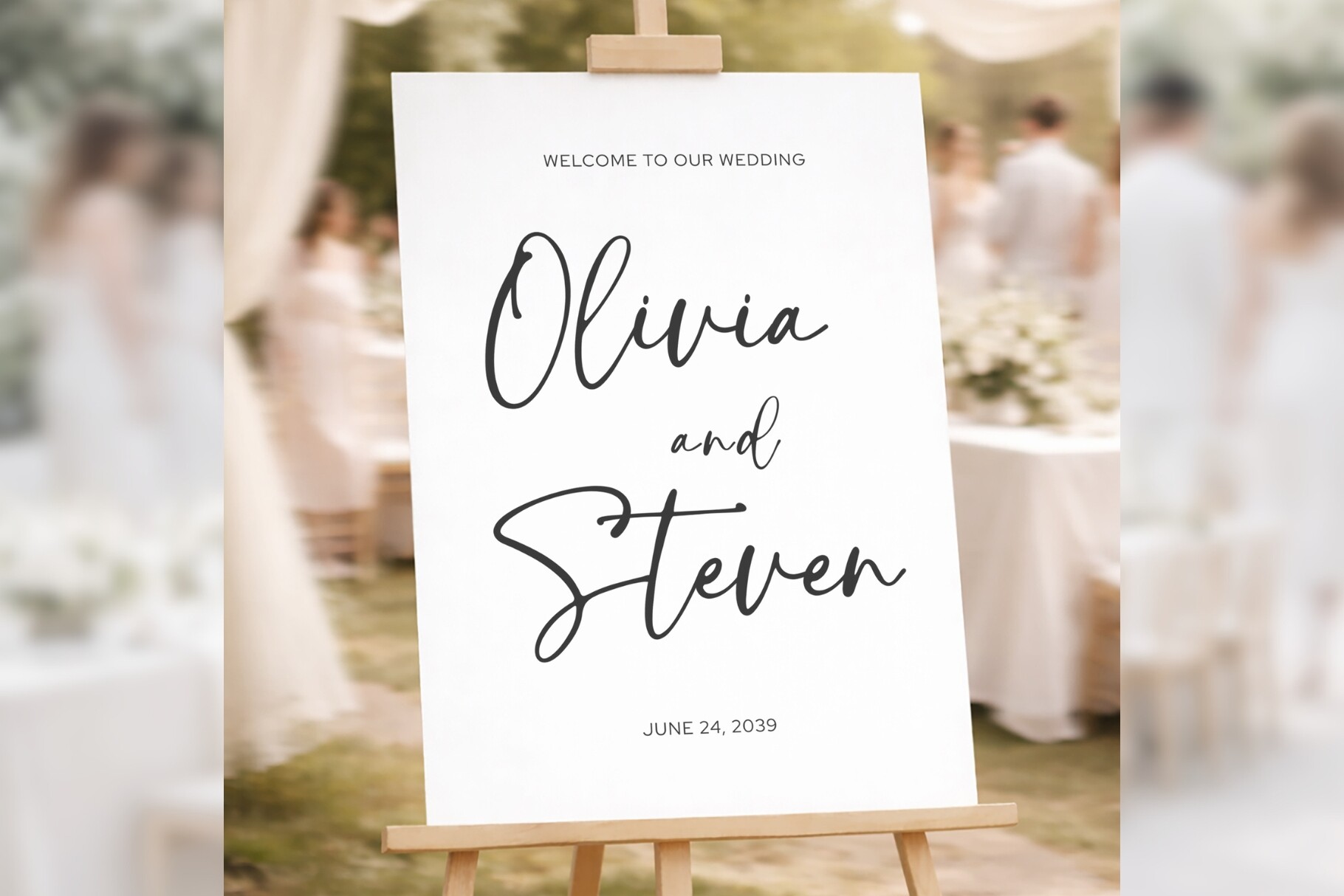
Plain on purpose, and that’s the point
Some bars don’t need flowers. This is the no-frills welcome layout, clean type, big open field, the kind of thing you can turn into a drink menu in about four minutes. I typed our two signature drinks, the beer, and a line that said “water is free and we love you for drinking it.”
The spacing here is the good part. It lines up your text without you fiddling, so changing a drink name doesn’t blow up the whole layout. I swapped “Aperol Spritz” for “the orange one” the night before because nobody could spell it, and nothing shifted. The default font ships a little light. In a dim venue I bumped the weight before printing a stack. One wasted page taught me that.
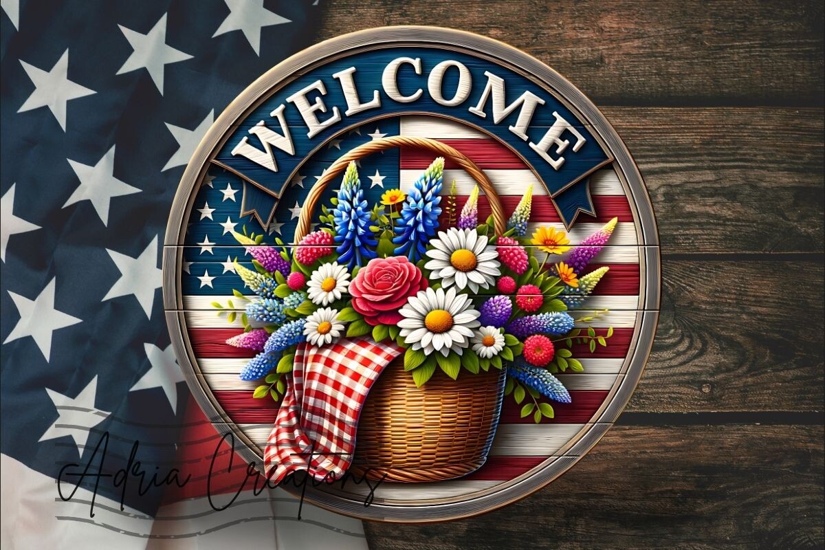
For the Fourth of July bar table
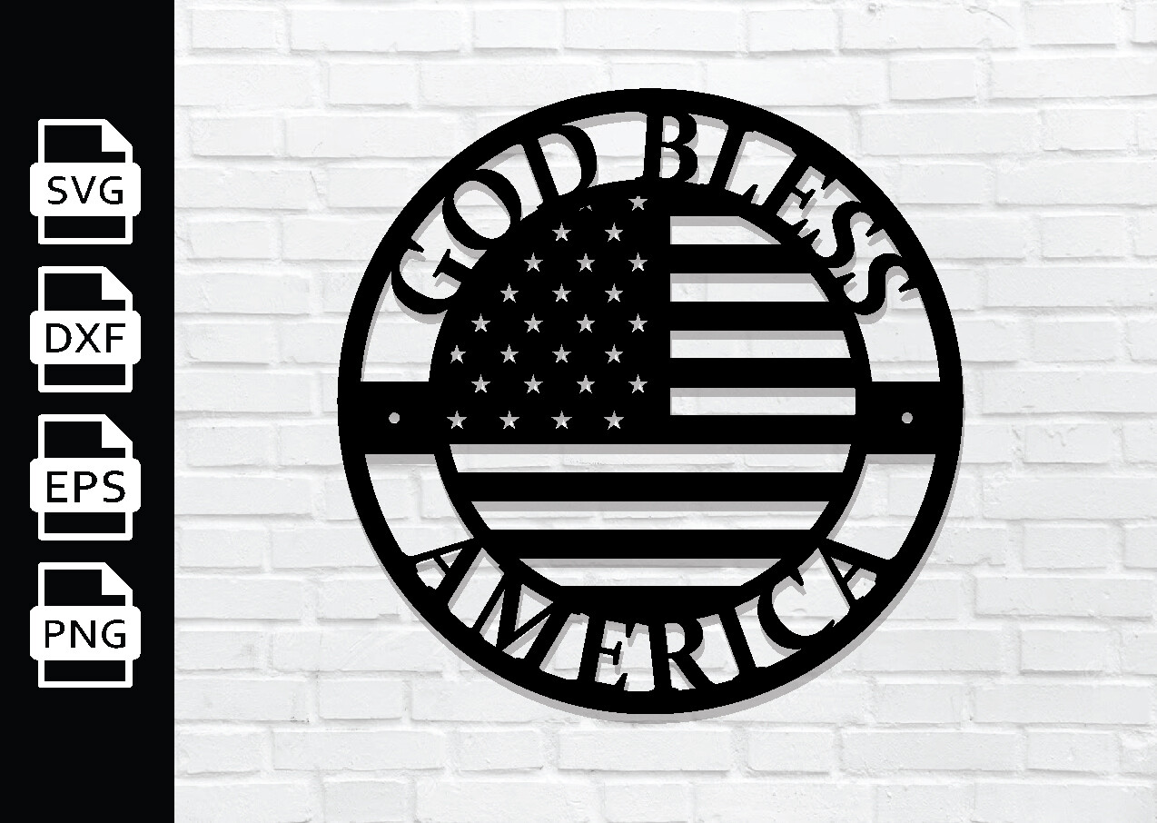
Quick honesty, this one isn’t a classic wedding sign. It’s a flag-and-stars piece I grabbed for a July wedding my coworker had, the whole thing was red, white, and blue down to the napkins. I printed it as the header above her beer cooler and wrote the drink names underneath on a separate card.
It reads loud from far away, which is exactly what you want on a packed patio. Bold lettering, high contrast. That said, it’s seasonal and unapologetic about it, so this is a yes only if your day actually leans patriotic. Don’t force it onto a soft greenery wedding. I printed it on bright white because anything cream washed out the blue.
Script that still reads across a loud room
I am suspicious of script fonts on bar signs because they look amazing on the screen and turn into spaghetti from across a reception. This one mostly survives that test. The script is on the header, and the body where your drink list goes stays in something readable.
I printed a draft, taped it to my hallway wall, walked to the kitchen, and could still make out the words, which is my whole bar at home so that’s the test I had. Use the script for “Drinks” or your names up top, keep the actual cocktails plain underneath. My one gripe, the script’s flourishes eat space, so a long single word can run wide and crowd the margins. Shorten the header and you’re fine.
The themed one I almost talked her out of
Another flag piece, this one with a 3D basket look, and I’ll be straight with you, it is very specifically a Fourth of July thing. My coworker wanted a matching set for her drink station and this paired with the other flag sign. As a duo on a summer holiday table, fine, it works, it’s festive and it pops.
I’d skip it for any normal wedding. It’s busy, the basket detail competes with whatever text you add, and on a small print it gets muddy. We printed it big, like 11 by 14, so the detail had room. At letter size it looked like a sticker. Print large or don’t print it.
The grown-up one for the head of the bar
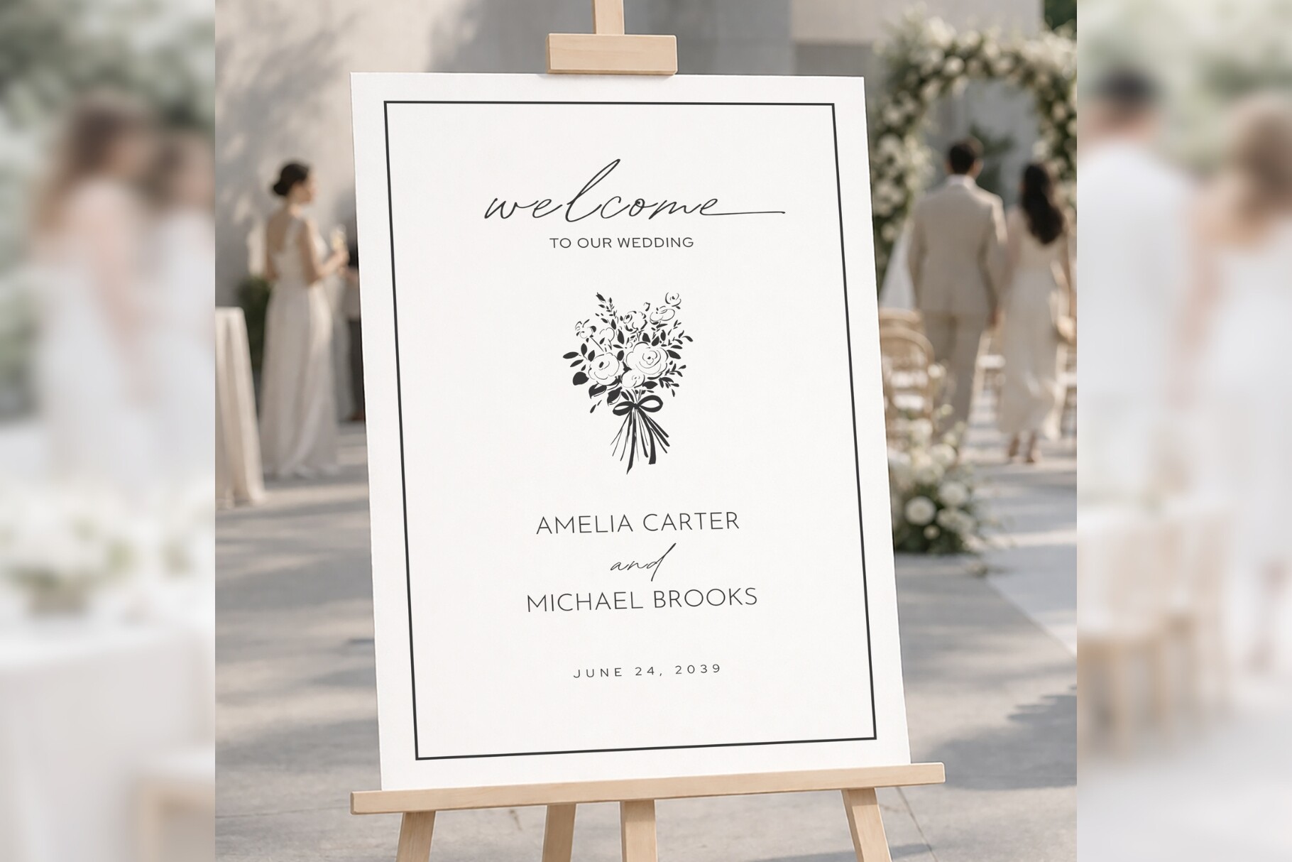
This is the one I’d put at the main bar if the wedding is dressy. Clean, modern, a little formal, the kind of sign that makes a garage folding table look intentional. I tested it for my maid of honor’s vow renewal and it carried the whole drink corner on its own.
The margins are generous, which I care about more than I should after a home printer once clipped a name in half on me. Text sits comfortably with room around it, so your drink list breathes instead of crowding the edge. Small catch, the elegant version leans light and airy, so a long list of six cocktails starts to feel cramped. Keep it to four drinks and a water line, or split it across two signs.
The Questions I Get Most
What bar signs do I need?
Honestly? Fewer than Pinterest will tell you. I did two and it was plenty, a welcome or header sign so people know where the drinks are, and a drink list so nobody has to interrogate the bartender.
If you have a signature cocktail, give it its own little card, people love a named drink. Everything past that is decoration. I made a third sign about a tip jar and nobody read it, so learn from me and don’t bother.
Can I edit the drink list myself?
Yep. You type your own drinks right in, swap names, change the order, all of it. I changed mine the night before because two of our cocktails were impossible to spell after the third glass of wine.
My only advice, edit on a real computer if you can, not your phone at midnight. I tried thumb-typing a drink list once and the spacing went sideways. Easier to fix on a bigger screen with both hands.
What size do I print?
For a header by the bar I go big, 11 by 14 or larger, because people read it from a line, not up close. For an actual drink list they’ll stand near, letter size or 8 by 10 is fine.
I learned the hard way that a tiny sign on a busy bar just gets ignored. Print one test page first, tape it up, and walk to the far wall. If you can’t read it from there, size up. That squint test has saved me every single time.
One Last Thing
Your bar table does not need to be fancy. Mine was a borrowed folding table and a sign I printed in my running shorts, and people still lined up at it all night.
Pick one welcome sign, one drink list, maybe a card for the cocktail with the fun name. Run a test page on plain paper, tape it to the wall, squint from across the room. If it reads, you’re done, go deal with the forty other things on your list.