My venue was a converted hay barn with a sliding door that never quite closed. Lovely in photos. A wind tunnel in real life. I learned that the morning of, when my seating chart, the thing with everyone’s name on it, decided it wanted to fly toward the parking lot.
Rustic is a trap that way. It looks effortless on Pinterest and then you are standing in a field at dawn with a staple gun, a slab of pine you bought off a guy named Dale, and a printout that is one centimeter too wide for the frame. The wood part is easy. The readable, holds-up, did-not-cost-four-hundred-dollars part is where people lose a weekend.
These are the templates I either used or handed to a friend who was crying about her chart at 10pm. I print a test page on plain paper, prop it against a chair across the kitchen, and back away until I can still read the last table. If it survives that, it survives a barn. A couple of the links here are affiliate links, so if you grab one it tosses a few cents my way. Doesn’t change your price.
Quick note, a couple of these are affiliate links. If one ends up at your reception, it helps keep this little blog running and you pay the same.
The plain one I keep coming back to
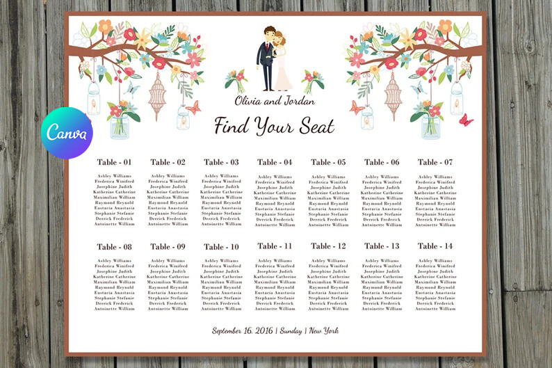
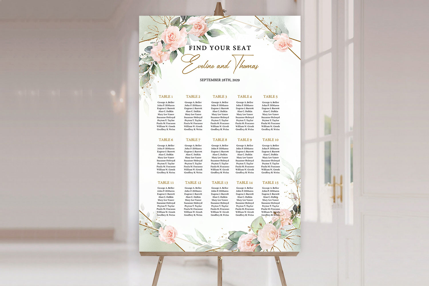
This is the workhorse. No flowers, no flourish, just clean type and tables you fill in, which is exactly what you want when your decor is already doing the talking with a giant wood plank behind it. I typed in 96 names for my cousin Dani and the spacing held without me babysitting every line.
I printed it on warm white instead of bright white so it sat better against the raw pine. Looked aged, in a good way. One gripe though. The default header sits high, so on a tall sheet you get an awkward gap up top. I dropped it down a notch before printing the real stack and it looked deliberate after that.
When your rustic leans soft and not so lumberjack
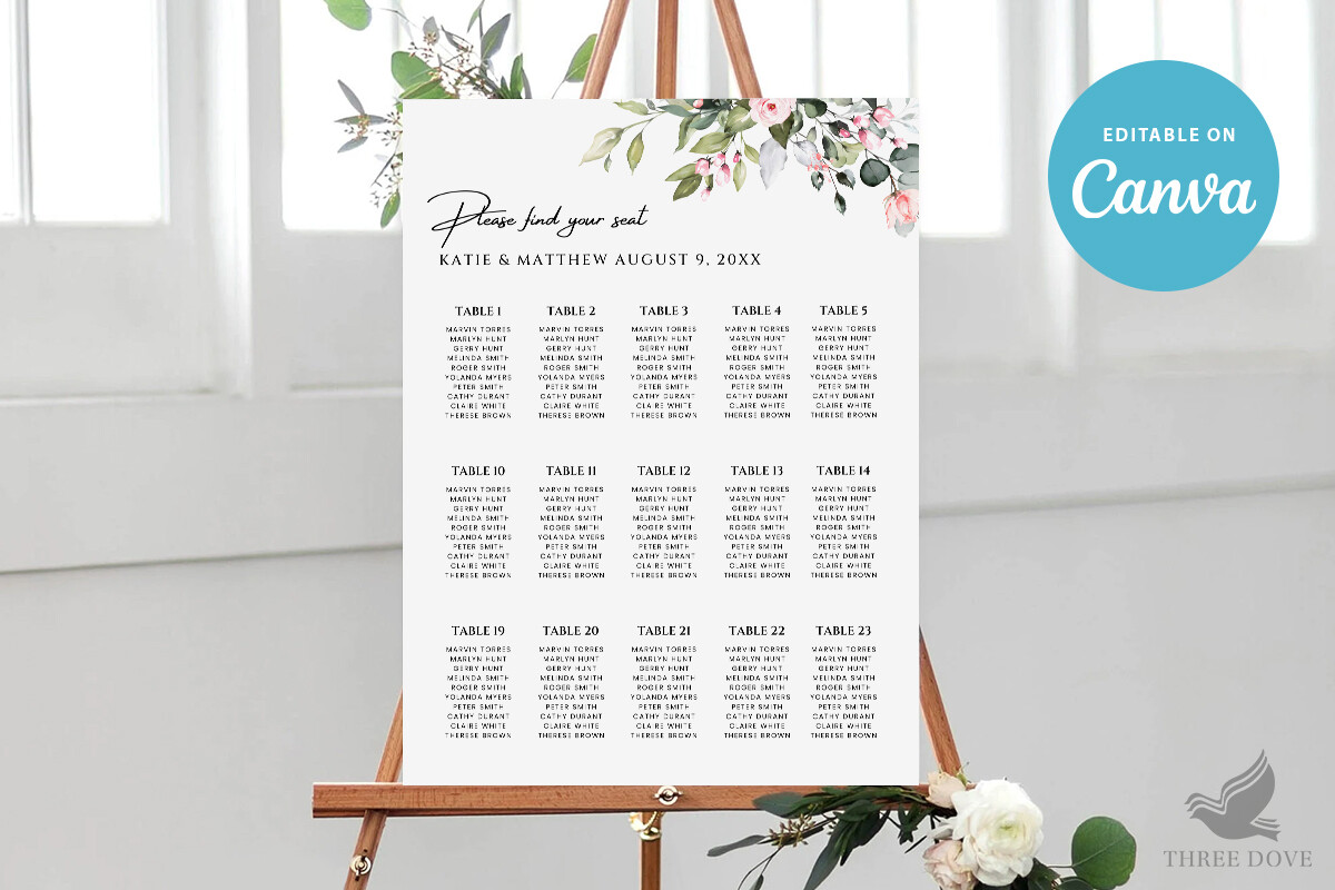
Not every barn wedding is all burlap and antlers. My friend Priya wanted rustic but pretty, more wildflower-field than woodshed, and this floral one hit it. The blooms frame the names instead of crowding them, which matters when you have eleven tables to fit.
She ran hers at a copy shop on Bell Street because her inkjet turns peach into salmon every single time. Smart move. The flowers print muddy on cheap paper, I found that out testing it at home first, so spend on the cardstock for this one. The base layout is forgiving. The art is not.
Eucalyptus without buying actual eucalyptus
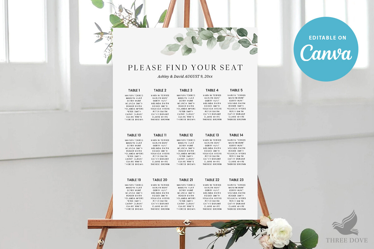
Real greenery on a chart wilts by the reception. Ask me how I know. This template fakes it with painted sprigs down the sides, and honestly from six feet away nobody could tell my chart had a single real leaf on it.
I paired the printed version with two stems of dried eucalyptus tucked behind the frame, total cost maybe four dollars, and it read as a whole forest. The catch is the green runs close to the margin, so do a test print and check your printer isn’t shaving the edge off. Mine clipped the left sprig the first go. One wasted sheet, lesson learned.
For the bride who changed the layout four times
Some templates fall apart the second you move a table. This one didn’t. My maid of honor swapped her floor plan the Tuesday before the wedding, twice, and the type just reflowed instead of throwing the whole thing into chaos.
It is simple enough to drop onto any rustic backdrop, a window pane, a chalkboard, a leaning ladder, whatever you found at the flea market. I’d warn you the font ships a little thin. In a dim barn at dusk it nearly disappeared, so bump the weight before you commit to printing a dozen. Took me one squint from across the room to catch that.
The blush version for an outdoor afternoon
If your color story is soft and your light is good, the blush pink florals on this one glow. My neighbor used it for a daytime orchard wedding and the pink picked up the actual peach trees behind the easel. Felt planned, wasn’t.
Word of caution. Blush is the trickiest color to print right, it goes orange on a tired cartridge faster than anything, so I’d send this one out rather than wrestle your home printer. She did a single proof at the print shop, held it up against her bridesmaid dress, then ordered the full sheet. The names stay crisp even with all that flower around them, which is the whole point.
The one that scales up to poster size
Here is where vector earns its keep. I wanted my chart big, like 18 by 24 big, and most files get pixelated and sad when you blow them up. This one didn’t. Crisp at every size, which let me go large without it looking like a fuzzy screenshot stapled to wood.
My guy held the slab steady on the lawn while I checked the proof from across the yard, the way we’d done with everything else by then. It stayed sharp. My only nitpick, the larger you print the more empty space opens up between names, so for a big format I nudged the tables wider apart on purpose. Looked intentional. It was, eventually.
The fastest route from panic to printed
Sometimes you are out of time and you just need a chart that works tonight. This printable is that. I sent it to a coworker who realized at 9pm she had no chart and a wedding in 36 hours. She typed her names in, printed at the FedEx by her office the next morning, done.
No fuss, no fighting the layout, which is the entire appeal when you are running on fumes. I’ll say the design is on the plainer side, so if your wedding is very styled you might want one of the floral ones above. For a rustic setup with a strong wood backdrop, plain is exactly right. Hers was framed in an old window and looked like she’d planned it for months.
Questions Brides Ask Me
How do I make a rustic seating chart?
Start with the backdrop, not the names. I grabbed a slab of pine off a guy selling them out of his truck, sanded the worst splinter off, and propped it on an easel. Then I printed the chart, framed it, and leaned it against the wood.
The trick that saved me was testing the print on plain paper first and reading it from across the room. If you can’t read the last table from your couch, your guests won’t read it from the bar. Fix the size before you touch the good cardstock.
What materials fit rustic?
Wood, mostly. A raw plank, an old window pane, a chalkboard, a leaning ladder, a vintage frame you found for six bucks at a flea market. I used pine and an old window I pulled out of my parents’ garage, and both looked like I’d hunted for weeks.
What I’d skip is anything too shiny or too new. Glossy frames fight the whole vibe. Burlap is fine in small doses but it eats the printed words if you put paper right on it, so frame the chart and set it against the burlap instead.
How do I add greenery?
Two ways, and I’ve done both. The cheap fast way is a template with painted sprigs printed right in, no wilting, no cost beyond the paper. From a few feet out nobody clocks the difference.
The other way is real, and it’s fussier. I tucked a couple stems of dried eucalyptus behind the frame the night before so they wouldn’t wilt, total spend around four dollars. Fresh greenery looks droopy by dinner, I tried it once and regretted it, so if you go real, go dried.
Before You Hit Print
None of these will make the wind in a barn behave, I can promise you that much. But the right template means the chart itself isn’t the thing keeping you up the night before.
Pick one, print a test page on whatever’s in the tray, and squint at it from the far side of the room. If your last table still reads, you’re done. Go to bed. The pine slab from Dale will still be there in the morning.