Green was the only color my fiance and I agreed on without a fight. Everything else was a negotiation. He wanted black, I wanted blush, we landed on sage by accident after I pinned a eucalyptus garland at two in the morning and refused to let it go.
Here is the thing about green on paper. On a screen it looks calm and a little fancy. On my home printer the first time, it came out the color of a hospital wall. I almost gave up and ordered from a print shop downtown that quoted me four hundred dollars for fifty suites. Instead I tested six different files until I found ones where the green stayed green.
These are the ones I kept. Sage, deeper emerald, a couple of neutrals I leaned on so the whole thing did not read like a salad. I printed a test page of each on cheap copy paper, taped them to my hallway wall, and let them sit a week. A handful of the links below are affiliate links, so if you grab one I get a tiny cut. Does not cost you a thing.
Some links below are affiliate links. If you download one for your day, I earn a tiny bit and it changes nothing on your end.
The eucalyptus and gold set I built my whole suite around
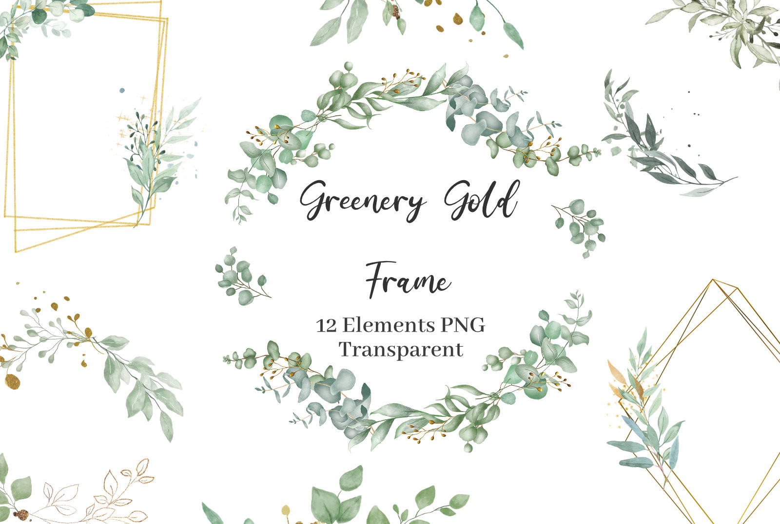
This was my anchor. Soft watercolor green with thin gold geometric lines, and I dropped our names into the frame and barely touched anything else. The eucalyptus reads as eucalyptus, not generic leaf shapes, which mattered to me because that was the actual plant in my bouquet.
I printed the save-the-dates from this on a slightly heavier matte stock at the FedEx on Roswell Road. The gold does not print as real gold, obviously, it is a printed mustard tone, so I set my expectations there and was happy. Looked rich enough across the room.
My one gripe. The geometric border sits close to the edge on the RSVP card, so trim carefully or it looks lopsided. I lost two cards to a crooked paper cutter before I slowed down.
Tiny sage bows that saved my place cards
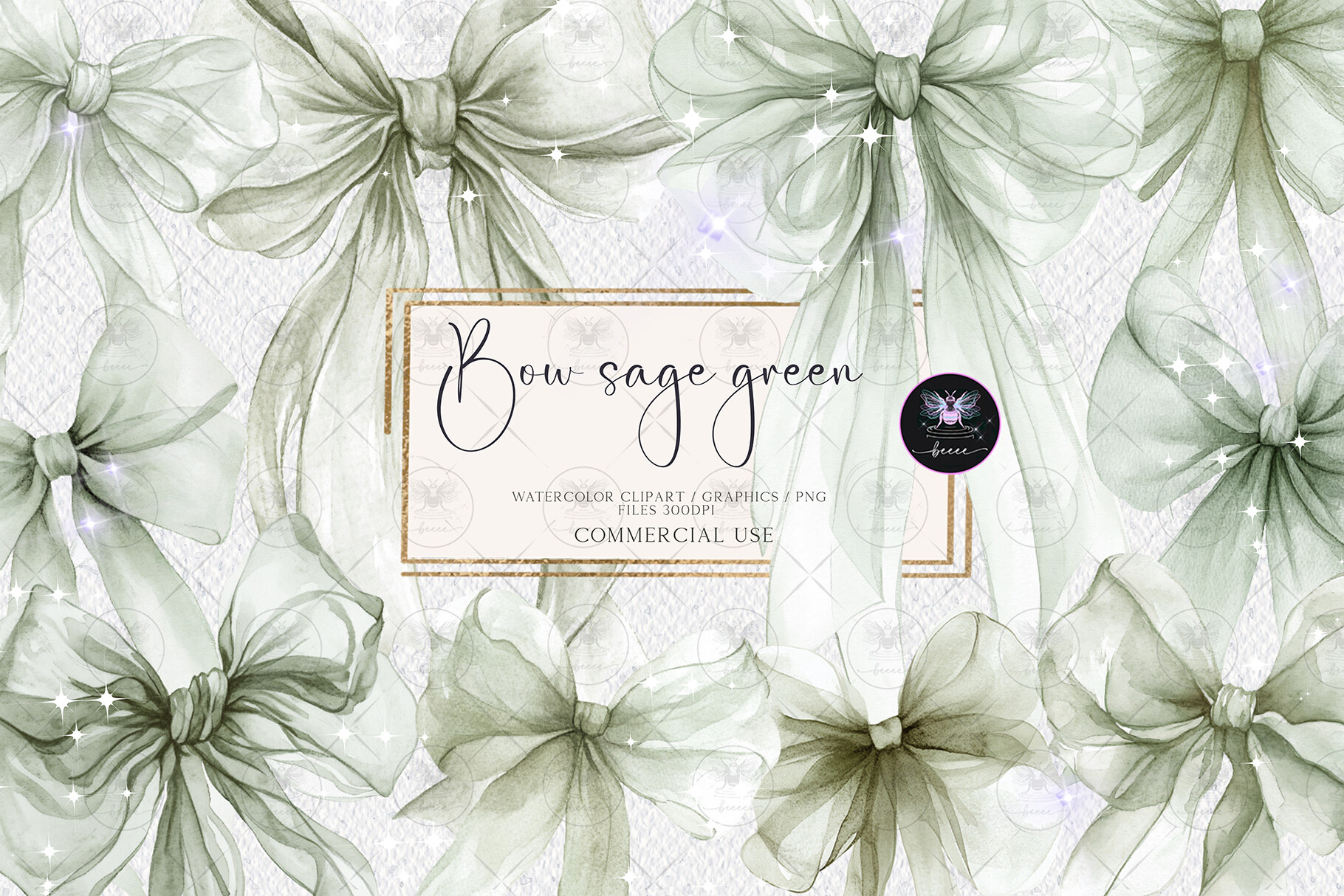
I almost skipped this one. Then I needed something to dress up plain folded place cards and these little watercolor bows did exactly that. I tucked one in the top corner of each name card and suddenly the table looked like I had a plan.
They are clipart, so I dragged them around freely and resized them per card. I made a few bigger for the head table. My cousin who hates anything cutesy even admitted they were nice, which from her is a standing ovation.
The catch is the white edge. A couple of the bows had a faint halo around them on darker paper. On my cream cardstock you could not see it. On a kraft tag it showed, so I stuck to light backgrounds.
Bouquet clipart that filled my awkward empty corners
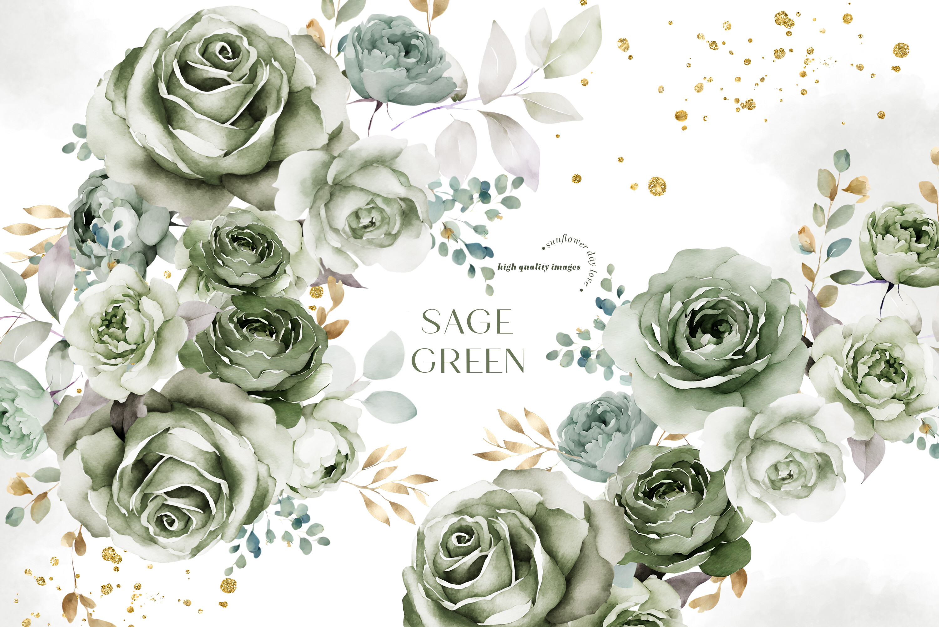
Every layout I made had a sad blank space in the bottom right. These sage bouquets fixed that. Little clusters of soft green florals I could float wherever the card felt thin.
I used the smallest ones on the details card and a fuller bouquet on the welcome sign I taped to an easel at the entrance. That sign, by the way, fell off twice before the ceremony, but the design held up fine. Operator error.
What bugged me a hair was the file count. There are a lot of them and no real preview grid, so I scrolled forever to find the three I actually wanted. Worth it once I did, just budget ten minutes to dig.
A whisper of blush so the green stopped feeling cold
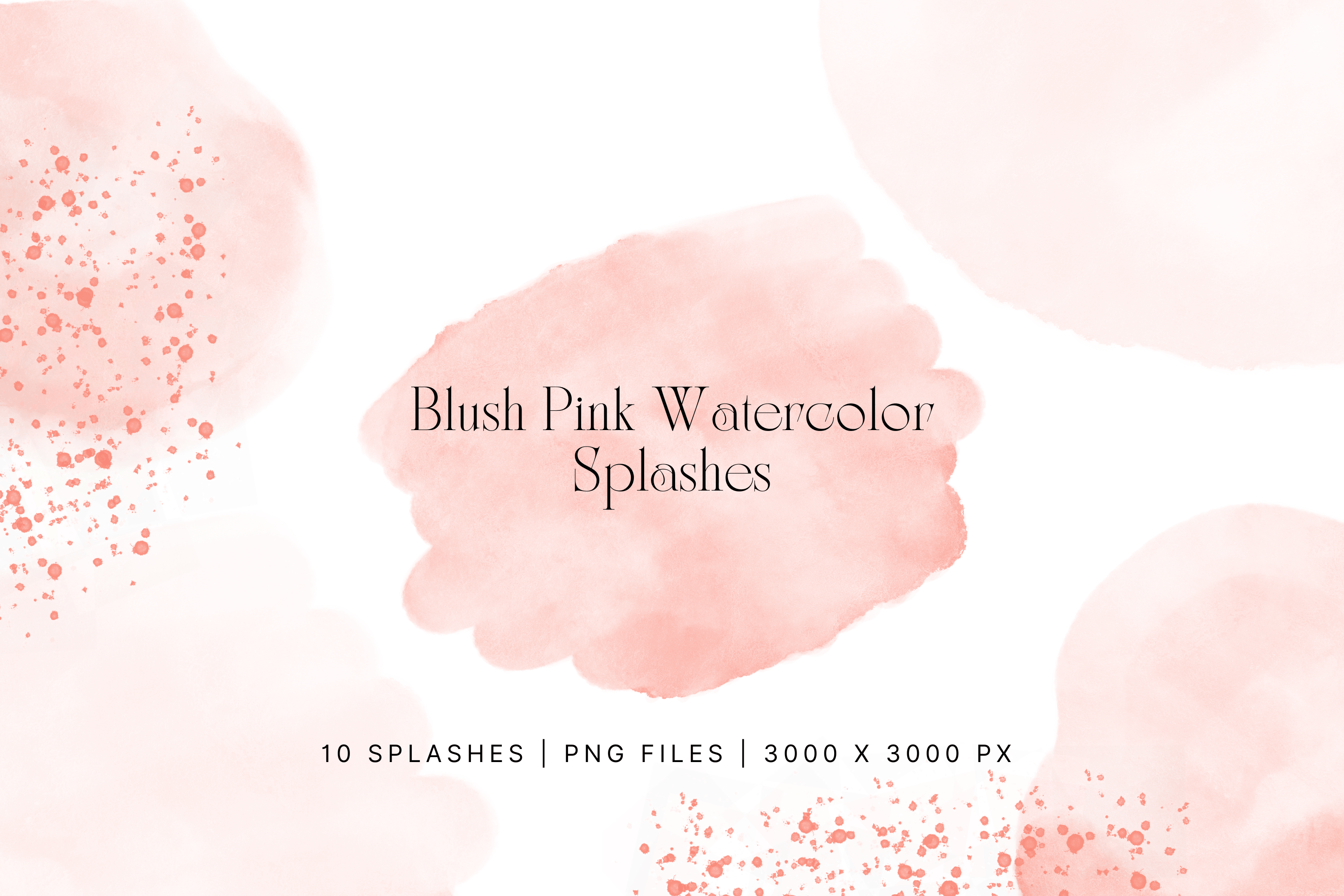
All green starts to feel a little serious after a while. I wanted a warm note without going full pink wedding, so I pulled in these blush watercolor splashes and used them small. Like, behind a monogram or under the RSVP date.
I kept them faded way down in opacity. At full strength they were too much, more art project than invitation. Dialed to about thirty percent they sat under the sage and just warmed it up.
One honest note. The splatter edges are sharp watercolor, not soft, so they do not blend into a background, they sit on top. If you want subtle, layer them low and tuck them behind text.
The striped rose papers I lined my envelopes with
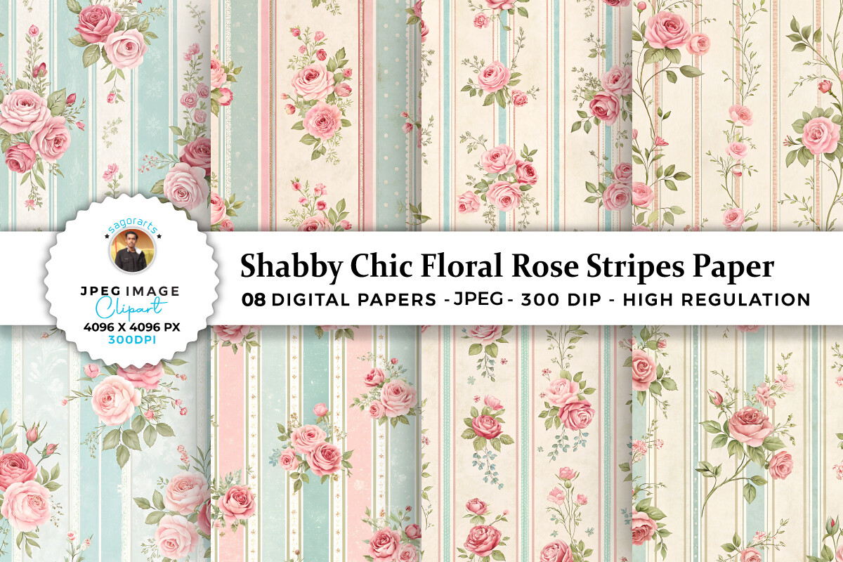
This was a maid of honor idea, not mine. She suggested lining the envelopes so the inside had a little surprise when guests opened them. These shabby floral and stripe papers were the move.
I printed sheets of the rose stripe, cut them to fit the envelope flap, and glued them in with a tape runner one very long Sunday. Forty envelopes. My hands smelled like adhesive for a day. Came out looking like I paid for it.
The rose is more vintage than bright, which fit the sage perfectly, though if you want crisp modern this is the wrong file. It leans soft and a touch faded on purpose.
Beige splashes for the neutral breathing room
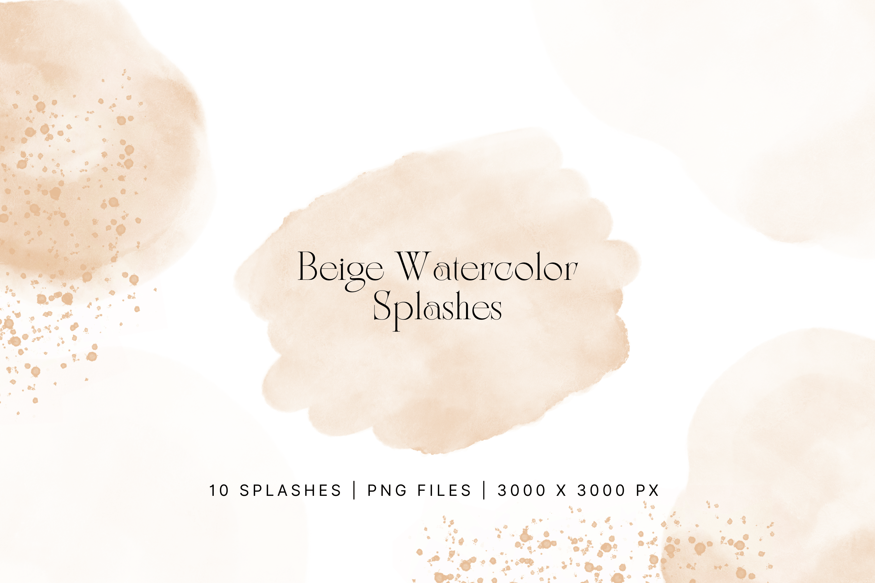
Pairing green with neutrals is the whole trick, and beige was my quiet workhorse. These nude watercolor splashes did the same job as the blush ones but even calmer, so I used them on the formal pieces where pink felt like too much.
They went under the ceremony program text. Just enough texture so the page was not a flat white block. From the back row nobody clocked the splatter, they just felt the page looked finished.
Same issue as the pink set, the edges are defined, so do not expect them to fade into the paper. Keep them low and behind type and they earn their keep.
Box templates for the favors I cut myself at midnight

Okay this one is not paper for invites, it is the favor boxes, and I am sneaking it in because it tied my green theme onto the tables. Seventy plus box shapes I ran through my Cricut.
I cut a small pillow box for each guest in a sage cardstock, dropped a couple of chocolates in, and tied them with thin twine. The cut lines were clean, no fussing with the blade depth past the first test. I did burn one sheet figuring out the mat.
Fair warning, there are a ton of styles in here and some I will never touch. I used maybe four. But the four I used were exactly right, and I cut them at home for pennies a box instead of buying favor boxes that never match anything.
Questions Brides Ask Me
What greens work for invitations?
Sage was my safe bet and I would tell any friend to start there. It prints forgiving, photographs soft, and plays nice with almost any neutral.
Emerald is the dramatic one. It looks incredible but it eats ink and goes muddy on cheap paper, so I only used deep green as an accent, never a full background. Test your printer before you commit to anything dark. I learned that the hard way with a sheet that came out swampy.
What pairs with sage green?
Cream, beige, and a hush of blush. Those three carried my whole suite. I leaned on the nude and blush splash files to warm the sage up so it did not feel like a spa menu.
If you want a little glam, a printed gold tone works, just know it reads mustard, not metallic, off a home printer. I was fine with that. Gold foil is a whole other expensive rabbit hole.
How do I match my decor?
I matched mine by reusing the same clipart everywhere. The eucalyptus from the invites showed up again on the welcome sign and the place cards, so it all looked related without being matchy.
A friend asked me this exact thing and my answer was pick two or three elements and repeat them. The bows on the cards, the bouquets on the signs, the same green box on every table. Repetition did the work, not buying a hundred matching things.
Before You Hit Print
If you take one thing from all this, it is print a test page first, tape it up, and walk away for a day before you buy good cardstock. I wasted maybe eight sheets early on being impatient.
Green turned out to be the easiest color decision and the trickiest one to print, which I did not expect going in. The files above are the ones that survived my hallway wall and my cheap printer. Steal the ones that fit your table and go cut some favor boxes at midnight like the rest of us.