My invitations smelled like the copy shop on Bell Street for a week. Kraft paper does that. I had printed a stack of forty at lunch, stuffed them in my tote, and the toner smell just lived in my bag until the weekend. My fiance asked if something died in there. It was the invites.
Rustic is the look everyone wants and the one that goes wrong fastest. You aim for a barn and a field at golden hour. You end up with clip-art ferns and a font that screams craft fair. The gap is small. It is paper, one or two greenery elements, and resisting the urge to add a third script font at 1am because the first two felt too plain.
So here are the seven I came back to. Some I used for my own, a couple I printed for a friend who got married last October in her parents’ backyard. I run one test page on plain paper, prop it against the toaster, and back away to the kitchen doorway. If it reads from there, I buy the cardstock. A few of these are affiliate links, so if you grab one a little something comes back to me. Costs you the same either way.
Some links below are affiliate links. If you download one for your day, I earn a tiny bit and it changes nothing on your end.
A greenery wreath that does not look like a sticker
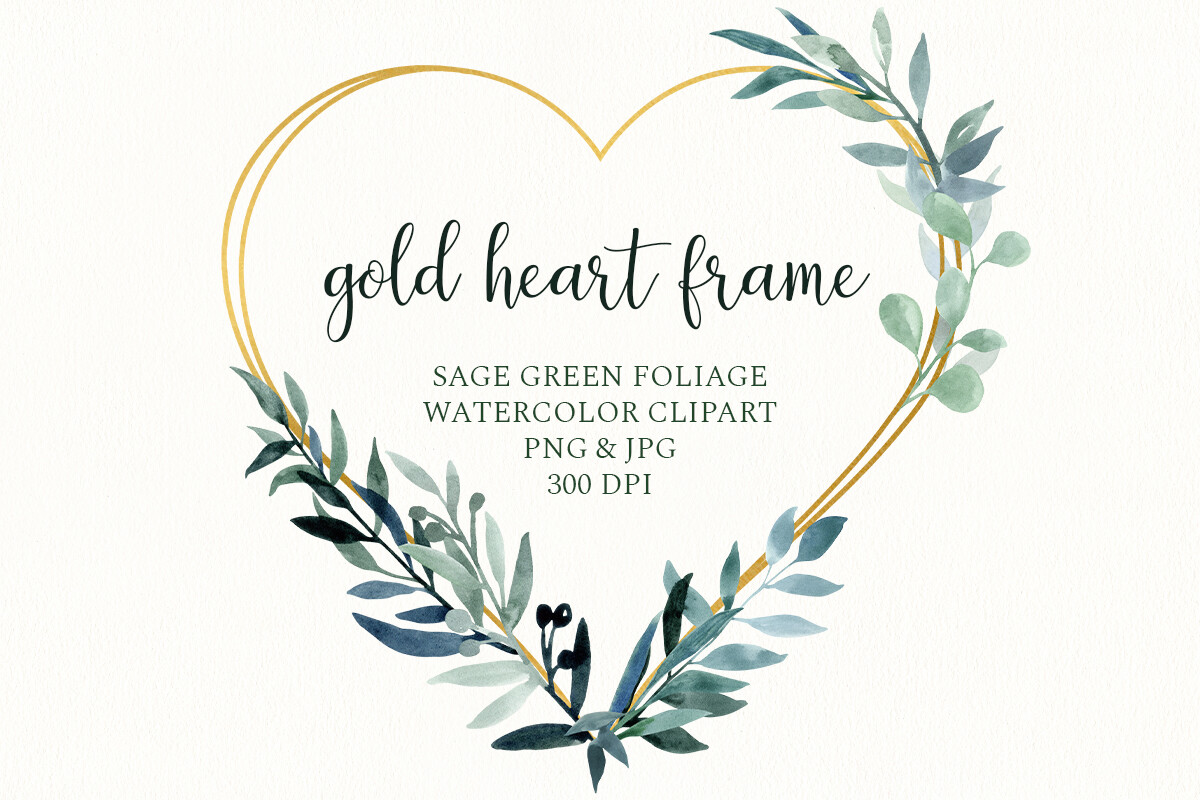
I started with this one because the wreath is where rustic invites usually fall apart. Most greenery looks pasted on, like someone dropped a leaf graphic and called it a day. This wreath sits around the names with a thin gold heart, and the leaves overlap the way real eucalyptus does, a little messy at the edges.
I typed our names in and printed a single test on plain copy paper before I touched anything nice. Held it up. The gold reads as a warm tan on a home printer, not actual metallic, which honestly looked softer with the kraft tone. For my friend’s backyard thing we left it on white linen stock and it was the cleanest part of the whole suite.
One gripe. The default name spacing runs a touch wide, so if you have a short couple name like Mae and Jo it floats in the middle looking lonely. I nudged the text box in and it fixed itself in about a minute.
The bundle I send the friend who says she can’t design
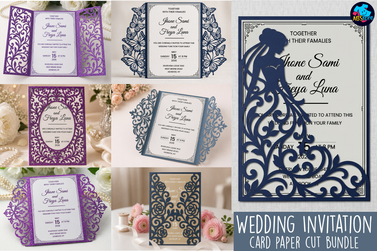
This is the set I forwarded to my maid of honor at midnight when she texted me panicking about her own invites. A whole bundle of pieces that match, so the invite, the RSVP, and the details card all look like they came from the same hand instead of three random Pinterest saves.
You drop your own wording in and the layout holds. I changed our date twice (venue drama, long story) and nothing shifted or broke. I printed the RSVP card on the lighter kraft and the main invite on the heavier sheet, and side by side they still read as one family.
The catch is the sheer number of files. The first time I opened it I scrolled for a while wondering which one was the actual invitation. Once I sorted them into a folder it was fine, but budget five minutes to figure out what is what before you start.
Soft paper backgrounds for when plain kraft feels flat
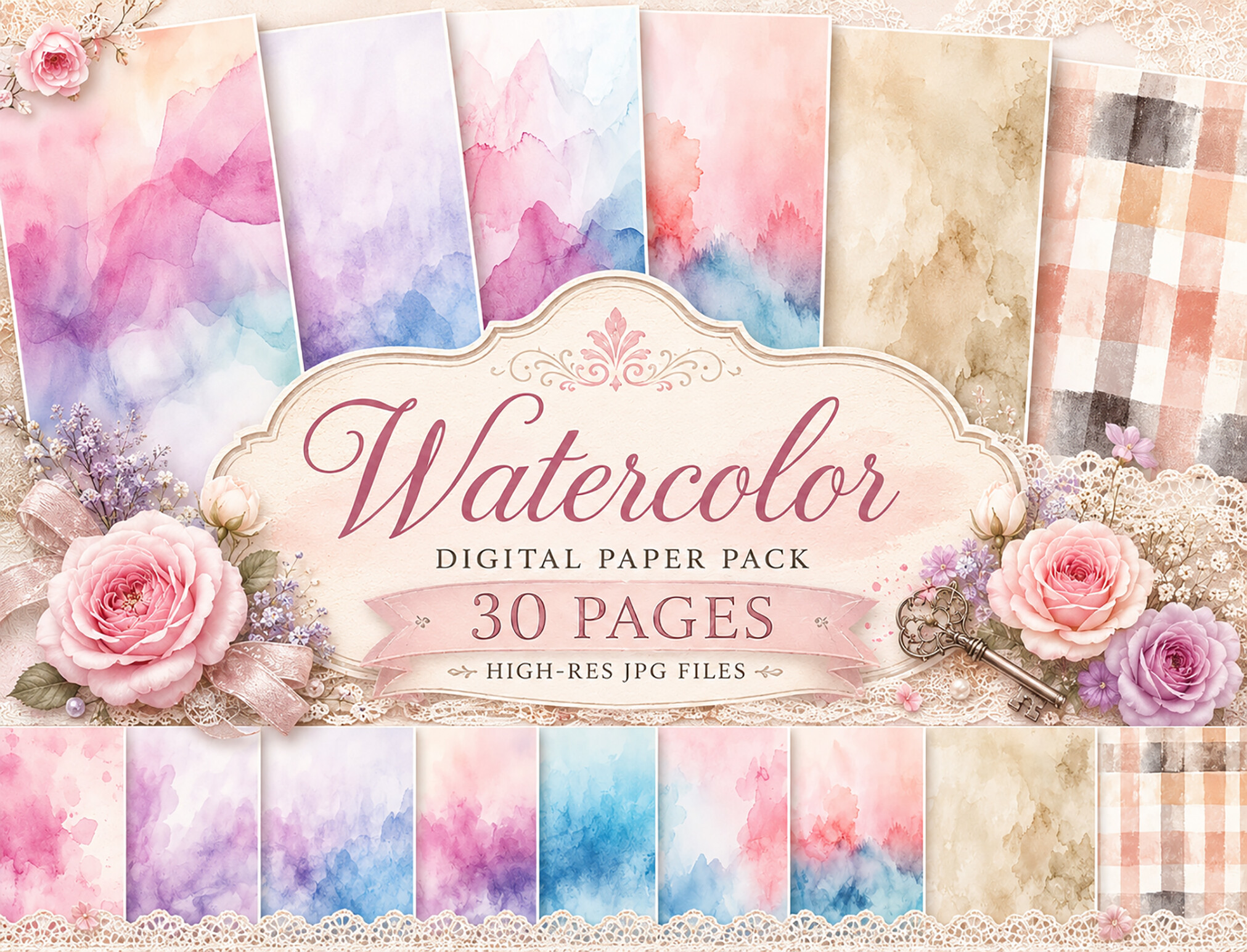
Sometimes straight kraft brown reads cheap, and you want a little color under the text without going full floral. I used this watercolor pastel paper behind the names on my save the date and it warmed everything up. Faded blush and sage washes, the kind that look painted, not printed.
I layered one of these as the background and dropped my text on top. Printed two versions, one on matte and one on a slightly glossy sheet from the same pack at the copy shop. Matte won. The gloss made the watercolor look like a screensaver.
My one note, the colors print lighter than they show on screen. I bumped the saturation up a step before my real run, otherwise the sage washed out to almost nothing on the kraft.
Thin line frames for a rustic look with a dressier edge
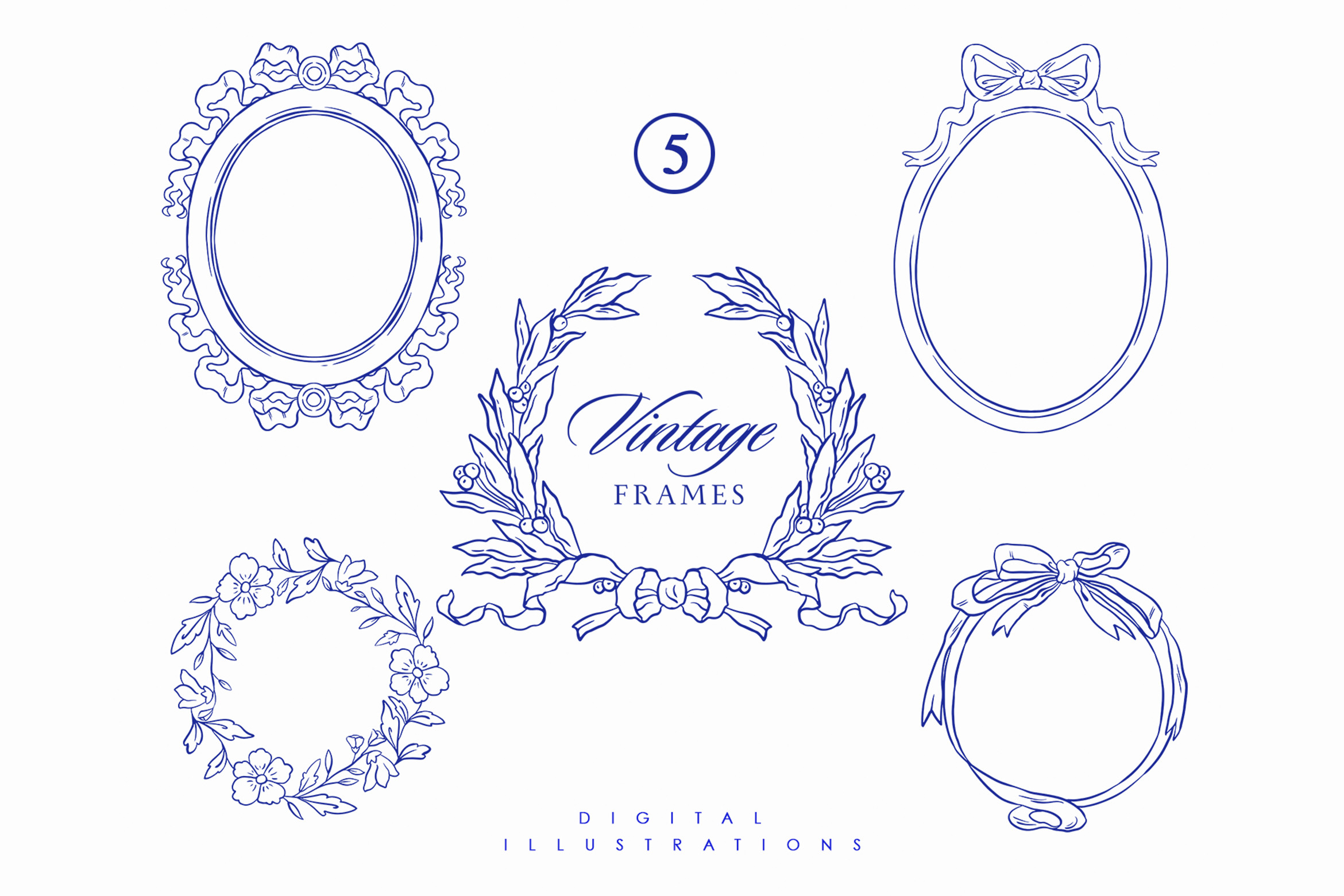
Rustic does not have to mean only twigs and burlap. My cousin wanted her barn venue to feel a little more formal, so we framed her invite text with one of these baroque line frames. Just the outline, thin black strokes, no fill. It reads elegant against kraft instead of fussy.
I printed it at 80 percent of the original size because the full frame crowded the edges and my home printer was clipping the corners. Scaled down, it left a clean border and the text had room. Took two wasted pages to land on the right size, but the third was perfect.
Watch the line weight if your printer is old like mine. The thinnest strokes break up into dashes on a tired cartridge. I ended up doing the final stack at the shop on Bell because my printer streaks anything that fine.
A vintage floral frame I almost overused
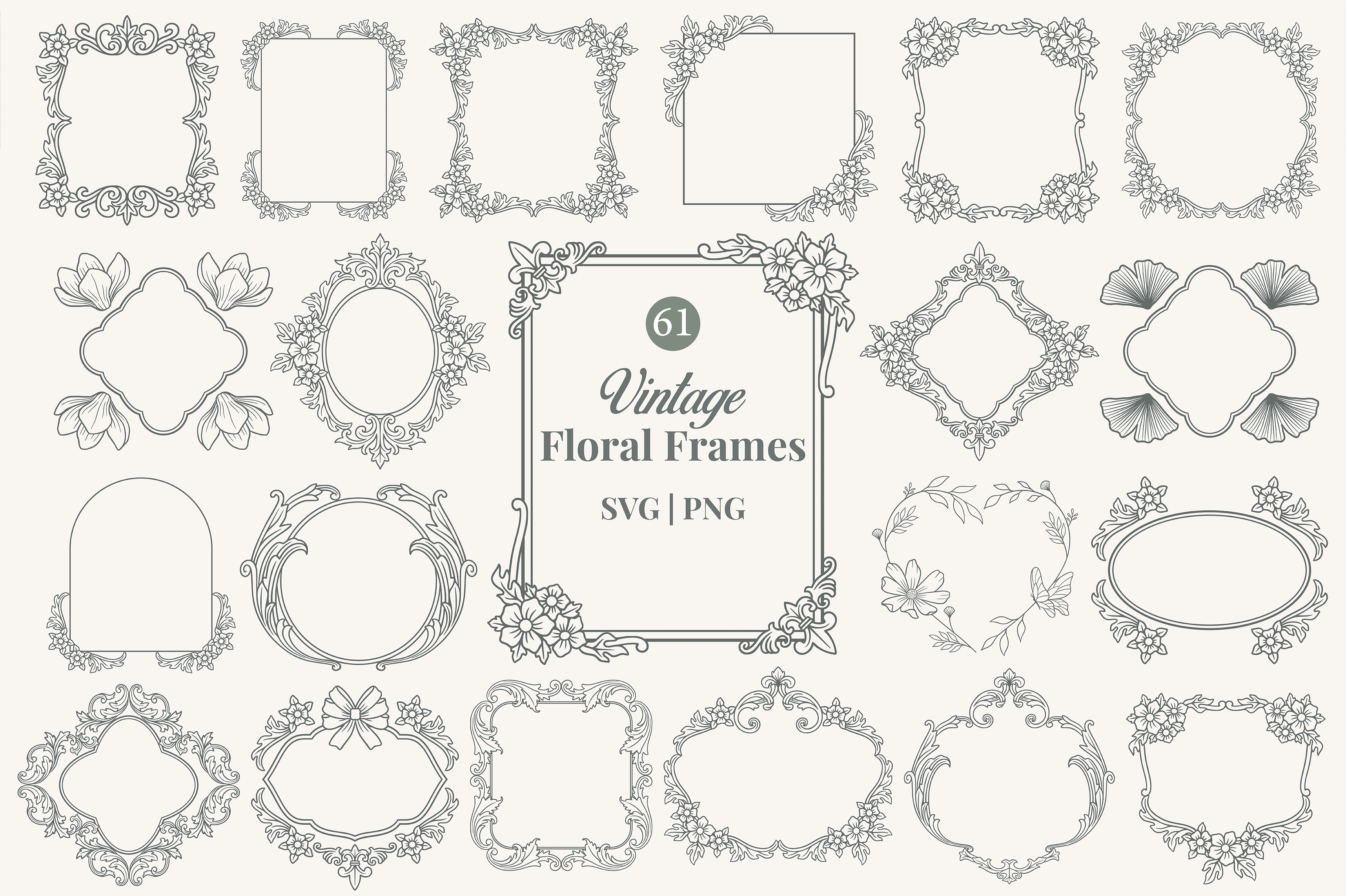
I have a weakness for this kind of ornate floral border and I had to talk myself out of slapping it on every single card. On the main invitation, though, it earns its keep. Aged floral scrollwork around the edge that pairs with kraft like it was always meant to be there.
For my own suite I put this only on the invite itself and kept the RSVP plain, so the frame felt special instead of everywhere. Printed it on the heavier cardstock, the cream one, and the vintage tone matched the floral perfectly.
The gripe, it is detailed enough that it really wants good paper. I tried a draft on flimsy 20 pound printer paper and the fine flourishes looked muddy. On the thick stuff it sharpened right up. Do not judge this one by a quick home test page.
Butterflies for a softer spring rustic feel
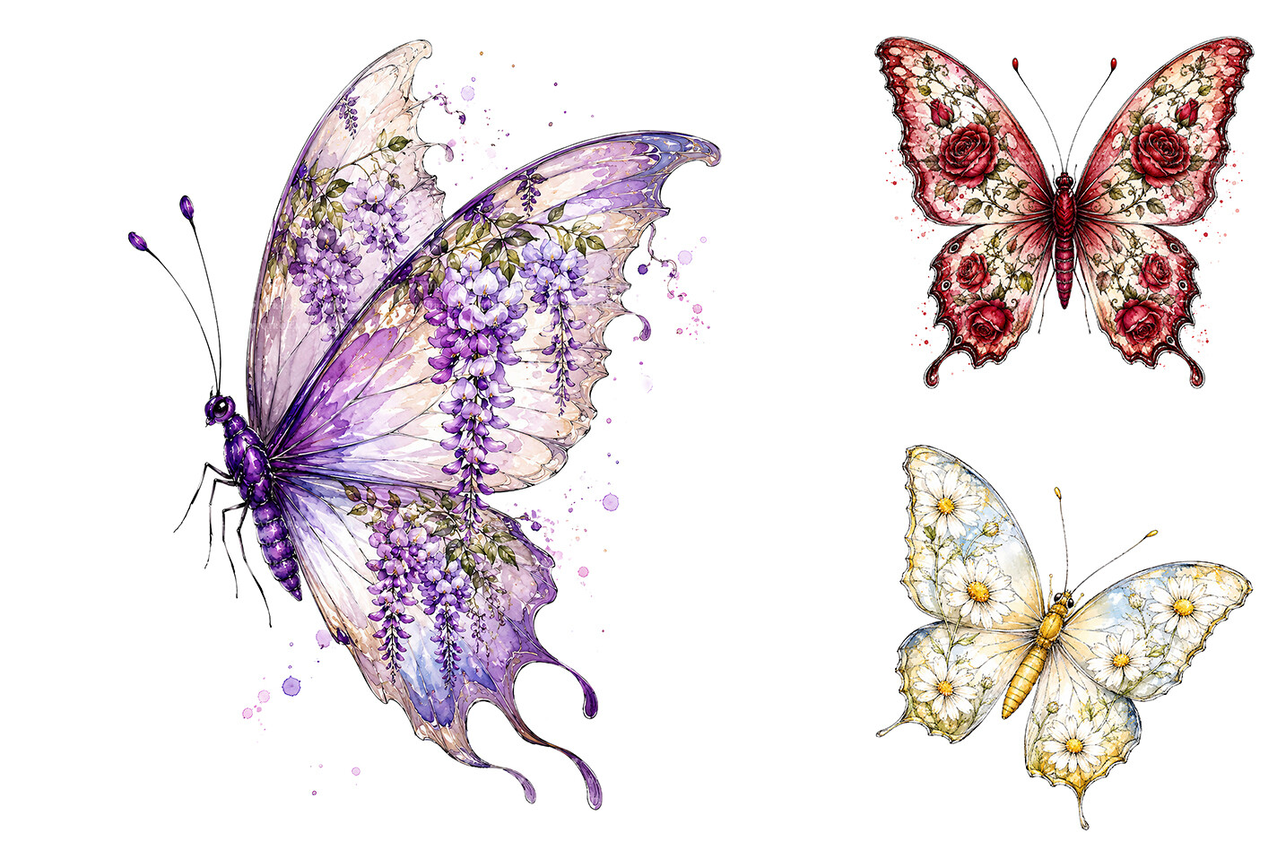
My neighbor got married in May in an apple orchard and wanted something gentler than heavy greenery. These watercolor butterflies and florals were the answer. Painted blooms with a couple of small butterflies, the kind of thing that feels rustic but airy, not woodsy.
Since they came as separate pieces, we scattered two small butterflies in the corners of her invite and tucked a floral sprig by the date. We did not crowd it. Three elements total. I printed her test sheet and we both agreed one more butterfly would have tipped it into too much.
One thing to know going in, you place each piece yourself, so it takes a little fiddling. Worth it because you control where everything lands, but it is not a one-click drop-in template. Give yourself an evening.
Fifteen laurel wreaths so your whole suite matches
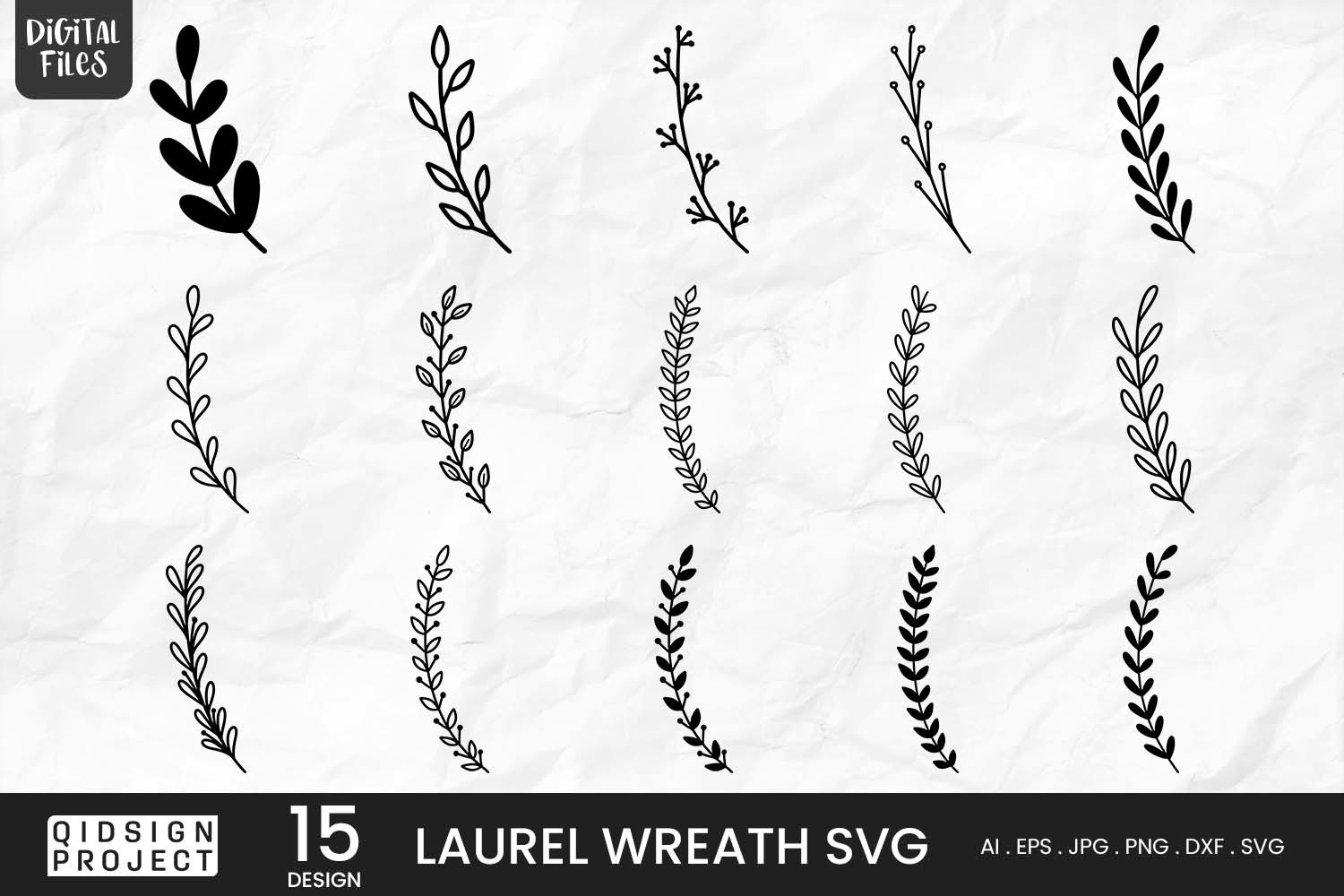
I saved this one for last because it solved the thing that drove me nuts. Matching. You want the laurel on the invite, the menu, the table number, and the thank you cards to look related without being identical. Fifteen variations of the same laurel wreath means you pick a few that share a style.
I used a fuller one on the invitation and a thinner version on the place cards for my friend’s October wedding, and they read as a set from across the room. Printed the small ones four to a page to save kraft, since I always run out at the worst moment.
The quibble is that fifteen options is almost too many. I spent way too long deciding between two that were nearly the same. Pick fast, print a test, move on. They all look good, which is sort of the problem.
The Questions I Get Most
What makes an invitation look rustic?
Honestly? It is mostly the paper and one bit of greenery, and then stopping. I figured this out by overdoing it first. My early draft had kraft, a wreath, a floral frame, AND a script font, and it looked like a craft fair flyer.
Keep it to one or two natural touches, eucalyptus or laurel, on warm kraft or cream stock. The second you add a third decorative thing it slides into busy. Rustic is restraint plus brown paper, basically.
What paper fits rustic?
Kraft, every time. The brown speckly kind. I print mine on a heavier kraft cardstock, around 80 pound cover, because the thin stuff curls and feels like a receipt.
If full brown feels too dark under your text, cream or a soft natural white works too. I learned the hard way that glossy paper kills the whole vibe. The shine fights the rustic look. Go matte. A friend tried gloss for hers and we both winced when it came out.
How do I match my save the dates?
Pick one element and carry it through. For me it was the laurel wreath, so the save the date got a small version and the invite got the full one. Same plant, different size, instantly looks like a set.
The other trick, use the same paper. When my save the dates and invites were both on the same kraft stock, nobody could tell I had printed them three months apart. Same font, same greenery, same paper. That is the whole secret, no fancier than that.
One Last Thing
That is the short list, the seven I trust enough to hand a friend at midnight when she is spiraling about her invites. Print a test, prop it across the room, squint. If it still reads, you are done.
My actual advice after doing my own and helping with three others? Buy the good kraft and stop adding things. The invites I regret are the ones where I got fancy at 1am. The ones I loved were plain paper, one wreath, and the names spelled right.