Our reception tables were three things. White linen, a low bunch of stems in a jam jar, and one printed card per table. That was it. I had pinned about sixty maximalist tablescapes and then panicked the week of, because we had no money left for centerpieces and the rental place wanted forty dollars a candelabra.
Here is what nobody warns you about going minimal. Empty and intentional look almost identical until they don’t, and the thing that tips it one way is usually a piece of paper. A table number you can read from the door. A little menu folded so it stands. Get that part wrong and the whole table reads like the caterer forgot to set it.
So I am just going to walk you through the printables I actually used or wish I had, the night I sat on my friend Dana’s floor sorting cardstock by color. I print one test page on plain paper first, prop it against the salt shaker, and back up across the kitchen to see if it still reads. A few of the links below are affiliate links, so if you grab one it sends a little something my way. Costs you nothing.
Heads up, some links here are affiliate links. Grab a template through one and I get a small cut, no extra charge to you.
The table number that does most of the work
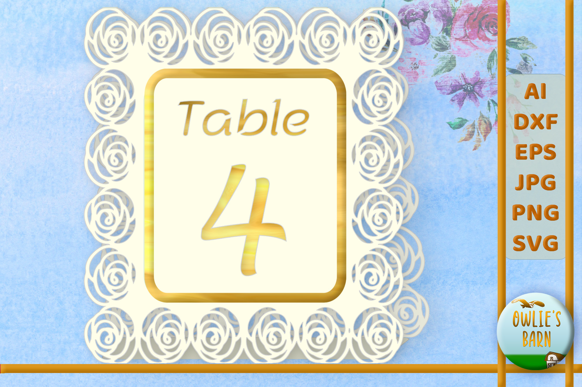
I am putting this first because the number is the one thing a minimal table cannot fake. Skip the centerpiece, fine, but people need to find seat assignments without squinting. This one keeps a single rose tucked in the corner and lets the digit be big. Big is the whole point.
I printed mine on the heavier ivory stock, the 110 lb stuff, because anything thinner curls when it stands in a tent fold. Propped it against a water glass on Dana’s table for a day to make sure it held shape. It did.
One gripe. The rose prints a touch pink on a home inkjet, more than the preview shows. If your palette is strictly cream I would knock the saturation down a notch before you run the whole stack. I learned that on table seven.
A menu so plain it almost felt rude
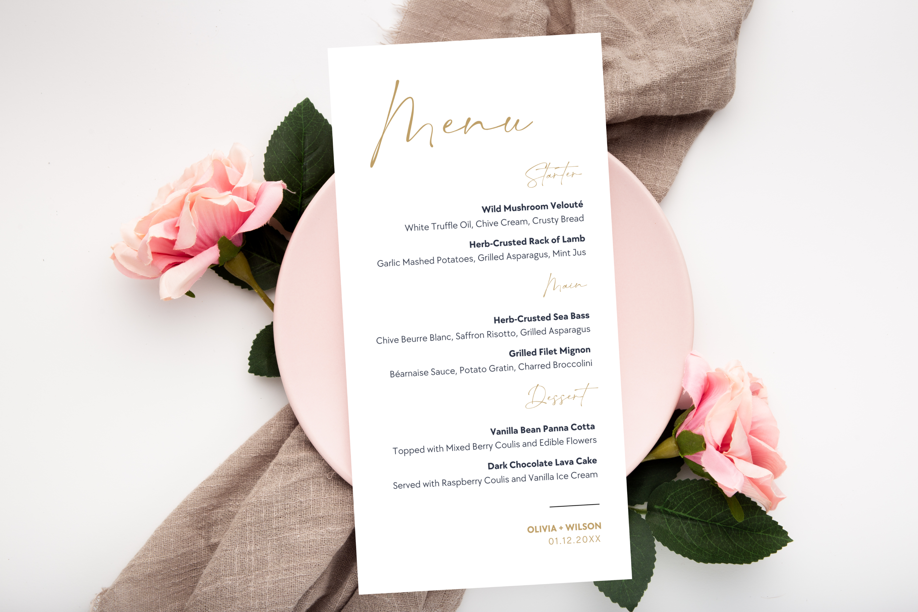
I went back and forth on menus for ages. They feel fussy. But a single thin gold menu at each place setting was the one detail that made our bare tables look like a choice and not an oversight. Three courses, type set small, lots of white around it.
The gold here is the printed kind, not foil, so do not expect a shine. On matte cardstock it reads more like a warm tan, which honestly suited us better than a glare. I ran ours at the copy shop on Ashby because my printer drags anything metallic into streaks.
My one note. The default font is delicate. We had string lights and it was fine, but if your venue runs dark, bump the weight one step or your guests will be holding it up to a candle to read the entree.
When you want a little softness without a full bouquet
If the rose version feels too sparse for you, this set leans a bit more floral around the number. Still restrained. A thin band of small blooms along the top, nothing that fights the digit.
I mocked these up for my cousin’s shower as a trial run, printed two on plain paper, and stood them on her counter overnight. They photographed better than they looked in hand, which is the opposite of most things I print.
Watch the top margin. The flowers run close to the edge of the page and my printer clipped a few petals on the first pass. Nudge the whole thing down a few millimeters in the editor before you commit the good paper. Took me one wasted sheet.
Greenery, for the people who hate pink
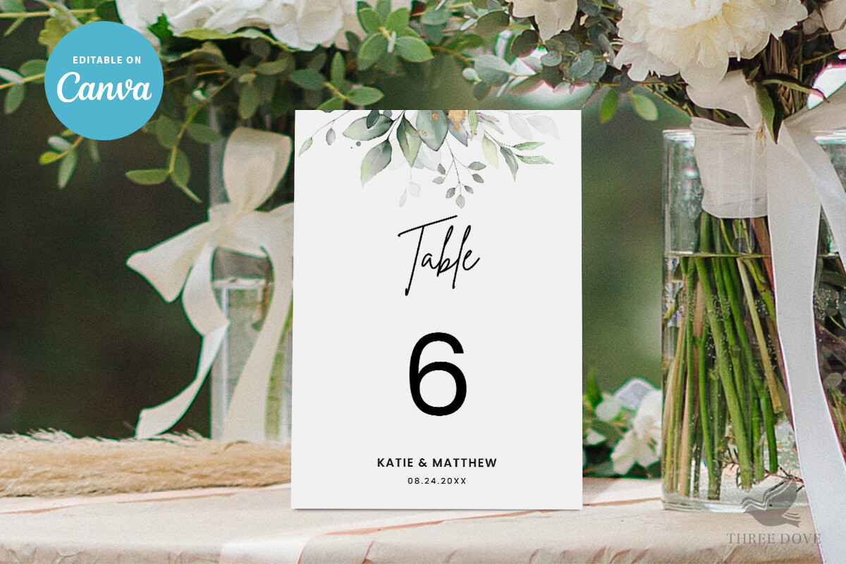
Dana flat out refused anything with a rose on it. This was the answer. A sprig of eucalyptus instead of a flower, same clean number, same calm. On a white linen with a few real stems in the jar it tied to the rest of the table without me trying.
Green is the color that suffers most on a tired inkjet, by the way. Mine went gray-green the second the cartridge dipped below a quarter. I refilled before printing the full set and the difference was night and day.
The catch. The green sits a bit cool, more sage than olive, so if your bridesmaids are in warm green it will not match exactly. Up close you notice. From across the room nobody does.
Little tent cards for the food, because labels matter
We did a small buffet and I almost forgot food signs entirely. My aunt asked what the pale dip was and I had no answer. These tent cards fixed that for the next event I helped with. They fold and stand on their own, no stand to buy.
I keep a stack of these blank and fill them in at the last minute, because the menu always changes the morning of. Wrote ours by hand in the end with a fine black pen, which looked more deliberate than the typed version, oddly.
One thing. The fold line is not scored, so you get a cleaner crease if you run a bone folder or even the back of a butter knife along a ruler first. Skip that and the fold wanders.
The set I keep around for the off-season weddings
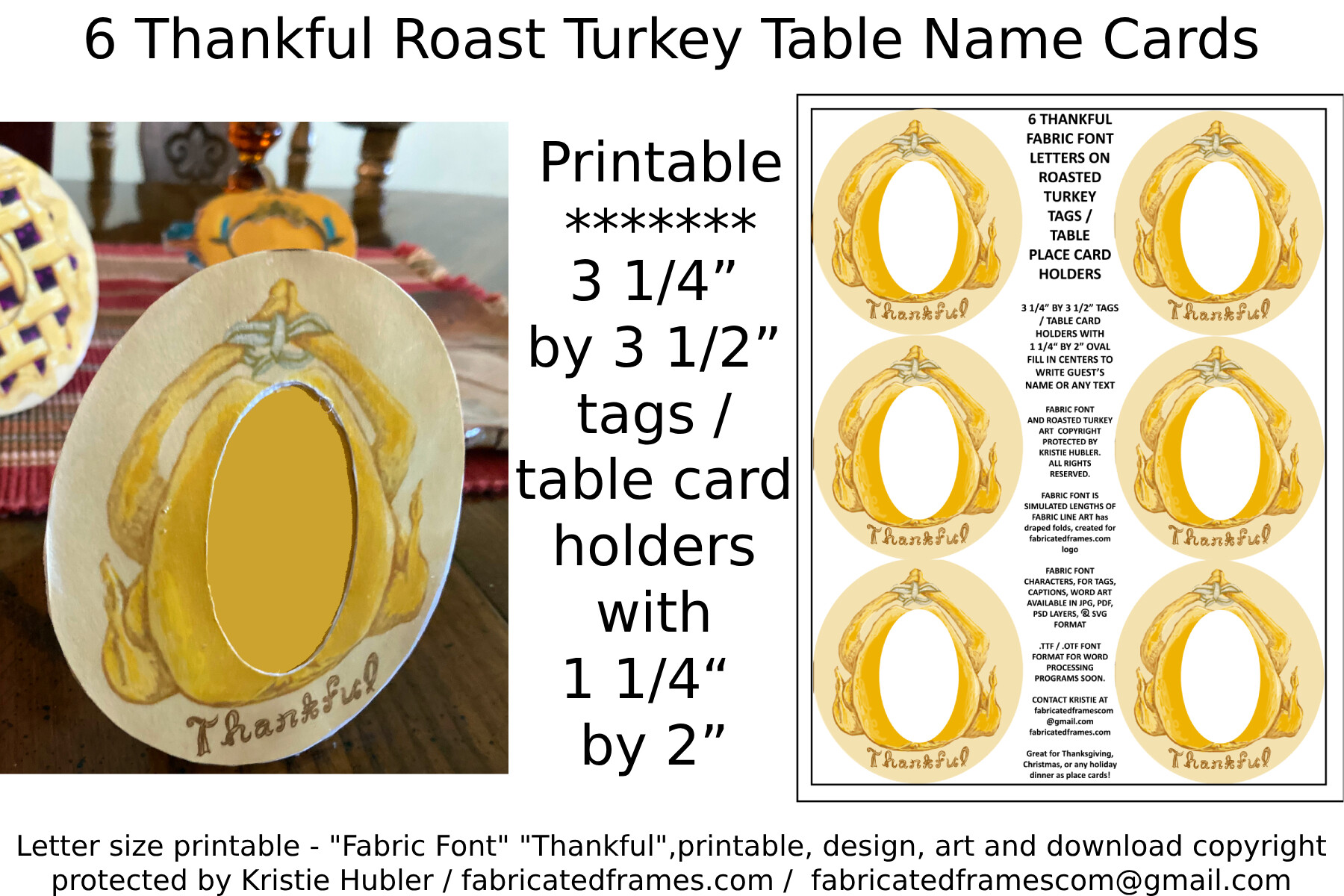
This one is a bit of a left turn, six name cards with a roast turkey on them, made for a Thanksgiving table. Hear me out. I helped a friend with a November wedding and a warm autumn table is its own kind of minimal, just in a deeper palette.
We used these as place cards down a long farmhouse table and they set the whole tone without a single centerpiece. Printed them on a kraft brown stock, which the turkey illustration actually loved more than white.
My only quibble. They come as a set of six per sheet, so for a big guest count you are running a lot of pages. Group your printing or you will be feeding the tray all afternoon like I was.
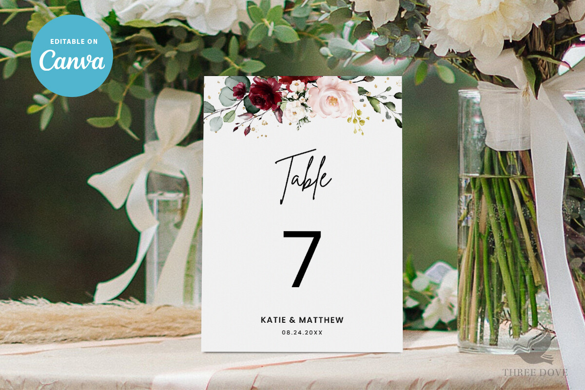
Place cards that finish the setting
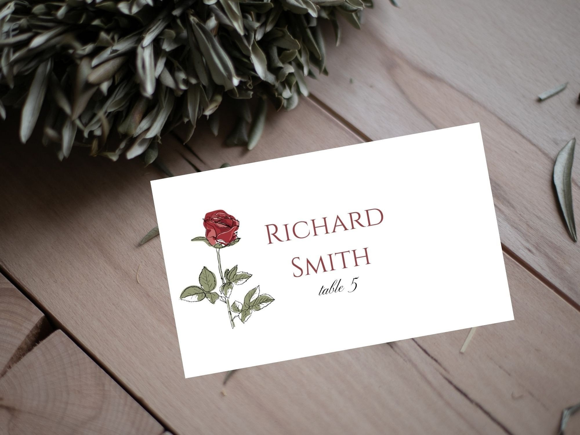
Last piece. A place card with a small rose, meant to sit folded at each setting or tuck under a fork. This is the detail that makes a guest feel expected, and it is the cheapest way to make a plain table feel set.
I handwrote the names on ours and printed only the rose and the fold guide, because my handwriting on cardstock looks intentional and my printer’s script font does not. Did forty of them at my kitchen table the Sunday before, with a glass of wine, and it was honestly the calmest part of the whole week.
Heads up on sizing. These print small, and if you have long names or double-barreled surnames the line crowds. I dropped the font a point for the longer ones so nothing ran off the card.
The Questions I Get Most
What is minimalist table decor?
Honestly? For me it was whatever was left after I ran out of budget and started taking things off the table instead of adding them. White cloth, a low jar of stems, one good printed number, maybe a menu. The trick is that everything left has to earn its spot, because there is nowhere for a cheap-looking thing to hide.
A friend asked me this and I told her to think of it as a table where the negative space is on purpose, not where you forgot to bring more stuff.
How do I avoid looking bare?
This is the exact thing I got wrong twice. The fix was not more objects, it was one taller thing and a few candles low around it. Height gives the eye somewhere to land. We used a single bottle of stems and three votives per table and it read full enough.
The other half is the paper. A crisp printed number and a place card at every seat makes a sparse table look set rather than skipped. Empty plus a clear printed detail equals deliberate. I tested that on Dana’s dining table for a week before I believed it.
What anchors a minimal table?
The table number, every time. I learned this the hard way when our first mockup had a lovely jar of flowers and nothing else and the table just floated, no center, no point. Add a number card that you can read from the doorway and suddenly the table has a job.
After that, a low candle or two. That is genuinely all. We spent the saved money on better wine and nobody noticed the tables were nearly empty.
One Last Thing
If you take one thing from this, print a single test page on plain paper and walk it across the room before you buy a stack of cardstock. I have wasted more good paper to a font that looked fine on screen and vanished from six feet away than I want to admit.
Minimal is forgiving on your wallet and unforgiving on the details that are left. Get the number readable, get one card at every seat, refill your cartridge before the green goes gray. The rest you can leave off the table on purpose.