We got married in my aunt’s field outside Bishop, the one with the crooked fence she keeps meaning to fix. Rustic was not a mood board for us. It was the only way to make a folding-table reception not look like a folding-table reception. I had eleven tables to fill and a budget that had already been eaten by the catering deposit.
Here is the thing about rustic decor. It looks effortless in photos and it is the opposite of effortless on a Tuesday night when you are spray-painting mason jars in the garage and the can sputters out on jar number nine. The trick is letting cheap materials do most of the work and putting your money and your printer where people actually look. Which is the table itself. They sit there for two hours. They stare at it.
So this is what I leaned on, mostly printables I ran myself plus a few props I would buy again. I do a test page on plain paper first, prop it against the salt shaker, and back up to the doorway to see if the numbers read. A couple of links below are affiliate links, so if you grab something it kicks a little back to me. No cost on your end.
Full disclosure, a few links are affiliate links. Use one and a few cents come back to me, never anything added to your price.
Where the rustic starts (and it is not the table)
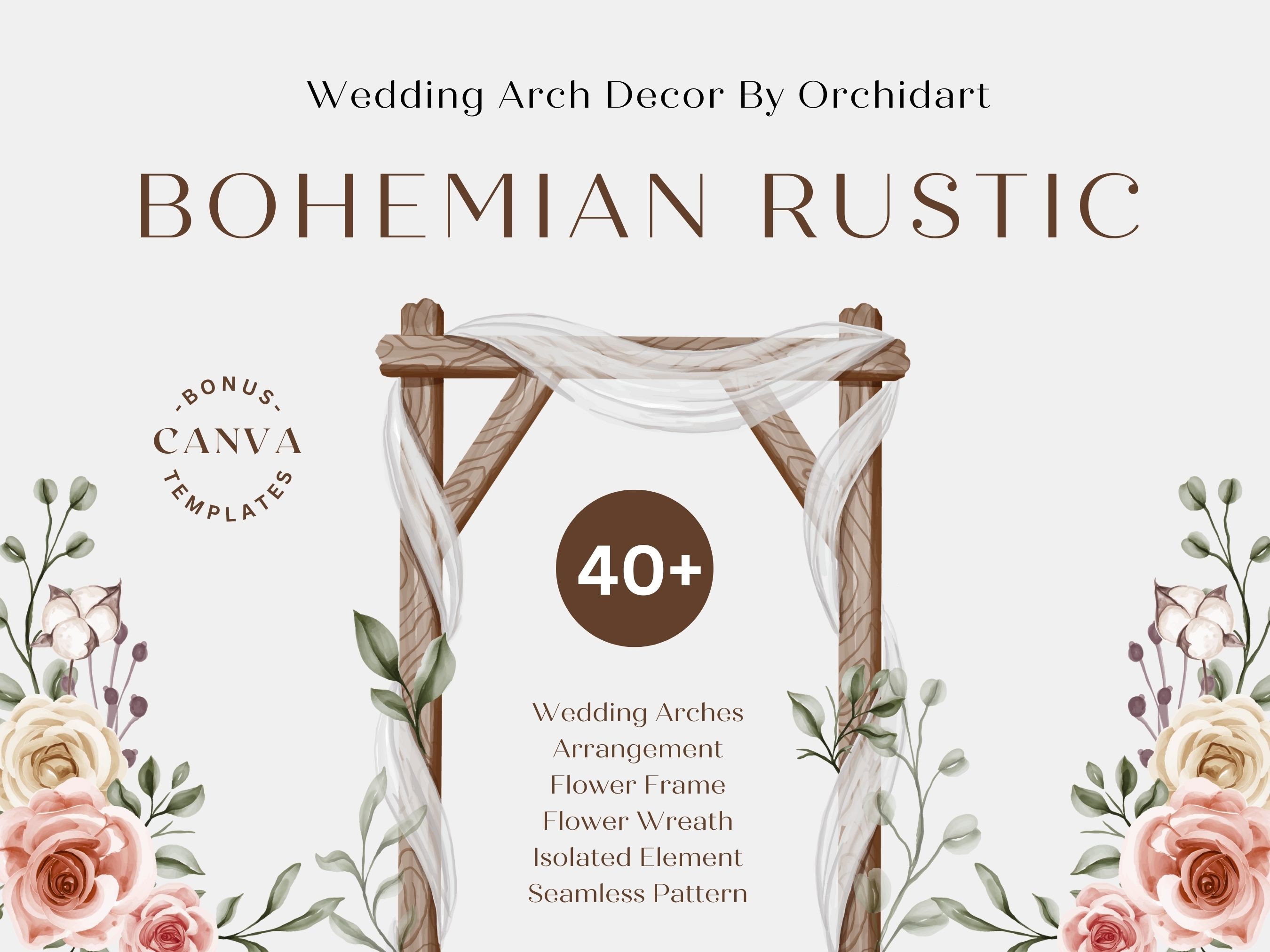
Before anyone looks at a table number they look at the backdrop, and our backdrop was the fence I mentioned. I used this arch decor set to dress an old wooden frame my cousin’s husband welded from rebar in an afternoon. Pampas, dried palm, that whole soft sandy palette. Printed the smaller botanical pieces at home to fill gaps where the real grasses thinned out.
What surprised me was how much it pulled the rest of the room together once I echoed those same dried tones on the tables. The cake table, the welcome sign, all of it suddenly matched without me trying.
One gripe. The lighter cream tones print washed out on my home printer, almost ghostly. I ended up sending those sheets to the FedEx counter on Alpine and they came back the right warm beige. Worth the four dollars.
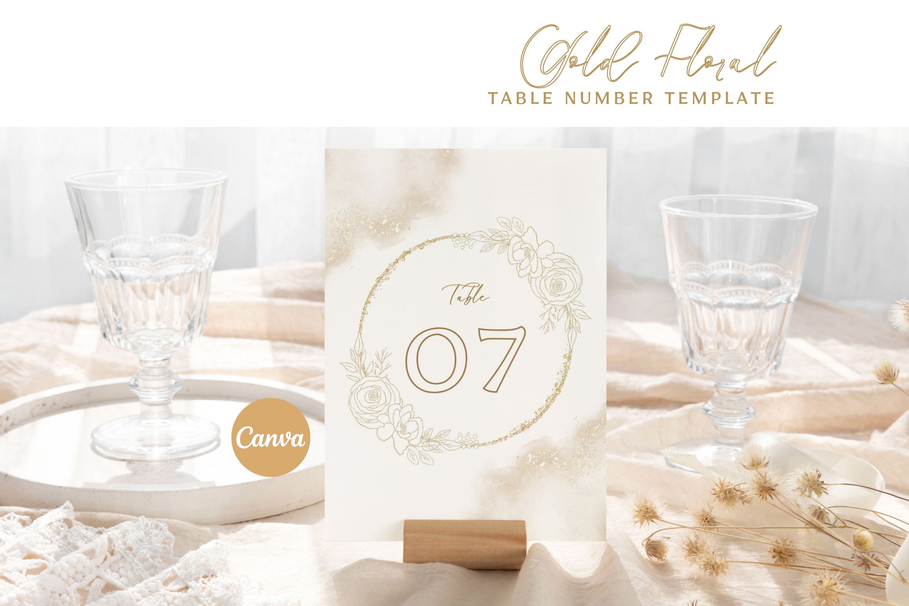
Table seven, and a lesson about ordering singles
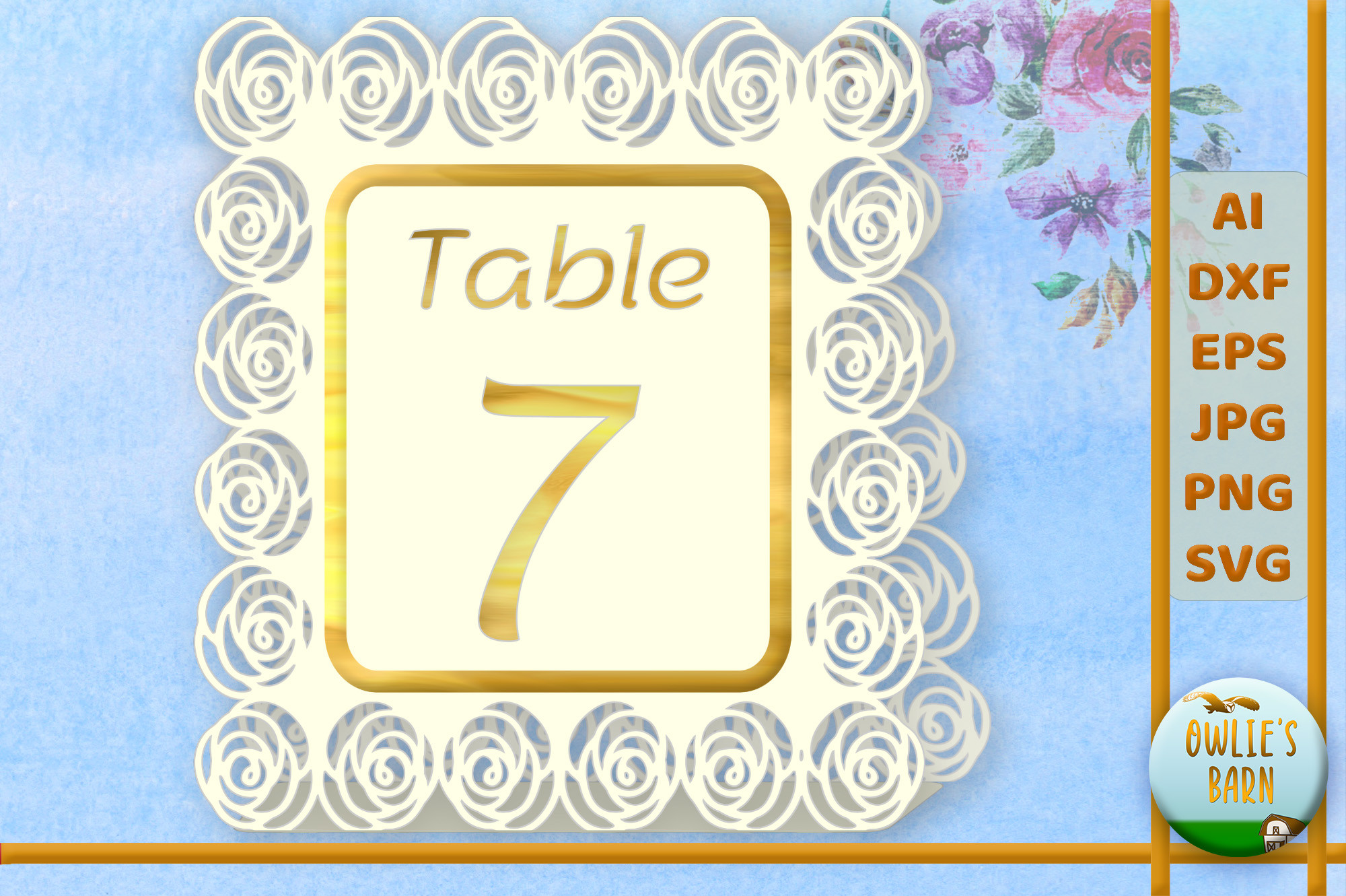
This is the soft rose number I tested first because table seven was right by the door and I knew everyone would walk past it. I taped a printed copy to my fridge for three days, living with it, before I committed. The roses are muted, dusty, not the loud red kind, which is exactly what sits right against linen and wood.
I printed it on a warm ivory cardstock, 110 lb, because anything thinner curled in the heat by lunchtime.
The catch is in the name. It is one number, the seven. I almost ordered it thinking it was a full set and only caught it the night before. If you want the matching look across every table you want the full template instead, which brings me to the next one.
The set that saved me eleven separate headaches
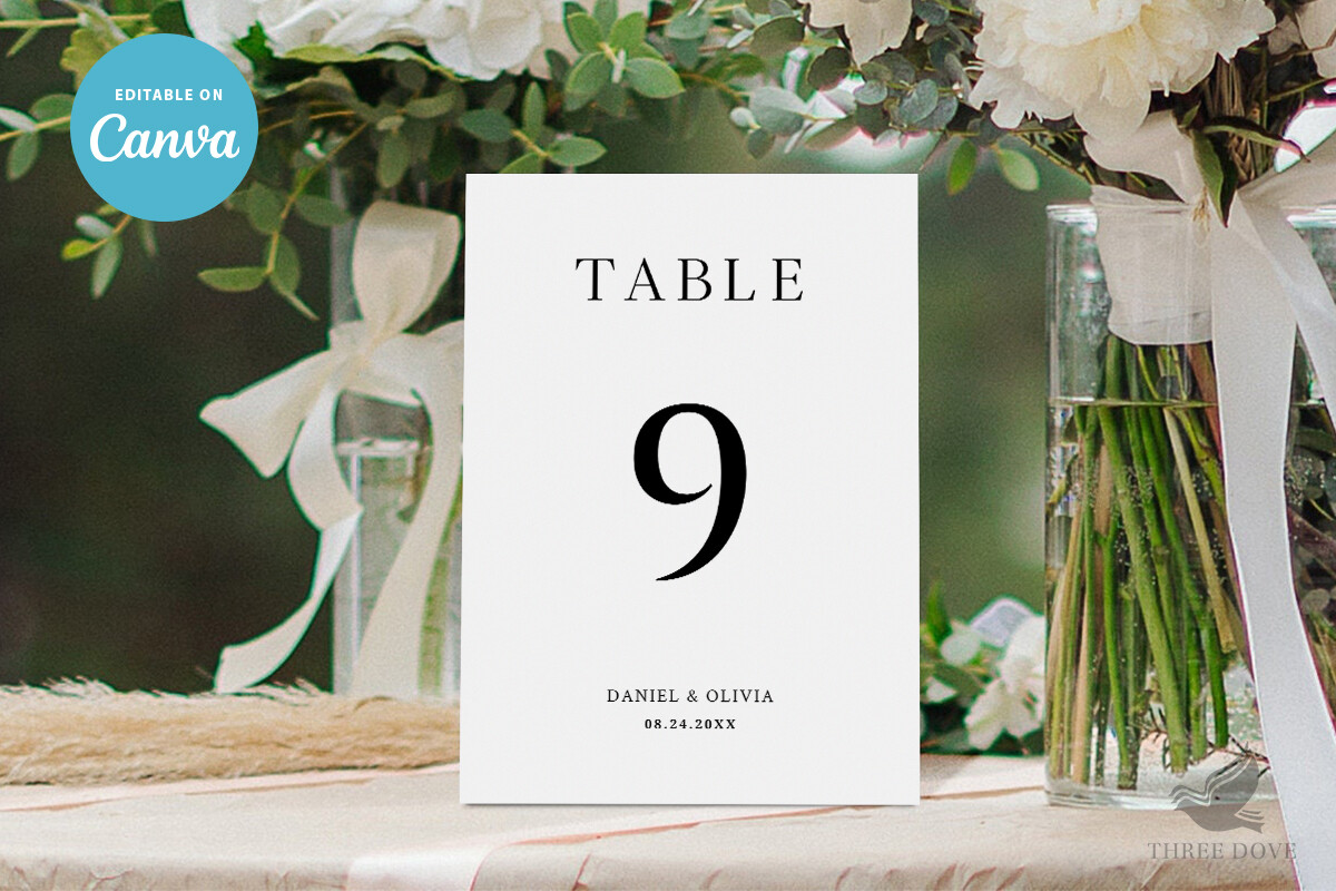
After the single-number scare I switched to this full template and typed all eleven numbers in one sitting at the kitchen table, glass of wine, done in twenty minutes. You change the number, the layout holds, nothing shifts around on you. That is the whole reason it exists and it delivers.
I ran them double-sided so guests at round tables could read the number from both sides, which my maid of honor suggested after squinting at a friend’s wedding the summer before.
My one note. The default font sat a little small for our big tables. I bumped it up a couple points before printing the stack, lost one test sheet learning that, and the rest came out fine.
Green that does the matching for you
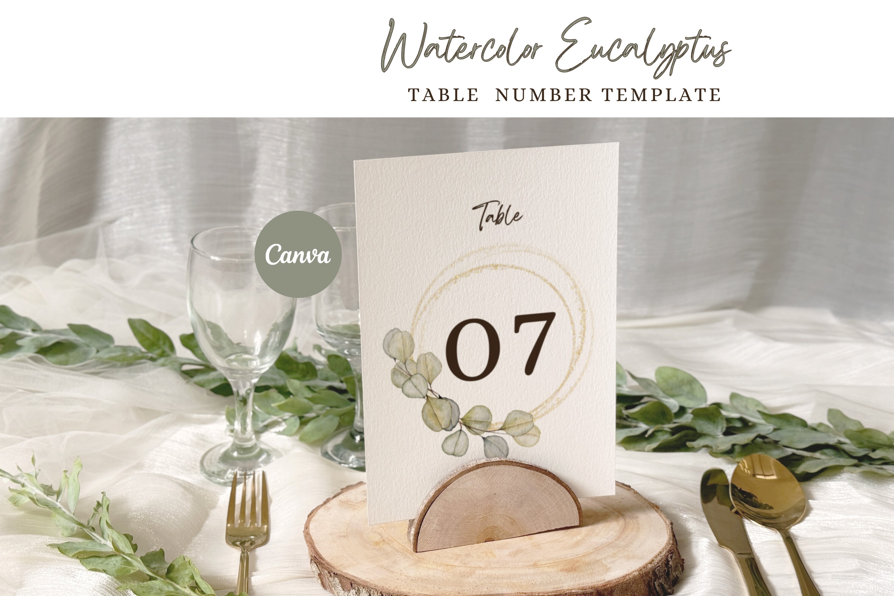
Eucalyptus shows up at basically every rustic wedding for a reason, it goes with everything and it is cheap to buy by the bunch. This watercolor version let me skip buying fresh greenery for the numbers themselves and save the real stuff for the centerpieces. The painted sprigs read as soft and a little hand-done rather than clip-art stiff.
I laid loose eucalyptus stems across the table runners and the printed numbers sat right in among them, real and printed blurring together. Nobody could tell which was which from across the field.
Downside, the greens skew slightly blue on screen versus how they print. Mine came out warmer and yellower than the preview, which actually worked better, but order a single test before you trust the thumbnail.
For the two tables that needed to feel a notch dressier
We had a small head table and a parents’ table, and I wanted those to read a touch more polished than the rest without buying a whole second decor scheme. This card template did that. Cleaner lines, more white space, the kind of thing that looks expensive but cost me a sheet of cardstock.
I folded these into little tents so they stood on their own. No stand needed, which mattered because I had run out of the acrylic holders by then.
The one fuss. Getting the fold dead center took a few tries. I scored the line with the back of a butter knife and a ruler before folding, which fixed it, but the first three I eyeballed came out lopsided and went straight in the recycling.
The menu people actually picked up and read
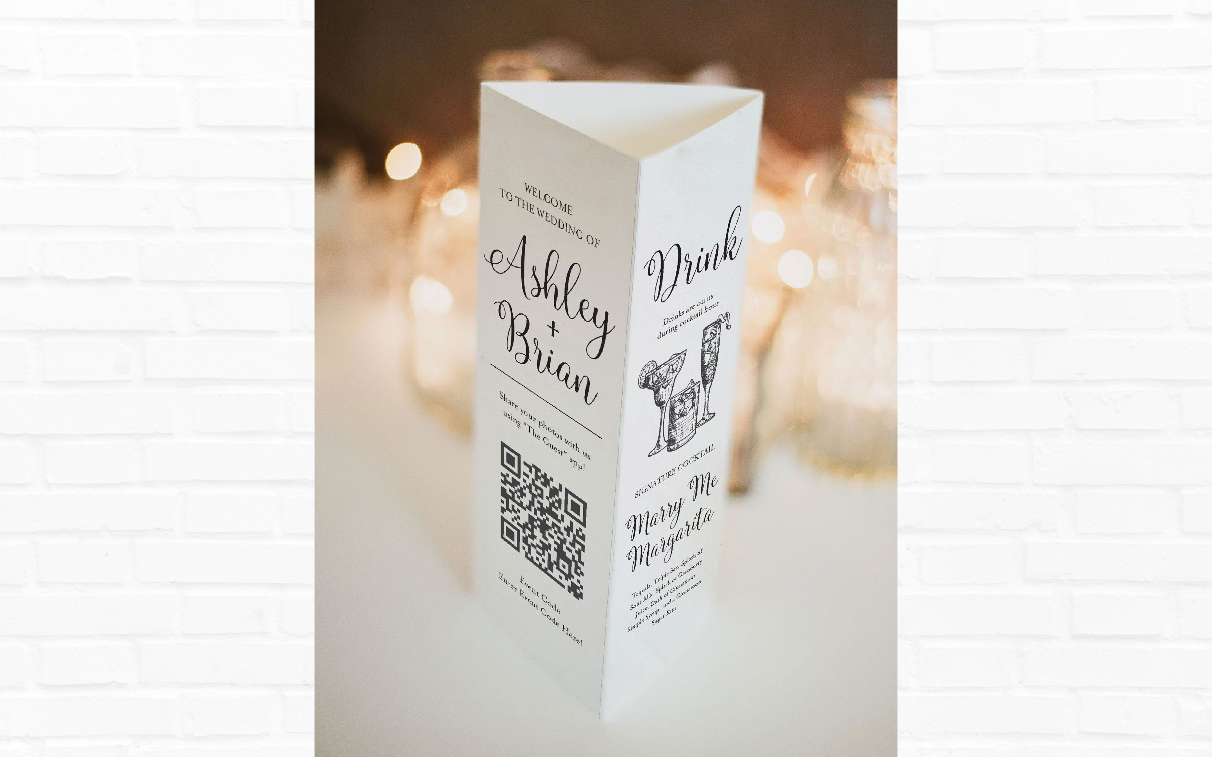
A printed menu at each place setting does a sneaky amount of work, it makes a backyard plate of food feel like an event. This stand-up menu was the piece I was most nervous about and the one guests commented on most. Folks held it, read it, took it home in their pockets.
I printed ours on a textured kraft-tone cardstock to lean into the rustic thing, and the dark text held up well against the speckly background.
My complaint is small. The stand-up fold is a bit shallow, so on a breezy field afternoon a few tipped over flat. I weighted the base of each one with a flat river stone from the driveway and that was the end of that problem.
The one my mother-in-law actually asked about
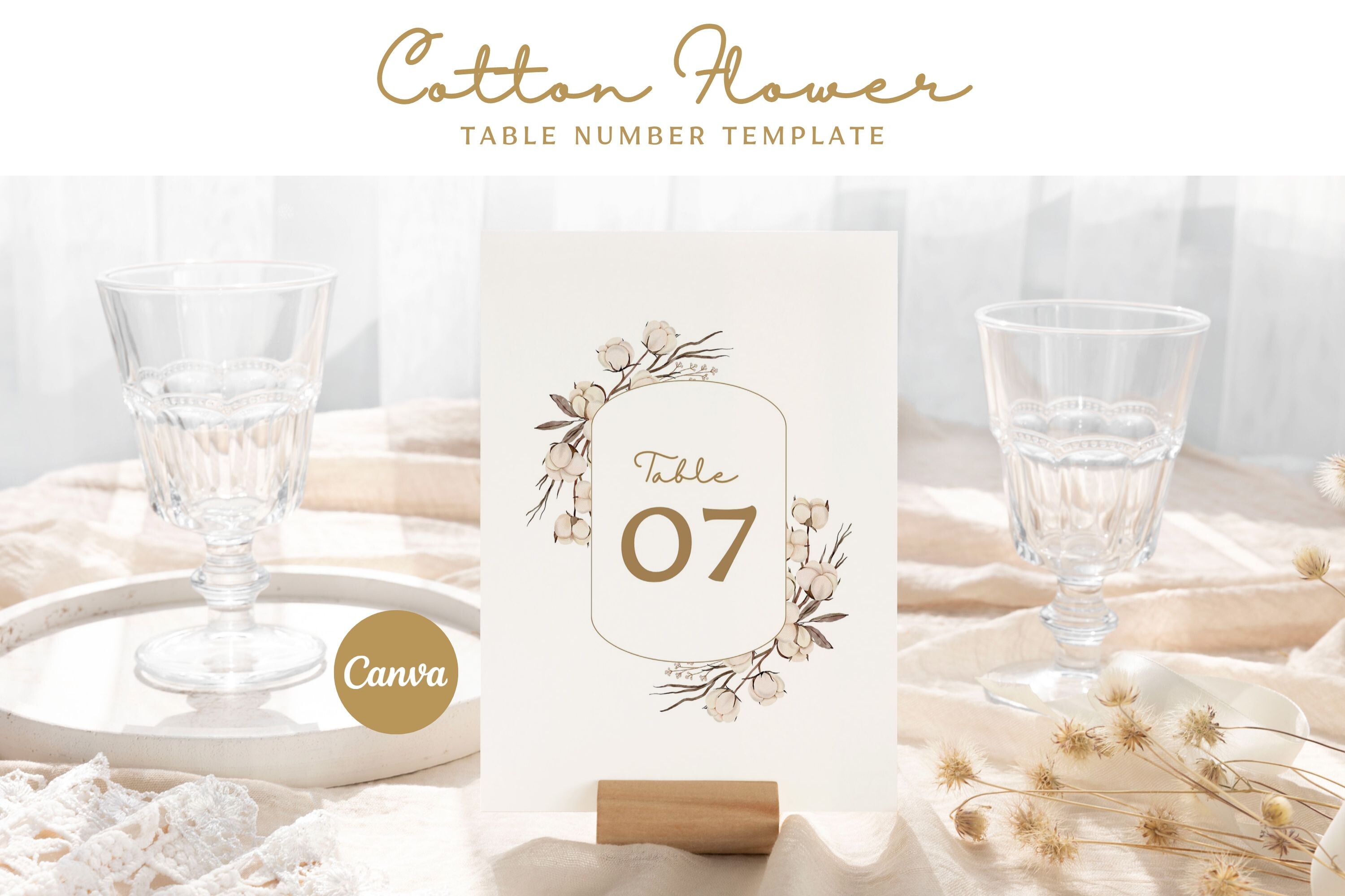
Cotton stems were having a moment when I planned ours and they suit rustic without being the same eucalyptus everyone uses. This template has those soft white cotton bolls worked into the design, fluffy and a little wintry, which played nicely with the dried arch pieces I started with up top.
I printed these for the dessert and gift tables specifically, the cozy corner, and tucked a couple of real cotton stems from a craft store bin beside them.
The nitpick. The white-on-white of the cotton can disappear if you print on a stark bright-white stock. I went with a warm natural cardstock so the bolls had something to stand against, and that small swap is the difference between the design showing and the design vanishing.
What People Keep Asking
How do I do rustic table decor?
Honestly? Start with texture and let it be a little imperfect. I built mine on wood, raw linen runners, twine, mason jars, and loose greenery, then put printed numbers and menus on top so the tables had something to read. The cheap natural stuff covers the table and your printer covers the details.
The mistake I made early was trying to make it look finished. Rustic falls apart the second it looks too neat. I stopped fussing, let the jars sit a bit crooked, and it looked more like the field it was in.
What flowers fit rustic?
Anything that looks like it could have been gathered on a walk. We did wildflowers, baby’s breath, eucalyptus, and a few cotton stems for texture. I bought most of it loose at a wholesale flower place on Garnet two days before and stuffed it into mason jars the morning of.
Skip the tight formal roses unless they are the soft dusty kind. A friend asked me this last spring and I told her the same thing, go to the flower market, grab whatever looks a little wild, and do not overthink the arranging.
How do I keep costs down?
Print the paper goods yourself and spend the saved money on real greenery and good light. That is the whole formula. My table numbers, menus, and signs were a handful of dollars in templates plus cardstock instead of a couple hundred from a calligrapher.
The other trick, borrow and thrift the containers. I collected mason jars for months from my mom, my neighbor, and a yard sale on a Sunday, and washed off the old labels with hot water and a bit of patience. Nobody counts how much your jars cost.
Before You Print a Stack
None of this looked like much sitting in piles in my garage the week before. It came together on the tables, in the field, once the greenery went in and the printed numbers caught the afternoon light. That is rustic. It looks like nothing until it is suddenly the whole thing.
If you only do one thing, print a test page and back up across the room before you commit to a stack. I learned that on jar number nine and a wasted cartridge. Grab whichever of these fits your tables and go make a mess in your garage.