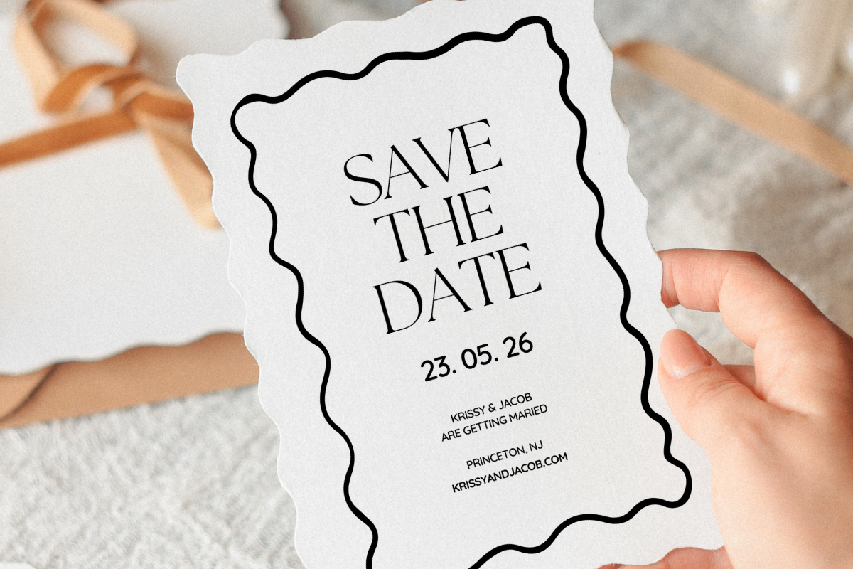
We picked a barn for the wedding before we picked anything else. Then I spent a Sunday trying to make save the dates that matched it without looking like a feed store flyer. There is a thin line. Cross it and your cards look like they smell of hay. Stay on the right side and people put them on the fridge and leave them there for a year.
Rustic is sneaky like that. It reads as easy, throw some kraft paper and a sprig of greenery on it, done. It is not easy. The good ones look offhand on purpose, and the offhand look takes about four tries. I know because I have the four tries stacked in a drawer somewhere, the early ones with text crammed so close to the edge my printer ate the L in our last name.
These are the templates I came back to, or handed off to friends who asked. I print one test on plain paper, prop it against the toaster, and walk to the doorway to see if the date still reads. If I can catch it from there it ships. A couple of the links below are affiliate links, so if you grab one a little change comes my way. You pay the same either way.
A few of the links below are affiliate links. If you print something from one, it tosses a little something my way and costs you nothing.
When you want the card to feel like wood without the splinters
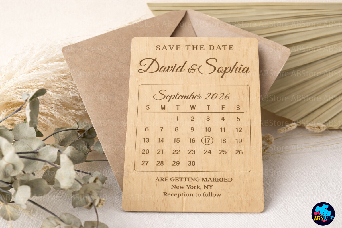
My cousin had her reception in a converted dairy barn and wanted something that felt like the rafters. This laser cut style gave her that. The edges have that carved-out look, all the negative space doing the work, and it photographs like real cut wood even though it printed off a normal sheet at the UPS Store on Decatur.
I will be honest about the catch. All that fine detail means you cannot go cheap on paper. We tried it once on the 65 lb stuff and the thin parts looked muddy, like the design had a cold. Bumped it to 110 lb cardstock and suddenly every little cut read clean. So budget for the heavier stock before you fall for the look, not after.
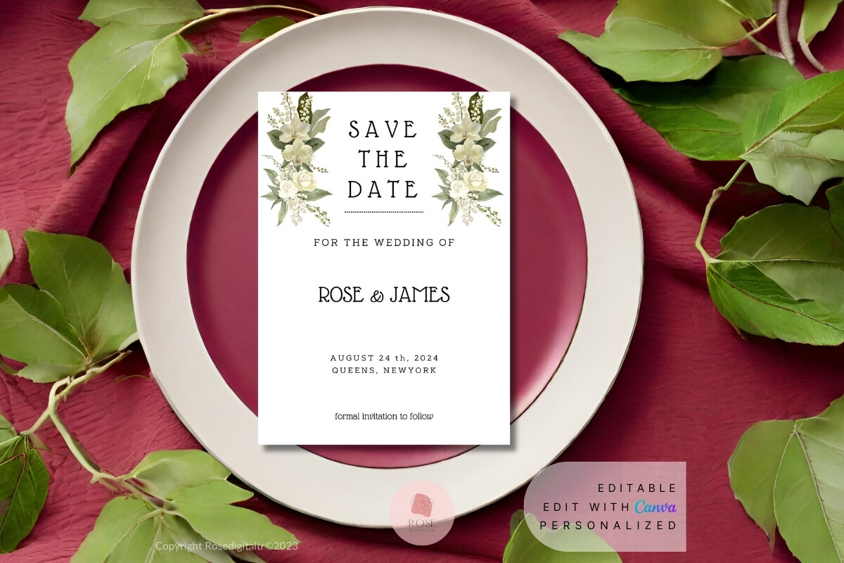
The one my flower-obsessed friend grabbed before I finished my sentence
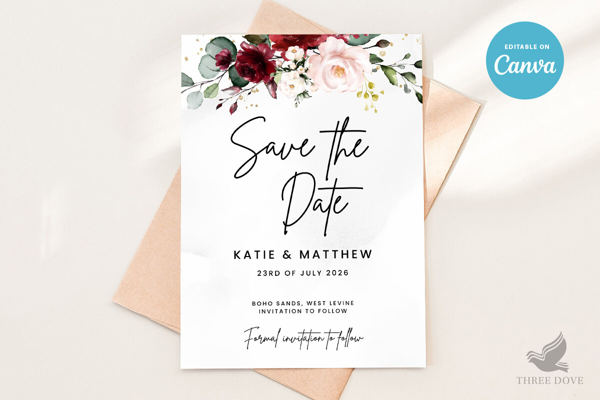
I showed this to a friend who has opinions about peonies and she claimed it on the spot. The florals sit in the corners and along one edge, so your names and your date get a clear lane down the middle. That matters more than it sounds. Half the floral cards I see bury the actual information under a hedge.
I typed her info in for her on a Tuesday night, printed a test, taped it to her bathroom mirror so she would see it groggy in the morning and tell me if it still made sense. It did. One gripe, the pink in the flowers prints a shade hotter than it looks on screen, so do a test page before you commit to a stack or you will get a candy tone you did not order.
For the half of your guest list that lives in a group chat
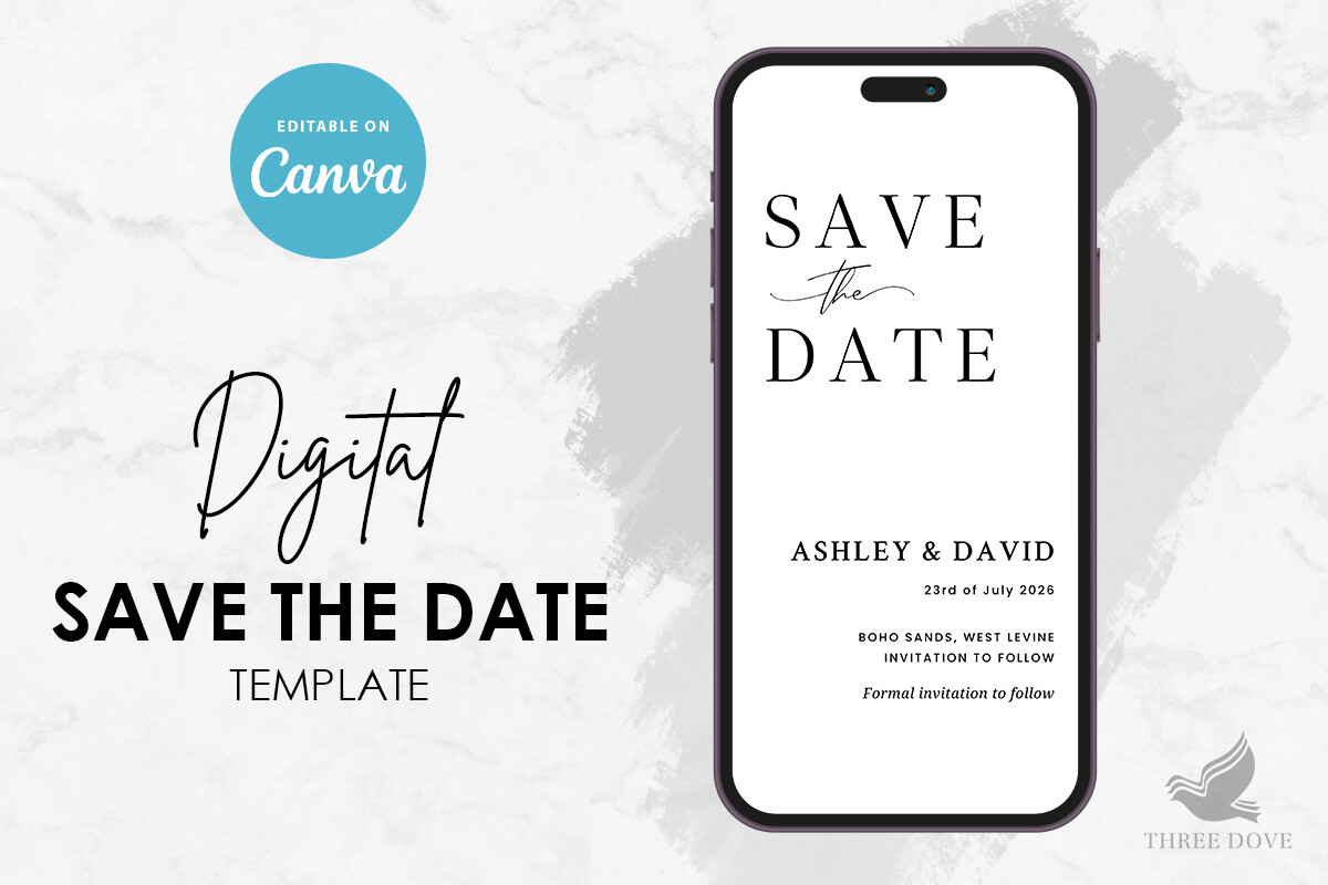
Not everyone we invited was going to pin a card to a corkboard. My younger guests live in their phones. So for them I sized this one down and sent it straight to the group chat, no envelope, no stamp, no trip to the post office on my lunch break.
It still has the rustic warmth, the soft tones and the relaxed type, it just travels light. The thing I almost missed, on a phone screen the smaller text gets squinty, so I nudged the date up two sizes before sending. Took ten seconds and saved me five ‘wait what day’ replies. Anyway, it does double duty, print a few for the relatives who like paper and text the rest.
Soft purple that does not tip into baby-shower territory
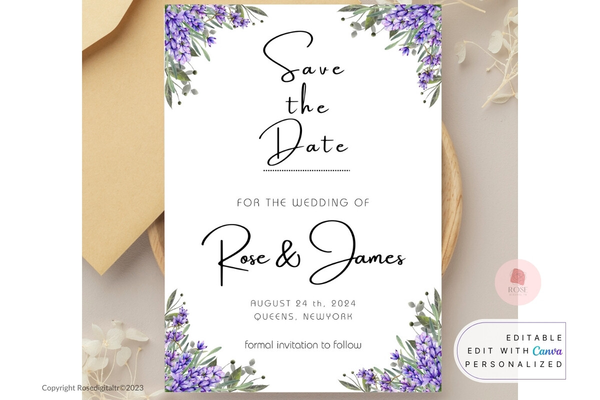
Lavender is easy to get wrong. Too much and your wedding looks like a nursery. This one keeps it dusty and muted, more dried lavender bundle than crayon, which sat nicely against the kraft tones I was using everywhere else.
My maid of honor was doing a small fall wedding and this was the one she landed on after rejecting about nine others over a bottle of wine at my place. We printed hers on a warm ivory stock instead of bright white and the purple calmed right down. Heads up, on stark white paper the color can read cooler, almost gray, so the paper you choose changes the whole mood here. Test on the actual stock you plan to buy.
The plain-Jane workhorse I keep recommending
Some people do not want flowers or laser cuts or anything fussy. They want their two names, a date, and a place where the card does not get in the way. This is the one I point them to. Clean layout, generous margins, type that you can read across a room.
I used a version of this energy for my own and the margins are why. My old printer clipped anything that ran close to the edge, and I learned that lesson on a card with my fiance’s name missing its last letter. This template leaves a real border. The one nitpick, the default font is a touch light, so if your venue is dim bump the weight one notch before you print thirty of them.
Eucalyptus, basically, but the kind that behaves
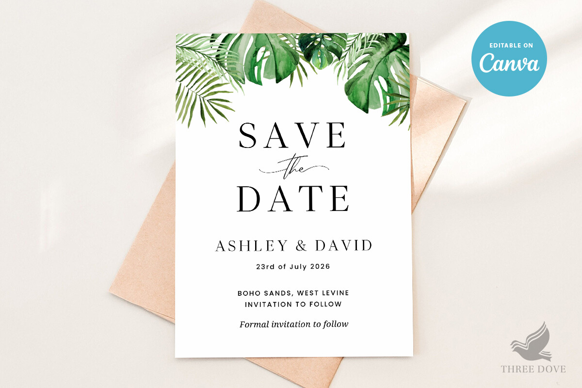
Greenery is the safest way into rustic if you are nervous about it. No bold colors to clash, just leafy trailing bits that read fresh against kraft or cream. I leaned on this look hard for my own barn thing because greenery was the only decor I could afford in bulk.
A coworker getting married in May used this exact template and printed it at a copy shop near her office, the one wedged between a nail salon and a sandwich place. Came out lovely. The catch with greenery is the green, your home printer probably renders it darker and bluer than the screen, so run one test sheet and check it in daylight, not under your kitchen light, before you trust the color.
The budget pick I’d hand a friend counting every dollar
When a friend tells me she is doing this on fumes, this is where I send her. It is the straightforward printable, no frills built in, which means you can lean on whatever rustic texture you already have. I taped one to a scrap of brown paper bag once for a mockup and honestly it looked intentional.
We printed a batch of these at thirty cents a page at the copy shop two streets from my old apartment and the whole save the date stage cost less than one box of the fancy pre-printed kind. The thing nobody warns you about, cheap thin paper curls when the ink is heavy, so go one weight up from copy paper even on a budget. That tiny upgrade is what keeps it from looking like a homework assignment.
Things Brides Email Me About
How do I make rustic save the dates?
Honestly? Start with the paper, not the design. I spent way too long fussing over fonts the first time and then printed it all on flimsy white and wondered why it looked off. Pick a kraft or warm ivory stock, drop your names into a template that leaves real margins, and add one rustic cue, greenery or a little floral, not three.
Then test before you commit. I print a single page on plain paper, prop it across the room, and squint. If the date still reads from over there, I print the real stack. If it does not, I fix the type and try again, no harm done but one sheet.
What colors fit rustic?
Warm and muted is the whole trick. Kraft brown, cream, sage, dusty terracotta, a soft lavender if you keep it dried-looking. The minute a color goes neon it stops feeling rustic, learned that when a coral I picked printed like a highlighter.
My rule now is keep it to two or three tones that you would actually find in a barn at golden hour. Greens, browns, a quiet warm accent. Skip the bright stuff, your printer exaggerates it anyway.
Photo or illustration?
Depends on your printer and your patience, weirdly. I went illustrated for ours because photos need good paper and good color calibration, and my home printer streaks anything dark. The illustrated ones forgive a cheaper setup.
That said, a friend did a knockout photo card from an engagement shoot and it was the better choice for her because she had a great picture and printed it properly at a shop. So, photo if you have a strong image and a real printer, illustrated if you are doing this at home with mid equipment like I was.
Before You Commit to a Template
I still have one of my rejected save the dates pinned to a board in my office, the one with the clipped letter, as a reminder that the test page exists for a reason. Print one. Walk across the room. Squint. That is most of the battle right there.
Whatever you pick from up top, give it a heavier paper than you think you need and run a single test before the full stack. Mine cost almost nothing and people still mention them. The barn helped, but so did not trying to be clever at midnight.