Here is the thing about reception signs. Guests do not read your timeline, they read whatever is taped to the nearest easel. At my own wedding my cousin walked three full laps looking for the bar because the only sign pointing at it was a cocktail napkin I had written on in eyeliner pencil. True story. After that I got a little obsessive about having an actual sign for every spot people would get lost.
I helped my friend Dana do hers in March and we mapped it out at her kitchen table on a Tuesday, with a cold pizza between us. Front door, seating, bar, dessert, the photo corner. Five signs, give or take. We printed test pages on plain paper first and walked them across the room, because a sign that looks great six inches from your face can turn into mush from across a dim hall.
These are the sets I actually reached for, or wish I had. I print one trial sheet, prop it up, back away, and squint. If I can still read it slouched on the couch, it goes in the cart. A couple of the links below are affiliate links, so if you grab one it tosses a few cents my way. Doesn’t cost you a thing.
A few of the links below are affiliate links. If you print something from one, it tosses a little something my way and costs you nothing.
The round one I hung first
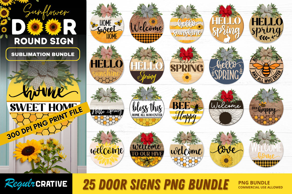
Dana’s whole thing was sunflowers, so this round bundle was an easy yes. The shapes are circles, which sounds obvious until you try to mount a circle on a square easel and realize you need a wooden round or an embroidery hoop behind it. We found a 12 inch hoop at the craft store on Bell Avenue for under four dollars and it looked like we planned it that way.
We ran the welcome circle for the front door and a smaller one pointing toward the ceremony. The sunflower art holds up when you blow it up, which I did not expect. No weird fuzzy edges.
One gripe. The yellow prints darker on home printers than it looks on screen, so my first sheet came out almost mustard. I bumped the brightness and reprinted at the copy shop and it was fine. Lost one page learning that.
When you want the entrance to do the talking
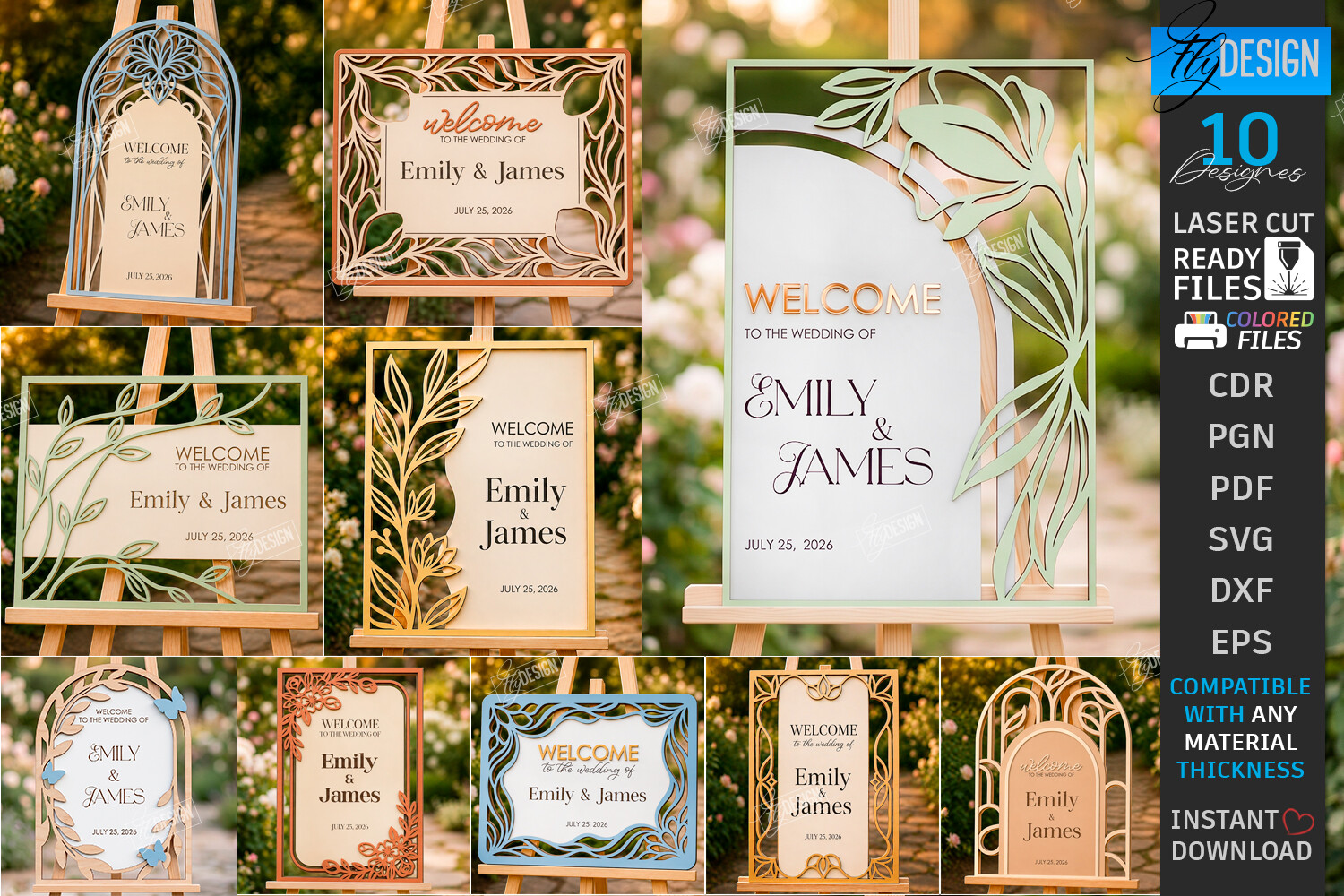
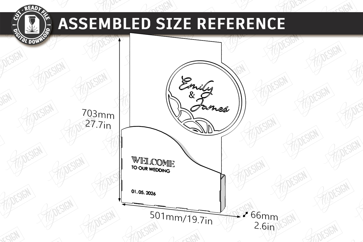
This is the set I’d point at if your venue has a real entryway and you want one big sign that makes people stop. The files are built for laser cutting, so the move here is to send them off rather than wrestle your home printer. I used a little online cut shop for Dana’s because nobody we know owns a laser, obviously.
The lettering came back crisp and the cut lines were clean, no scorched edges. We stood it against the wall by the coat rack and it greeted everyone before the coordinator could.
Heads up though, you’ll want to confirm your cutter’s max board size before you commit. Ours capped at 24 inches and one of the layouts wanted bigger. We scaled it down a touch. Nobody noticed but me.
For the corner that needs a little drama
I have a soft spot for the 3D floral look because it reads from far away. The flowers stack and catch shadow, so even in a dark reception hall the sign has depth instead of going flat. My maid of honor used a version of this for her vow renewal last fall and I stole the idea shamelessly.
We layered the cut florals onto a painted board and the whole thing took maybe an hour of fiddling with glue dots. Worth it. People kept asking where she bought it.
The catch is the layering takes patience and a steady surface. I glued two petals on backwards the first round because I was doing it on my lap watching TV. Do it at a table. Trust me.
The sandwich-board move that saves your easel budget
If you’ve ever watched a welcome sign slide off an easel mid-ceremony, and I have, you’ll understand why I love an A-frame. It stands on its own. No tipping, no propping, no asking your dad to babysit it. This bundle is set up for that fold-and-stand shape.
We used one outside Dana’s venue on the sidewalk so guests knew they had the right address. It held in a breeze that would’ve sent a flat board flying. The other guests’ signs that day did not fare as well.
My only nitpick is the board you cut it from matters a lot. Thin stock wobbles. We went a step thicker than the suggestion and it was rock solid. Cost a couple extra bucks at the lumber counter.
A second welcome option, for when one isn’t enough
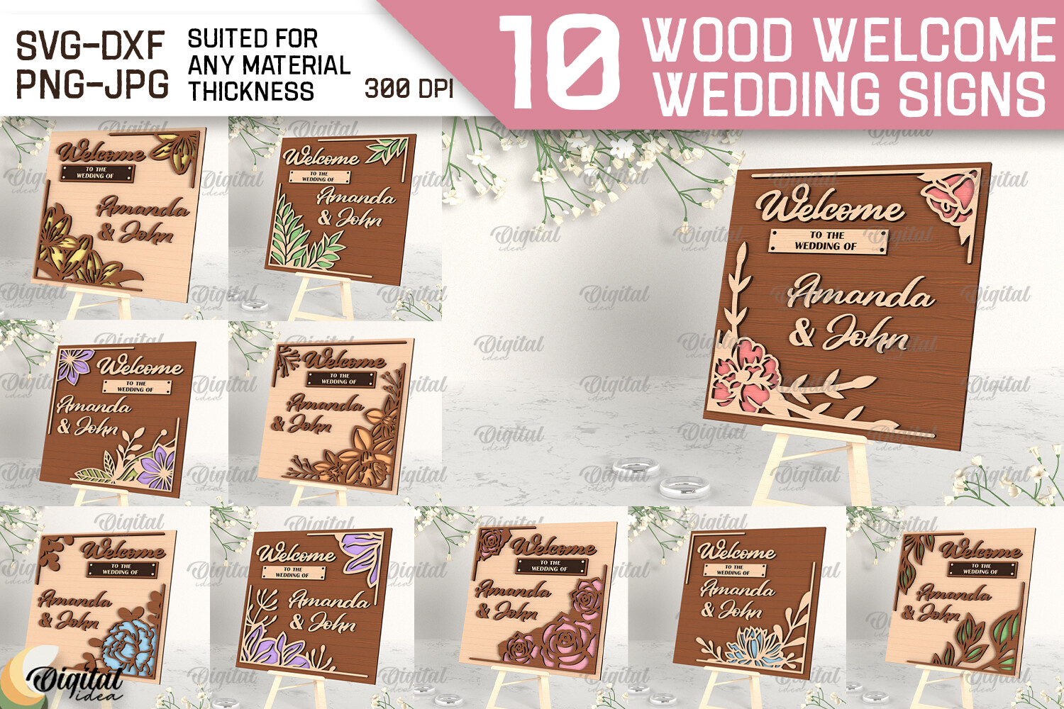
Yes, another welcome set. You end up needing more than one. We had a front door welcome and then a separate smaller one upstairs where cocktail hour lived, because half the guests skipped the lobby entirely and went straight up. This bundle gave us a matching look without buying two different products.
The designs in here lean a bit more classic, less floral, so it played nice next to the fancier downstairs sign without competing. Same font family, basically. That mattered more than I thought it would.
Grumble of the day, the file naming was a little chaotic and I opened three wrong layouts before finding the one I wanted. Once I renamed them on my desktop it was painless. Five minutes of annoyance.
The keepsake you make before the date, not after
This one is a bit of a side quest, and I’m including it because Dana made one as a gift for herself. It’s home wall signs, CNC and laser ready, the kind you hang in the new place after the honeymoon. She cut a little ‘established 2026’ piece and it lives over their entry now.
It’s also handy if you want a guestbook-adjacent sign at the reception that doesn’t get tossed in a box afterward. We propped hers on the gift table and it migrated home with them. Double duty.
The honest catch is this leans more toward the woodworking crowd than the print-at-home crowd. If you don’t have a cutter or a friend with one, factor in a shop fee. Dana’s run was about thirty dollars cut, raw board on top of that.
The one that turns a window into a sign
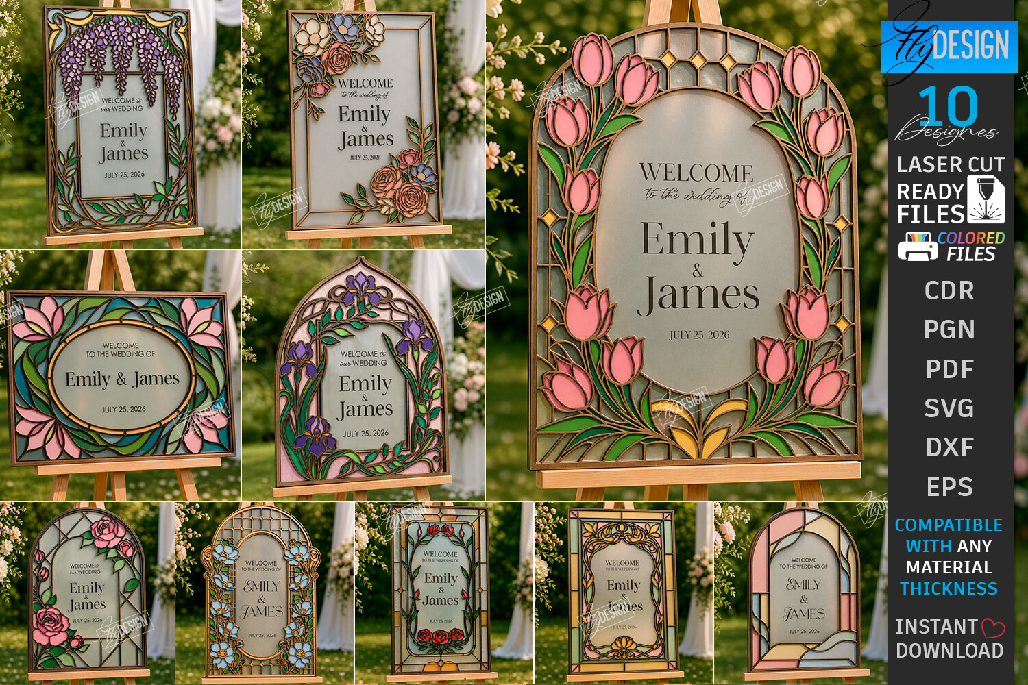
I saved my favorite for last. The stained glass set is colored and translucent, so the magic is sticking it on actual glass, a window or a glass door, and letting light pour through it. Dana’s venue had this big arched lobby window and we put the welcome there. By late afternoon the sun lit it up and it was the most photographed spot of the night.
We printed on a clear film at the copy shop near the train station because regular paper kills the whole effect. The film run was pricier but it’s the only way this set sings.
Fair warning, lining up the pieces on glass is fiddly and bubbles love to creep in. I used a credit card to push them out, slowly, from the center. Took two tries. The first attempt is now a souvenir in my junk drawer.
Things Brides Email Me About
What signs do I need at the reception?
Honestly? Fewer than Pinterest tells you. I map it by where people physically get confused. Front door so they know they’re in the right place, a seating sign so they stop hovering, and one each for the bar and dessert so nobody asks you personally. That’s the core four for me.
After that it’s gravy. Photo corner, guestbook, a ‘phones away during the ceremony’ card if you care about that. Dana added a card just for the late-night snack table and it was the smartest one she made, because that’s where the traffic jam happened.
What does an open seating sign say?
Keep it short and a little warm. Mine said ‘Pick a seat, not a side, we’re all family once the dancing starts.’ People actually read it and laughed, which beat the silent shuffle of guests guessing whether there was a chart.
A friend asked me this exact thing and I told her the only rule is make it unmistakable that there’s no chart. Otherwise folks stand around waiting to be told where to go. One clear line does the job. No need to get poetic.
How do I keep them matching?
I learned this the hard way at a wedding I helped with two years back, where every sign was a different font because we grabbed them from five places. It looked like a ransom note. Now I pick one bundle, or bundles that share a font and color, and stick to it the whole way through.
The other trick is printing them all in one session on the same stock. Same paper, same printer, same day. Switch any of those three and you’ll see the difference under reception lighting, even if you can’t on your screen.
Before You Commit to a Template
If you take one thing from me, print a test page and walk it across your living room before you commit to the good board or the film. I’ve wasted more cardstock skipping that step than I’d like to admit. The couch-squint test has never let me down.
Signs are the cheapest way to make a reception feel handled, and most of these sets cost less than the easel you’ll prop them on. Pick the look you keep coming back to, print one, prop it up. If it reads from across the room, you’re done. Go drink something cold and stop scrolling.