My welcome sign almost did not happen. The plan was to hire someone to hand-letter a mirror, then I saw the quote and laughed out loud in the parking lot of the rental place. Eighteen people had already RSVP’d. The mirror quote was more than my shoes. So I went home, opened my laptop, and decided I would figure it out myself or there would just be a blank easel and a vibe.
Here is the thing about a welcome sign. It is the first thing people see when they walk in, so it gets photographed a hundred times, and it also has to survive being propped on an easel outside in whatever weather shows up. Mine sat in full sun on a windy afternoon in May. The cheap foam version I made first warped by the second hour. The printed one held.
These are the templates and boards I actually used or would use again. I print a test page on plain paper, prop it across the room, and walk to the far wall to see if the names still read. A handful of the links below are affiliate links, so if you grab one a little something comes back to me. Does not cost you a thing.
Quick note, a couple of these are affiliate links. If one ends up at your reception, it helps keep this little blog running and you pay the same.
The round one I cut on a borrowed machine
My maid of honor owns a cutting machine she uses maybe twice a year, so I drove over with a bottle of wine and a stack of vinyl. This is a round design, which I liked because every welcome sign at every wedding I had been to was a rectangle and I was tired of rectangles. We weeded the vinyl on her kitchen counter while her cat tried to sit on it.
The shape works on a circular acrylic blank or a wood round from the craft store, and the curve of the lettering follows the edge so it actually fills the space. We stuck ours on a 24 inch wood round I sanded the night before.
One warning. The thin parts of the letters are a pain to weed if you go small. Below about 18 inches I lost two letters and had to recut. Stay big and you are fine.
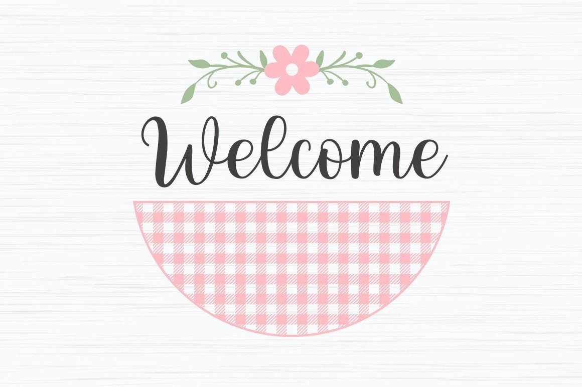
Soft pink that did not photograph like Pepto
I was nervous about pink. The last time I printed anything pink at home it came out the color of cough syrup. This one is a muted blush, more dusty than candy, and it actually held up when I printed a test on plain paper. I printed the real one at a copy shop on Halsted because my home printer streaks anything pale.
I typed in our names, the date, and a little line under it that said come find your seat. Took maybe ten minutes. The spacing held when I changed the longest line, which is where a lot of these fall apart.
The blush reads as nearly white in bright sun though. My sign sat under an awning so it was fine, but if yours goes in full daylight, bump the saturation a notch before you commit to good paper.
Faking the hand-lettered look without the hand
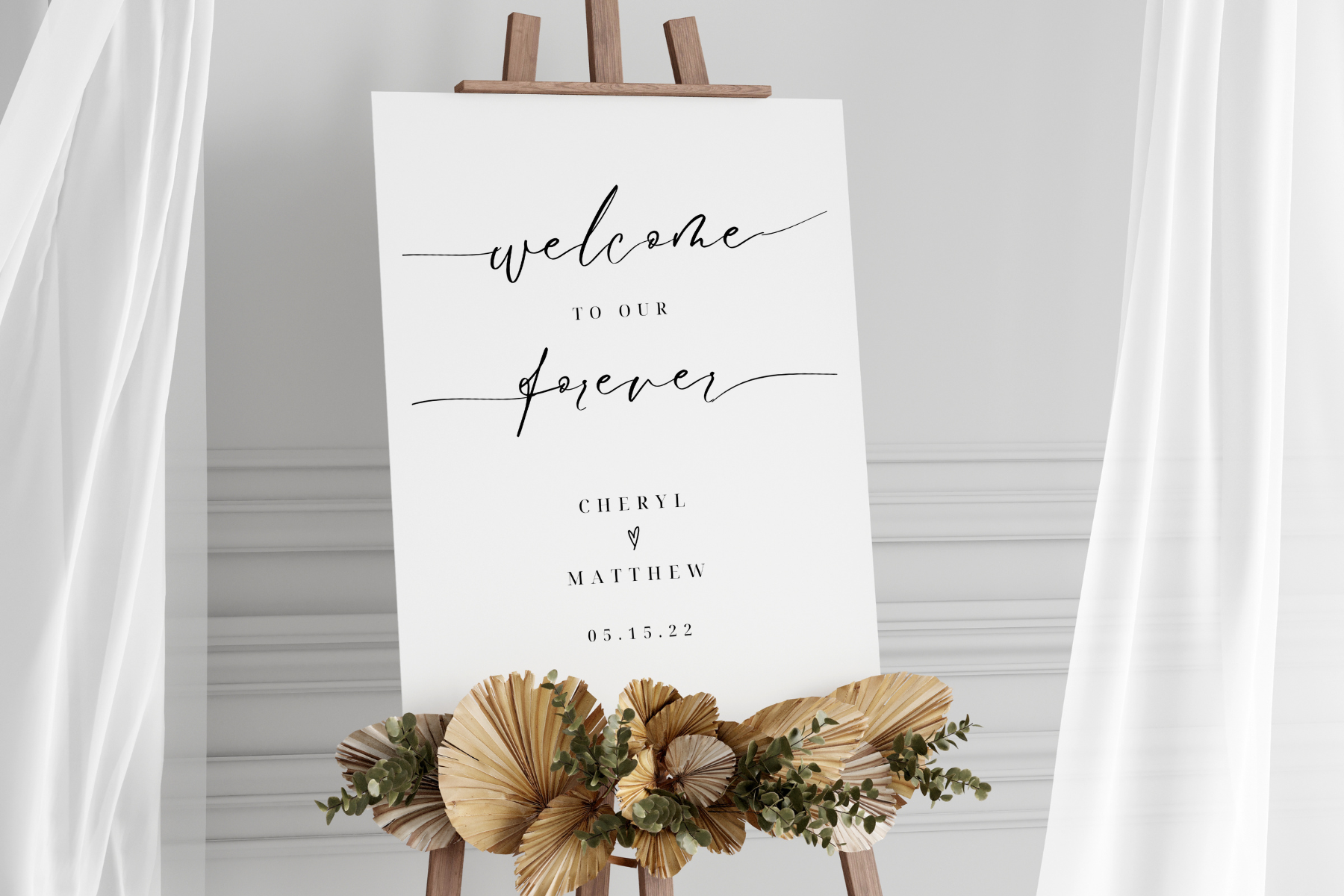
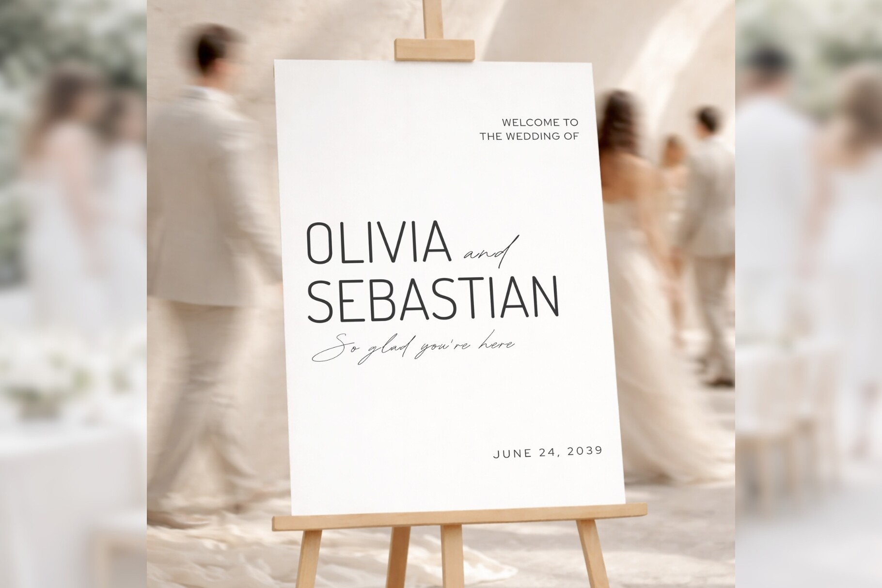
This is the one I would have shown my past self in that parking lot. It has the flowing script that makes people assume you paid someone, except you type your names in and the letters connect on their own. I sent it to a coworker who got married three weeks after me and she texted me a photo, furious that it looked too good to be DIY.
I printed mine large, framed it, and propped it on a brass easel I rented for nine dollars. Nobody asked if I lettered it by hand. Two people asked for the calligrapher’s name, which felt great and also a little dishonest.
The script is pretty but it is also delicate, so a thin home-printer line can break up the fine strokes. Print it somewhere with a real laser printer if you can. I learned that on a streaky first pass that went straight in the recycling.
The Canva version for people who panic in Canva
I am not a Canva person. I open it, get overwhelmed, and close it. This template made it survivable because almost everything is locked in place and you just click the text and type. I did mine on my phone on the train home from work, which is not a recommendation, just a fact about how easy it was.
The layout is clean and a little formal, good if your venue is on the fancier side. I changed the names, swapped the date, and left the rest alone. Resisting the urge to add stuff is the whole game.
The default font is on the thin side. In a dim ballroom it could vanish, so I made the names heavier before exporting. One tap, big difference.
Same family, a touch more dressed up
This is the slightly fancier sibling of the one above. A bit more flourish around the edges, the kind of detail my mother-in-law calls elegant and my husband calls busy. I liked it for a sign that sits near the entrance where people linger and actually look closely.
I used it for a friend’s bridal shower as a test run before her wedding. Printed it on a heavier matte stock, around 110 lb, so it did not flop when I propped it. Held its shape all afternoon on a metal easel by the door.
Watch the corners. The decorative bits run close to the edge, so if your printer has a fat margin you can clip them. I scaled the whole thing down two percent and the problem went away.
When you want it to shut up and look clean
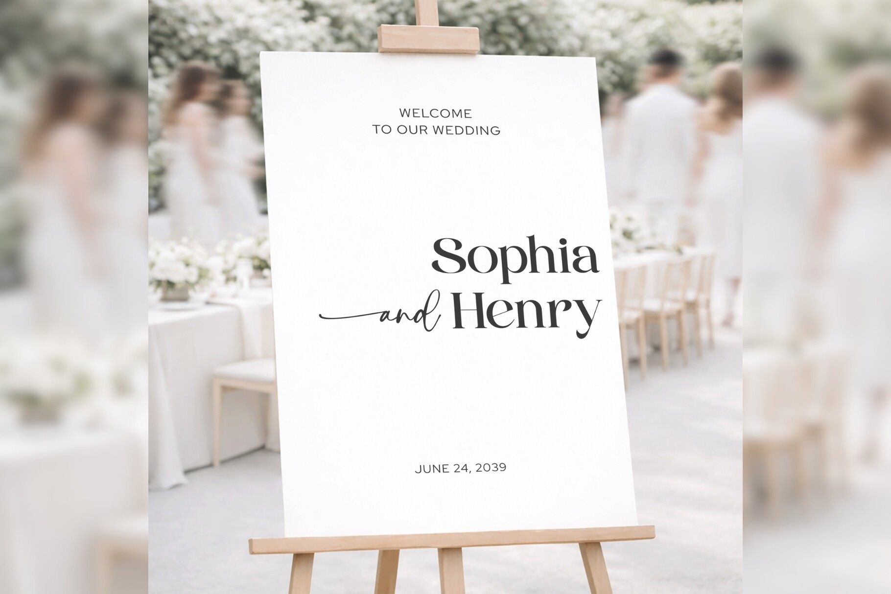
Some venues already have a lot going on. Brick walls, string lights, a band setting up in the corner. For a busy room I wanted a sign that did not compete, and this one is about as stripped down as it gets. Just the words, lots of white space, one clean line.
I made this for my cousin who got married in a converted warehouse. We printed it big on plain white and it looked intentional against all that exposed brick. She framed it in a thin black frame from a thrift store on Damen, eight bucks.
Because it is so bare, any typo is extremely visible. Read it out loud before you print a stack. I caught a missing R in our last name on the second read, and that would have been a long day.
The all-rounder I keep sending people
If a friend texts me panicking the week before, this is usually the one I send back. It is not the fanciest or the most minimal, it just works for almost any venue and almost any vibe. Middle of the road in the best way. I have now recommended it to four people and three of them used it.
You type your names, set the date, and it stays put. I printed a test, taped it to the back of a door, and lived with it for a day before printing the real one at the copy shop. Cost me a few dollars to print large.
The one nitpick. The sample text uses a really long fake name, so when you put in a short name there is awkward space. Nudge the text box up a hair and it centers right. Took me a minute to spot.
Things Brides Email Me About
How do I DIY a welcome sign?
Short answer, you grab a template, type your names and date into it, and print it. That is genuinely most of it.
The part nobody tells you is the test print. I printed mine on plain paper first, propped it across the room, and walked to the far wall to see if the names still read from a distance. They did not the first time, the font was too thin, so I fixed it before wasting the good cardstock. Print cheap, look from far away, then commit.
What do I print it on?
I learned this the hard way with a flimsy first attempt that curled in the sun by hour two. Thin paper warps and flops the second it stands up on an easel.
Go heavy. I used cardstock around 110 lb for the framed ones, or had the bigger signs printed on foam board at a copy shop. The foam board cost me about fifteen dollars and it stayed flat all day outside. Worth every dollar versus the sad curling version.
How do I make it look pro?
Honestly? Two things did it for me. A real laser printer instead of my streaky home one, and a frame.
A friend asked me this and I told her the frame is the cheat code. I propped my printed sign in a thrifted black frame on a rented easel and suddenly it read as something you would pay for. Nine dollar easel, eight dollar frame, and people asked for my calligrapher. There was no calligrapher.
Before You Commit to a Template
I still have my welcome sign. It is in a closet behind the winter coats, a little dinged on one corner from the easel tipping over during setup. Caught it before it hit the ground, mostly.
None of these need a calligrapher or a steady hand or a free weekend. Pick one, type your names in, print a cheap test, and squint at it from across the room. If it reads from the couch, you are done. Go deal with the seating chart, which is the part that actually keeps you up at night.