My invitations were one ink color and a lot of empty space, and people thought I hired someone. I did not. I sat at the kitchen counter with a $4 ream of paper from the office store on Garfield and printed forty of them while a frozen pizza was in the oven. Half the empty space on those cards was me being lazy about design. The other half was me figuring out my home printer streaks the second you ask it for anything heavier than light gray.
Minimal is sold as a style. For me it started as a way to not waste ink. Less stuff on the page means fewer things to line up wrong, fewer colors to bleed, and a much smaller chance you print sixty cards before you notice the date is a Saturday that does not exist. I learned that one in February. Cost me a stack and most of an afternoon.
So here are the pieces I actually pulled into mine, plus a couple I tried on my cousin’s save-the-dates last spring. I print one test on plain paper, prop it on the windowsill, and walk to the far side of the room. If I can still read the names from there, it goes to cardstock. Some links below are affiliate links, so if you grab one it kicks a little back to me. Does not change your price.
A few of the links below are affiliate links. If you print something from one, it tosses a little something my way and costs you nothing.
One small flourish, that’s the whole trick
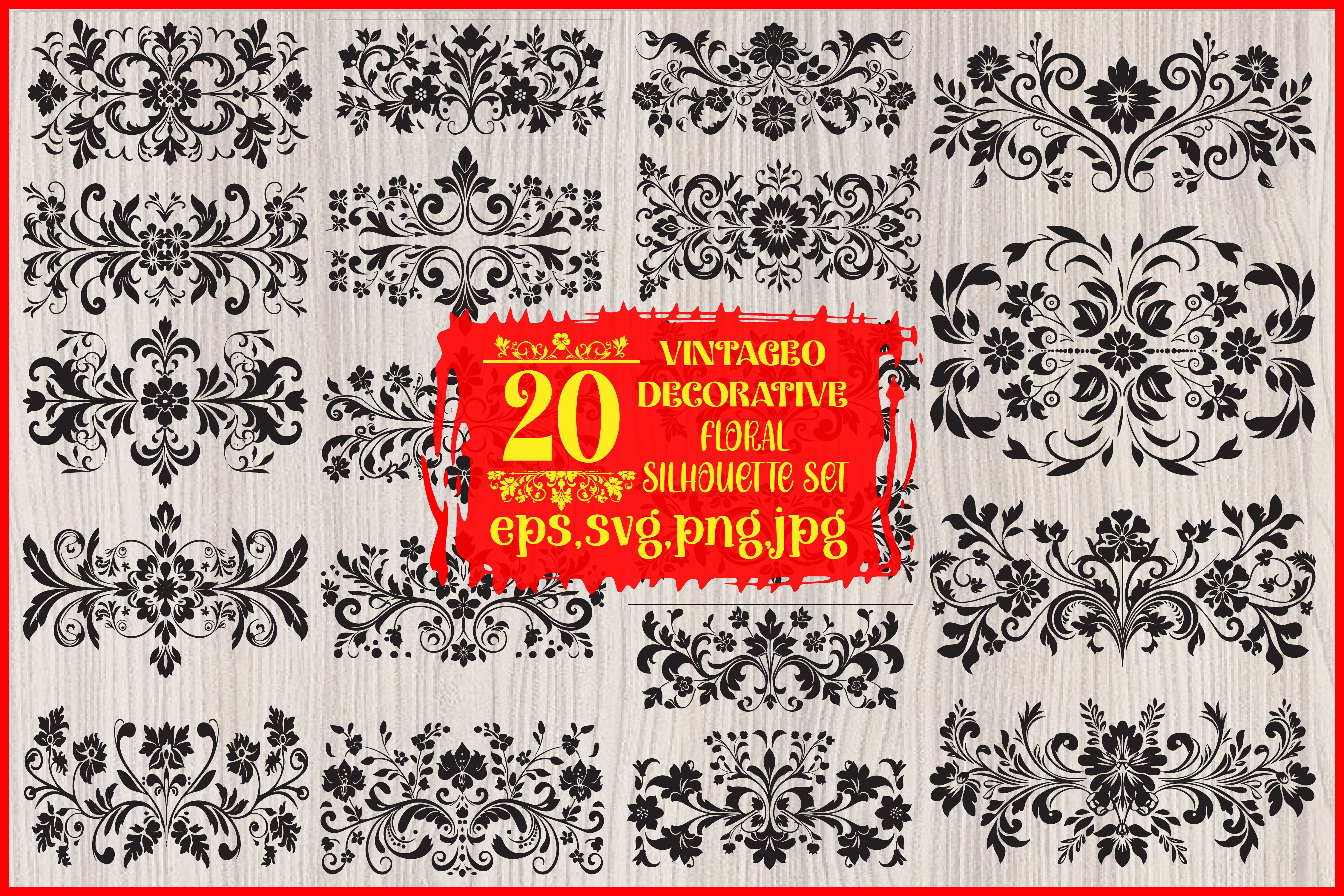
Minimal does not mean nothing. A bare card can read like you forgot to finish it. I dropped one thin flourish from this set in the bottom corner of my menus and suddenly the whole thing looked on purpose. Twenty options in here, and I only ever used two of them.
The nice part is they scale without going pixelated, so I shrank one down tiny for the RSVP cards and it held. I taped a printed corner to my fridge for three days to make sure it did not feel fussy up close.
My gripe: a few of the designs are heavy enough that a home printer will smear them in one pass. I took the darker one to the copy place on Garfield instead of fighting my own machine at 11pm again.
When plain white felt too cold
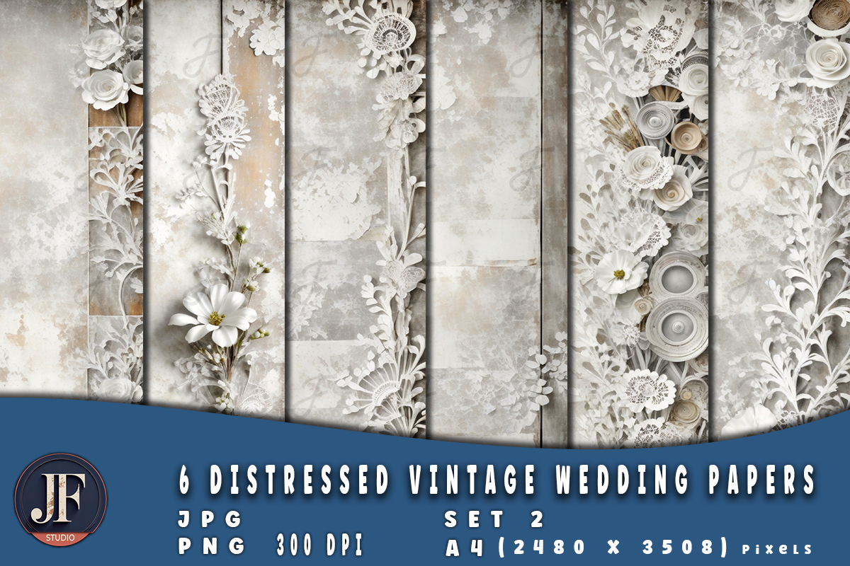
Pure white kept looking like a tax form to me. These papers gave me a soft worn texture behind the text without adding any actual clutter, which is the thing I wanted. I used the palest one as a background layer and left almost everything else empty.
I printed a test on regular paper first because backgrounds eat ink fast. They do. One full-bleed card and my cartridge dropped a bar. So I switched to the lightest sheet in the set and it barely sipped.
One catch. The texture is subtle enough that on cheap copy paper it almost vanishes, and you only really see it on decent cardstock. Mine was 110lb and it finally showed up the way the preview promised.
Stripes for the parts nobody photographs
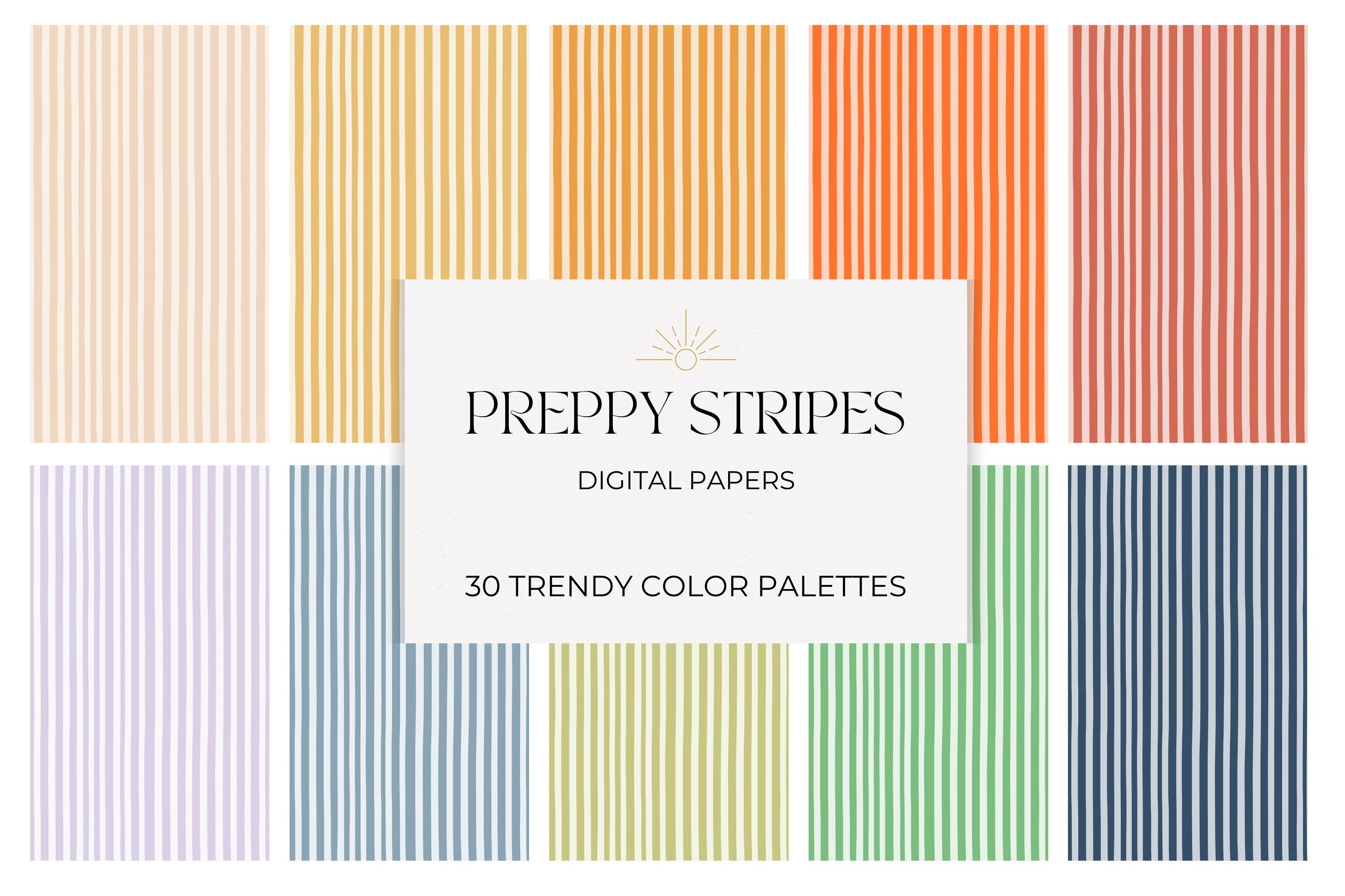
I would not put a pattern on the main invite. Too much. But the back of a card, or the inside of an envelope, or a little drink tag? That is where these stripes earned their keep. I lined my envelopes with the thinnest one and it made the whole set feel finished for basically no effort.
They tile cleanly, so I stretched one sheet across a long welcome sign and the lines stayed straight at the seam. That never happens with the free ones I usually grab.
The colors run a touch brighter on screen than on paper, at least on my printer. I bumped the saturation a hair before the real run so the navy did not come out looking gray and sad.
Corners do the framing so you don’t overthink it
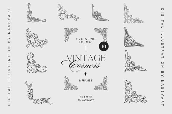
Centering type on an empty card by eye is a nightmare. You think it is straight, you print fifty, your maid of honor squints and goes hmm. These corner pieces gave me an anchor. I pinned one ornate corner to each side and the text just sat where it was supposed to.
I used the simplest frame for the ceremony programs and a fancier one for the table numbers, same family, so it read as a set without being matchy.
They are detailed, which is great until you print small. At table-number size the fine lines stayed crisp on cardstock but turned to mush on plain paper. Test it at the actual size you need before you commit a stack.
Lace, but only a thread of it
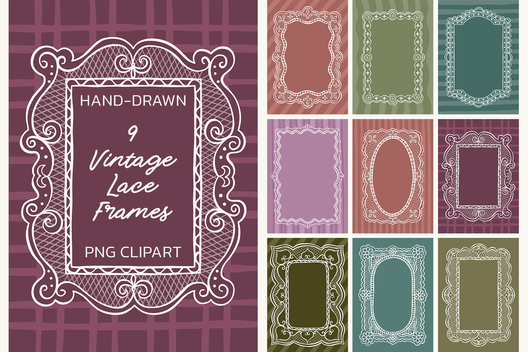
I almost skipped lace. Sounded like the opposite of minimal. Then I used one of these frames as a single thin border on the vow booklets and it stayed quiet, just a delicate edge around a mostly blank page. Nine frames, and the most barely-there one was the keeper.
I printed it in one warm gray instead of black, which softened it enough that it never fought the text. Took me two tries to land the right gray.
Watch the corners on these. A couple of the lace patterns get so fine that my printer dropped tiny gaps in the line at small sizes. The copy shop machine handled it; mine did not.
One stem of color on an otherwise empty card
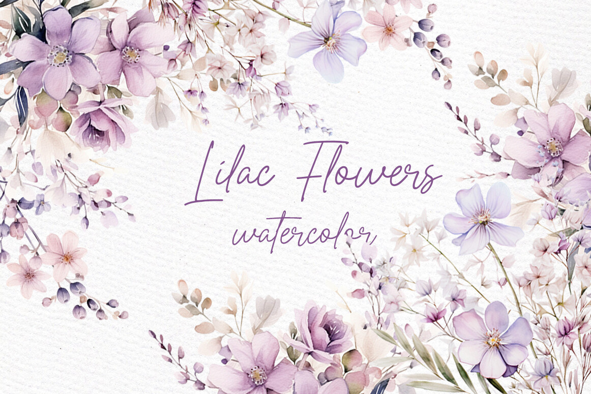
If you do minimal in only black ink it can go a little severe, like a meeting agenda. I wanted one spot of color and nothing else, so I used a single lilac sprig from this set in the top corner of the invites and left the rest white. That one stem did more than a full border ever would have.
The files come on a clear background, so I dropped the flower straight over my layout with no white box around it. Lined it up once and reused it across the whole suite.
My nitpick: the purple prints a shade duller than the screen shows, which is true of basically every watercolor I have printed at home. I had the lilac save-the-dates done at the copy place and the color finally matched.
Save the big floral for one piece only
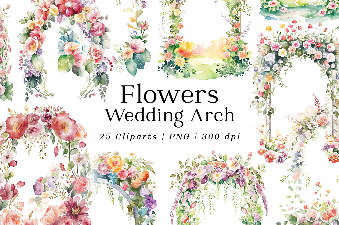
This one is the exception to keeping it sparse. It is a full watercolor arch, and it would bury a small invite. So I used it on exactly one thing, the welcome sign, and left everything else clean. The contrast is what made the sign feel like the centerpiece of the entrance.
I sized it up for a 18 by 24 print and the watercolor stayed soft instead of going blocky, which surprised me. I sent that one out to be printed; my home machine maxes out at letter size anyway.
The one warning: this is the most ink-hungry file in the bunch by a mile. Do not even think about running it on your own printer for a big sign. I tried a half-size test and it drank a third of a cartridge.
What People Keep Asking
What is a minimalist invitation?
Honestly? For me it just meant taking stuff off the card until it stopped looking cluttered. Mine was the names, the date, the place, and one little flourish in the corner. That was it.
A friend asked me this while we were standing in a craft store and I realized I could not give her a rulebook. There is no official line. If it looks calm and there is breathing room around the words, people will call it minimal.
Does minimalist save money?
Yep, and that was the real reason I went that way. Less color and less coverage means your ink lasts way longer. I printed forty invites on one cartridge because most of each card was blank.
The other savings is paper you did not ruin. Fewer elements to misalign means fewer scrapped sheets. I still wasted a stack on a typo, so it is not foolproof, but a busy card gives you more ways to mess up.
How do I keep it from looking plain?
This is the part I got wrong first. My early version was so bare it looked unfinished, like I ran out of time. The fix was one small thing, not more things. A single corner flourish, or a thread of color, or a textured paper underneath.
The other half is the paper itself. I printed the same plain layout on cheap copy paper and on 110lb cardstock, and only the heavy one felt intentional. Same design, totally different read across the room.
Before You Print a Stack
Minimal turned out to be the lazy person’s win, which is why I keep recommending it. Less ink, fewer ways to print it crooked, and it photographs clean. I still have a few leftover cards in a drawer somewhere from the night I printed too many.
If you only grab one thing from this list, make it the piece that fixes your specific headache, the corners if you cannot center text, the watercolor stem if black ink feels grim. Print one test page first, walk to the far wall, and squint. That trick has saved me more cardstock than any tutorial ever did.