My invitations had peonies on them that I did not order. I bought a floral border pack thinking it was roses, opened the files at my mom’s kitchen counter the weekend before I sent the batch, and there they were, big pink peonies all over the corners. I kept them. They matched nothing in my actual bouquet and I have never once regretted it.
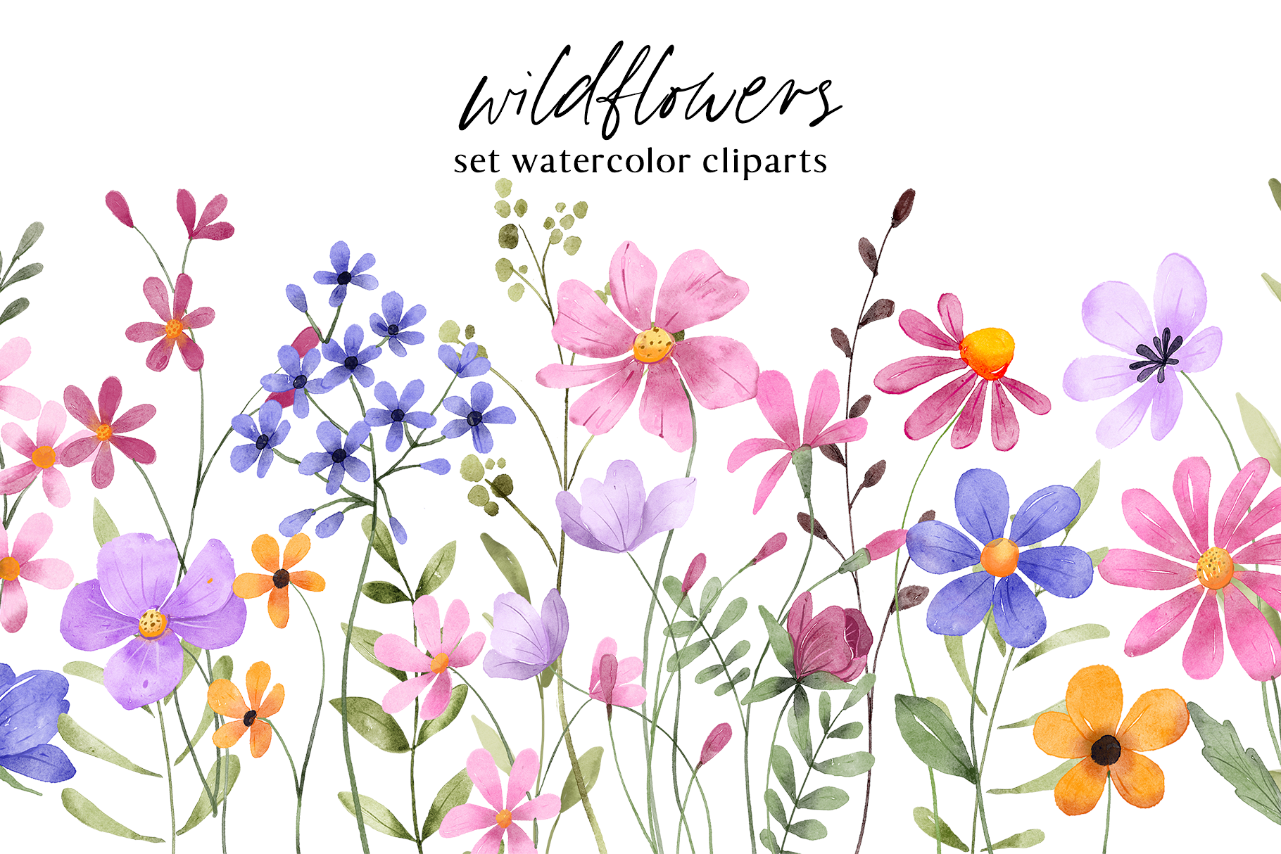
Flowers on a wedding invite are a funny thing. Done right, the paper feels like a real season, like you can almost smell whatever was blooming in your yard. Done wrong, it looks like clip art got loose. The gap between those two is usually one decision: too many flowers, or the wrong kind for the time of year you are actually getting married in.
So here are the floral sets I have printed, mailed, or pushed on a friend who panicked three weeks out. I test everything the same way. One page on cheap paper, taped to the cabinet, looked at from across the room with my coffee. If the flowers still read and the names are not swallowed, it stays. A few links here are affiliate links, so if you grab one a little something comes my way. Doesn’t cost you a thing.
Some links below are affiliate links. If you download one for your day, I earn a tiny bit and it changes nothing on your end.
The border set I reach for first
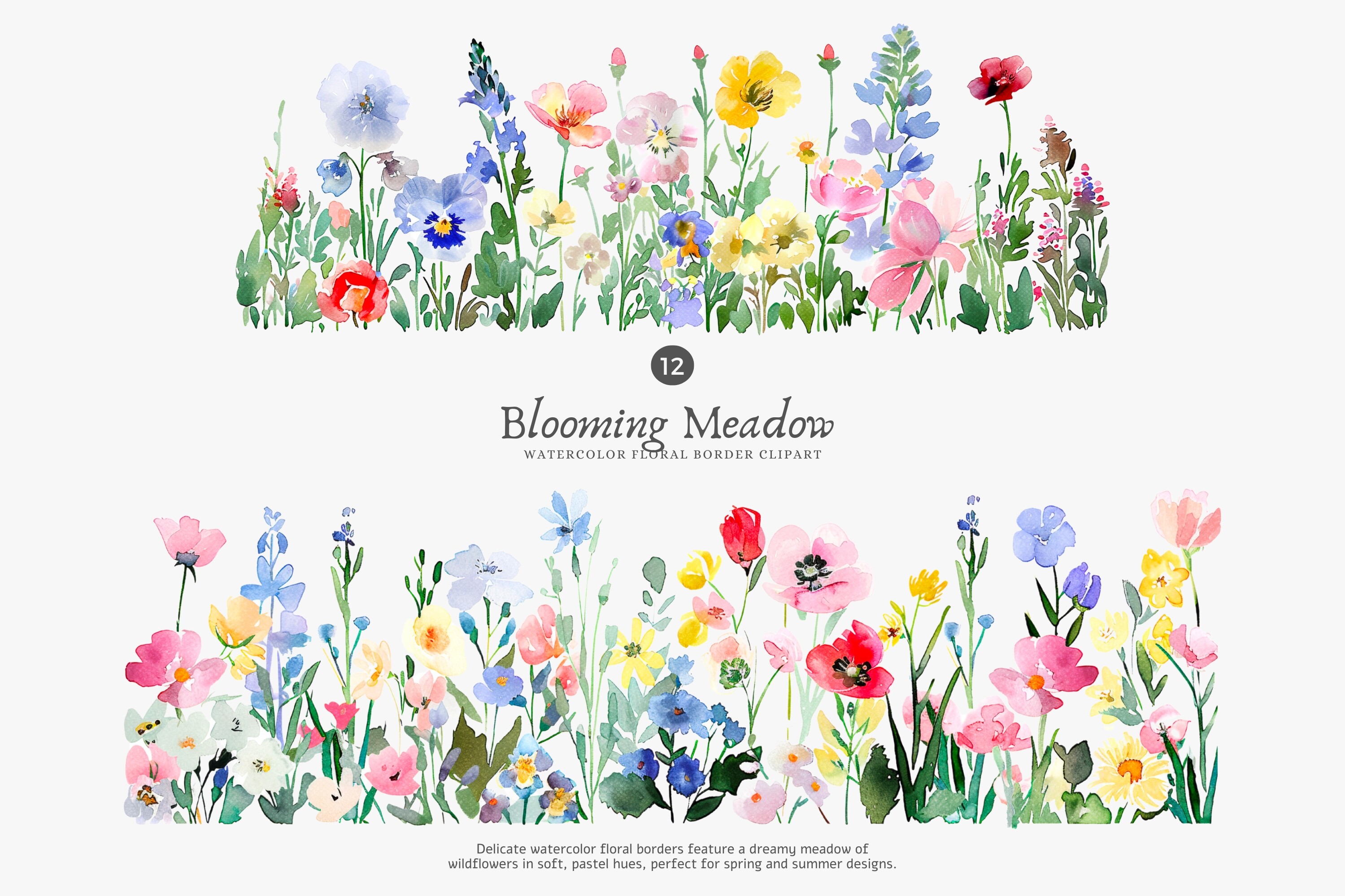
Borders are where I start every time, because they frame the names without fighting them. This set drops a soft watercolor edge around your text and leaves the middle alone, which is exactly what you want when the whole point is people reading a date and an address.
I used these on my own save-the-dates after the peony incident. Printed a stack at the copy place on Foster Ave because my home printer turns anything pink into a bruise. Came out clean. The wash on the corners is light enough that black text sits right on top and stays sharp.
My one gripe. There are a lot of files in here and some of the corner pieces are nearly identical, so I spent a dumb amount of time clicking through them to find the two I liked. Worth it, but pour the coffee first.
When you want flowers everywhere and it still works
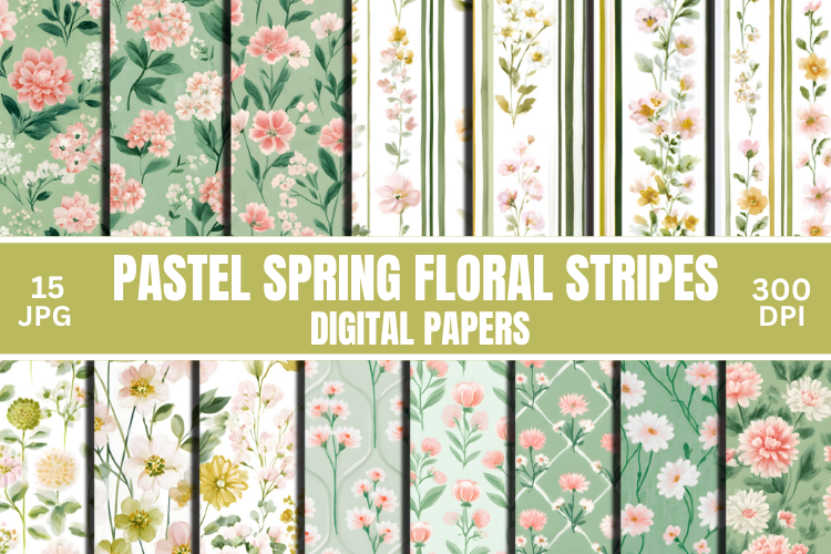
Seamless paper is the cheat code for a backing card. You lay it down full bleed, flip the invite over, and suddenly the back is not a sad blank rectangle. This spring set tiles without any visible seam, which sounds obvious until you have used a cheap one and watched the pattern jump halfway down the page.
A coworker getting married in April begged me for help and this is what saved her. We ran the pattern on the reverse of her invites and a thin strip down her menu cards so the table tied back to the mailbox. She did the printing herself on her own inkjet and it held up.
Small thing to know. The colors lean bright, properly springy, so if your palette is dusty or muted it will read a little loud. She knocked the saturation down a notch before printing and that fixed it.
Spelling things out with actual flowers
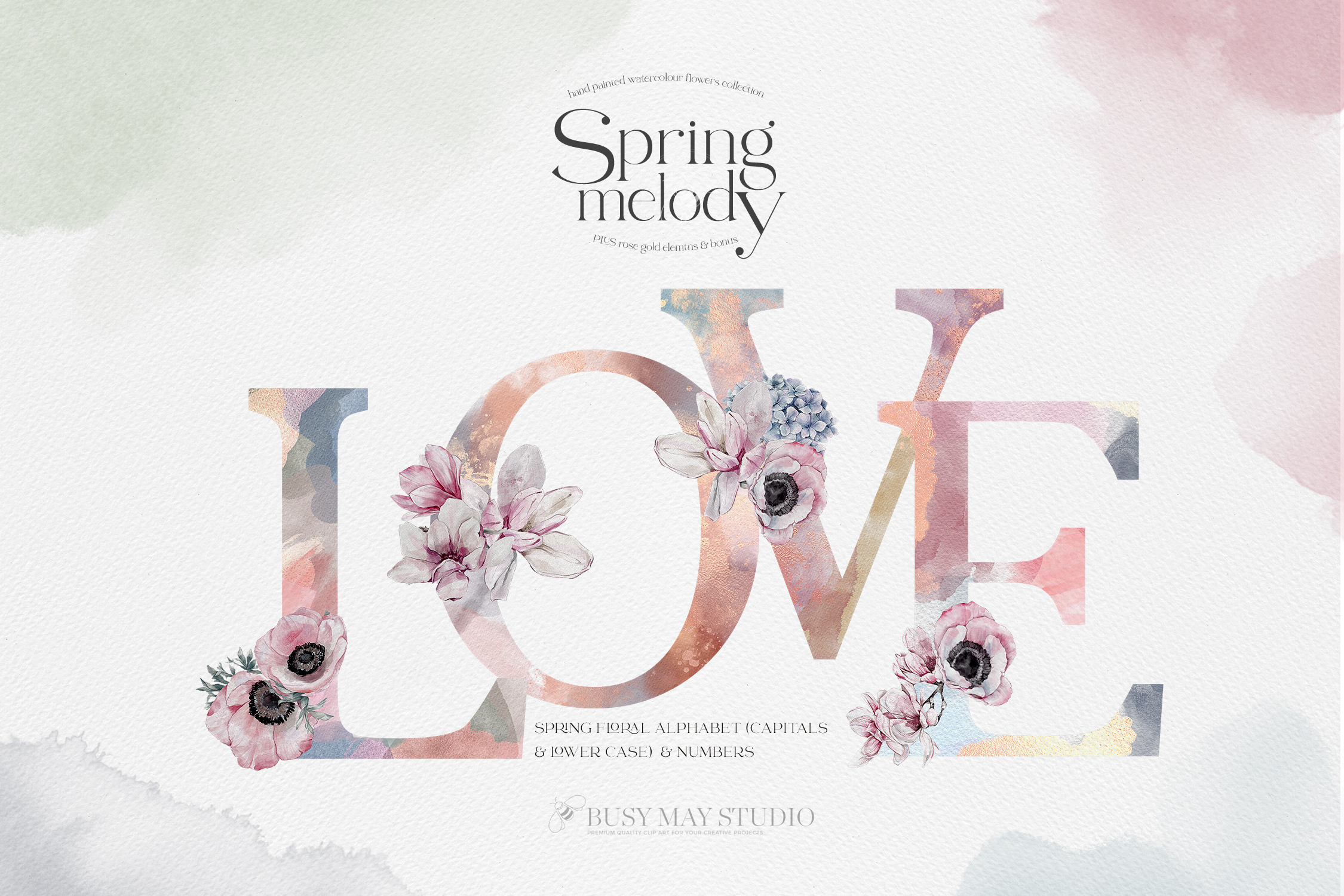
This one is a full alphabet and numbers, each letter built from watercolor blooms. I did not expect to love it as much as I do. You drop in a monogram or a table number and it looks hand-painted instead of typed, which is a nice trick for almost no effort.
I used the numbers for table markers at my cousin’s reception. Printed the 1 through 12 on heavy cardstock, the 110 pound stuff, trimmed them with the paper cutter at the library, and propped them in little frames from a thrift store. People asked who made them. I let them assume.
Heads up on the letters. Some are denser than others, so a flowery W next to a skinny I can look uneven if you set them side by side. For a single monogram it is perfect. For a long name, eyeball it first.
Roses and stripes for the cottage-leaning bride
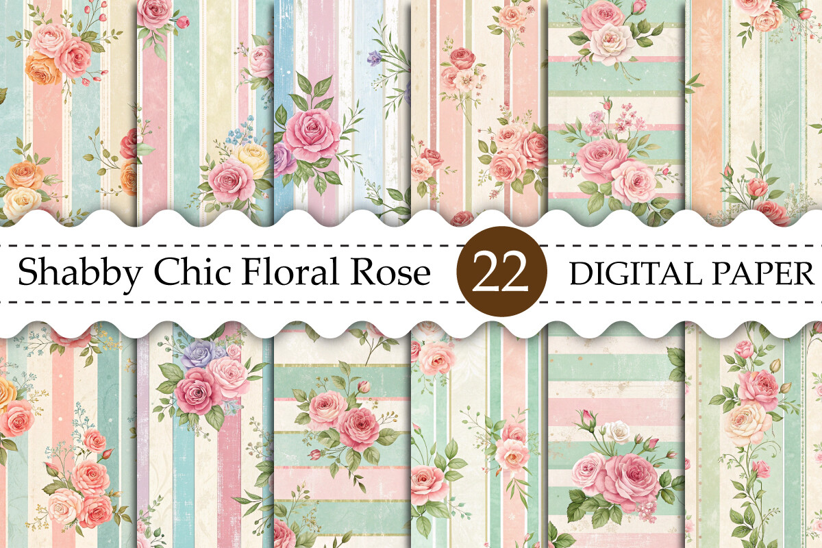
If your wedding has any barn, garden, or grandma’s-china energy, this is the set. Roses mixed with soft stripes, the kind of pattern that looks like faded wallpaper in the best way. I am partial to it because it does not try to be modern and minimal, which everything else online seems to be lately.
A friend used these for a backyard wedding in late June. We layered the striped paper behind her vows printout and used the rose sheets as a wrap around the napkins. Cost her maybe four dollars in cardstock for the whole table look.
One catch. The vintage cream background means it really wants a warm white paper, not a bright white. I printed a test on the bright stuff first and the whole thing looked off, like two different photos taped together. Switch your paper, not the file.
Butterflies, used with restraint
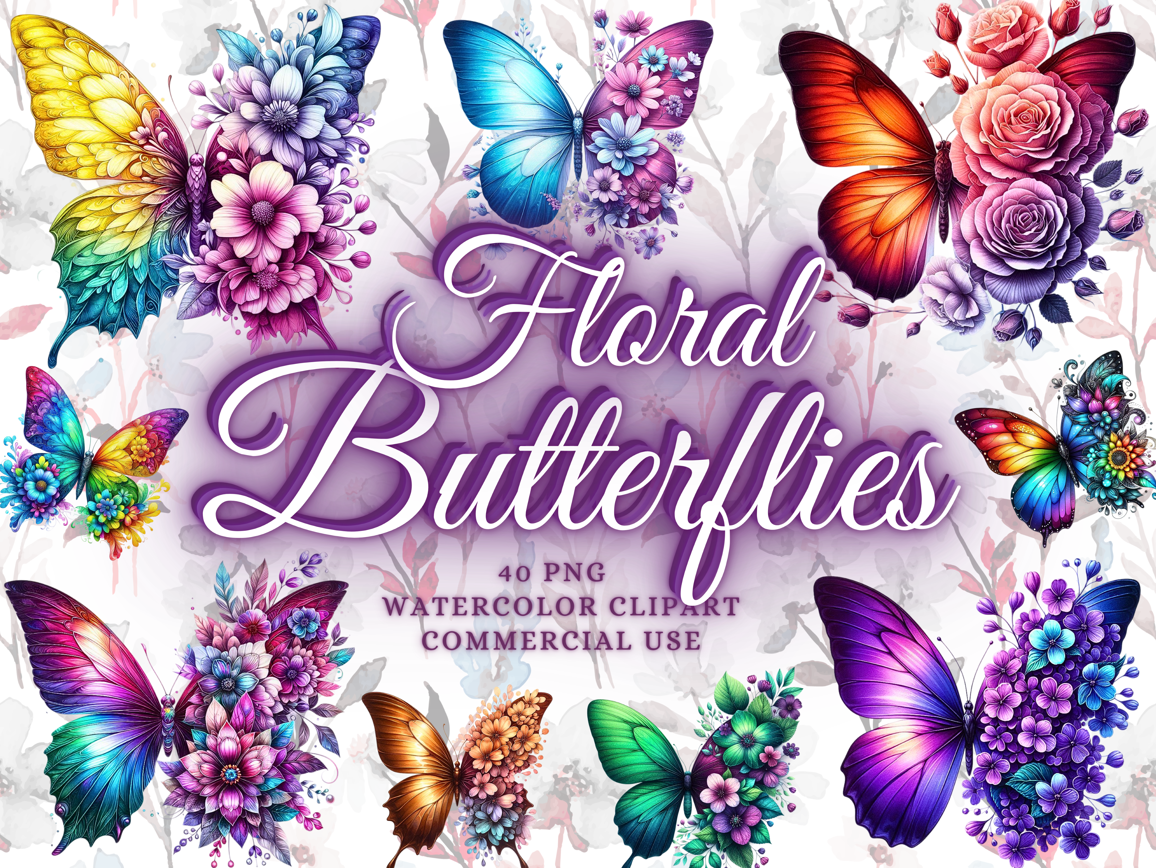
I was skeptical here. Butterflies on a wedding invite can go very wrong, very fast, into quinceanera territory or a kid’s birthday. But this bundle has them painted loose and soft, more garden than glitter, and used in twos and threes they actually settle a busy floral down.
Where I put them was the envelope flaps. A single butterfly on the back seal of each envelope, nothing else. My neighbor was the one who suggested it after I told her I had the files and no plan. Printed them on sticker paper, cut around each one, done.
The gripe. Some of the butterflies are pretty saturated and bright, so if the rest of your suite is whisper-soft they jump out. I stuck to the two palest ones in the pack and ignored the rest.
The mix-and-match pile I keep going back to
This is the set I treat like a kit. Individual flowers and leaves, loose, so you can build your own arrangement instead of taking whatever someone else clustered together. For anyone who likes control over their layout, this beats a pre-made bouquet graphic every time.
I built my own little corner sprigs for the wedding programs with these, just three leaves and a single bloom in the top left, repeated bottom right. Took an evening on the couch with the laptop. The leaves are the strong part, honestly, they are the bits I reuse the most across other projects.
What will annoy you. There are a lot of pieces and no real guide to which ones pair, so the first half hour is just sorting. I made a tiny page of my favorites so I would not hunt through everything next time. Future me said thanks.
Gold frames for the people who want it to look expensive
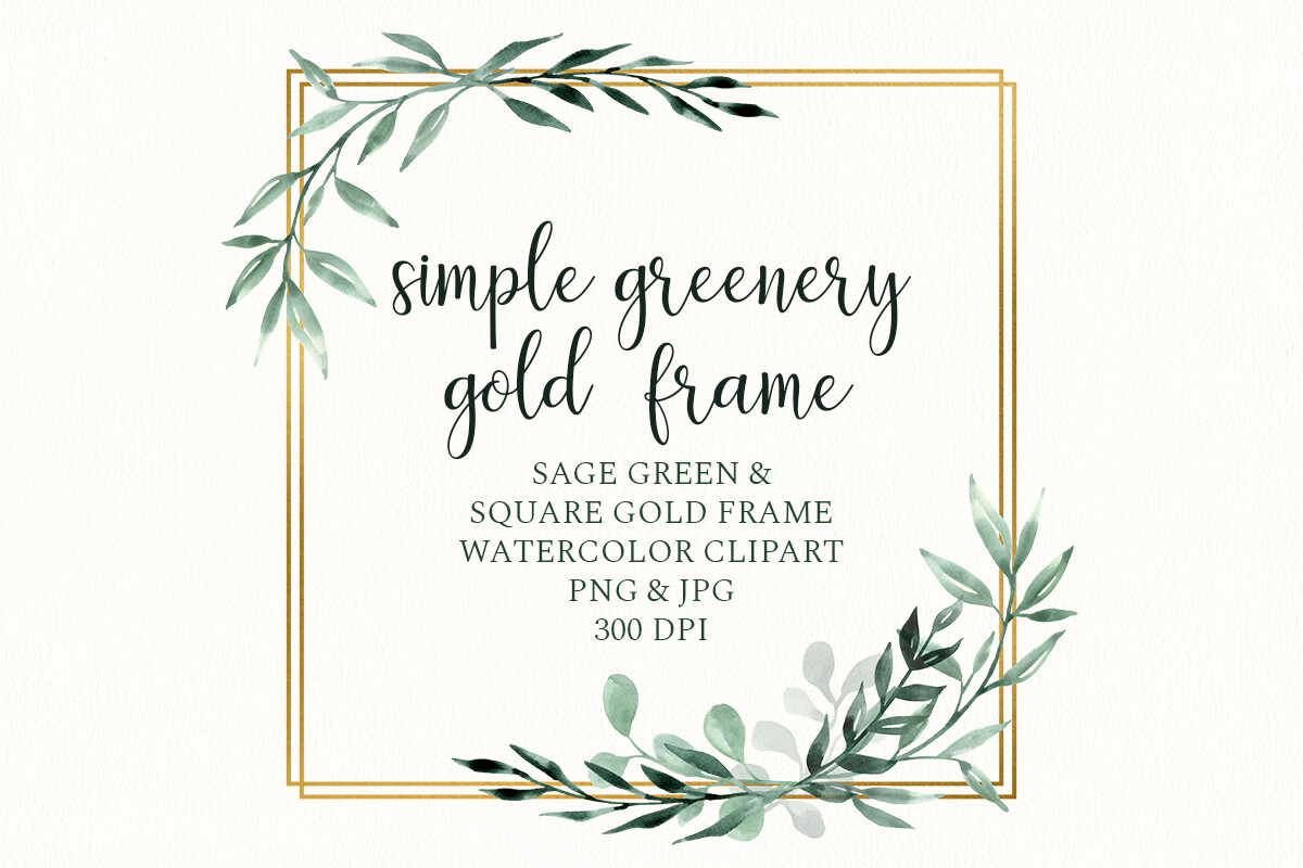
Sometimes you want the invite to look like it cost more than it did, and a gold floral frame does that lifting for you. Square borders with leaves and a thin gold edge, the kind of thing that photographs like foil even though it is just printed.
My maid of honor used one of these for her own invites a year after mine. She wanted the look of real gold foil and her budget said no, so we printed the frame on a slightly textured ivory cardstock and from a foot away you genuinely cannot tell. Up close, sure, it is ink. Across a room or in a photo, it reads rich.
The one warning. Gold prints muddy on a lot of home inkjets, comes out more mustard than metal. I would not trust your own printer on this one. We took the file to a print shop and paid the extra two bucks a sheet. Cheap insurance.
Things Brides Email Me About
What florals fit my season?
Honestly, just match what is actually blooming when you get married and you are most of the way there. Spring weddings can hold the bright pastels and the loud tulips. Summer wants fuller stuff, roses, peonies, anything lush. Fall I would push toward warm tones and more leaves than flowers, and winter looks best with sparse sprigs and a lot of white space.
I learned this the hard way when I put bright spring florals on a friend’s October invite and it looked like the date was wrong. We swapped to the rose and leaf set and suddenly it felt like fall. Same friend, same printer, completely different mood.
Watercolor or line florals?
Depends what your home printer can survive, frankly. Watercolor looks soft and romantic and forgives a cheap printer because the edges are already blurry. Line art is crisp and modern but it shows every flaw, a streak or a low cartridge and the thin lines break up.
I ran both at home before my wedding. The line florals looked patchy on my inkjet and I gave up and took them to the copy shop. The watercolor I printed in my kitchen and nobody could tell. So if you are printing yourself, watercolor is the safer bet.
How do I match my flowers?
Short answer, you do not have to, and trying too hard usually backfires. I matched mine to nothing and it was fine. The trick is matching the feeling, the same softness or the same boldness, not the exact same flower from your bouquet.
If you do want them to tie, pick one color out of the invite and carry it through. A coworker pulled the dusty blue from her florals onto her napkins and table numbers and skipped trying to match the flower itself. Looked pulled together, took her about ten minutes of decisions.
Before You Commit to a Template
None of this needs to be perfect. I sent invites with the wrong flowers on them and the only person who ever noticed was me. The flowers are there to set a mood and frame your names, and almost any of these sets will do that if you do not pile on every file at once.
Print one test page before you commit to the good paper. Tape it up, walk away, look at it tomorrow with fresh eyes. If you still like it in the morning, print the stack. That is the whole method, and it has not failed me yet.