My wildflower tables started as a panic. The florist quote came back at a number that made me sit down, and I had already spent the budget on a dress I now think was a mistake. So I drove to a farm stand off Route 9 the morning before, bought every bunch of cosmos and yarrow they had, and stuffed them into jam jars I had been hoarding for a year.
Here is the thing about the loose, just-picked look. It hides a lot. Stems lean wherever they want, a few petals drop, and nobody reads it as a flaw because that is the whole point. The part that is harder is the paper. A stiff, glossy table number sitting next to a messy little jar of daisies looks like it walked in from a different wedding. I learned that the night I taped a sleek black-and-white number to a vase and it looked like a parking sign.
So these are the printables and decor pieces I actually used or would use again for that relaxed wildflower thing. I print one test page on plain paper first, prop it against a jar across the kitchen, and back up to the doorway to see if it still reads. A couple of links below are affiliate links, so if you grab one it tosses a little something my way. Doesn’t cost you anything.
Full disclosure, a few links are affiliate links. Use one and a few cents come back to me, never anything added to your price.
A rose number that does not fight the daisies
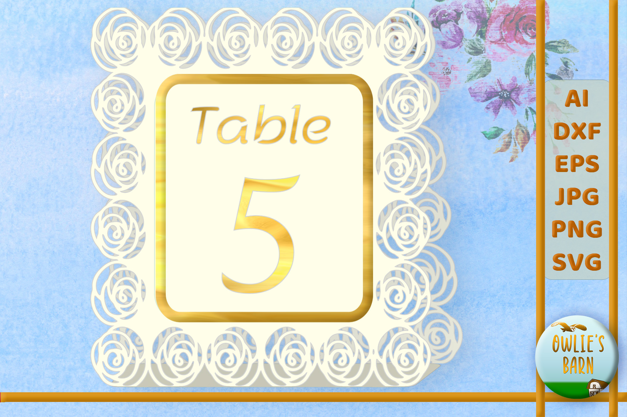
I was worried roses would read too formal for a table covered in scrappy farm-stand flowers. They didn’t. The little rose detail on this number is soft, kind of faded looking, so it sits next to a jar of bachelor buttons without acting like it is in charge.
I typed the numbers in, printed eight of them on a cream cardstock I had left over from save-the-dates, and propped them against the jars. My cousin asked where I bought them, which is the only review that matters to me.
One gripe. The rose prints a touch darker than it shows on screen, so on a true white paper it can look heavy. I went warm white and it calmed right down. Print one and check before you run the stack.
The floral set I gave my friend who said she can’t design
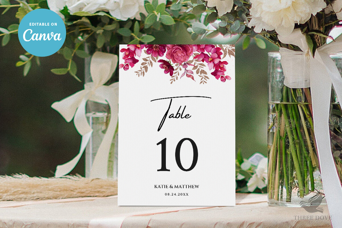
A friend was doing a backyard wedding in August and kept saying she couldn’t make anything look right. I sent her this. You type the table number into the box and the little floral border just stays put. She had all ten done in an afternoon while her kid napped.
What made it work for the wildflower vibe is the border, it is sketchy and loose rather than tight and symmetrical. Sat fine next to her mismatched bottles of Queen Anne’s lace.
The catch she ran into. The default font is a bit thin, and her venue was a dim barn at dusk. She bumped the weight up before printing the second batch and it read from across the room. Cost her one wasted sheet.
When I wanted one fancy thing on a messy table
I have a soft spot for a little gold. Not the whole table dripping in it, just one note. These leaf cards gave me that without tipping into formal. The gold leaf print catches the light a bit and plays nice with greenery, so I tucked sprigs of eucalyptus around the base of each one.
I printed mine at the copy shop on Foster because my home printer streaks anything with metallic tones into a sad brown. The shop ran them on a slightly heavier stock and they stood up on their own without flopping.
Honestly the gold reads more like mustard on plain inkjet paper. If you want it to actually look gold, pay the few extra dollars for the copy shop. I tried at home first. The home batch went in the recycling.
Fall wedding, name tags, and a happy accident
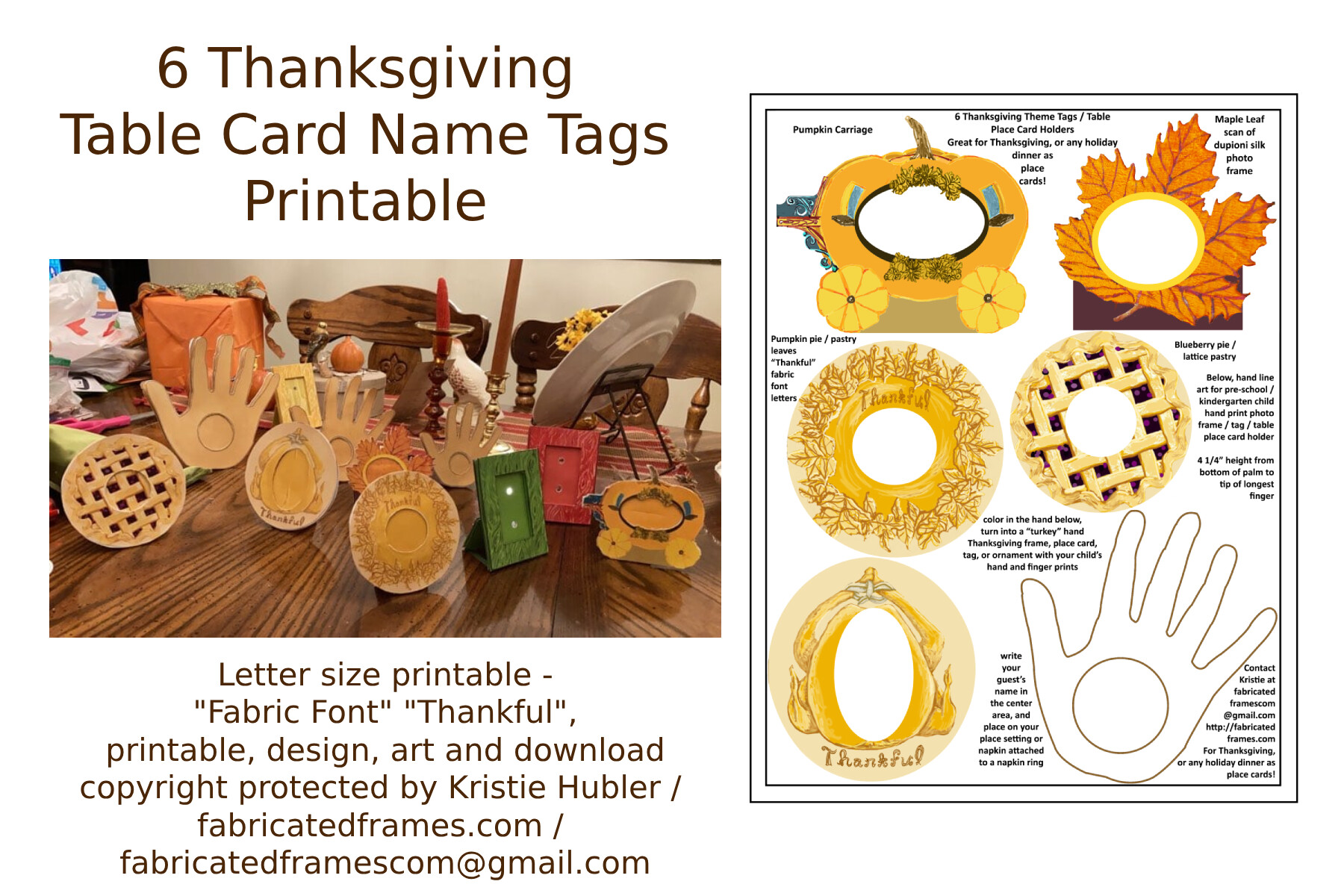
These are sold as a Thanksgiving thing, but I grabbed them for a late October wedding and nobody clocked the holiday angle. The warm leaf colors landed right in the middle of a wildflower-meets-autumn look, dried strawflowers and orange cosmos on the table.
I wrote names by hand on these instead of typing, because my handwriting is the one craft thing I trust. Printed them on a kraft-toned cardstock, let the corners go a little rough, leaned them against each plate.
The one snag. The print area for the name runs small, so if you have a guest named something long it gets cramped. I had a Konstantin at table four and had to shrink his name awkwardly. Test your longest name first.
The card frame I almost skipped and then loved
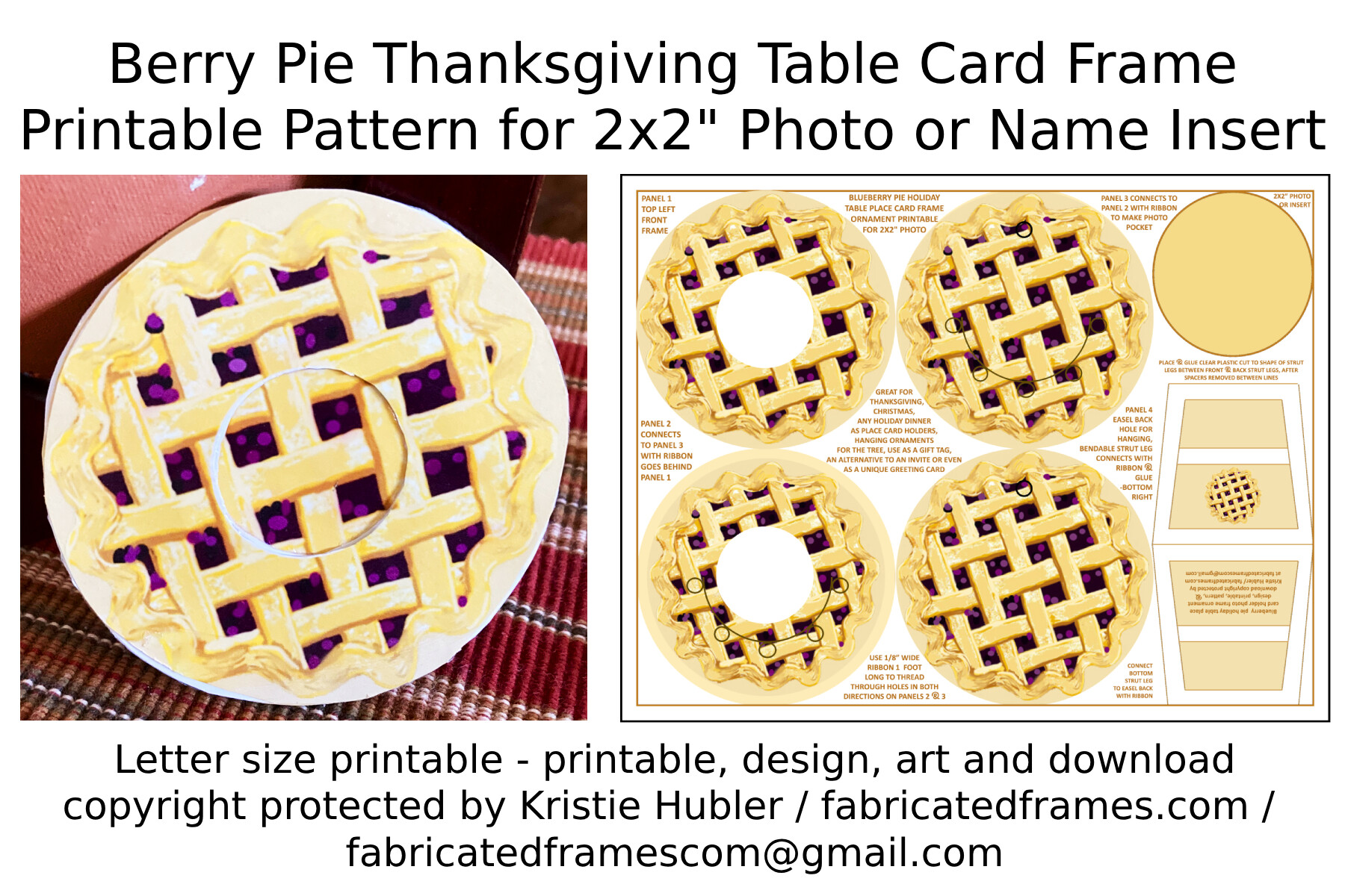
I added this one late, like the week before, when I realized my tables looked a little bare in the middle. The berry frame gives you a printed border to drop a card into, and the deep berry color picked up the dried red flowers I had without trying to match exactly.
I printed the frames, wrote our menu inside by hand, and stood them between the jars. My maid of honor said they looked like something from a magazine, then immediately asked if I made them at the copy shop. Yes. Obviously.
Watch the inner margin. I printed my first menu too close to the berry border and the words crowded the art. Pulled the text in on the second try and it breathed. One ruined card, lesson learned.
Place cards that took me one quiet evening
Place cards were the chore I dreaded most and they turned out to be the easiest. You type all the names into the template, it fills them onto the cards in order, and you print a sheet at a time. I did the whole guest list on a Tuesday night with a glass of wine and the printer on the floor.
The design is plain enough to sit under any flowers, which is exactly what I wanted with such busy little arrangements. Cut them, folded them, tented them next to each jar.
One thing to know. The fold line is not marked, so you eyeball the crease, and my first few were lopsided. I found a bone folder in a drawer (a butter knife works too) and ran them along a ruler after that. Sharp folds, no more leaning.
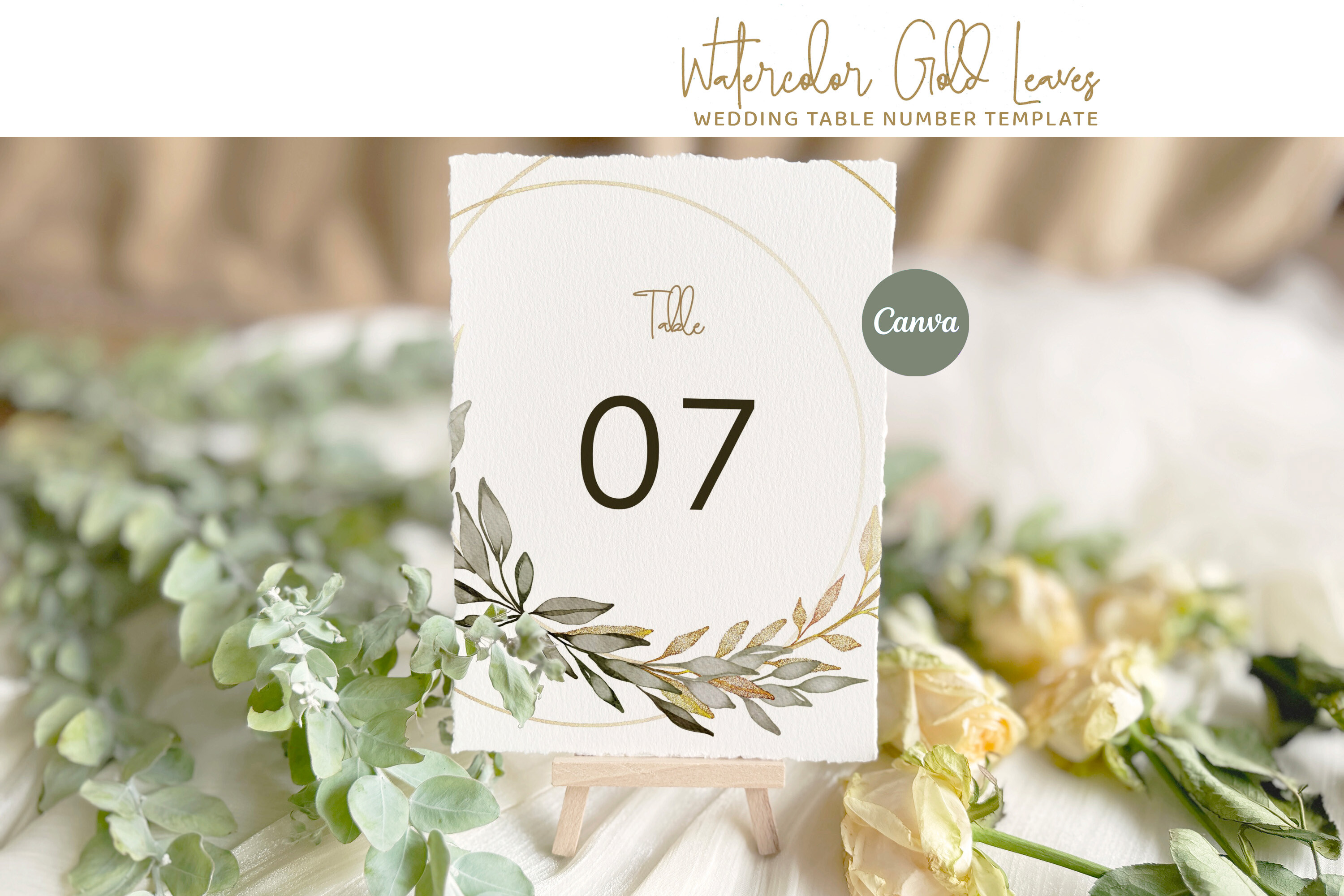
The greenery numbers I keep recommending
If I had to pick one piece from this whole list for a wildflower table, it is probably these. The soft green leaf trim reads natural, almost like the plant crept onto the paper, and it tied into the eucalyptus I had threaded down the center of every table.
You type the number, the leaves stay where they are, and the spacing handles itself. I printed mine on a textured ivory stock, which gave the green a little depth instead of looking flat and printed.
The gripe is small. On glossy paper the green goes a bit neon, weirdly. Matte or textured stock fixes it completely. I printed one glossy test by accident and it looked like a gym flyer, so, matte.
The Questions I Get Most
How do I do wildflower tables?
Short answer, raid a farm stand and a cabinet of mismatched jars. I bought my flowers the morning before from a stand off Route 9, picked nothing matchy, and split them across small jars instead of one big arrangement. The trick is to let stems lean and not crowd them.
The part that trips people is the paper. Keep your printed numbers and cards loose and natural, soft borders, warm stock, hand-written names if your writing holds up. A glossy formal number next to scrappy daisies looks off. I learned that with a black-and-white sign that looked like it directed traffic.
Dried or fresh wildflowers?
I did both at the same wedding, kind of by accident. Fresh cosmos and yarrow in the jars, dried strawflowers and a bit of statice tucked around the cards. The dried stuff bought me time, I made those pieces a week out and they didn’t wilt in the car.
Fresh wins on smell and that just-picked look, but it bruises and you are doing it the day before, stressed, with cold hands. Dried is forgiving and travels. If you hate last-minute panic, lean dried and use a few fresh stems where people sit close.
What colors work?
Honestly almost anything soft works, which is the nice part. I went warm: cream, dusty yellow, a little berry red, lots of green. The flowers carry the color so your paper can stay quiet, ivory or kraft, with just a leaf or rose detail.
Where I’d be careful is going too bright or too pure-white on the printables. A stark white card fights the natural look. I matched my stock to the warmest flower on the table and everything settled down.
One Last Thing
None of this needs to be perfect. My tables had a leaning jar, a place card I creased crooked, and a gold number that printed too dark until I gave up and went to the copy shop. People still came up and asked who did the flowers, and the answer was me, the morning before, with a farm-stand receipt in my pocket.
Print one test page first, every time. Hold it across the room next to a jar. If it reads from the doorway it’ll read at the table, and you’ll have saved enough to spend on something you actually care about. For me that was the cake. No regrets there.