I did not plan on having menu cards. They felt like the kind of fussy little thing you add when you have run out of real problems. Then my caterer asked, two weeks out, whether the salmon people and the chicken people would be sitting together, and I realized nobody at the table would have any idea what was coming. So I made cards. At a folding table in my friend Dana’s spare room, with her cat walking across the cardstock every four minutes.
Here is what I figured out doing it. The menu card is the cheapest piece of paper on the whole table and it does more work than the favors nobody takes home. It tells people what they are eating, it fills the empty space in front of the plate before the food lands, and it photographs well next to a folded napkin. I printed mine the Wednesday before, on a stack of warm white cardstock I bought on sale, and I still have eleven leftover ones in a drawer.
These are the templates I actually opened more than once. I print a single test page on plain paper first, set it on the dining table, and back up to the doorway to see if it still reads. A couple of the links below are affiliate links, so if you grab one through me it kicks a little back my way. Does not cost you a thing.
Heads up, some links here are affiliate links. Grab a template through one and I get a small cut, no extra charge to you.
The hand-drawn one I used for a backyard dinner
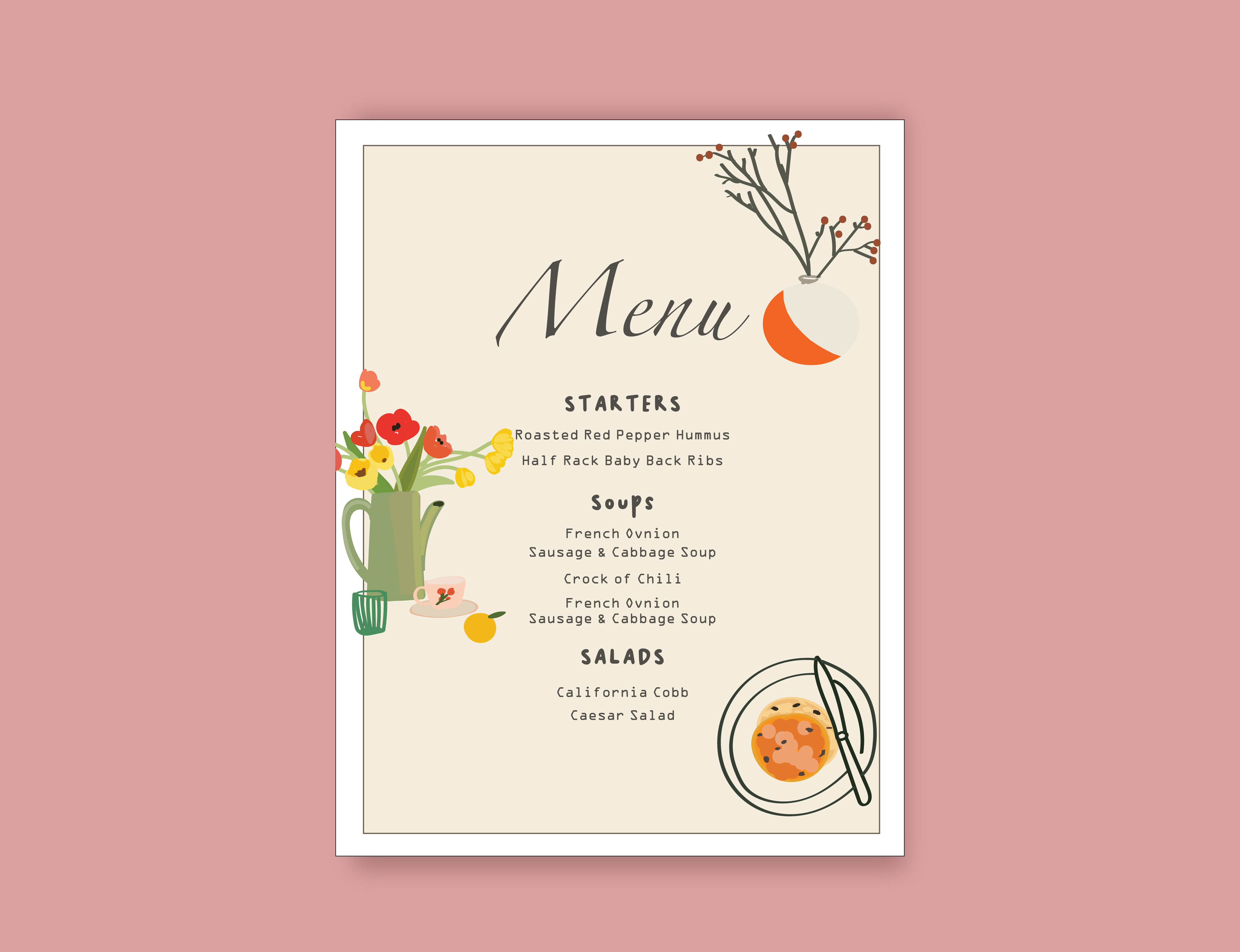
My cousin had a tiny garden reception, forty people, long shared tables, and nothing about it was formal. A clean typed menu would have looked like a hotel printed it. This one has the little sketched look, the food drawn in by hand, and it sat right next to the wildflowers in jam jars without fighting them.
I typed in her three courses, printed two on plain paper, and we held them up against the actual jars before committing. The drawn style hides a lot, which I liked. You are not staring at perfect kerning, so a slightly off letter does not jump out.
One gripe. The hand-drawn elements are darker than I expected on screen, and my old printer made the lines look muddy. I took the file to the copy place on Fenwick and it came out crisp. Worth the four dollars.
When your whole table is candles and moody linen
A coworker of mine got married in October in this dim little restaurant with black tablecloths, and every light, airy menu card she tried just vanished against it. White paper on a dark table looks like a sticky note. This dark template flips that. Pale text on a deep background, so it belongs there instead of floating.
She printed it on a slightly heavier matte stock so the dark ink would not bleed through and ghost on the back. I helped her tape one to the wall and we lived with it for an evening. Read clean from across the room, even by candle.
The catch with dark cards is ink. They eat a cartridge. She gave up on her home printer halfway through and ran the whole batch at a shop, which honestly cost less than a third refill would have.
The square one that matched a square plate
I am a little obsessed with square menu cards now. They sit on the plate instead of leaning awkwardly against a glass, and they photograph straight down without looking like a leaning tower. This one is the square format I sent my maid of honor when she could not decide on a shape.
She typed her names and the courses, printed one, and tucked it inside a folded napkin to see how much showed above the fold. About two thirds, which turned out to be the part you actually want people reading.
Small thing to watch. Square cards mean you fit fewer per sheet, so you burn more cardstock than you think. We figured four per page after some math and one wasted sheet. Order extra paper.
A plainer square for the people who hate clutter
Same square shape, but stripped way down. My neighbor wanted something her grandmother would not call busy, and most of the floral templates were too much for her. This one is mostly space and a little type. It looks expensive because there is nothing on it trying too hard.
She set her menu in it the Thursday before the wedding, printed three test versions with the font at different sizes, and lined them up on the kitchen counter to pick. The middle one won. Bigger than she thought she wanted.
My one note. With this much empty room, any typo is loud. There is nowhere for the eye to hide. We caught a missing ‘r’ in ‘parmesan’ on the second pass, which would have lived on every plate.
Skip the stack and print one big board
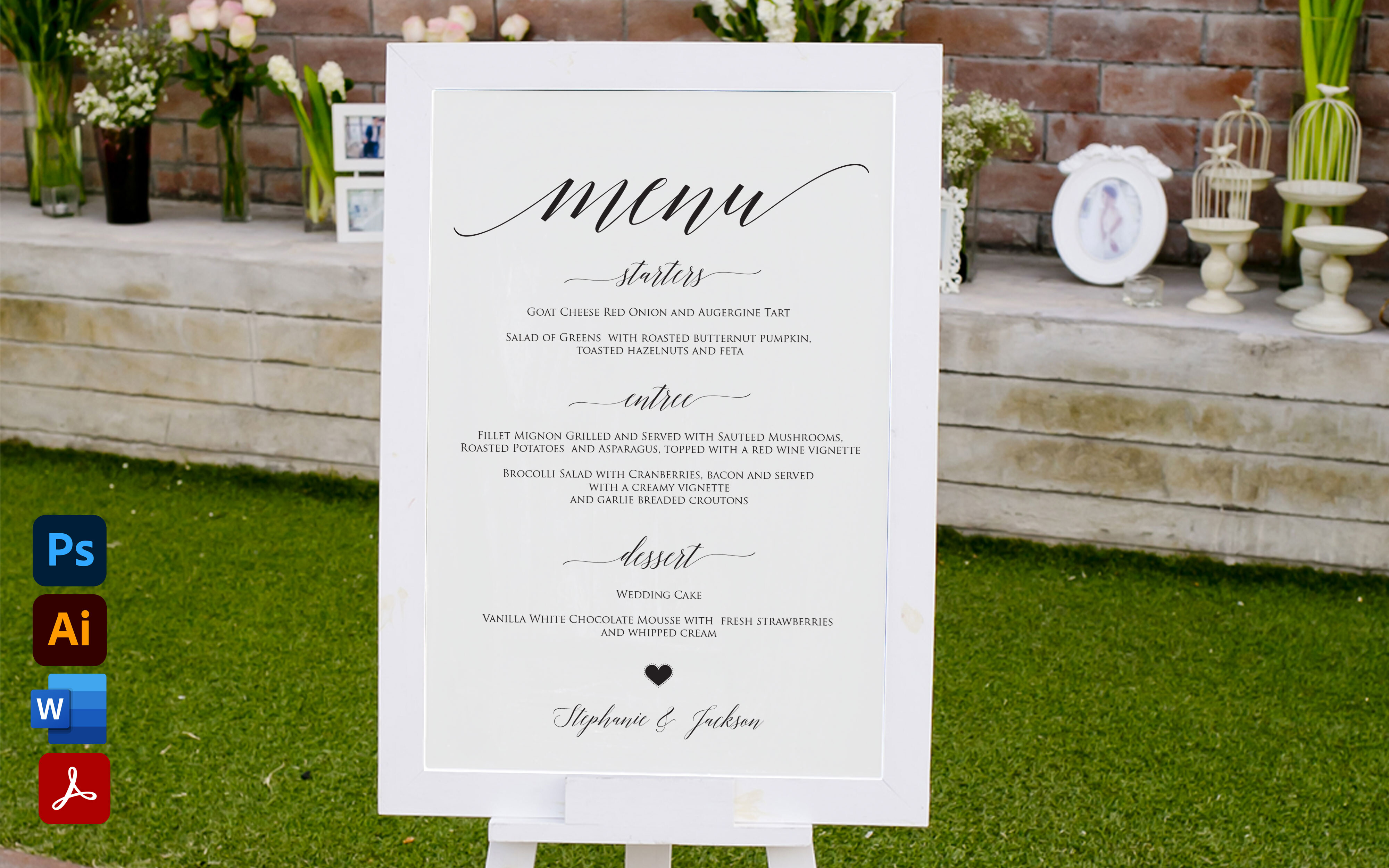
Not every table needs a card per seat. For my own reception, with eight people to a round table, I did one larger menu board per table propped in a little frame from the craft store. Cheaper, faster, and one less thing to weigh down with a stone when the wind picked up.
This is the board style I would use again. I sized it to a frame I already owned, printed it on the heavy stock so it would stand without buckling, and set it slightly off center so the centerpiece did not swallow it. People leaned in to read it, which got the table talking.
The downside is obvious once you do it. One board per table means the folks at the far seats have to crane a bit. If your tables are long instead of round, I would do two boards, one at each end.
The floral one for a garden vibe without the florist bill
When you cannot afford flowers on every surface, you can at least put them on paper. A friend doing a spring wedding used this floral menu to echo the few real blooms she had, and from across the room it read like there was more greenery than there was. A nice cheat.
She matched the flower color on the card to her actual bouquet by printing a swatch first and holding it up next to the test stems at the shop. Took a couple tries. The pink on screen ran warmer on her printer than on mine.
One snag worth knowing. The florals run close to the edges, and a home printer that does not do borderless will clip them. She added a hair of margin in the file before printing so nothing important got guillotined.
A second floral take, softer, for the indecisive (me)
I pinned both floral menus and could not choose, so I printed each and taped them side by side on the fridge for a weekend. This one is the quieter of the pair. The flowers sit more in the corners and leave the middle clear, so longer dish names do not get crowded out.
I like it for a reception with a real dinner menu, the kind with a full description under each course, because it has room to actually breathe down the center. I typed in a four-line entree description just to test, and it did not feel cramped.
My quibble is the corner art. On the smaller print size the flowers get a little soft and lose detail. Print it at the larger dimension if you can. At the bigger size on Pearl Street it looked great.
What People Keep Asking
Do I need menu cards?
Honestly? No, you can absolutely skip them. I almost did. But here is what changed my mind. People sit down and there is this dead stretch of time before the food comes, and a menu card gives them something to do besides check their phone or make small talk with a stranger.
They also save your servers from answering ‘what is the chicken’ forty times. And if you have anyone with allergies, a card that names the dish quietly does a job nobody has to ask out loud about.
One per person or per table?
I did one per table at my own and it was fine, mostly because round tables of eight meant everyone could lean in and see. Cheaper too. I printed eight boards instead of sixty cards.
If I were doing it again for long banquet tables, I would do per person, or at least one at each end. The far seats on a long table cannot read a single board in the middle without standing up, and nobody wants to stand up to find out it is salmon.
How do I match my invitations?
The trick I learned is to chase one thing, not all of them. Pick the font or the flower from your invite and carry just that onto the menu. Trying to match every element is how you end up at midnight nudging a flourish two pixels left.
Dana and I matched her menu to her invites by pulling the exact same header font and one accent color, and left everything else simple. From the table it read as a set. Up close, who is comparing them side by side anyway.
Before You Print a Stack
Menu cards ended up being my favorite small thing from the whole day, which surprised me, because I tried to cut them twice. They are a few dollars of paper that make the table look finished and give people something to read before dinner.
Whatever you pick from up here, print one test on cheap paper, set it on a real table, and walk to the other side of the room. If you can read it from there, you are done. Go glue something else.