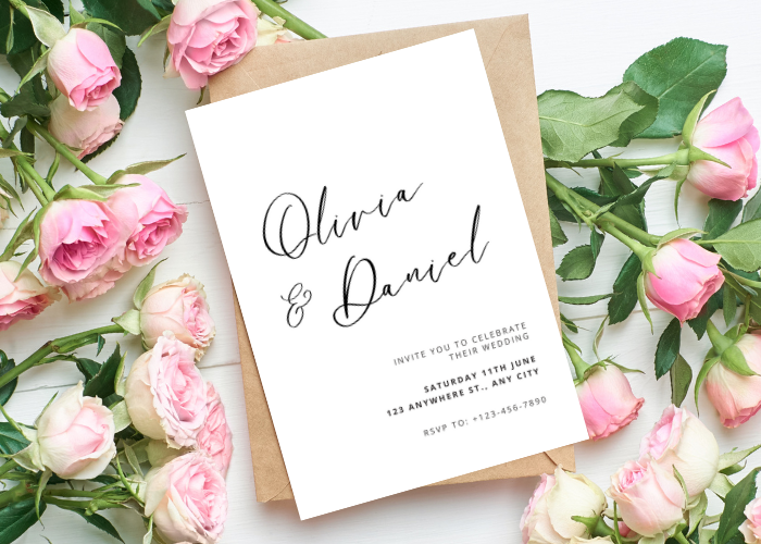
My save the dates were a single line of text on cream paper. Just our names, a date, and the word Vermont, because that was as much as we had figured out at the time. I almost added a little sketched arch behind it. Glad I did not. The plain version came back from the print queue looking like we had hired someone, and we had hired nobody. We had a coupon and a slow Tuesday afternoon.
Here is the thing about going minimal. It reads as a choice when you do it on purpose, and it reads as lazy when you run out of ideas at midnight and just delete stuff. Same card, two completely different vibes. The trick is knowing which corner to leave empty and which font to leave alone. I got that wrong a few times before I got it right.
So below are the ones I keep going back to, plus a couple I bought for friends who panicked. I print a test page on regular paper first, prop it on the counter, walk to the doorway, and see if I can still read the date from there. If yes, it ships. A few of these links are affiliate links, so if you grab one through me it tosses a little change in my jar. You pay the same.
Heads up, some links here are affiliate links. Grab a template through one and I get a small cut, no extra charge to you.
When you want one flower, not a whole garden
I gave this to my college roommate who swore she hated florals. She does not hate florals. She hates the kind that swallow the whole card. This one tucks a single soft sprig in the corner and lets the rest sit quiet, which is exactly what she needed to calm down.
She typed her names in over coffee on a Sunday and had it back from the local print place by Wednesday. The spacing held when she switched from a March date to an April one, which is more than I can say for the free thing she tried first.
One gripe. The flower prints a touch heavier than it looks on screen, so if you are on a home printer running low on color, do a test first. She did not, and the first three came out muddy.
The green one for people who think florals are too much
This is greenery, so it is the cousin of the floral version, except calmer. Eucalyptus down one side, lots of breathing room everywhere else. I used a version of this look for my own and never regretted skipping the bright colors.
A friend who got married in a barn outside Asheville sent these out and three people told her they framed them. Nobody frames a busy card. They frame the ones that look like a quiet decision.
The catch is the green can go gray if your printer is tired. I told her to run hers at the copy shop on Haywood instead of fighting her inkjet at home, and that fixed it in one pass.
The fridge stays loyal longer than a drawer
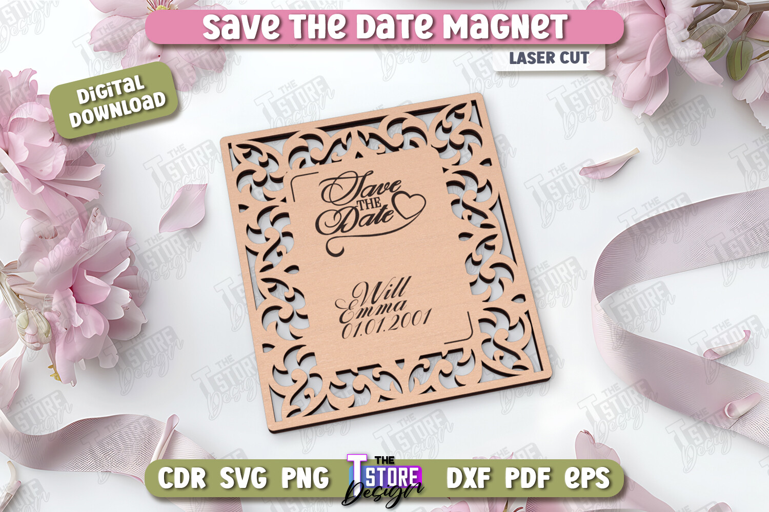
Paper cards end up in a drawer. Magnets end up on the fridge, next to the takeout menu, staring at your guests for eight months. That alone sold my maid of honor, who is convinced everyone loses paper.
This is the laser cut magnet style, clean shape, very little fuss on it, just the words and a trim edge. She ordered hers and stuck one on her own fridge to test the hold. Held a grocery list and two photos. Good enough.
Where it bites you is cost. Magnets run more than a printed card, so she did the math and only mailed magnets to the out of town people who actually needed the reminder, and printed flat cards for the locals.
Tiny drawings that do the talking for you
Okay, this one is not a card. It is a little kit of small line drawings, a ring, a glass, a leaf, that sort of thing, and you drop one onto whatever you are making. I used a couple to mark the bar and the dessert table on my signage, and they pulled the whole stack together without a single extra word.
My cousin used one as the only image on her save the date. One small icon, centered, names underneath. People asked her who designed it. She designed it, in about nine minutes.
The annoying part is they come in a set and you will use maybe four of them. The rest just sit there. Not a dealbreaker, but I kept wanting more glass and fewer doves.
Buy the whole set once and stop shopping
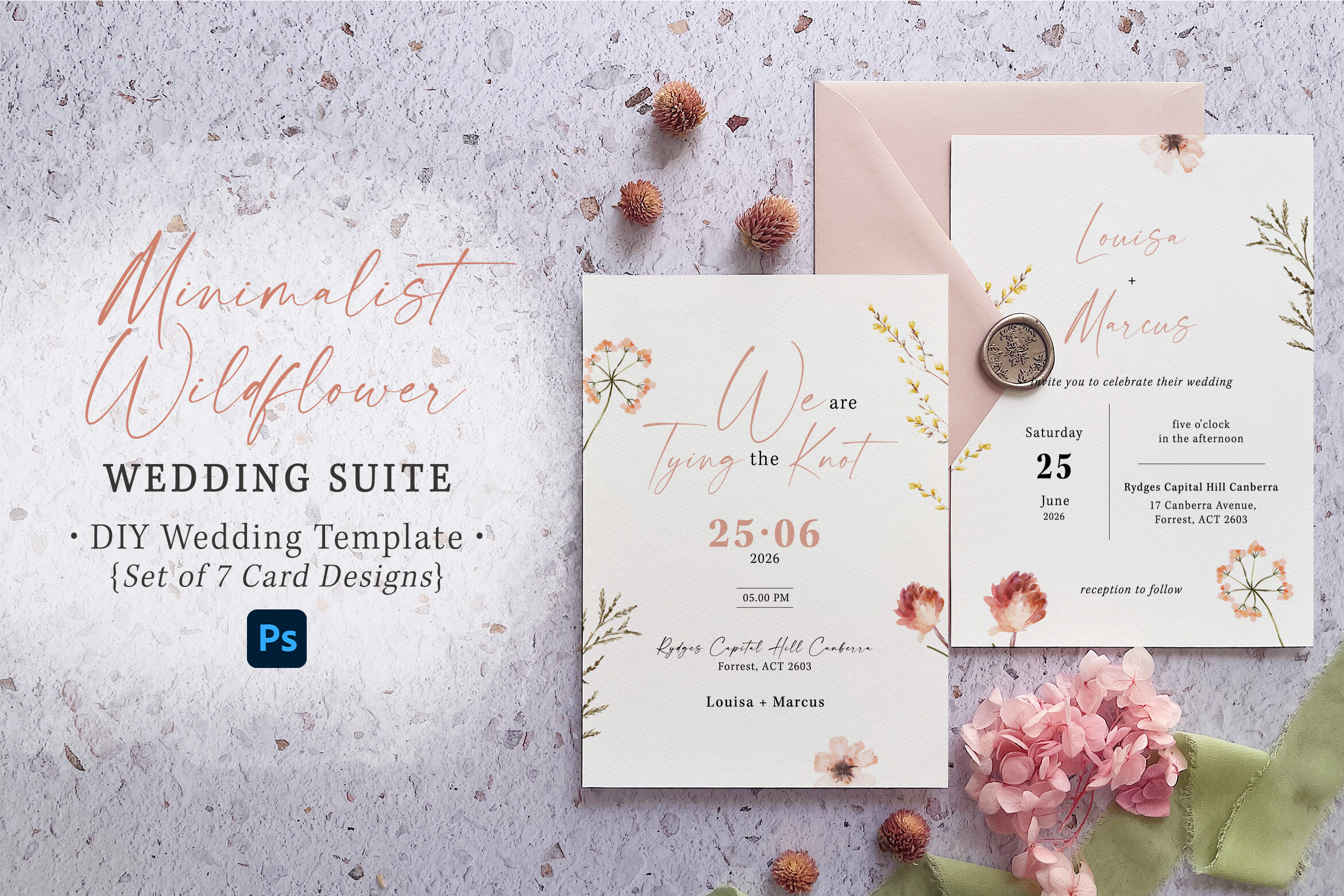
A suite means the save the date matches the invite matches the menu, all in the same quiet wildflower style, so you are not hunting for coordinating pieces in three months when you are already tired. I wish I had bought a suite. I bought everything piecemeal and spent a weekend trying to make a stranger font match my cards.
A coworker grabbed this one the week she got engaged and just sat on it. Every time another thing came up, the place cards, the program, it was already there in the folder waiting. Smug about it, honestly. Earned smug.
The wildflowers are delicate, which is the point, but on cheap cardstock the thin lines can break up. She moved to a slightly heavier 110 lb stock and the detail came back.
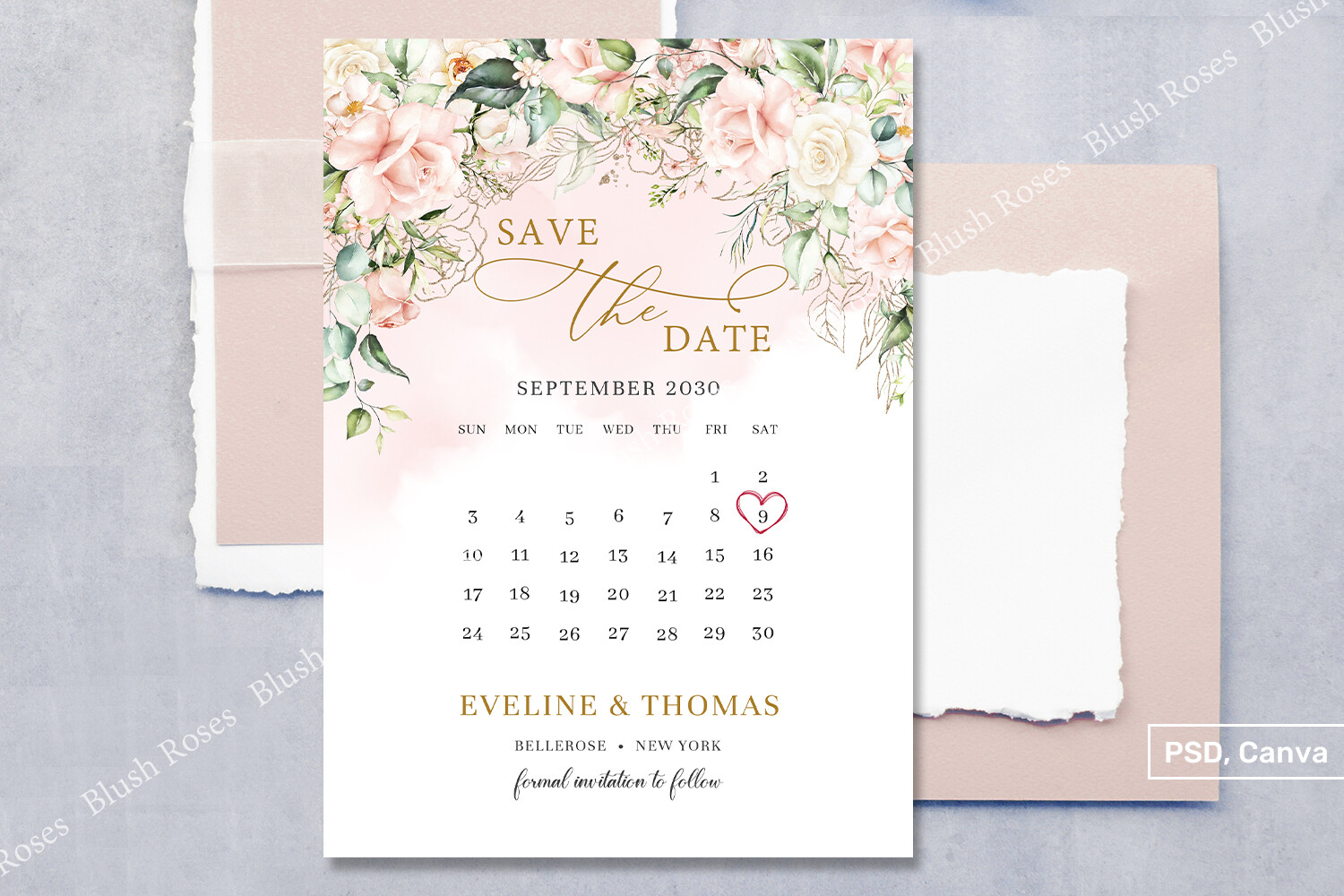
The invite that matches the save the date you already sent
Save the dates are step one. Then the invite shows up months later and people compare them, even if they say they do not. This is the matching minimalist invitation, same restraint, same room around the type, so the second card feels like a sequel and not a reboot.
I helped my neighbor set hers up at her kitchen table. We typed in the venue, picked a date, and printed one on plain paper to check the line breaks before touching the good stock. Caught an awkward wrap on the address. Saved her a sheet.
The only thing I would flag is the font ships a bit thin. Her venue had low light and the address was hard to read, so we bumped the weight one notch before the real run.
A little blush for the people who want some color
Not everyone wants stark white and nothing else, and that is fair. This one keeps the minimal bones but adds soft blush florals, eucalyptus, and a thin gold touch, so it has a pulse without going loud. I send it to brides who tell me white feels cold.
My sister in law used it for a fall date, which I thought was a strange match, and she was right and I was wrong. The blush warmed it up just enough against the brown invitations she was pairing it with.
The gold is the part to watch. On a home printer gold reads as a sad mustard yellow. She had hers run with a real metallic at a shop on Pearl Street, and that is the version worth paying for.
What People Keep Asking
What is a minimalist save the date?
A friend asked me this over the phone while she was panicking, and the easiest way I could put it was, it is the card where you take stuff away until only the important words are left. Names, a date, maybe one tiny image and a lot of empty space.
Mine was three lines on cream paper and nothing else. People kept it on their fridges. The busy ones I have seen end up in a drawer by Thursday.
Does it save on printing?
Yep, and more than I expected. Less color on the page means less ink, and a single color or a thin gold accent costs way less to run than a full bleed of bright flowers.
I learned this the hard way going the other direction first. My original idea had a big colored background and the copy shop quote made me laugh out loud. Stripped it down to one ink color and the price dropped by almost half.
How do I keep it from looking plain?
This is the real question and I got it wrong before I got it right. Plain happens when you delete things and panic. Minimal happens when you leave one thing on purpose, a good heavy font, or a single small icon, and then stop touching it.
The other fix is the paper. A flat design on cheap thin stock looks like a flyer. The same design on 110 lb cardstock feels like you meant it. I felt the difference the second I held both.
Before You Print a Stack
If you take one thing from all this, make it the test page. Print on regular paper, walk across the room, and squint. The card that still reads from the doorway is the one to buy the good stock for. Costs you one sheet to find out.
And do not panic about the white space. The empty part is doing the work. I added a sketched arch to my own draft at midnight once, hated it by morning, and went back to the bare version that came out looking like we had paid a professional. We had paid for a coupon and a slow afternoon.