The mirror seating chart was not even my idea. My friend Priya found an old beveled mirror at a yard sale in Glenwood for eleven dollars, and she texted me a blurry photo at 7am asking if we could put names on it. We could. We did. It took three tries and a lot of words I will not type here.
Here is the thing about the mirror version. It looks like you spent a fortune and it really did not have to. The trick is the lettering, because freehand paint pen on glass is a special kind of betrayal. My first attempt slid right off when I wiped a smudge near the top, and I lost the whole left column. So now I print the names first and treat the writing as the last step, not the brave one.
These are the templates I have actually opened and printed, plus a couple I handed to friends who did not trust themselves with a pen. I print a test page on plain paper, tape it up, and back across the room until I either give up or it reads. A few of the links below are affiliate links, so if you grab one a little something comes my way. Does not cost you a cent.
A few of the links below are affiliate links. If you print something from one, it tosses a little something my way and costs you nothing.
The one I trace through the glass
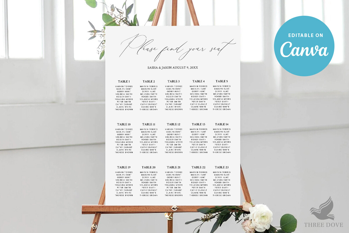
I keep coming back to this template for the mirror because the names sit big and clean, and that matters more than you would think when the surface is reflecting half the room back at you. I printed it, taped the sheet to the back of the mirror, and traced the letters through the glass with a pen so I never had to guess at spacing.
My cousin’s list had fourteen tables and I fit all of it without crowding, which I did not expect. The trace method means your handwriting can be terrible (mine is) and nobody knows.
One gripe. The default letter spacing is a hair tight for a tall list, so if you have more than ten tables, widen it a touch before you print or the bottom names crawl into each other.
When you want a backup that matches
Priya wanted a small card on the gift table that echoed the big mirror, and this set covered both without me hunting for two separate files at midnight. The pieces share the same look, so the mirror up front and the little sign by the cake did not feel like two different weddings.
I printed the smaller piece at a copy shop on Harlow because my home printer streaks anything with a dark band across the top. The set held up fine on their cardstock.
Watch the color, though. What looked like a soft charcoal on my screen came out almost black on the print, and against a mirror that reads as a heavy block. I dialed it back twenty percent on the second pass and it sat better.
For mirrors that fight you on contrast
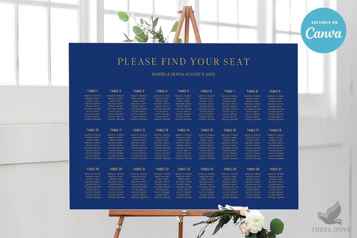
A mirror reflects whatever is behind it, so light text on a busy room turns into mush. This dark layout solved that for a friend’s evening reception where the mirror sat near a window and the daytime glare ate everything pale. The darker block behind the names gives your eyes something to land on.
She stuck this one straight onto the glass as a printed panel instead of writing at all, which honestly looked sharper than her paint pen ever would have.
The catch is ink. Dark templates drink a cartridge, and I went through most of one printing a single full sheet. Print it somewhere with a laser machine if you can, or budget for the refill.
The standalone sign, no mirror required
Not every venue lets you lean a mirror anywhere, and the place my coworker booked banned anything propped against a wall for fire code reasons. So she used this as a flat sign in a frame instead, set it on an easel, and called it a day. It carries the same job without the glass anxiety.
I helped her print it the Tuesday before, two test pages, then the real one on heavier stock once the margins looked right.
My one note. The text runs a little close to the edge on the default setup, and a home printer will clip it. Nudge everything in before you commit a good sheet.
The softer cousin for a smaller crowd
This one is gentler, and I used it for a bridal shower where the host wanted the mirror look but only had five little tables to sort. The lavender tone reflects nicely and does not go harsh under string lights, which the dark templates sometimes do indoors.
We wrote the names on this one by hand over the printed guide, slowly, with a fine pen, and it survived being moved twice during setup.
Keep in mind the pale color is faint on glossy paper. On the first sheet the words nearly vanished under the overhead light, so I switched to a matte stock and the lavender finally showed up.
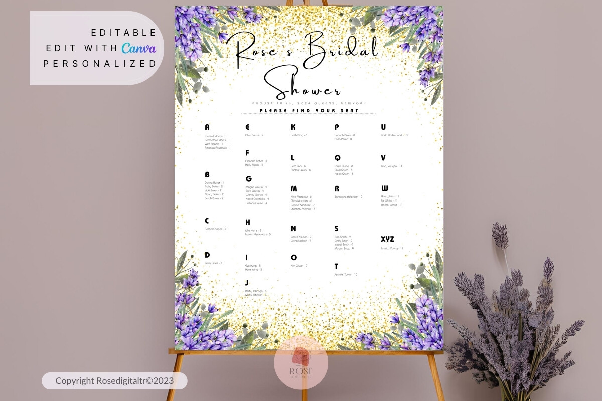
Florals that do not crowd the names
Most floral charts bury the actual names under vines and I cannot read them from six feet away, which defeats the point of a seating chart. This one keeps the flowers to the corners and leaves the middle clear, so it works on a mirror where you already have visual noise from the reflection.
I test printed it for my neighbor’s spring wedding, held it across her living room, and it still read from the doorway. That is my whole bar for these.
The gripe is small. The floral corners are a touch pale, so if you want them to pop on glass, bump the saturation a step before printing or they wash out under bright halls.
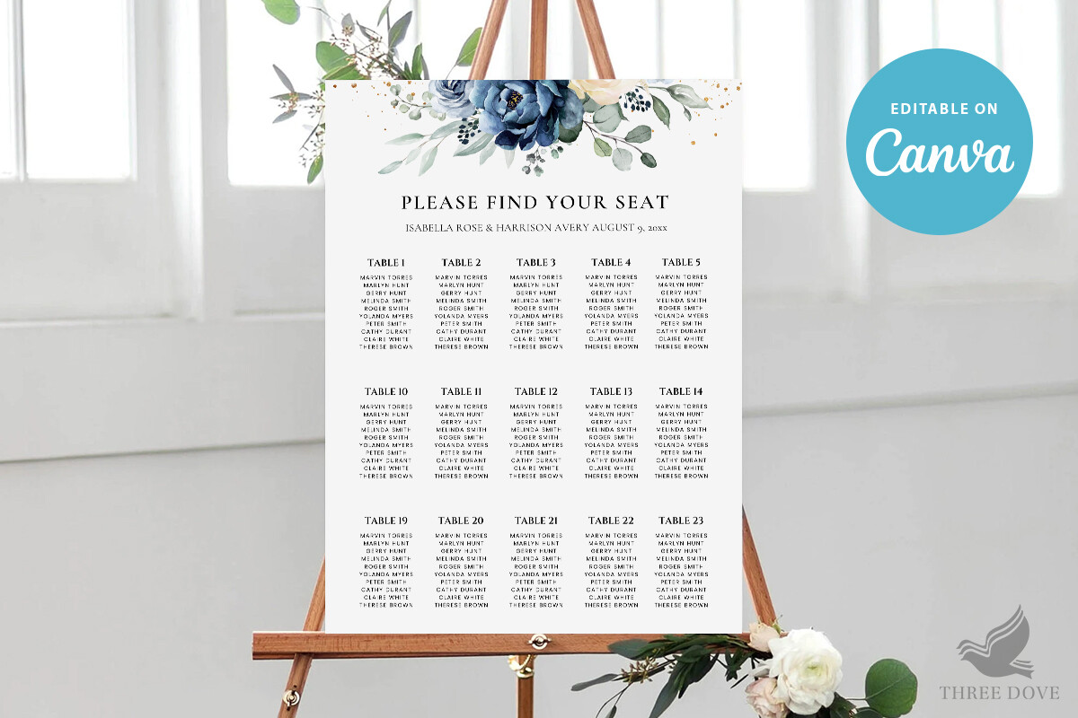
When you sort by name and not by table
Alphabetical changes the whole feel of a mirror chart, because guests find their own name fast instead of hunting table by table. I set this up for a friend with a big extended family who kept getting a line forming at the chart, and sorting A to Z cleared the jam at the door.
The eucalyptus running down the side gives it a green note that looks alive against a mirror, almost like real sprigs leaning there.
One thing I ran into. Alphabetical means long single columns, and on a tall mirror the bottom names ended up below knee height. Plan your layout to the size of the actual glass first, then print, not the other way around like I did.
What People Keep Asking
How do you make a mirror seating chart?
Honestly, the laziest reliable way is to print the names first. I tape the printed sheet to the back of the mirror, then trace the letters through the glass with a pen, so the spacing is already decided for me.
The first time I tried freehand I lost a whole column to a smudge and had to clean the entire mirror with vinegar and start over at midnight. Print, trace, then write. That order saved me.
Do I write on it or use a decal?
Depends how steady your hand is and how much you want to cry. I have done both. Writing gives you that handmade feel but one wipe near a wet line and it is gone.
A printed panel stuck to the glass, or a decal, is the safe call if your list is long or you are doing this the night before. My cousin used a printed panel and nobody could tell it was not painted on.
Is it hard to read?
It can be, yeah, because a mirror throws back whatever is behind it and names disappear into the reflection. That is the real risk, more than the lettering.
What fixed it for me was contrast. Darker text, or a darker template panel, and putting the mirror where it does not face a window. I test it by backing up across the room and squinting. If I can read it from the couch, the guests can read it from the door.
Before You Print a Stack
If you take one thing from this, let it be the test page. I print on plain paper, tape it to the mirror, and walk away before I touch the good cardstock or a single pen.
The mirror look gets all the credit at the reception, but the part that actually saves you is boring. Print first, write last, and pick the template that keeps the names big. Priya’s eleven dollar yard sale mirror still leans in her hallway, names half wiped off, and she will not let anyone clean it.